Angular CDK Tutorial: Accordion Module
An accordion component is a component that has one or more expandable sections within it. It’s pretty common to have the need for this type of thing when building apps in Angular. And, it’s not the most difficult thing to do even if you’re creating your own from scratch but the CDK makes it really simple. In this example I’ll show you just how easy it is. And after we create the accordion using the CDK, we’ll even make it accessible with some ARIA. Alright, let’s get to it!
The Demo Application
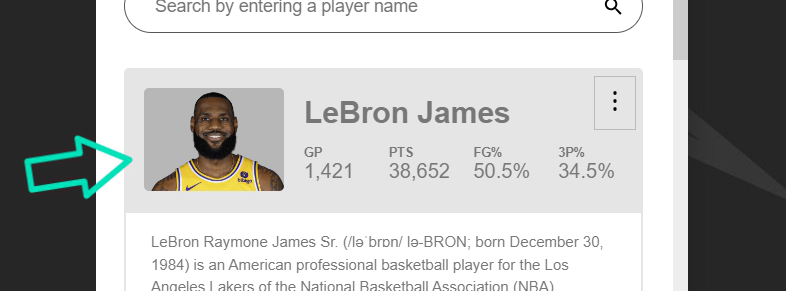
For the example we’ll be working with in this post, we have a simple application that lists some information about several different NBA players.
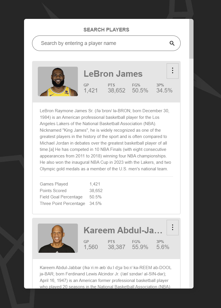
There are two distinct regions that you can see here. What we want to do is convert this to an accordion where the first section, this darker gray region is always visible, and this lower region will be expandable.
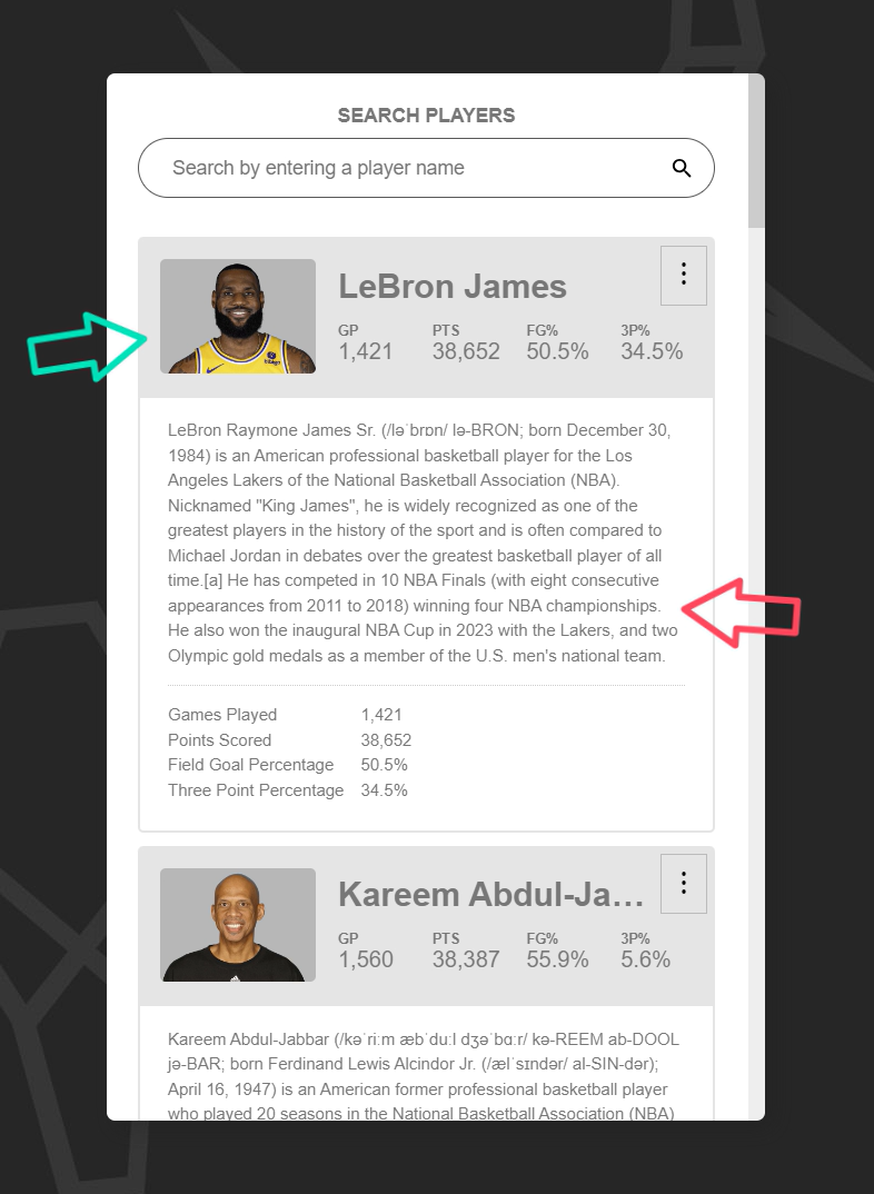
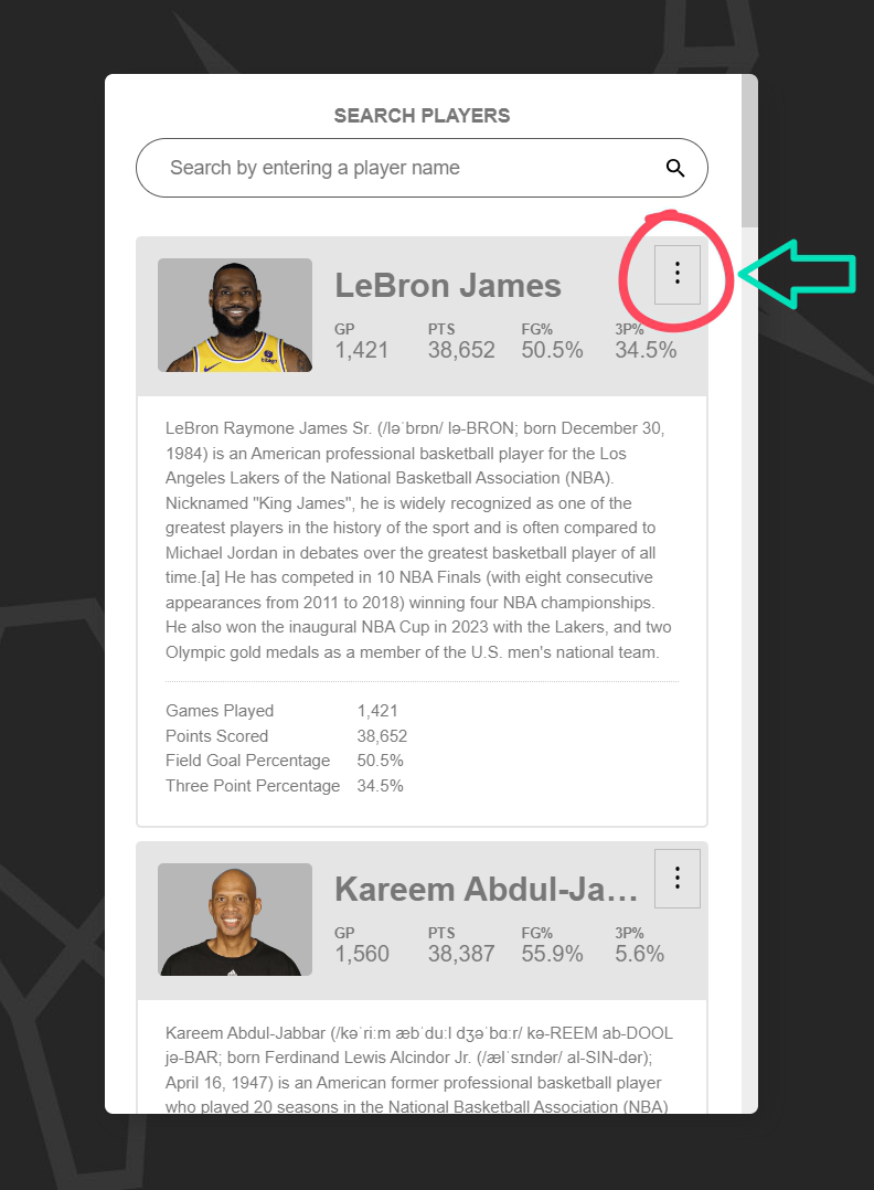
We’ll use the button with the ellipsis in the upper right corner to toggle the lower region.
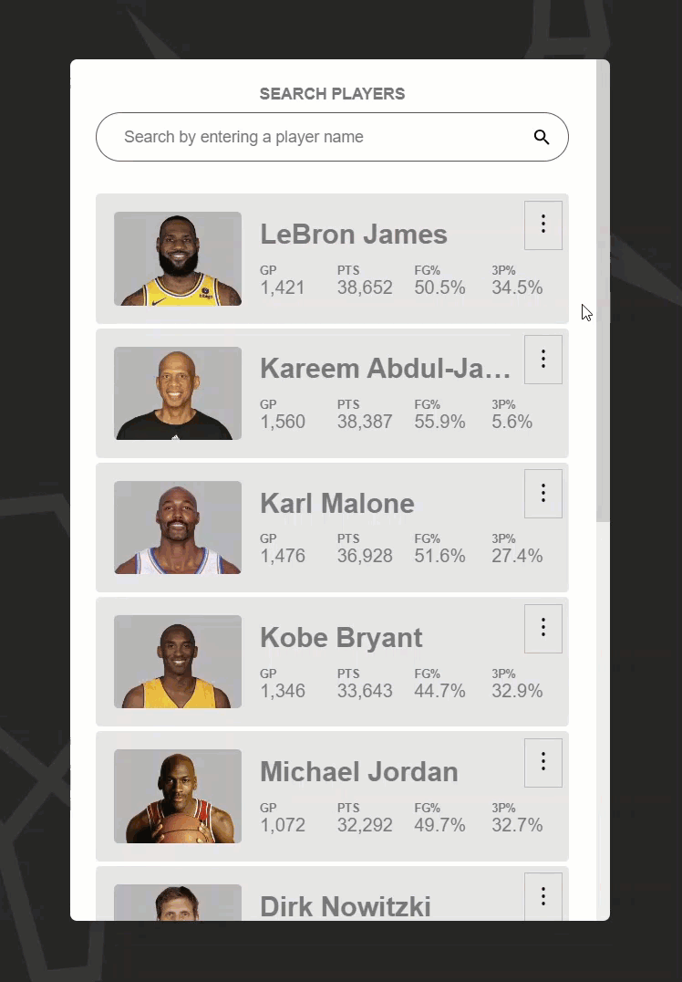
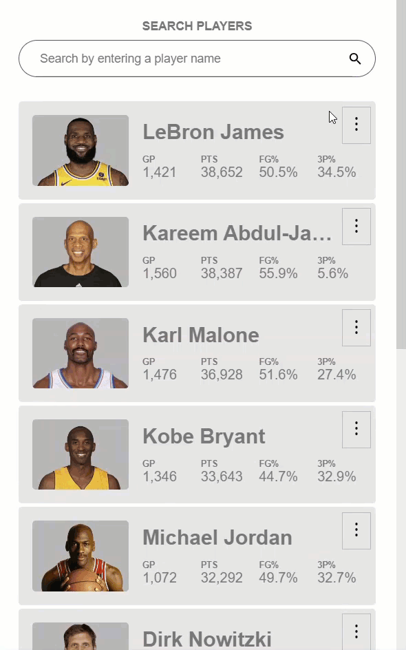
The final result will be something that looks like this:
As we can see, this functions like an accordion. When we toggle a region, it expands, then when we toggle another region, it too expands while the other collapses.
So, if we were to create all of this functionality from scratch, we’d have some work to do, but luckily the Angular CDK has us covered. We can use the CDK Accordion Module which will provide some basic accordion functionality for us.
Now, it’s important to note that these components only provide basic logic for an accordion pattern. They don’t provide any style or accessibility information so that’s stuff we’ll need to handle ourselves, which we’ll do in this example.
Ok, let’s look at the code for this app.
The Existing Code
Here, in the app component template, we can see that we have a @for block that iterates over a list of player objects. For each of these players, we have a player-summary and a player-details component.
app.component.template
@for (player of players | filter: searchText; track player.name) {
    <app-player-summary [player]="player">
        ...
    </app-player-summary>
    <app-player-details [player]="player"></app-player-details>
}
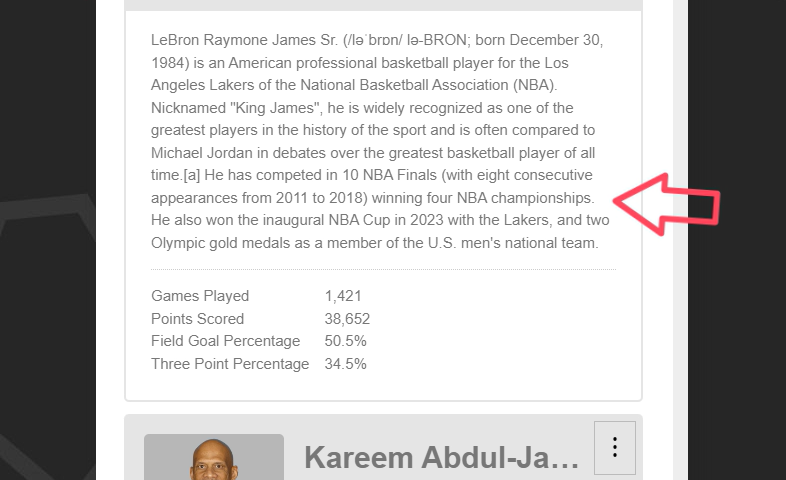
The player-summary component contains the section that will always be visible:
The player-details component contains the section that will be expandable:
Also, within the player-summary component we have a slot that contains the button we’ll use to toggle the details section.
<app-player-summary [player]="player">
    <button title="{{ player.name }}'s Details">
        ...
    </button>
</app-player-summary>
Ok, so that’s what we’re starting with, now let’s add the Angular CDK Accordion components.
Installing the Angular CDK
Now, in order to use the Angular CDK, you’ll first need to install it. To do so, you’ll need to run the following command from your terminal within the root directory of your Angular application.
npm i @angular/cdk
Adding Basic Accordion Functionality with the Angular CDK Accordion
Ok, once the CDK is installed you’ll be able to add the accordion components. We’ll be using these components within our main app-component so we’ll need to first import the CdkAccordionModule.
main.ts
import { CdkAccordionModule } from '@angular/cdk/accordion';

@Component({
    selector: 'app-root',
    ...,
    imports: [ ..., CdkAccordionModule ]
})
export class App {
    ...
}
Ok, after that’s imported, we can switch back to the component template. Now, we can add a cdk-accordion component around our list items.
app.component.template
<cdk-accordion>
    @for (player of players | filter: searchText; track player.name) {
        ...
    }
</cdk-accordion>
This is simply a basic wrapper component used to manage the state for the accordion overall.
Next, we can wrap each of our items in a cdk-accordion-item component.
<cdk-accordion-item>
    <app-player-summary [player]="player">
        ...
    </app-player-summary>
    <app-player-details [player]="player"></app-player-details>
</cdk-accordion-item>
This is a wrapper used to manage the state for the individual accordion item itself.
Ok, at this point we have some accordion components, but we don’t have any accordion functionality going on yet. To add this, we will now use some of the features provided by the accordion, but first we’ll need to be able to access the accordion item component within the template.
To do this, let’s add a template reference variable on the accordion-item component, let’s call it “#item”. Then, this component is exported as cdkAccordionItem, so we’ll pass that to our reference variable.
<cdk-accordion-item #item="cdkAccordionItem">
Ok, so now we’ll have access to the component like we need. The first thing we can do is add the style to toggle the details region to the player-details element itself.
Let’s add a style binding for the display property. Then, we can use the “expanded” property on the accordion item to toggle the display. It will not need a display value when it’s visible, but we’ll set it to “none” when it’s not expanded.
<app-player-details [style.display]="item.expanded ? '' : 'none'">
</app-player-details>
Ok, almost there, all we need to do now is toggle the expanded state of the item when we click the button. So we can add a “click” event to the button, and when this event fires, we’ll call the toggle() function on the accordion item.
<button (click)="item.toggle()">
    ...
</button>
Ok, that’s all we need for the basic accordion functionality.
Now if we save, we can see that the details start out hidden, then when we click on the button, the details region is properly expanded. Then when we click on it again, it collapses.
Also, if we expand a player’s details region, and then click on another player, that player expands and the other collapses.
So, this is pretty cool, but one thing I think we need to fix is this label on the button. It always says the players name, and “details”, even when it’s expanded.
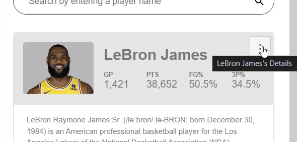
This probably doesn’t make a lot of sense when it’s expanded.
Instead let’s add some logic when the item is expanded to toggle the label between “Show details” and “Hide details” instead. This label is actually in two spots, once as a visually hidden, accessible label, and then as a title attribute which is what shows when we hover over it. So, we’ll need to change both of these.
We can use the item.expanded value to switch between the word “Hide” when it’s expanded, and “Show” when it’s not.
<button title="{{ item.expanded ? 'Hide' : 'Show' }} {{ player.name }}'s Details">
    ...
    <span class="cdk-visually-hidden">
        {{ item.expanded ? 'Hide' : 'Show' }} {{ player.name }}'s Details
    </span>
</button>
Now it it should say “Show”, then the player’s name, then “details” when collapsed, and it should say “Hide”, the player’s name, “details” when expanded.
So, this is pretty cool so far. We now have a working accordion, and it didn’t take much to get there did it? But there’s one big piece that’s still missing, accessibility.
If we were to leave this as is, it wouldn’t make much sense to those with disabilities who may encounter it. In order to fix this, we need to add some ARIA.
Adding Accessibility Features with ARIA
Ok, the first thing we need to do is add an aria role of “region” to the details region of our accordion item.
<app-player-details role="region">
</app-player-details
If we weren’t using an actual button to toggle this region, we would need to add a role of “button” to the element that toggles it. Of course, it’s always best to use the appropriate element if possible because then, no ARIA is needed, which is what we’re doing in this case. So we don’t need a role attribute on the button here.
Ok, now we can add an aria-expanded attribute to our button to notify the user of the expanded state of the accordion item.
<button [attr.aria-expanded]="item.expanded">
    ...
</button>
Ok now we need to add several ARIA attributes that will require an id unique to either our button element or the details region element. To add an id that’s unique, we can use the index of our list item so let’s add an index variable to our @for block.
@for (player of players | filter: searchText; track player.name; let index = $index) {
    ...
}
Ok, now let’s use this index to bind an id on our button. We’ll use a prefix of “item-” and then we’ll concatenate our index.
<button [attr.id]="'item-' + index">
    ...
</button>
Ok, now let’s bind an id on the details region, let’s use a prefix of “item-body-” and then our index.
<app-player-details [attr.id]="'item-body-' + index">
</app-player-details
Ok now that we have these ids, on our button we can add an aria-controls attribute. This button will control the details region so we will add the “item-body” id.
<button [attr.aria-controls]="'item-body-' + index">
    ...
</button>
And now, the last thing we need to do is add the aria-labelledby attribute to our details region. This region is labelled by the button, so let’s add the button id.
<app-player-details [attr.aria-labelledby]="'item-' + index">
</app-player-details
Ok, so that should be all of the ARIA that we need to make this component accessible.
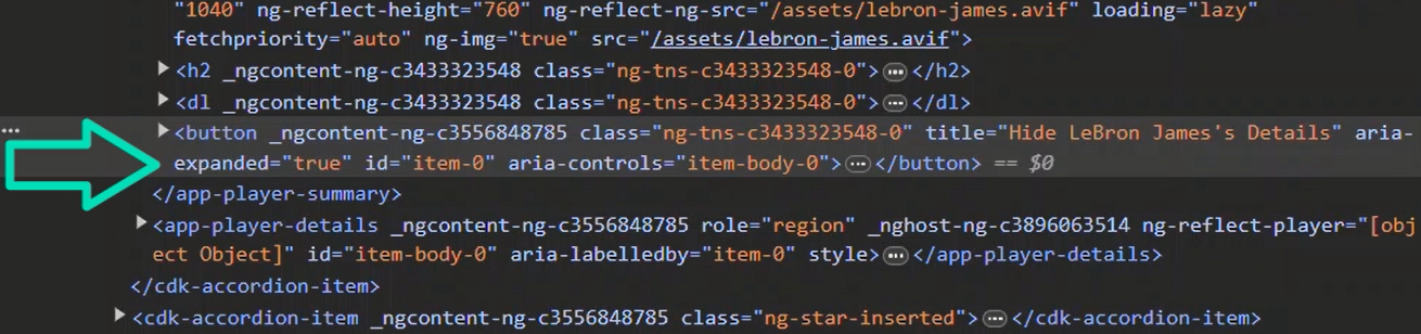
Now we can make sure everything is getting applied correctly. If we inspect the code, before we’ve toggled the item, we can see that aria-expanded is false.
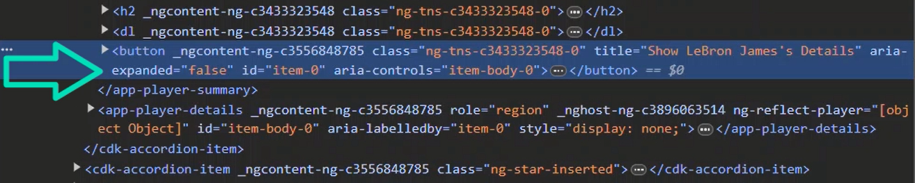
We can see that aria-controls is set to the id of the details element.
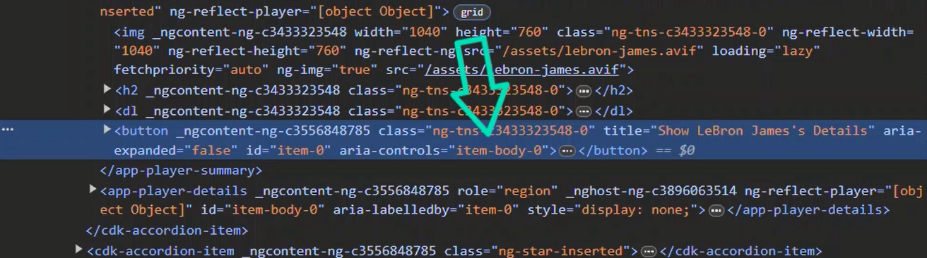
And, we can see that the aria-labelledby attribute on our details component is set to the id from button.
And, of course, the role attribute of “region” is on our details element too, because we hard-coded it.
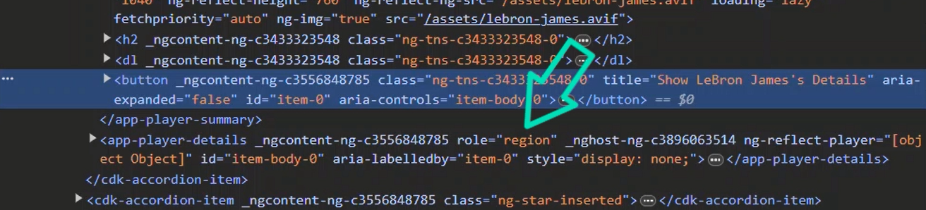
Now, if we click to expand, we can see that the aria-expanded attribute was updated correctly.
Conclusion
So there you go. Now you have a pretty simple set-up for creating an accessible accordion component in Angular. And it doesn’t take much effort thanks to the Angular CDK.
I hope you found this tutorial helpful, and if you did, check out my YouTube channel for more tutorials on the Angular CDK and Angular in general.
Want to See It in Action?
Check out the demo code and examples of these techniques in the in the Stackblitz example below. If you have any questions or thoughts, don’t hesitate to leave a comment.
Found any of this Stuff Helpful?
If you found any this helpful and want to show some love, you can always buy me a coffee!