From Plain Textarea to AI Suggestions with Angular Signal Forms
AI suggestion textboxes are everywhere right now. From GitHub Copilot to ChatGPT, folks expect AI assistance when working with forms. Adding this capability to your forms doesn't have to be complicated. By creating a custom form control with Angular Signal Forms, you can integrate AI-powered suggestions seamlessly while maintaining proper form state management, request cancellation, and error handling. This tutorial shows you how to build an AI suggestion textbox that works like a native form control, and provides a professional user experience.
Starting Point: A Plain Angular Form (No AI Yet)
Here we have a basic form to create a product listing:
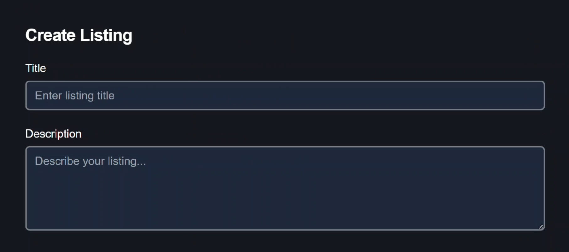
We can add a title for our product and then add a description using a plain textarea.
Five years ago this would’ve been great. Today? We have AI. We can do better!
We’re going to transform this into an AI-powered experience by creating a custom form control that:
- Takes the text entered by the user
- Builds a prompt from that input
- Passes it to a third-party LLM to generate better product descriptions
- Integrates seamlessly with Angular Signal Forms
The result will be a textbox that behaves like a normal form control with an AI preview layer.
Users stay in control and the form remains the single source of truth.
How the Angular App Talks to an AI Model
In this app, we have both a client and a server architecture:
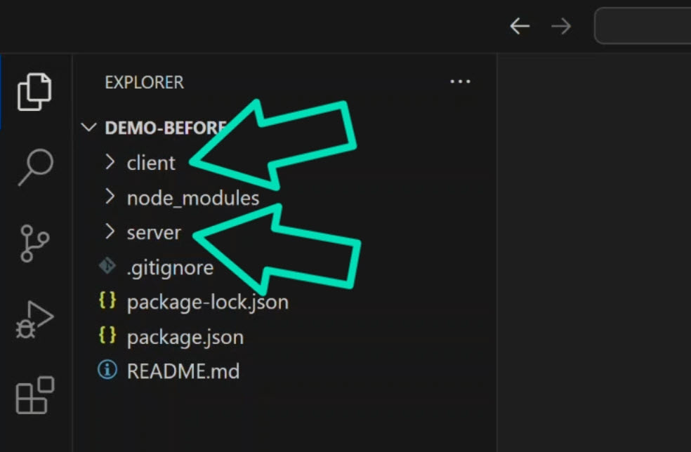
For the purposes of this demo, we won’t really be concerned with the server implementation details.
The Angular app lives in the client directory.
In this app, I’ve already created an ai-suggest-field component.
Inside of this component directory, we have an ai-suggest service:
import { Injectable } from '@angular/core';

export interface SuggestResponse {
  suggestion: string;
}

@Injectable({
  providedIn: 'root'
})
export class AiSuggestService {
  async suggest(text: string, signal?: AbortSignal): Promise<SuggestResponse> {
    const response = await fetch('/api/suggest', {
      method: 'POST',
      headers: {
        'Content-Type': 'application/json',
      },
      body: JSON.stringify({ text }),
      signal,
    });

    if (!response.ok) {
      const error = await response.json().catch(() => ({ error: 'Unknown error' }));
      throw new Error(error.error || `HTTP ${response.status}`);
    }

    return response.json();
  }
}
This is the place where the Angular app talks to our backend.
It uses Fetch to call the suggest API, passing text that will be used to build a prompt and send it to the model.
The AbortSignal is important.
It lets us cancel requests if the user keeps typing.
We’ll see more on this in a moment.
Setting Up the AI Service
This tutorial uses a real LLM.
You can clone this repo, add your own API key, and run it locally.
In the server app, let’s create a .env config:
# AI Provider Configuration
AI_PROVIDER=groq

GROQ_API_KEY=YOUR_GROQ_API_KEY
GROQ_MODEL=llama3-8b-8192

# Server Configuration
PORT=3500
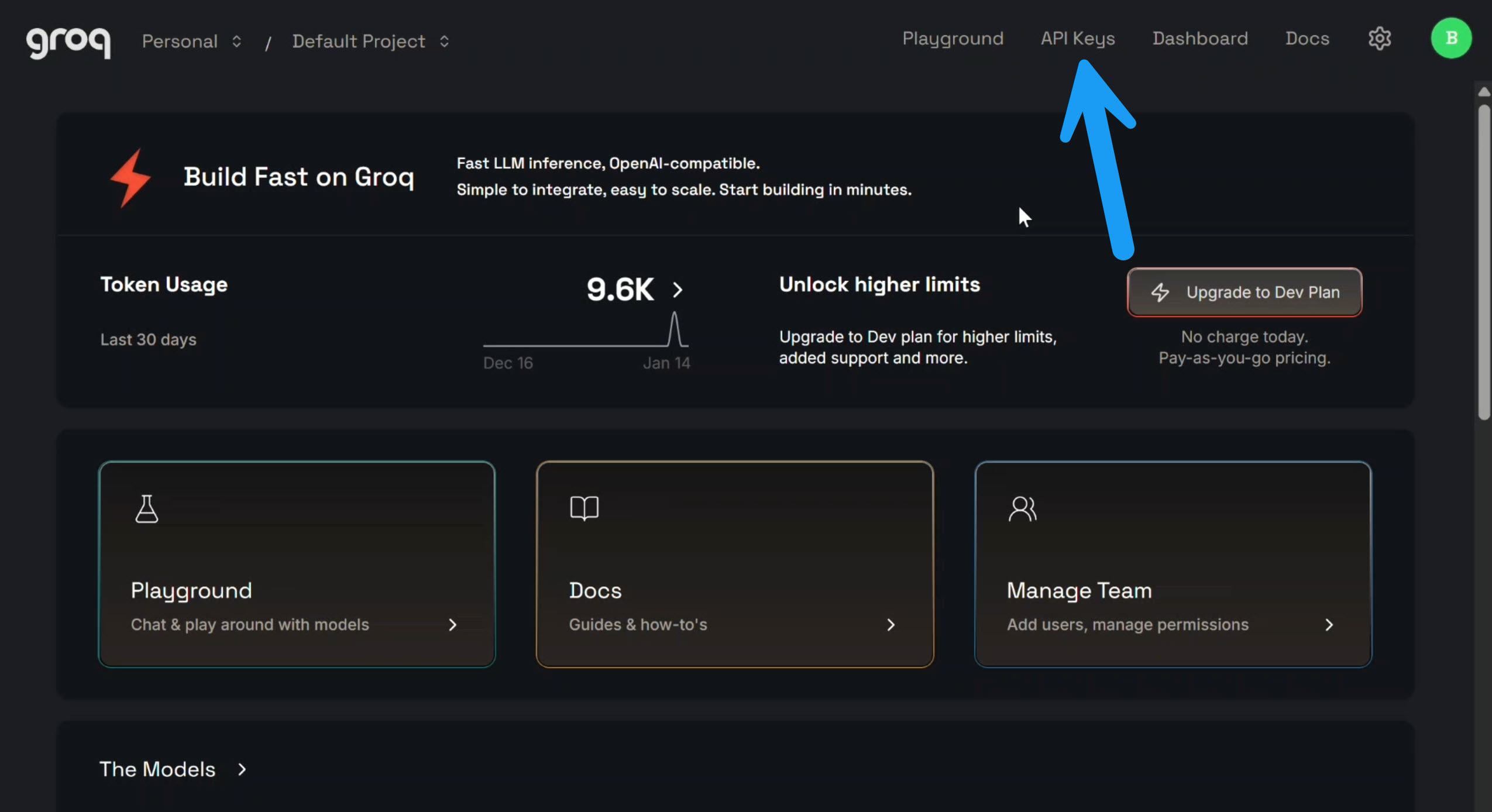
Here you can see we’re using Groq.
You can pretty easily switch this out if you wanted to use a different model with this app, but Groq is pretty generous with their free requests, so that’s why we’re using it here.
To use it, you just need to go to their website and create a free account, then click the API keys link at the top:
Then, you just need to create an API key:
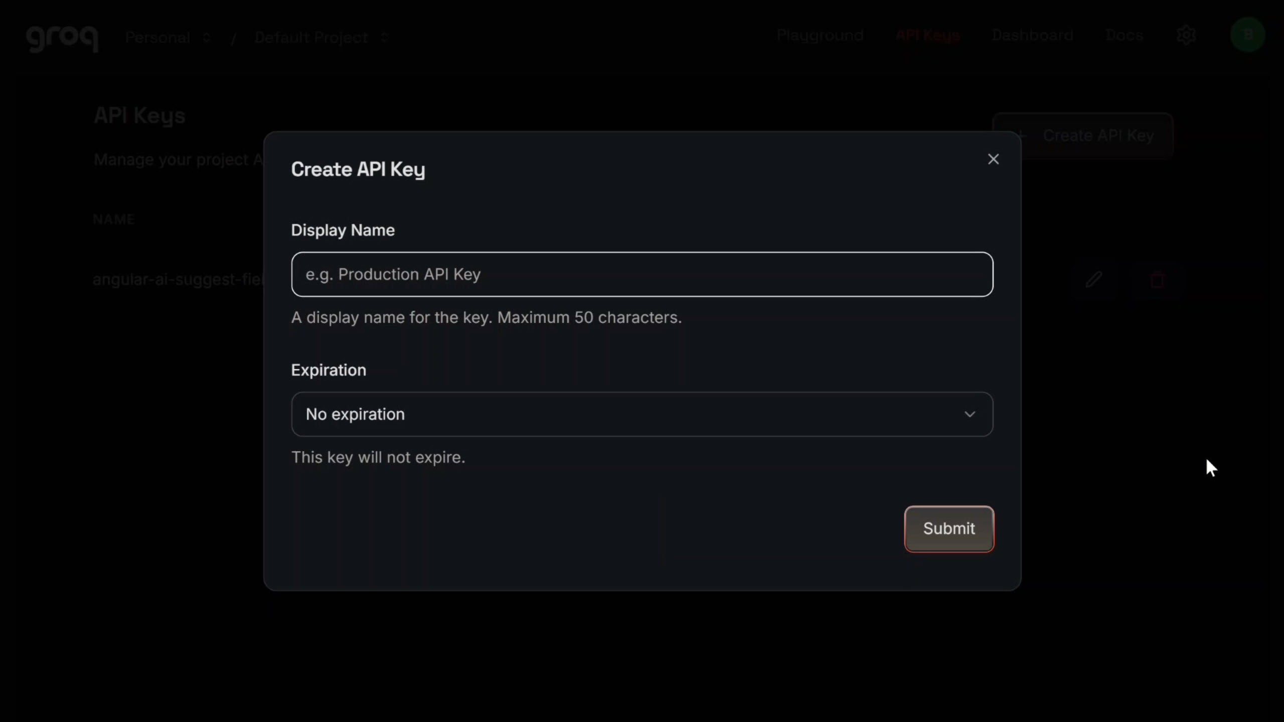
Then copy it and paste it back in the .env config.
Once you have your API key, all you need to do is run the app, which you can do with these commands:
npm run install:all
npm run dev
At this point, the app should be up and running for you.
So let’s go ahead and wire up our custom control.
Building a Custom AI Form Control with Signal Forms
Here’s the code that we’re starting with in the AI suggest field component:
import { Component, input, model, computed, signal } from '@angular/core';
import { FormValueControl } from '@angular/forms/signals';

type Status = 'idle' | 'loading' | 'ready' | 'error';

@Component({
  selector: 'ai-suggest-field',
  templateUrl: './ai-suggest-field.component.html',
  styleUrl: './ai-suggest-field.component.css'
})
export class AiSuggestFieldComponent implements FormValueControl<string> {
  // Label and placeholder inputs (not related to signal forms)
  label = input.required<string>();
  placeholder = input<string>('');

  // Required by FormValueControl interface
  value = model<string>('');
  touched = model<boolean>(false);

  // AI-specific state
  protected status = signal<Status>('idle');
  protected suggestion = signal<string>('');
}
We can see that it’s already implementing the FormValueControl interface, which makes it a custom control in Angular Signal Forms.
Key components:
valuemodel signal: Required by theFormValueControlinterface. Stores the actual value of the control.touchedmodel signal: Represents the touch status of this control from an Angular Forms perspective.statussignal: Represents the communication status with our backend and language model. Can beidle,loading,ready, orerror.suggestionsignal: Stores the suggestion value we get back from the AI.
This component is going to behave like a normal form control with an AI preview layer.
Adding Request Cancellation Support
First thing we need to do is add an AbortController property and initialize it to null:
private abortController: AbortController | null = null;
This lets us cancel in-flight requests.
If the user types again, we don’t want stale AI responses accidentally popping in later.
Next, let’s add a helper method to reset the abort controller:
private cancelPendingOperations() {
  if (this.abortController) {
    this.abortController.abort();
    this.abortController = null;
  }
}
First we call abort() on the controller, and then we reset it to null.
Now let’s add a helper method to reset the status to idle:
private resetToIdle() {
  this.status.set('idle');
  this.suggestion.set('');
}
First we set our status signal to idle, and then we clear out the AI suggestion signal.
This just gives us a clean, deterministic reset helper.
Making the AI Field Behave Like a Real Form Control
Next, we need to respond to user input typing.
Let’s add an onInput method with an event parameter:
onInput(event: Event) {
  const target = event.target as HTMLTextAreaElement;
  const value = target.value;
  this.value.set(value);
}
We create a variable to store the value of the underlying textarea control.
Then we set our control value model signal to this value.
This will now work just like a normal input.
As the user types, the form control value will be updated.
Handling the Touched State
We’ll want the control to be marked as touched as soon as the user focuses and then blurs out of the field.
Let’s create an onBlur method:
onBlur() {
  this.touched.set(true);
}
Within this, we set our touched signal to true.
That lets Signal Forms know the user interacted with this field.
Wiring Up the Template
Okay now let’s switch over to the template.
Here we’ll use an input event to wire up our onInput function, passing along the actual event to update the value as the user types.
Also we will use a blur event binding to call our onBlur method to mark the control as touched:
<textarea
  (input)="onInput($event)"
  (blur)="onBlur()"
  ...
></textarea>
So, that wires up the basic textarea control functionality, but while we’re here in the template, I can go ahead and point out a couple of other things.
First, we have our AI suggestion button:
<button
  type="button"
  class="magic-button"
  title="Get AI suggestion">
  ...
</button>
We just need to wire this up.
And if we scroll down, we can see we have a suggestion panel region:
@if (status() !== 'idle') {
  <div class="suggestion-panel" [class]="status()">
    <div class="suggestion-content">
        @if (status() === 'loading') {
          <span>Thinking...</span>
        } @else if (status() === 'ready' && suggestion()) {
          <span>{{ suggestion() }}</span>
        } @else if (status() === 'error') {
          <span>AI unavailable (kept your input)</span>
        }
    </div>
  </div>
}
If we get a suggestion back from the AI, this is where it will render.
Also while we’re waiting for a response, we’ll get a message that says “thinking”.
Once we have the suggestion, we’ll display it.
If we have an error, we’ll let the user know there was an error.
And then when we have a valid suggestion, there is an accept button that also needs to be wired up so the user can accept the AI suggestion as their description:
@if (status() === 'ready' && suggestion()) {
  <div class="suggestion-actions">
    <button class="btn-accept">Accept</button>
  </div>
}
The UI is already prepared, we just haven’t wired the behavior yet.
Let’s switch back to the TypeScript and create this logic.
Calling the LLM Safely: Cancellation, Errors, and State
First we need to inject our AI suggest service:
import { ..., inject } from '@angular/core';

private service = inject(AiSuggestService);
Now let’s create a function to request the suggestion:
private async requestSuggestion(text: string) {
  // Set up abort controller
  this.abortController = new AbortController();

  // Update status to loading
  this.status.set('loading');

  try {
    const response = await this.service.suggest(
      text,
      this.abortController.signal
    );

    if (response.suggestion?.length > 0) {
      this.suggestion.set(response.suggestion);
      this.status.set('ready');
    } else {
      this.resetToIdle();
    }
  } catch (error: any) {
    // Handle manual abort
    if (error.name === 'AbortError') {
      return; // Not a real error
    }

    // Handle actual errors
    this.status.set('error');
    this.suggestion.set('');
  } finally {
    this.abortController = null;
  }
}
What this does:
- Sets up cancellation: Creates a new
AbortControllerto cancel pending requests when needed - Updates UI state: Sets status to
loadingso the UI can show a loading indicator - Calls the AI service: Passes the text and abort signal to allow cancellation
- Handles success: If we get a suggestion, stores it and sets status to
ready - Handles errors: Distinguishes between manual aborts (not errors) and real errors
- Cleans up: Resets the abort controller in the
finallyblock
Creating the Submit Method
Okay, this should handle getting a suggestion from AI.
Now we need to create a method to actually call this from our submit button:
protected submitRequest() {
  this.cancelPendingOperations();
  this.requestSuggestion(this.value());
}
Inside this, the first thing we do is cancel any pending operations so that we don’t get a stale value and then immediately update it with our new value.
Then we call our new requestSuggestion() function and pass it the current value.
Adding the Accept Functionality
Now let’s add an accept function for our accept button:
protected accept() {
  this.value.set(this.suggestion());
  this.resetToIdle();
}
When we accept the suggestion from AI, we need to set the value of the control to the value of the suggestion.
Then we reset our status to idle.
Disabling the Submit Button During Loading
Now the last thing we need to do here is ensure that our submit button is disabled while we’re fetching the suggestion from AI.
To do this, let’s add an isSubmitDisabled property using a computed signal based on the loading status of our status signal:
protected isSubmitDisabled = computed(() =>
    this.status() === 'loading'
);
When our status is loading, the submit button will be disabled.
That should be everything we need here.
Now let’s switch over to the template and wire it all up.
Wiring Up the Template Events
The first thing we’ll do is use a click event on our AI suggestion button, and then we will call our submitRequest() function.
Then we’ll add a disabled attribute binding with the isSubmitDisabled computed signal:
<button
  type="button"
  (click)="submitRequest()"
  [disabled]="isSubmitDisabled()"
>
  Get AI Suggestion
</button>
So when a user clicks this button, we’ll submit the request to the AI and we’ll disable it while it’s processing.
Now let’s wire up the accept button.
For this we’ll use a click event binding again, and this time we’ll call our accept() method.
<button type="button" (click)="accept()">
    Accept
</button>
So now when we have a suggestion and the user clicks to accept it, it will update the value of the textarea based on the value from AI.
Okay, this component should be ready to use. So let’s switch over to the form and wire it up.
Replacing the Textarea with Our AI Control
First thing we need to do is add this component in the imports array so that we can use it in the template:
import { AiSuggestFieldComponent } from './ai-suggest-field/ai-suggest-field.component';

@Component({
  selector: 'app-root',
  imports: [..., AiSuggestFieldComponent],
  ...
})
export class AppComponent {
    ...
}
Now we’re ready to use it.
Let’s switch over to the template and add it:
<app-ai-suggest-field
  label="Description"
  placeholder="Enter product description..."
  [field]="form.description"
/>
We add the component, then we add a label and a placeholder just like we did with the original textarea.
And since this is a custom control, we can simply use the field directive to bind to the description control from the form.
And that’s it. All that’s left is to remove the old textarea and the rest of the markup around it, because we no longer need it.
Demo: AI Autocomplete Without Breaking UX
Let’s save and check it out!
Alright, everything looks the same to start, but there is one little difference: we now have this button in the corner of our textarea:
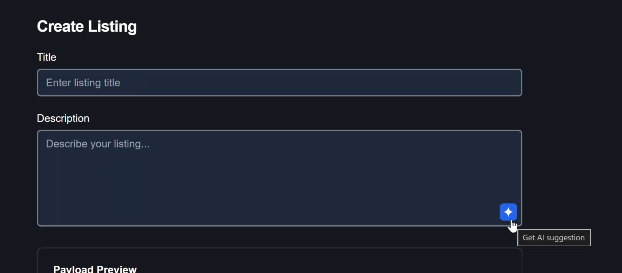
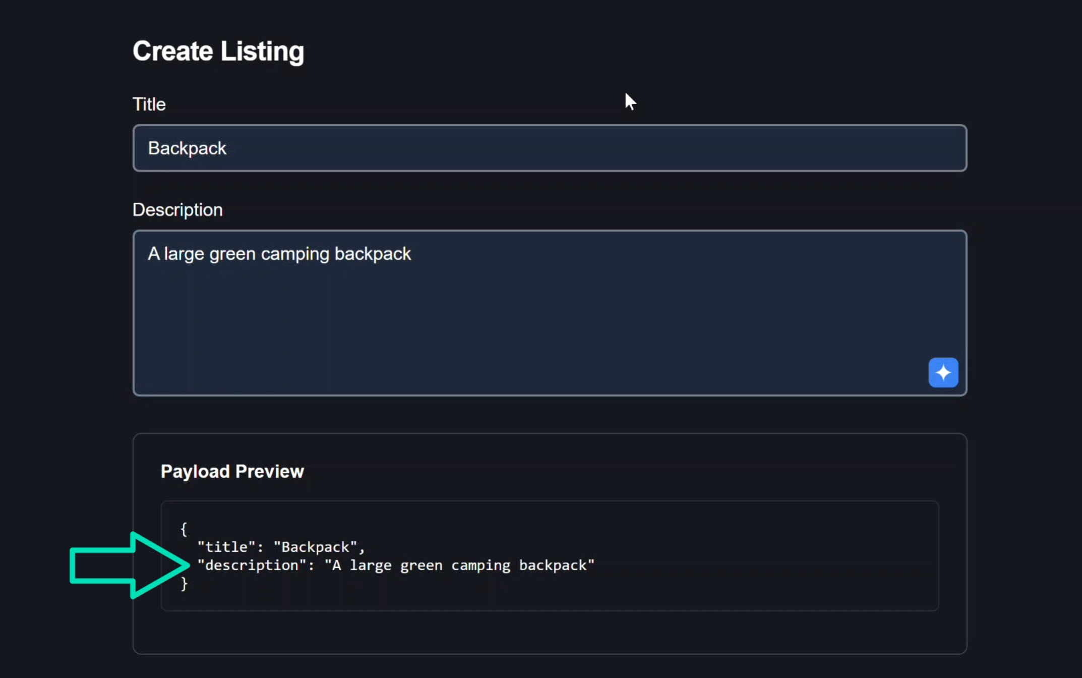
Let’s add a product title, then a partial description.
Here we can see the current value that we entered into the description text box:
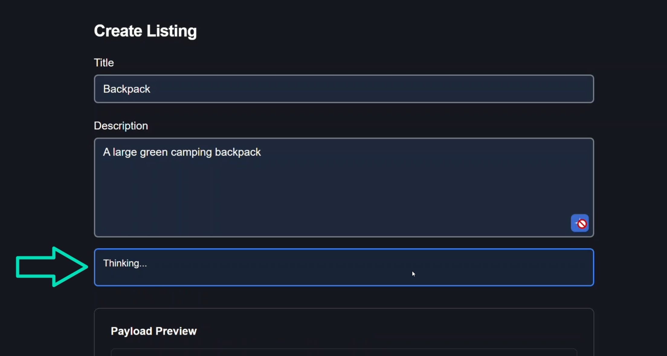
Now let’s submit it off to Groq.
Here we can see the status changes to “thinking”. That’s pretty cool:
And then boom, an AI suggestion appears:
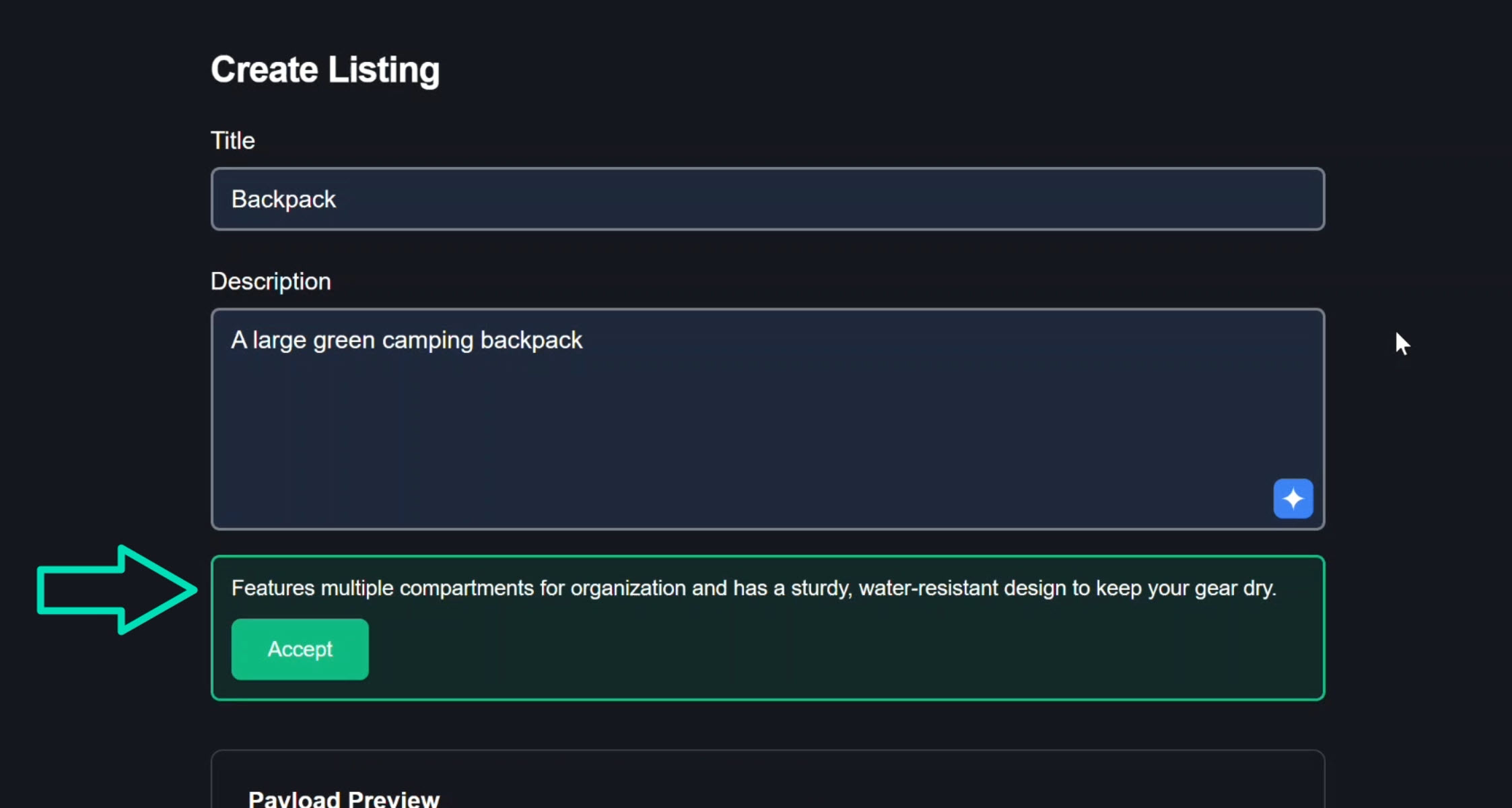
This is pretty cool. This is a good description. I think we’ll keep it. Let’s click accept:
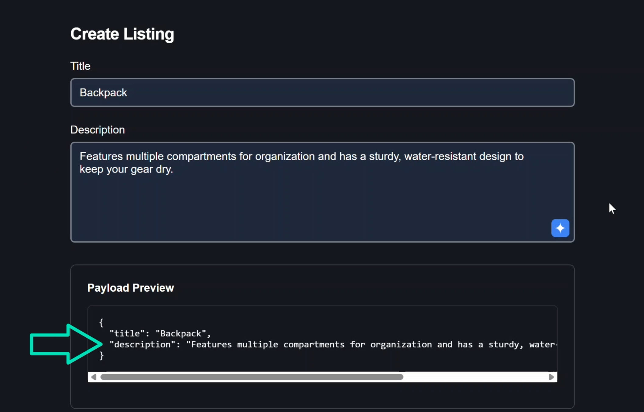
Nice. So the textarea value updated just like we want it to.
Also, the form value updated as well.
So this is a pretty cool feature that instantly makes your app feel modern in today’s AI world.
And it really doesn’t take too much effort to add.
On top of it all, I feel like Signal Forms makes it even easier to implement than it would have been in the past.
Key Takeaway: Production-Ready AI in Angular
By wrapping this in a Signal Forms control, we keep the form as the single source of truth and we turn this AI suggestion textbox into a shippable, production-grade pattern.
The result is something that feels professional:
- AI helps, but the user stays in control
- The UI never surprises them
- Request cancellation prevents stale responses
- Proper error handling keeps the experience smooth
- Form state management remains consistent
For simple forms, you might not need AI assistance.
But as forms grow in complexity or when you want to provide a modern, helpful user experience, this pattern becomes invaluable.
If this helped you, be sure to subscribe and leave a comment, it really helps other Angular developers find this content.