Angular ARIA Is Here: What It Does, Why It Exists, and When To Use It
Angular recently introduced a new accessibility package called Angular ARIA, released in Developer Preview a few weeks ago. If you've seen it mentioned in the docs, you've probably wondered: Do I need this? Is this something I should start using now? And what problem is it actually trying to solve?
This tutorial answers those questions by walking through a realistic example showing what Angular ARIA does, why it exists, and when it actually makes sense to use it.
This is especially relevant now as Angular continues to invest in first-class accessibility tooling.
What Is Angular ARIA? Understanding the New Accessibility Library
Angular ARIA is a collection of headless, accessible directives that implement common WAI-ARIA interaction patterns.
“Headless” just means there are no styles and no markup assumptions.
Angular ARIA provides behavior and accessibility.
You control the HTML and CSS.
These directives handle things like:
- Applying the correct ARIA attributes
- Managing keyboard navigation
- Handling focus correctly
- Supporting screen readers
All of the stuff that’s easy to get wrong when building custom interactive components.
Why Tabs Are the Perfect Example for Angular ARIA
Tabs are a great example because they look simple, but accessibility-wise, they’re not.
Browsers don’t give you accessible tabs for free.
Once you move beyond native elements, things like roles, focus behavior, keyboard interaction, and ARIA relationships are not automatic.
So let’s look at a basic tabs UI before we make it accessible.
Why Generic HTML Tabs Are Not Accessible
Here’s a simple tabs layout built with generic HTML:
<div>
    <ul>
        <li (click)="activeTab.set('overview')">
            Overview
        </li>
        <li (click)="activeTab.set('members')">
            Members
        </li>
        <li (click)="activeTab.set('billing')">
            Billing
        </li>
    </ul>
    <section>
        @if (activeTab() === 'overview') {
            <h3>Project overview</h3>
            <p>
                This project is running in <strong>production</strong>.
                Changes here take effect immediately.
            </p>
        }
    </section>
    <section>
        @if (activeTab() === 'members') {
            <h3>Team members</h3>
            <p>
                Manage who has access to this project and what they can do.
            </p>
        }
    </section>
    <section>
        @if (activeTab() === 'billing') {
            <h3>Billing</h3>
            <p>
                View invoices, update payment methods, or change your plan.
            </p>
        }
    </section>
</div>
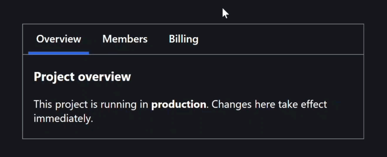
Visually, this looks like tabs:
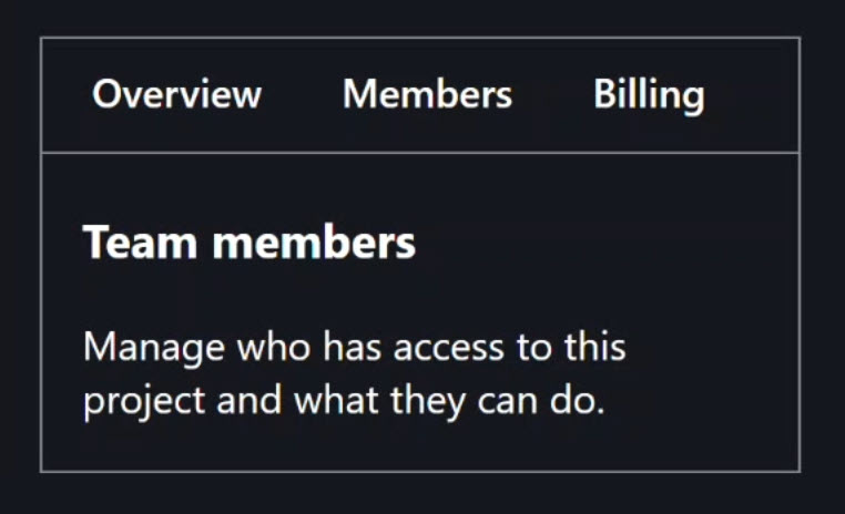
But from the browser’s perspective, and from assistive technologies, this UI has no semantic meaning.
There’s no way to know:
- Which element is a tab
- Which panel is active
- How keyboard users should navigate
And all that means it’s not accessible!
What Accessibility Actually Requires for Tabs (WAI-ARIA)
This is where the WAI-ARIA Tabs pattern comes in.
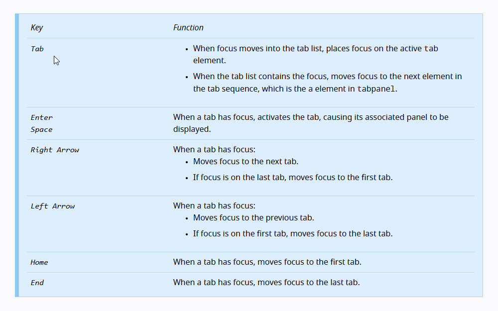
The W3C defines required keyboard behavior:
- Arrow key navigation
- Home and End keys
- Enter and Space for activation
- Specific focus management rules
It also defines required roles for the tab list, tabs, and panels, as well as required ARIA attributes like aria-selected, aria-controls, and aria-labelledby.
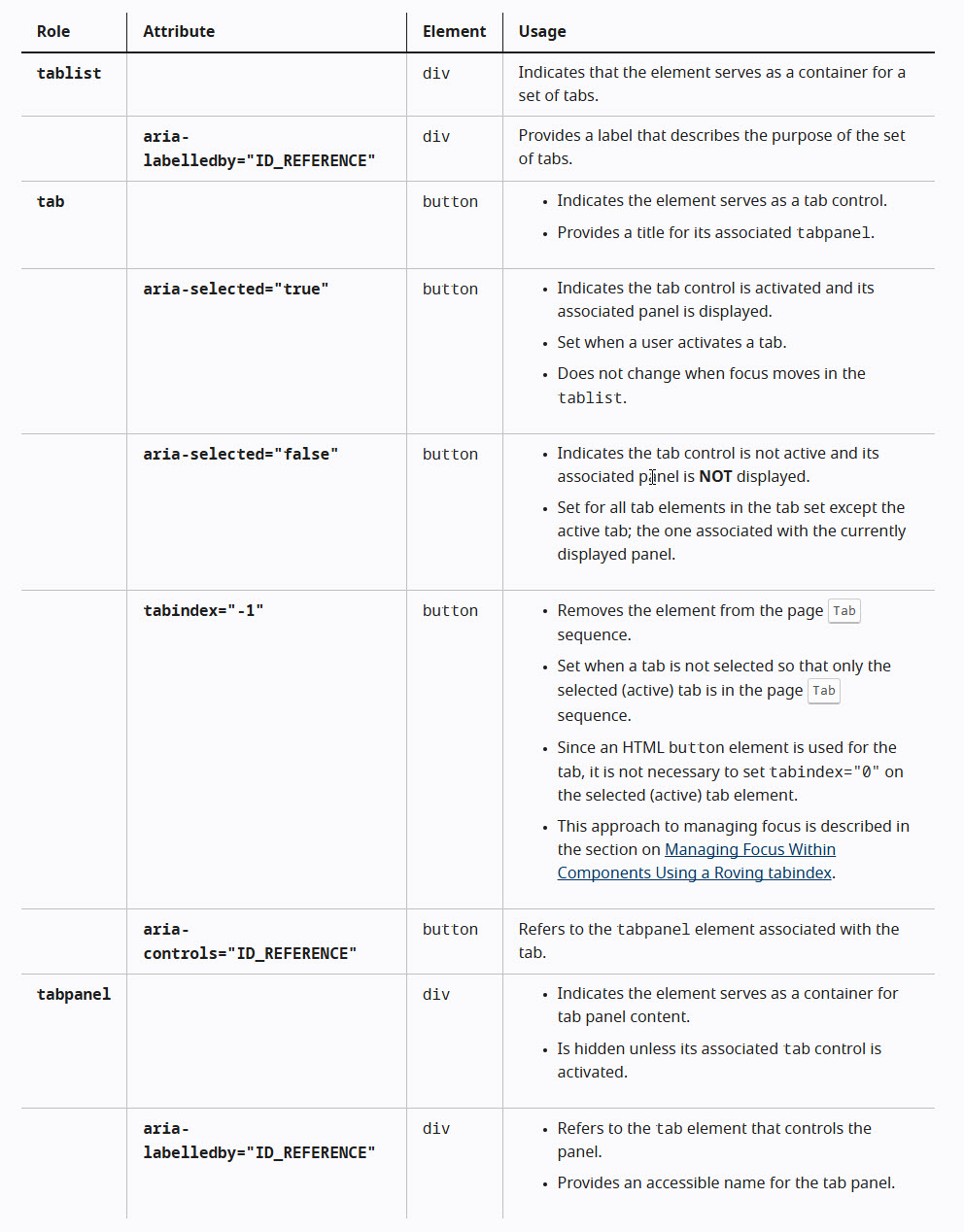
None of this is optional.
If you want accessible tabs, all of it needs to be correct.
Why Building Accessible Tabs by Hand Is So Error-Prone
So what does it take to make our example accessible?
To implement this by hand, you need to add something more like this:
<div>
    <ul
        role="tablist"
        tabindex="-1"
        aria-orientation="horizontal"
        (keydown)="handleTabListKeyDown($event)">
        <li
            role="tab"
            id="overview-tab"
            (click)="activateTab('overview')"
            (keydown)="handleTabKeyDown($event, 'overview')"
            [tabindex]="activeTab() === 'overview' ? 0 : -1"
            [aria-selected]="activeTab() === 'overview'"
            aria-controls="overview-pane">
            Overview
        </li>
        <li
            role="tab"
            id="members-tab"
            (click)="activateTab('members')"
            (keydown)="handleTabKeyDown($event, 'members')"
            [tabindex]="activeTab() === 'members' ? 0 : -1"
            [aria-selected]="activeTab() === 'members'"
            aria-controls="members-pane">
            Members
        </li>
        <li
            role="tab"
            id="billing-tab"
            (click)="activateTab('billing')"
            (keydown)="handleTabKeyDown($event, 'billing')"
            [tabindex]="activeTab() === 'billing' ? 0 : -1"
            [aria-selected]="activeTab() === 'billing'"
            aria-controls="billing-pane">
            Billing
        </li>
    </ul>
    <section
        role="tabpanel"
        id="overview-pane"
        [tabindex]="activeTab() === 'overview' ? 0 : -1"
        aria-labelledby="overview-tab">
        @if (activeTab() === 'overview') {
            <h3>Project overview</h3>
            <p>
                This project is running in <strong>production</strong>.
                Changes here take effect immediately.
            </p>
        }
    </section>
    <section
        role="tabpanel"
        id="members-pane"
        [tabindex]="activeTab() === 'members' ? 0 : -1"
        aria-labelledby="members-tab">
        @if (activeTab() === 'members') {
            <h3>Team members</h3>
            <p>
                Manage who has access to this project and what they can do.
            </p>
        }
    </section>
    <section
        role="tabpanel"
        id="billing-pane"
        [tabindex]="activeTab() === 'billing' ? 0 : -1"
        aria-labelledby="billing-tab">
        @if (activeTab() === 'billing') {
            <h3>Billing</h3>
            <p>
                View invoices, update payment methods, or change your plan.
            </p>
        }
    </section>
</div>
And that’s just in the template, the TypeScript side adds even more complexity:
import { Component, signal } from '@angular/core';

type Tabs = 'overview' | 'members' | 'billing';

@Component({
    selector: 'app-tabs',
    templateUrl: './tabs.component.html',
    styleUrl: './tabs.component.scss',
})
export class TabsComponent {
    protected activeTab = signal<Tabs>('overview');
    protected readonly tabs: readonly (Tabs)[] = ['overview', 'members', 'billing'] as const;
    protected readonly focusedTabIndex = signal(0);

    protected handleTabListKeyDown(event: KeyboardEvent) {
      const { key } = event;
      switch (key) {
        case 'ArrowRight':
          event.preventDefault();
          this.focusNextTab();
          break;
        case 'ArrowLeft':
          event.preventDefault();
          this.focusPreviousTab();
          break;
        case 'Home':
          event.preventDefault();
          this.focusFirstTab();
          break;
        case 'End':
          event.preventDefault();
          this.focusLastTab();
          break;
        default:
          break;
      }
    }

    protected handleTabKeyDown(event: KeyboardEvent, tabId: Tabs) {
      const { key } = event;

      if (key === 'Enter' || key === ' ') {
        event.preventDefault();
        this.activateTab(tabId);
      }
    }

    protected activateTab(tabId: Tabs) {
      this.activeTab.set(tabId);
    }

    private focusNextTab() {
      const currentIndex = this.focusedTabIndex();
      const nextIndex = currentIndex < this.tabs.length - 1 ? currentIndex + 1 : 0;
      this.focusTabByIndex(nextIndex);
    }

    private focusPreviousTab() {
      const currentIndex = this.focusedTabIndex();
      const previousIndex = currentIndex > 0 ? currentIndex - 1 : this.tabs.length - 1;
      this.focusTabByIndex(previousIndex);
    }

    private focusFirstTab() {
      this.focusTabByIndex(0);
    }

    private focusLastTab() {
      this.focusTabByIndex(this.tabs.length - 1);
    }

    private focusTabByIndex(index: number) {
      this.focusedTabIndex.set(index);
      const tabId = this.tabs[index];
      if (tabId) {
        const tabElement = document.getElementById(`${tabId}-tab`);
        if (tabElement) {
          tabElement.focus();
        }
      }
    }
}
And that’s just to build one tabs component!
This is a lot of manual work and it’s very easy to get subtly wrong.
This is where the new Angular ARIA patterns come into play.
How Angular ARIA Solves These Accessibility Problems
This is exactly the problem Angular ARIA is trying to solve.
It provides headless directives that implement these WAI-ARIA patterns correctly, so you don’t have to wire everything by hand.
Let’s switch over and replace all of this custom logic with Angular ARIA.
How to Install Angular ARIA (Developer Preview)
But, before we can use it, we need to install the package.
You can do that by running this command at the root of your Angular project:
npm install @angular/aria
Now that it’s installed, let’s see how to use it.
Replacing Manual ARIA and Keyboard Logic with Angular ARIA
First, we can remove all the ARIA roles and attributes, the keyboard event handlers, the tab indexes, and even the ids:
<div>
    <ul>
        <li>
            Overview
        </li>
        <li>
            Members
        </li>
        <li>
            Billing
        </li>
    </ul>
    <section>
        <h3>Project overview</h3>
        <p>
            This project is running in <strong>production</strong>.
            Changes here take effect immediately.
        </p>
    </section>
    <section>
        <h3>Team members</h3>
        <p>
            Manage who has access to this project and what they can do.
        </p>
    </section>
    <section>
        <h3>Billing</h3>
        <p>
            View invoices, update payment methods, or change your plan.
        </p>
    </section>
</div>
Then, in the TypeScript we can remove all of the custom logic too:
import { Component } from '@angular/core';

@Component({
  selector: 'app-tabs',
  templateUrl: './tabs.component.html',
  styleUrl: './tabs.component.scss',
})
export class TabsComponent {
}
At this point, we’re left with just structure and content.
Now we’re ready to add the Angular ARIA directives.
Using Angular ARIA Tabs, TabList, Tab, TabPanel, and TabContent
Pretty much everything we need will be added in the template, but before we can use these new directives there, we need to add them to the component imports.
We will need to import the Tabs, TabList, Tab, TabPanel, and TabContent directives. All from the Angular ARIA package:
import { Tabs, TabList, Tab, TabPanel, TabContent } from '@angular/aria';

@Component({
  selector: 'app-tabs',
  standalone: true,
  imports: [
    Tabs,
    TabList,
    Tab,
    TabPanel,
    TabContent
  ],
})
export class TabsComponent {
}
Now we can switch over to the template.
First, on the outer container, we add the ngTabs directive:
<div ngTabs>
    ...
</div>
This acts as the overall coordinator.
It wires together tabs, panels, keyboard navigation, and focus behavior.
Next, on the element that contains the tabs, we add ngTabList:
<ul ngTabList>
    ...
</ul>
This represents the ARIA tablist pattern and manages keyboard navigation between tabs.
This directive also exposes a selectedTab input, which we’ll use to set the initial active tab:
<ul ngTabList selectedTab="overview">
    ...
</ul>
Each individual tab gets the ngTab directive:
<li ngTab value="overview">Overview</li>
<li ngTab value="members">Members</li>
<li ngTab value="billing">Billing</li>
Every tab must define a unique value.
That value is how Angular ARIA associates a tab with its panel and keeps selection, focus, and ARIA attributes in sync.
Each panel gets the ngTabPanel directive:
<section ngTabPanel value="overview">
    ...
</section>
<section ngTabPanel value="members">
    ...
</section>
<section ngTabPanel value="billing">
    ...
</section>
Just like the tabs, each panel must declare the same value as the tab it belongs to.
Angular enforces this at compile time, which helps prevent broken accessibility from ever shipping.
Then, inside each panel, we wrap the content in an ng-template with ngTabContent:
<section ngTabPanel value="overview">
    <ng-template ngTabContent>
        ...
    </ng-template>
</section>
<section ngTabPanel value="members">
    <ng-template ngTabContent>
        ...
    </ng-template>
</section>
<section ngTabPanel value="billing">
    <ng-template ngTabContent>
        ...
    </ng-template>
</section>
This allows Angular ARIA to control when panel content is rendered and displayed.
At this point, all of the accessibility behavior is declarative and handled by Angular ARIA.
Complete Angular ARIA Tabs Example
Here’s what the complete template looks like:
<div ngTabs>
    <ul ngTabList selectedTab="overview">
        <li ngTab value="overview">Overview</li>
        <li ngTab value="members">Members</li>
        <li ngTab value="billing">Billing</li>
    </ul>
    <section ngTabPanel value="overview">
        <ng-template ngTabContent>
            <h3>Project overview</h3>
            <p>
                This project is running in <strong>production</strong>.
                Changes here take effect immediately.
            </p>
        </ng-template>
    </section>
    <section ngTabPanel value="members">
        <ng-template ngTabContent>
            <h3>Team members</h3>
            <p>
                Manage who has access to this project and what they can do.
            </p>
        </ng-template>
    </section>
    <section ngTabPanel value="billing">
        <ng-template ngTabContent>
            <h3>Billing</h3>
            <p>
                View invoices, update payment methods, or change your plan.
            </p>
        </ng-template>
    </section>
</div>
And That’s It!
That’s all we need.
No custom keyboard handlers.
No ARIA attributes.
No focus management logic.
Let’s compare this to what we had before:
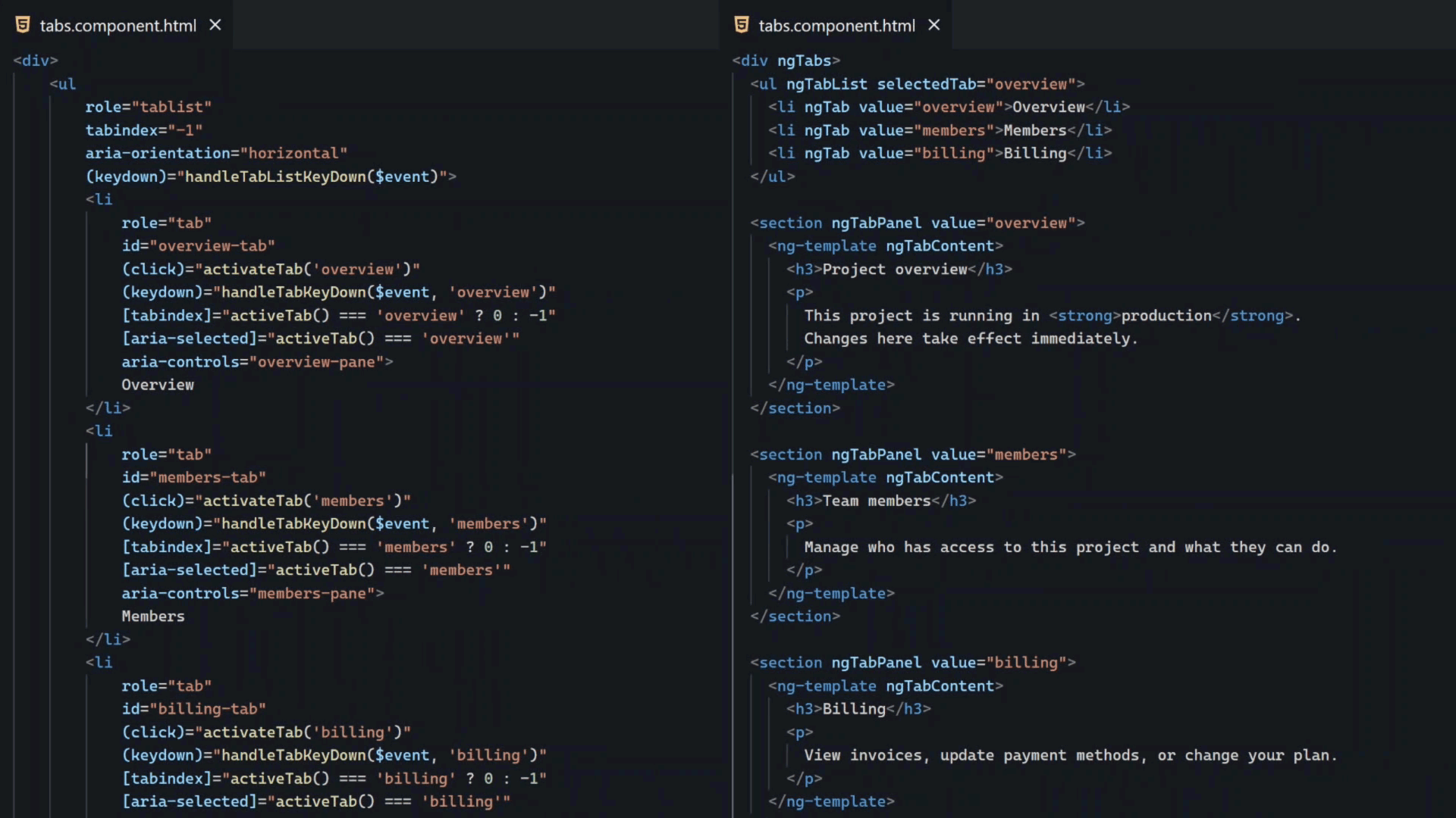
We’ve kept all of the behavior, but removed almost all of the complexity.
Pretty crazy how much simpler it is now, right?
Testing Angular ARIA Tabs with Keyboard and DevTools
When we inspect the rendered HTML, we’ve got all of the accessibility:
- Appropriate
tabindexattributes aria-selectedattributesaria-controlsrelationshipsaria-labelledbyrelationships- ARIA roles for
tablist,tab, andtabpanel
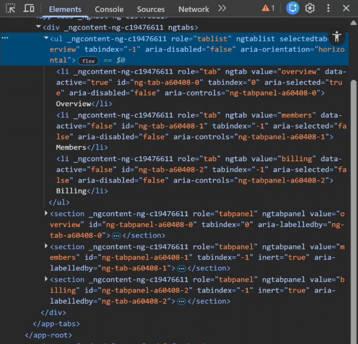
Plus, the keyboard functionality works too:
- When you press Tab, it brings focus to the tab list
- Arrow keys move between tabs
- Home and End jump to the first and last tabs
- Enter and Space activate the focused tab
All of this works exactly as the ARIA specification requires, without us writing any of that logic ourselves.
Angular ARIA Developer Preview: What to Know Before Using It
One important thing to keep in mind: Angular ARIA is still in Developer Preview.
That means:
- APIs may evolve
- Patterns may expand
- This is something you’ll need to evaluate intentionally
You’ll just want to understand these risks before using it in your own apps, but personally I’m pretty excited about it.
When Should You Use Angular ARIA vs Native HTML?
Here’s the decision framework I recommend…
If native HTML can express the interaction, use native HTML!
For example:
- Use
<button>for things that look like buttons - Use
<input>for form input type controls - Use
<select>for dropdowns
If you’re building custom interactive components like tabs, menus, or comboboxes, Angular ARIA can save time and reduce mistakes.
If accessibility correctness matters, especially in reusable components, Angular ARIA is worth evaluating.
It doesn’t make your app accessible by magic, but it does help you implement accessibility correctly.
Final Thoughts: Is Angular ARIA Worth Using?
Angular ARIA exists to take complex, well-defined accessibility patterns and make them easier to apply correctly.
It’s focused.
It’s headless.
And it’s intentionally optional.
Because accessibility isn’t about adding libraries.
It’s about making good decisions.
The value of Angular ARIA depends on your experience level:
- For beginner Angular developers, Angular ARIA provides a way to build accessible components without deep ARIA knowledge.
- For intermediate developers, it reduces boilerplate and prevents common accessibility mistakes.
- For advanced developers, it offers a clean, type-safe API that enforces accessibility patterns at compile time.
If this helped you, be sure to subscribe and leave a comment, it really helps other Angular developers find this content.
Additional Resources
- The demo app BEFORE any changes
- The demo app AFTER making changes
- Angular ARIA Overview
- Angular ARIA Tabs Documentation
- WAI-ARIA Tabs Example (W3C)
- My course “Angular: Styling Applications”
- My course “Angular in Practice: Zoneless Change Detection”
- Get a Pluralsight FREE TRIAL HERE!
Try It Yourself
Want to experiment with Angular ARIA?
The directives are straightforward once you understand how they work together.
If you have any questions or thoughts, don’t hesitate to leave a comment.