Angular Crossfade Animation: Fade Between Content (Deprecated Module)
Crossfade animations create smooth transitions between content changes, image carousels, and tab switches, eliminating jarring instant replacements. While CSS transitions can handle simple fades, coordinating simultaneous fade-out and fade-in effects requires careful timing and state management. This tutorial demonstrates how to create crossfade animations using Angular's animation framework, ensuring smooth transitions between content states. Note: This uses Angular's deprecated animations module—modern alternatives are available.
Enabling Animations in Your Application
Before we can create and add our crossfade animation, we need to first include the animations module in our application. In order to do this, we need to add the “providers” array to our bootstrapApplication function. Then, we need to include the provideAnimationsAsync() function within this array.
main.ts
import { provideAnimationsAsync } from '@angular/platform-browser/animations/async';

bootstrapApplication(App, {
  providers: [
    provideAnimationsAsync()
  ]
});
Ok, now we can add animations.
Create and Add a Crossfade Animation
For this example, I’ve already created a basic animation component to get us started. If we look at the code for this component, we can see that there’s not too much to it though.
animation.component.ts
import { Component } from "@angular/core";

@Component({
    selector: 'app-animation',
    standalone: true,
    templateUrl: './animation.component.html',
    styleUrl: './animation.component.scss',
})
export class AnimationComponent {
    protected step: 1 | 2 = 1;
}
All we have is a “step” property which will either be a value of one or two. This is the property that we’ll use to control which box to display and to trigger our animation. We’ll show the first box when the value is one, and we’ll show the second box when it’s two.
Now, If we look at the template, we’ll see that it’s pretty simple too.
animation.component.html
<div class="container">
    <div class="box">Step 1</div>
    <div class="box">Step 2</div>
</div>
<button (click)="step = step === 1 ? 2 : 1">
    {{ step === 1 ? 'Next Step' : 'Prev Step' }}
</button>
We have a “container” div which is where we will apply our animation. The animation will query for the items within and animate them as needed based on the current step value.
Then, within this container, we have the two boxes for step one and step two, that will animate.
Underneath all of that, we have the button that toggles the value for the active step when clicked.
So that’s the code that we’re starting with, now let’s add the animation.
Adding the Basic CSS Styles and Logic
Before we can animate anything here, we first need to add some basic CSS in order to place the crossfading elements on top of one another.
An easy way to do this is to use CSS grid layout. We can make our “container” div a grid container by adding display: grid.
animation.component.scss
.container {
    display: grid;
}
Then, we can place both of our boxes in the same grid cell with the grid-row and grid-column properties. If we set both of these to one on both of the boxes, they will then be placed on top of one another in the grid.
animation.component.scss
.box {
    grid-row: 1;
    grid-column: 1;
}
Let’s save and see how it looks now.
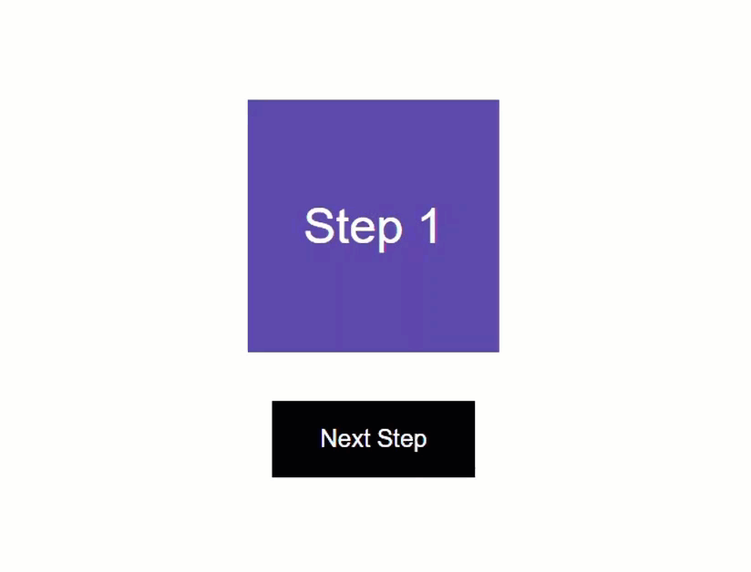
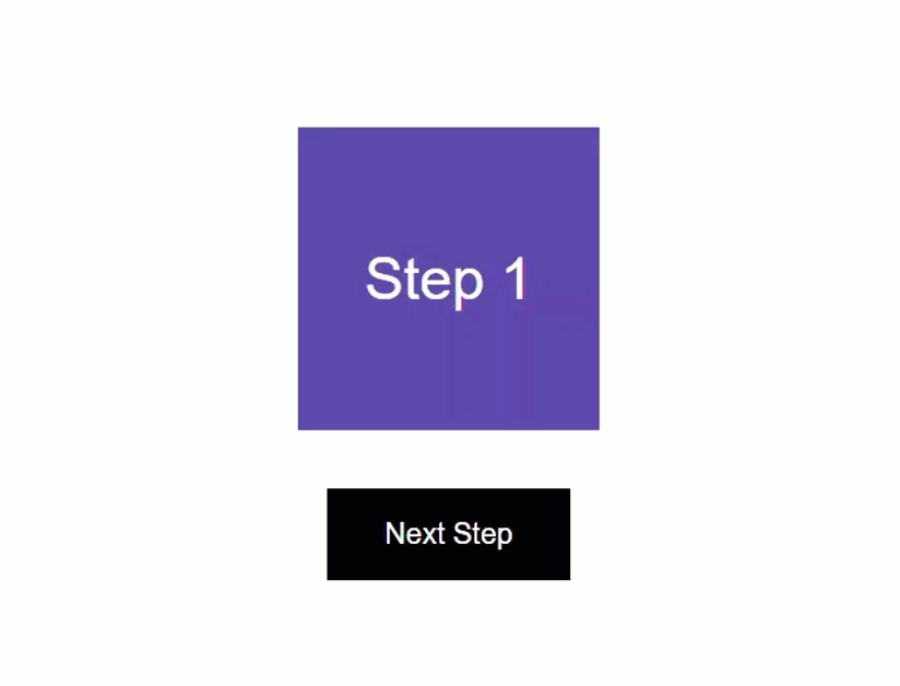
Before Grid Placement:
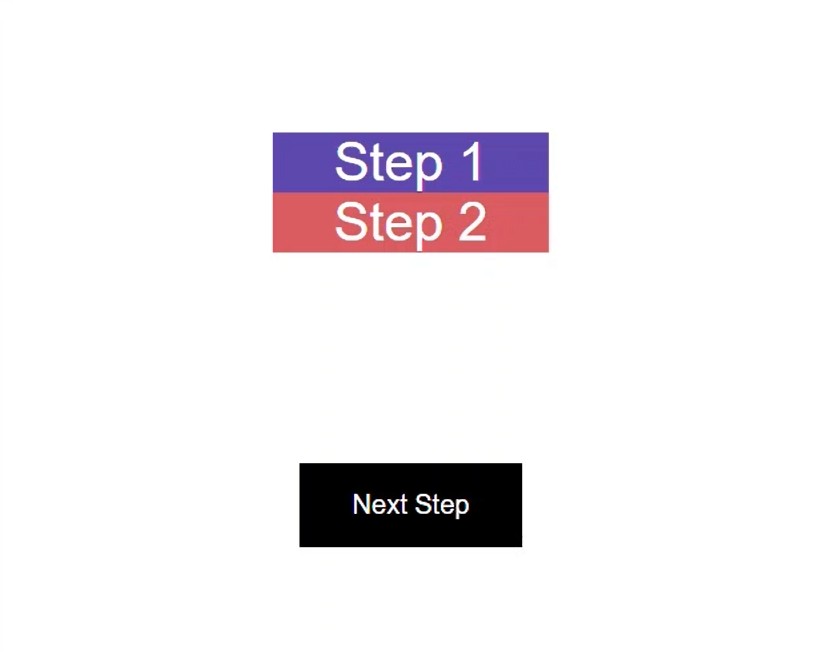
After Grid Placement:
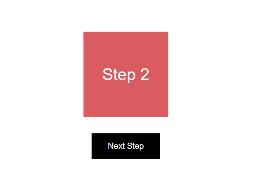
Ok, that’s a little better but we don’t want to see step two first, we want to see step one. So, we need a little more CSS.
What we’ll do is hide the box that is not “active”. We’ll plan on controlling which item is active by toggling an “active” class using our step value.
Let’s add this class to the boxes. We’ll bind the class on the first box when the step value equals one. Then, we’ll bind it on the second box when the value equals two.
animation.component.html
<div [class.active]="step === 1" class="box">
    Step 1
</div>
<div [class.active]="step === 2" class="box">
    Step 2
</div>
Ok, now we have the conditional classes, next we need to add some style to hide the inactive box.
For our box that doesn’t have the “active” class, we’ll set it to display: none.
animation.component.scss
.box:not(.active) {
    display: none;
}
Now, the other thing we need to do is avoid applying this display: none style during the animation. This would prevent us from seeing the item that’s fading out because the style would apply instantly, as soon as the class gets removed.
We can account for this by also making sure that our box does not have the “ng-animating” class before hiding it. This is a class that the framework automatically adds to animating elements while the animation is running.
animation.component.scss
.box:not(.active):not(.ng-animating) {
    display: none;
}
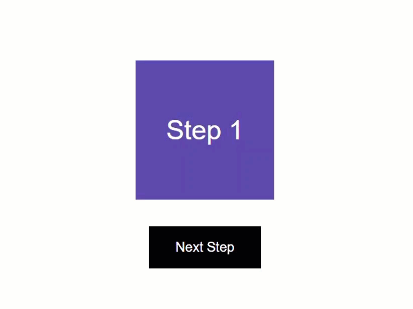
Ok, let’s save and try it again.
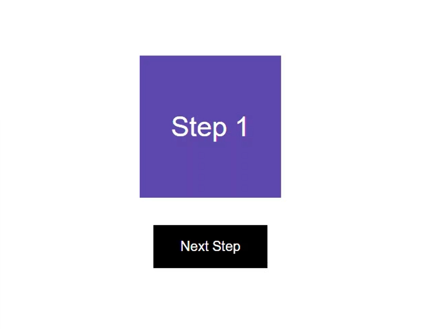
There, now the second step starts off hidden. Then, when we click the button, we’ll switch between the steps.
Ok, now we have all of the functionality in place, we just need to add the animation.
Creating the Basic Crossfade Animation
To add the animation, we need to first add the animations array to the component metadata.
animation.component.ts
@Component({
    selector: 'app-animation',
    ...
    animations: [
    ]
})
Within this array, we need to add a trigger() function from the animations module. Then we need to give this trigger a name, let’s call it “crossfade”.
animation.component.ts
import { trigger } from '@angular/animations';

animations: [
    trigger('crossfade', [
    ])
]
Now, this animation will be triggered any time the “step” value changes. We can set this up using the transition() function from the animations module.
This function then needs a state change expression as a string to monitor when to run. For this we’ll animate when the step changes from one to two and vice versa, so we can represent that with this expression “1 <=> 2”.
animation.component.ts
import { ..., transition } from '@angular/animations';

animations: [
    trigger('crossfade', [
        transition('1 <=> 2', [
        ])
    ])
]
Ok, now what we need to do is first ensure that the item with the “active” class starts off in a hidden state. It will remain hidden while the item without the class fades out, then it will fade in.
For this, we’ll use the query function from the animations module. In this function we’ll query for the item with the “active” class.
animation.component.ts
import { ..., query } from '@angular/animations';

animations: [
    trigger('crossfade', [
        transition('1 <=> 2', [
            query('.active', [
            ])
        ])
    ])
]
Now, to set its style we’ll use the style() function from the animations module. This function requires a style represented as an object.
When the item is hidden, let’s give it an opacity of zero. Let’s also scale it down a little with a value of point seven.
animation.component.ts
import { ..., style } from '@angular/animations';

animations: [
    trigger('crossfade', [
        transition('1 <=> 2', [
            query('.active', [
                style({ opacity: 0, scale: 0.7 })
            ])
        ])
    ])
]
Ok, now that item will start out hidden when the animation is triggered.
Now we need to transition the current, visible item out. So, let’s add another query. This time we’ll query for the item without the “active” class. It will start from its current visible style, so we just need to transition it to its hidden style.
animation.component.ts
animations: [
    trigger('crossfade', [
        transition('1 <=> 2', [
            ...,
            query(':not(.active)', [
            ])
        ])
    ])
]
For this we need to use the animate() function from the animations module. This function controls the timing that we want the animation run for as well as the final stye that we want to animate to.
The first parameter is the timing as a string. Let’s go with a duration of point five seconds. Let’s also add an easing function of ease-out too.
animation.component.ts
import { ..., animate } from '@angular/animations';

animations: [
    trigger('crossfade', [
        transition('1 <=> 2', [
            ...,
            query(':not(.active)', [
                animate('0.5s ease-out')
            ])
        ])
    ])
]
Ok, next we need to add the style to animate to, with the style function again. We’ll animate to an opacity of zero and a scale of point seven, just like what our “active” box will start from.
animation.component.ts
animations: [
    trigger('crossfade', [
        transition('1 <=> 2', [
            ...,
            query(':not(.active)', [
                animate('0.5s ease-out',
                    style({ opacity: 0, scale: 0.7 }))
            ])
        ])
    ])
]
Ok, now we just need to animate the active item to its final style. So, let’s add another query and query for the item with the “active” class again.
We can add the animation for this item with the animate function again. We’ll animate for the same duration of point five seconds, but we’ll use an easing function of ease-in this time. Then we need to add style with the style function, and this time we’ll animate to an opacity of one, and a scale of one too, so that it will be fully opaque and full size when the animation is complete.
animation.component.ts
animations: [
    trigger('crossfade', [
        transition('1 <=> 2', [
            ...,
            query('.active', [
                animate('0.5s ease-in',
                    style({ opacity: 1, scale: 1 }))
            ])
        ])
    ])
]
Ok, that’s it.
Binding the Animation in the Component Template
Now, we just need to wire up this animation in the template. For this, we’ll bind the animation trigger with the “@” symbol on our “container” div. And we’ll bind it to the step property.
animation.component.html
<div [@crossfade]="step" class="container">
    ...
</div>
Ok, that should be everything we need. Let’s save and see how it works now.
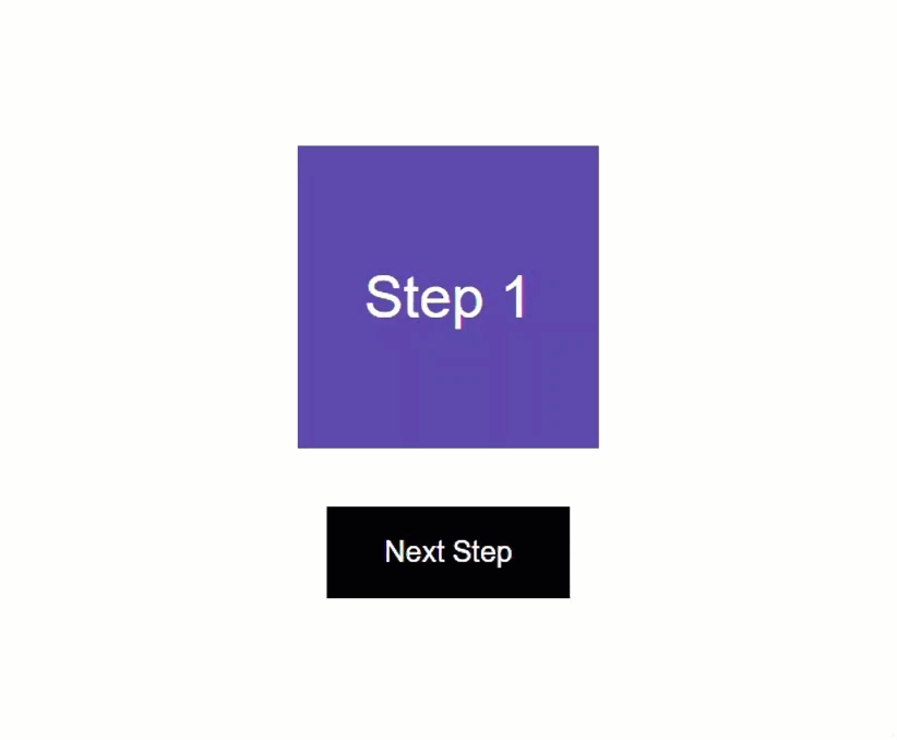
Ok, first we see step one, then when we click the button, we see it fade out and step two fade in. So that works pretty well, but it’s not really a true crossfade animation right?
The first item animates out completely and then the new item animates in. A real crossfade would probably animate out and in at the same time.
Using the Group Function to Animate Items in Parallel
Well, we can change it so that it works in this way. All we need to do is wrap all of the queries with the group function from the animations module.
animation.component.ts
import { ..., query } from '@angular/animations';

animations: [
    trigger('crossfade', [
        transition('1 <=> 2', [
            group([
                ...
            ])
        ])
    ])
]
By default, these animations will run in sequence, one after another, but the group function will run all of these animations simultaneously.
Ok, now let’s save and try it again.
There, now the items animate out and in at the same time. So that’s pretty cool.
Well, I guess now you know how to create a simple crossfade animation in Angular, but you don’t actually have to create one if you don’t want to.
Installing and Using the Bootjack Bounce Animation Library
Recently I’ve been combining some common UI animations into a reusable, installable Angular library called ngx-bootjack-bounce. So, if you want to, you can install this library and use the crossfade animation from it instead.
Currently there are only three different animations in this library, a slide animation, a flip animation, and this crossfade animation, so it’s still pretty slim but may have more in it by the time you’re reading this.
To use this library, you can install it in your angular app using this command.
npm i ngx-bootjack-bounce
Now, let’s look at how to use it.
Adding the Animation from the Library
Now, I’ve already installed the library in this project so I’m ready to use the animations within it.
To add the same animation we just built in the first half of this post, we can add the btjCrossfadeState() animation function instead of the existing animation.
animation.component.ts
import { btjCrossfadeState } from 'ngx-bootjack-bounce';

animations: [
    btjCrossfadeState()
]
Then we just need to go into the template and swap out the “crossfade” trigger with the “btjCrossfadeState” trigger instead.
animation.component.html
<div [@btjCrossfadeState]="step" class="container">
    ...
</div>
Next, we need to go into the SCSS and include the style for the library.
animation.component.scss
@use 'ngx-bootjack-bounce/styles';
Then we can remove the grid style from the container, the grid placement from the boxes, and the hidden box style too. All of these are automatically included in the styles from the library.
Ok, that’s everything we need. Now let’s save and try it out.
Everything looks correct to start, and when we click the button, the boxes fade in and out.
Customizing the Animation with Params
And we can also customize this animation a little like we can with others in the library.
For this animation, if we want to slow it down or speed it up, we can add a custom duration with animation params.
To do this, we need to switch the animation binding to an object. The first item we need to provide in this object is the value to trigger the animation, which is our step property.
Then we can add the params object. Within this object we can add our custom duration param, let’s go with two seconds, so we’ll slow it down a little.
animation.component.html
<div [@btjCrossfadeState]="{
    value: step,
    params: {
        duration: '2s'
    }
}" class="container">
    ...
</div>
Ok, let’s save and try it out again.
Nice, now it’s animating slower.
We can also customize the scale as a param too, but you get the idea.
Now you’ve probably noticed that this animation is running in sequence again, and not in parallel. Well, we can change this too.
Running the Crossfade Animation in Parallel
The crossfade animation function can accept an argument for running the animations with the group function. By default, it’s false so we can pass a value of true instead.
animation.component.ts
animations: [
    btjCrossfadeState(true)
]
That’s all we need to do. Now let’s save and try it again.
There, now they’re running in parallel.
Add a Crossfade Animation for Items Entering and Leaving the DOM
Now, if we need to animate between an item entering and an item leaving the DOM, we can do that pretty easily with this library too.
Let’s switch these boxes to be conditionally added and removed from the DOM based on the step value.
So, the first step will be added when the step value equals one, and will be removed when it doesn’t.
animation.component.html
@if (step === 1) {
    <div class="box step-1">Step 1</div>
}
Likewise, the second box will be added when the value is two, and removed when the value is one.
animation.component.html
@if (step === 2) {
    <div class="box step-2">Step 2</div>
}
Ok, now we just need to use a different animation function from the library. This time we need to use the btjCrossfadeEnterLeave() function instead.
animation.component.ts
import { btjCrossfadeEnterLeave } from 'ngx-bootjack-bounce';

animations: [
    btjCrossfadeEnterLeave()
]
And then we need to switch the trigger to btjCrossfadeEnterLeave too.
animation.component.html
<div [@btjCrossfadeEnterLeave]="step" class="container">
    ...
</div>
Ok, that’s all we need. Let’s give it another try.
Nice, looks just like it did when both items were in the DOM, but now they are entering and leaving.
So, that may be a little easier than creating and maintaining those types of animations over and over again in your project.
In Conclusion
Ok, so now you should have a pretty good idea on how to create a basic crossfade animation in Angular.
But if you don’t want to create one and maintain it in yourself, feel free to use my library.
Ok, I guess that’s it for now.
I hope you found this tutorial helpful, and if you did, check out my YouTube channel for more tutorials about various topics and features within Angular.
Additional Resources
- The demo BEFORE animations
- The demo AFTER animations
- The demo using the Bootjack Bounce library
- My Angular Animations YouTube Playlist
- Introduction to Angular animations
- Bootjack Bounce Animation Library
Want to See It in Action?
Check out the demo code and examples of these techniques in the Stackblitz example below. If you have any questions or thoughts, don’t hesitate to leave a comment.