Make Any List Keyboard-Friendly in Minutes
Keyboard navigation in lists requires handling arrow keys, home/end keys, type-ahead search, and focus management, but implementing this manually is complex and error-prone. The Angular CDK ListKeyManager provides a complete solution for keyboard-accessible lists, handling all navigation patterns automatically. This tutorial demonstrates how to use ListKeyManager to make any list keyboard-friendly, ensuring your Angular applications are accessible to all users without manual keyboard event handling.
Why Keyboard Navigation Matters: The Accessibility Gap
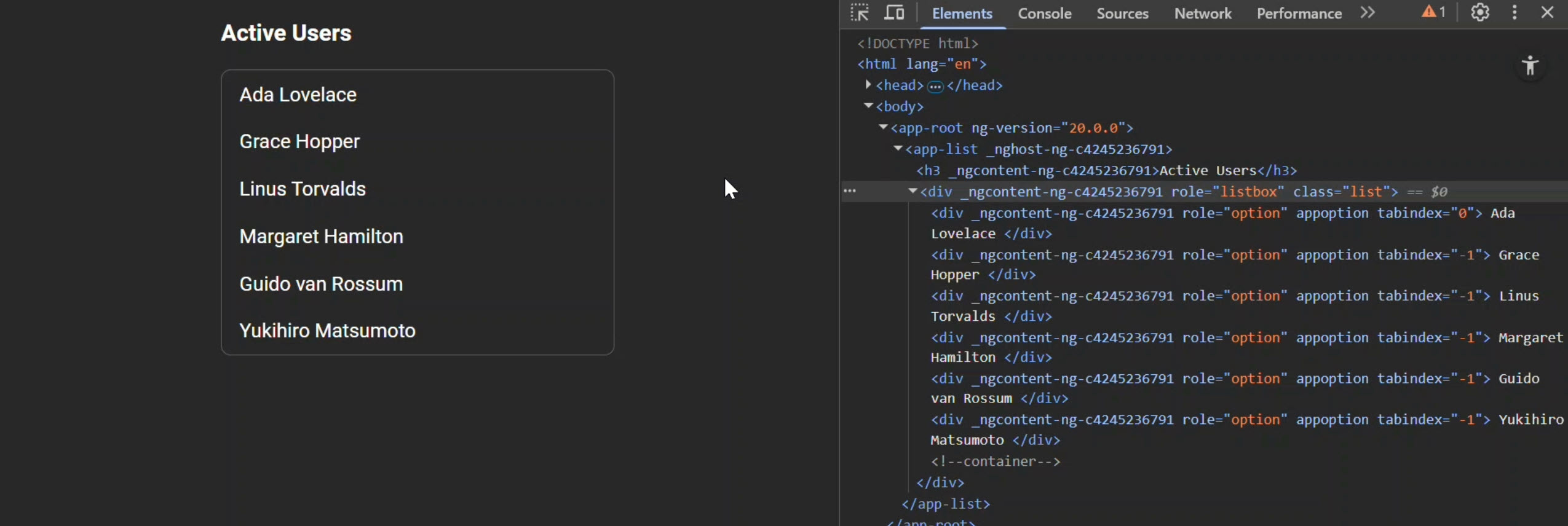
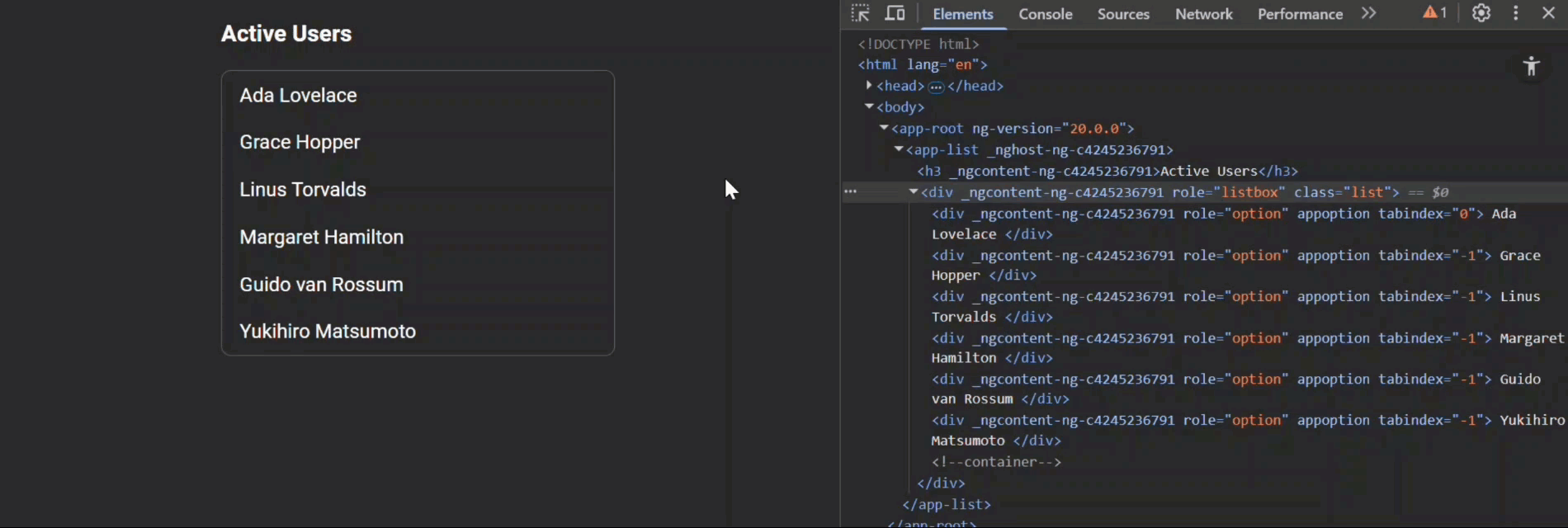
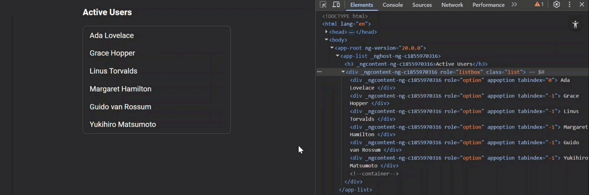
Here’s the app that we’ll be working on in this tutorial… it’s just a basic list of active users.
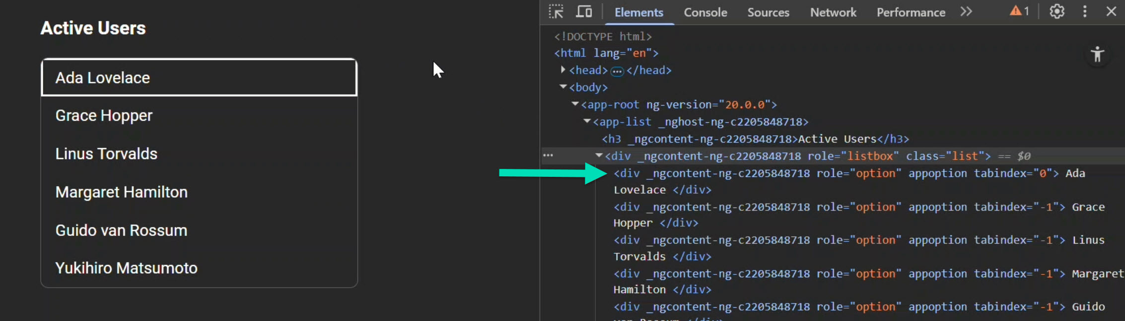
When we tab into it, the first item gets focused, but when we try to arrow through the items using our keyboard, nothing happens.
Clicking works fine, but this isn’t very accessible for users who rely on the keyboard.
Let’s improve this.
But, before we do, let’s explore the current logic to understand what we need to do.
Baseline Walkthrough: Angular Listbox Markup and Focus
To start, let’s look at the template for the list component.
First, we have a div that wraps the list of people, marked with an aria role of “listbox”:
<div
    class="list"
    role="listbox"
    (click)="handleClick($event)">
    ...
</div>
This role tells assistive technology…
“This is a selectable list”
So, it’s a good start, but we’ve got a bit more to do.
This div also has a click event that fires any time the items within this list are clicked, and when it fires it calls a “handleClick()” method which we’ll look at in a minute.
Inside the list, we have the options that use an option directive:
@for (person of people; track person; let i = $index) {
    @let isTabbable = active() === -1 && i === 0 || i === active();
    <div
        role="option"
        appOption
        [label]="person"
        [attr.tabindex]="isTabbable ? 0 : -1">
        {{ person }}
    </div>
}
These options have an aria role of “option” which fits with the listbox pattern, so that’s good.
Also, the options are tabbable once they are active, or if none are active and it’s the first item in the list.
This allows us to always tab into the list and focus on the active item.
Okay, now let’s look at the TypeScript.
Here we have the “handleClick()” method that determines the index of the option clicked and then calls an “applyListState()” function to update the UI based on the item clicked:
protected handleClick(event: Event) {
    const i = this.optionElements().indexOf(event.target as HTMLElement);
    if (i < 0) {
        return;
    }
    this.applyListState(i);
}
Then, we have the “applyListState()” function itself that updates the active state of the option clicked:
private applyListState(index: number) {
    this.active.set(index);
    const nodes = this.optionElements();
    nodes.forEach((el, i) => el.tabIndex = i === index ? 0 : -1);
    nodes[index].focus();
    this.options().forEach((o, idx) => o.setActive(idx === this.active()));
}
This function…
- Tracks the internal “active” item with a signal
- Updates the
tabindexbased on whether the item is active or not - Sets an internal “active” state on the option directive itself too
So this is why clicks already work for us.
Okay, now let’s look at the option directive.
This directive is pretty tiny.
On the host, it binds an active class when an internal active signal is true:
@Directive({
    selector: '[appOption]',
    host: {
        '[class.active]': 'active()',
    }
})
Then it has a focus method so the parent can move focus onto it:
focus() {
    this.host.nativeElement.focus();
}
We also have a “setActive()” function that the parent uses to set the option active or inactive:
setActive(on: boolean) {
    this.active.set(on);
}
So, that’s what we’re starting with… now how can we add the keyboard functionality?
Well, we can use the Angular CDK!
Goal: Add Arrow-Key Navigation with Angular CDK ListKeyManager
The Angular CDK ships a helper called ListKeyManager.
We’ll use it to handle arrow key functionality and more!
But first, you’ll need to have the CDK installed in your project in order to use it.
npm install @angular/cdk
Once installed, we can wire it up to handle keyboard input.
Wire It Up: Keydown Handling with ListKeyManager
We start by adding a keydown event to our list element and handling it in a function named “handleKeydown()”:
<div
    class="list"
    ...
    (keydown)="handleKeydown($event)">
    ...
</div>
Alright, now let’s switch to the TypeScript.
Let’s start by adding a new property to store the ListKeyManager instance.
import { ListKeyManager } from '@angular/cdk/a11y';
...
private keyManager?: ListKeyManager<OptionDirective>;
Now we need to set up the ListKeyManager, so we’ll add a new function with a condition based on whether it has already been set up or not.
If it hasn’t, we’ll create a new instance of the ListKeyManager and pass in the option query.
Also, we’ll use the “setActiveItem()” method to set the active item to the first one in the list.
And then we’ll update the UI to reflect the active item using the “applyListState()” function:
private setupKeyManager() {
    if (!this.keyManager) {
        this.keyManager = new ListKeyManager(this.options());
        this.keyManager.setActiveItem(0);
        this.applyListState(0);
    }
}
Okay, now we can add our “handleKeydown()” function:
protected handleKeydown(event: KeyboardEvent) {
    this.setupKeyManager();
    if (this.keyManager) {
        this.keyManager.onKeydown(event);
        const i = this.keyManager.activeItemIndex ?? this.active();
        this.applyListState(i);
    }
}
This function…
- Ensures the manager exists
- Lazily creates it if needed
- Passes the event to the
ListKeyManagerwith the “onKeydown()” method - Updates the active item based on the active index from the
ListKeyManageror from the active signal
The key here is this line:
this.keyManager.onKeydown(event);
This is what actually triggers the ListKeyManager to handle the keyboard events.
Alright, now we need to switch over and change a couple of things in the option directive.
Option Directive Upgrade: Implement ListKeyManagerOption and Highlightable
When using the ListKeyManager, we need to implement the ListKeyManagerOption and the Highlightable interfaces from the CDK A11Y module:
import { ListKeyManagerOption, Highlightable } from '@angular/cdk/a11y';
...
export class OptionDirective implements ListKeyManagerOption, Highlightable {
    ...
}
This requires adding…
- A
getLabel()function to return the label for the option - A
setActiveStyles()function to apply active state. - A
setInactiveStyles()function to clear active state.
getLabel() {
    return this.label();
}

setActiveStyles() {
    this.active.set(true);
}

setInactiveStyles() {
    this.active.set(false);
}
Now that these functions handle setting the active state, we can remove the old “setActive()” function too.
Also, while we’re here, we need to add the aria-selected attribute on the host when it’s active:
@Directive({
  selector: '[appOption]',
  host: {
    ...,
    '[attr.aria-selected]': 'active() ? true : null',
  }
})
We’ll use null when it’s not active in order to omit the attribute altogether.
Okay, that’s all we need here but now we need to switch back to the component and update the active state in the “applyListState()” function.
State Sync: Updating applyListState() for CDK Hooks
Since we changed to the functions from the ListKeyManagerOption and Highlightable interfaces, we need to switch to them instead:
Before:
this.options().forEach((o, idx) =>
    o.setActive(idx === this.active()));
After:
this.options().forEach((o, idx) =>
    idx === this.active() ?
        o.setActiveStyles() :
        o.setInactiveStyles());
The outcome is the same: options reflect active state correctly, but now it’s standardized and managed by the ListKeyManager.
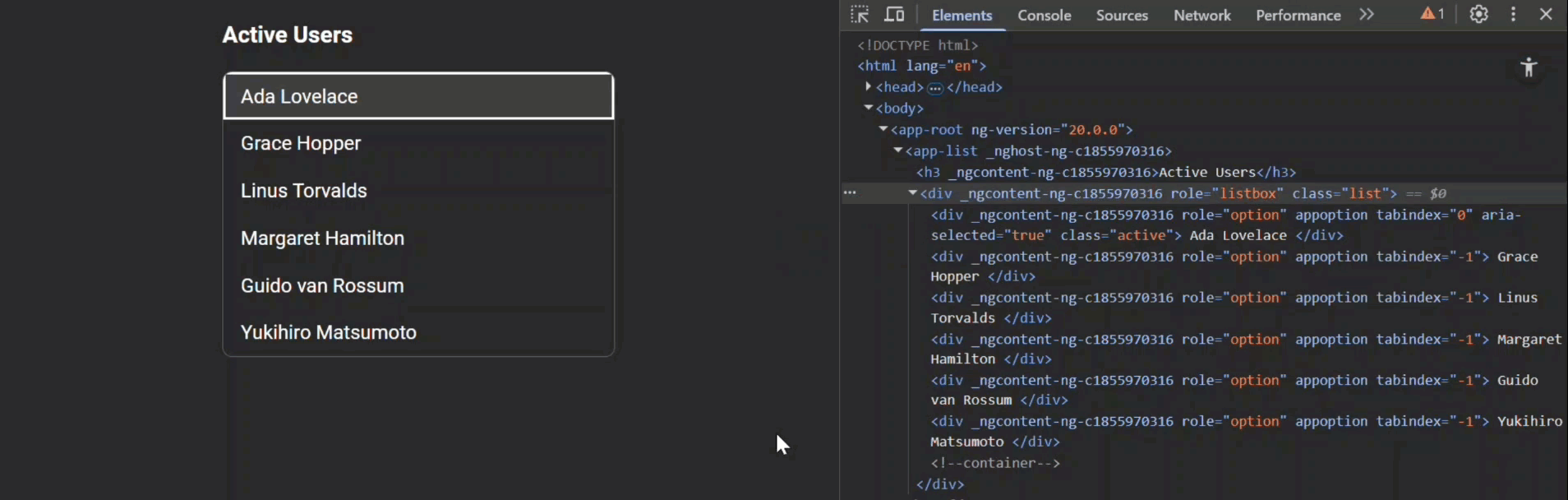
Now we can tab to the list and use the arrow keys to navigate through the items:

We can still click the items but when we use the arrow keys to navigate, it doesn’t quite work right because we never updated the ListKeyManager on click.
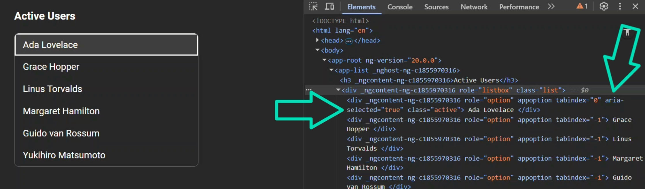
Also, you may not have noticed this but when we first tabbed into the list, while the first item was focused, it was not marked as active.
There’s no active class or aria-selected attribute on the item.
So, let’s fix these issues.
Troubleshooting Focus: Priming the Manager on Click and Focus
First, let’s fix the issue where clicking doesn’t update the manager.
To do this, we just need to add our “setupKeyManager()” function to the “handleClick()” method.
And we need to use the “setActiveItem()” method to set the active item to the clicked index:
protected handleClick(event: Event) {
    ...
    this.setupKeyManager();
    this.keyManager?.setActiveItem(i);
}
So now, on click, we set up the manager if it doesn’t exist and update it with the clicked index.
Now, let’s fix the issue where the first focused item isn’t marked active.
For this, we need to add a new function to the component called “handleFocus()” and then call the “setupKeyManager()” function:
protected handleFocus() {
    this.setupKeyManager();
}
Then, we need to add a focus event to the list item element and call this new function:
<div
    role="option"
    ...
    (focus)="handleFocus()">
    ...
</div>
Now, on focus, we ensure the manager exists and prime it so the first active item is selected:
And, both keyboard and mouse interactions stay in sync:
This is nice, right?
But there’s still more!
Bonus: Circular Wrap + Home/End in One Line
Let’s say we want to add circular navigation to the list.
And, we also want to add functionality to jump to the first and last items using the home and end keys.
Well, adding this functionality is really easy with the ListKeyManager!
It supports additional helpers…
.withWrap()→ circular navigation (after last, go to first, and vice versa)..withHomeAndEnd()→ Home jumps to the first item, End jumps to the last.
So we can just update our “setupKeyManager()” function to add these helpers:
private setupKeyManager() {
    if (!this.keyManager) {
        this.keyManager = new ListKeyManager(this.options())
            .withWrap().withHomeAndEnd();
        ...
    }
}
No custom key handling needed, just chain these in.
Summary and Next Steps: From List to Accessible Listbox
And that’s it, a plain list upgraded into a proper listbox with real keyboard support using the CDK ListKeyManager.
We kept clean markup, implemented the CDK ListKeyManager, and added minimal code for accessibility and power features.
This pattern scales to:
- Multi-select listboxes
- Disabled items (skipped automatically)
- More complex navigation scenarios
No custom arrow-key spaghetti, just clean, accessible Angular code.
If you want to see more lesser-known Angular features that can level up your applications, don’t forget to subscribe!
Additional Resources
- The demo app BEFORE any changes
- The demo app AFTER making changes
- Angular CDK A11y: ListKeyManager Overview (official docs)
- WAI-ARIA Authoring Practices: Listbox Pattern
- ARIA Practices Guide (APG) Home
- My course “Angular: Styling Applications”
- My course “Angular in Practice: Zoneless Change Detection”
Want to See It in Action?
Want to experiment with the final version? Explore the full StackBlitz demo below. If you have any questions or thoughts, don’t hesitate to leave a comment.