Modern Angular Animations: Ditch the DSL, Keep the Power
Angular's deprecated animations module leaves developers wondering how to create advanced animations without the DSL. The modern approach combines Angular's new enter/leave animation primitives with pure CSS animations, providing better performance, hardware acceleration, and simpler code. This tutorial demonstrates how to build complex animations including staggered list animations, sequential effects, and coordinated multi-element transitions using modern Angular animation techniques.
Stackblitz Project Links
Check out the sample project for this tutorial here:
Project Setup: A Basic Show/Hide Without Animation
For this tutorial, we’ll be working with a very simple Angular app.
It has a “Show Product” button, which when clicked, shows a product card and when clicked again, disappears instantly:
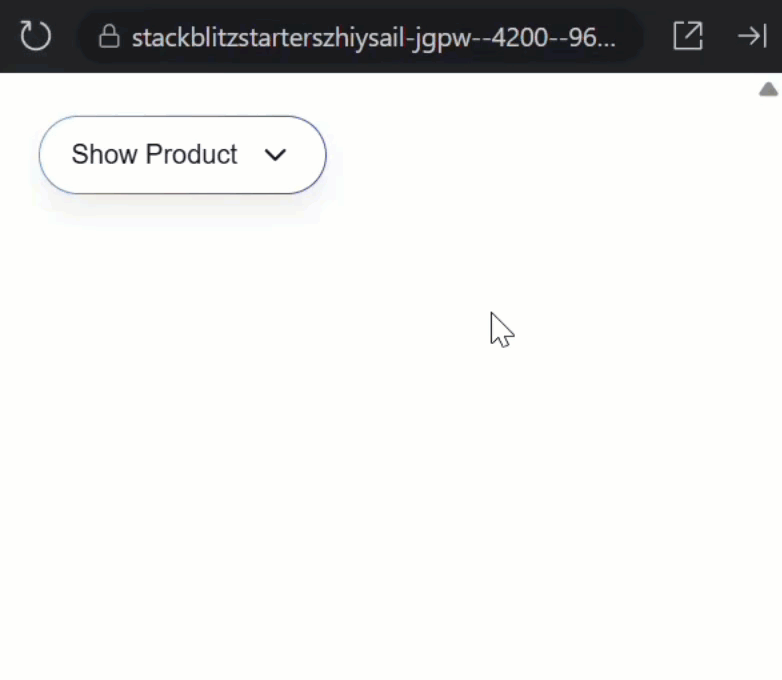
No animations yet, which makes it a great starting point.
Let’s take a look at the HTML for this product display component to better understand how it works.
The first thing we see is a button that toggles a “show()” signal when clicked:
<button (click)="show.set(!show())">
    ...
</button>
Below this button, we conditionally show a product card component based on the value of this signal:
@if (show()) {
    <app-product [product]="product" />
}
This is what’s controlling the display of the product card in the browser.
Now, let’s use the new animation primitives to add some animations to this component in a modern Angular way.
Add Enter/Leave: Fade + Slide
Since this component is being added and removed from the DOM, we’ll be dealing with the “enter” and “leave” states for this animation.
Angular’s new animate primitives (added in v20.2) are what make this possible without using the old animations module.
Using these primitives, we’ll define two CSS classes:
fade-slide-in→ for enterfade-slide-out→ for leave
@if (show()) {
    <app-product
        [product]="product"
        animate.enter="fade-slide-in"
        animate.leave="fade-slide-out" />
}
Angular automatically adds these classes at the right time: “fade-slide-in” on insert and “fade-slide-out” on removal.
Angular then waits for the CSS animation to finish before removing the element, which is super important for clean exit animations since there’s currently no way to do this with CSS alone.
Now, when using these new primitives, the animations are handled with standard CSS.
So first, we need to add a keyframe animation, let’s call it “fadeSlideIn”:
@keyframes fadeSlideIn {
    from {
        opacity: 0;
        translate: 0 16px;
    }
}
Now, when we use this animation, it will start with an opacity of 0 and a translation of 16px down.
Then it will finish with an opacity of 1.0 and a translation of 0.
Next, we need to add the “fade-slide-in” class and wire up the new animation:
.fade-slide-in {
    animation: fadeSlideIn 1000ms ease-out;
}
With this, when the component enters it will fade in and slide up over 1000ms with an easing function of ease-out.
Okay, now let’s do the same for the leave animation, but we don’t need to add keyframes for this, instead we can just run the existing animation in reverse:
.fade-slide-out {
    animation: fadeSlideIn 1000ms ease-in reverse;
}
At this point we should have a fully functioning enter and leave animation:
Now when we toggle the button, the card fades and slides in, and then exits gracefully when removed.
All this without the old animations module. Pretty cool.
Chaining with Multiple Animations (CSS Only)
So this is neat right, but we used to be able to easily chain animations when using the old library because everything ran in sequence.
So how can we do this now?
Well, since it’s all basically CSS, this is still easy.
Back in the template, let’s rename the animation classes.
Let’s go with “enter-chain” and “leave-chain”:
@if (show()) {
    <app-product
        [product]="product"
        animate.enter="enter-chain"
        animate.leave="leave-chain" />
}
Now, back in the CSS, let’s compose two animations:
- A “fadeIn” animation
- A “popIn” animation
The “fadeIn” animation will look like this:
@keyframes fadeIn {
    from {
        opacity: 0;
        translate: 50% 0;
    }
}
This will start with an opacity of 0 and a translation of 50% to the right.
Then, it will finish with an opacity of 1 and a translation of 0.
The “popIn” animation will look like this:
@keyframes popIn {
    0% {
        scale: 0.98;
    }
    50% {
        scale: 1.02;
    }
}
This will start scaled down a little bit, in the middle of the animation it will scale up a little bit, and then it will scale back down to 1.0.
Now, we can add these animations.
Let’s start with the enter animation:
.enter-chain {
    animation:
        fadeIn 1000ms ease-out,
        popIn 750ms ease-out 1000ms backwards;
}
This will run the “fadeIn” animation for 1000ms, and then the “popIn” animation for 750ms, starting 1000ms after the “fadeIn” animation, which allows them to run in sequence.
Then we have an animation-fill-mode of “backwards”, which essentially just tells the browser to apply the styles applied during the first keyframe before it starts.
Without this it would be rendered at its default scale of (1.0) during the delay while the first animation runs, then it would snap to the scaled down (0.98) version when its animation starts.
So, stacking animations like this is how we can chain animations in modern Angular.
Now let’s add the reverse for the leave animation:
.leave-chain {
    animation:
        popIn 750ms ease-out forwards reverse,
        fadeIn 1000ms ease-out 750ms reverse;
}
This will first run the “popIn” animation keeping the final scale after it finishes, then the “fadeIn” animation for 1000ms, starting 750ms after the “popIn” animation.
It will run both in reverse, so the opposite of what we had for the enter animation.
So now how does this look?
The result is a product card that smoothly fades in, then pops into place.
When it leaves, the sequence reverses, with Angular waiting for the longest animation before removing the element.
And if you need more steps, just add another animation with an appropriate delay.
Think of it like Lego bricks.
You can pretty much do whatever you want here.
Animate a List (then Stagger It)
What about lists?
Is there anything cool we can do?
We’ll actually there is.
First, let’s switch to display the product list component instead of the product display in the root component:
Before:
@Component({
    selector: 'app-root',
    template: `
        <app-product-display />
        <!-- <app-product-list /> -->
    `,
    imports: [
        ProductDisplayComponent,
        // ProductListComponent
    ]
})
export class App {
}
After:
@Component({
    selector: 'app-root',
    template: `
        <!-- <app-product-display /> -->
        <app-product-list />
    `,
    imports: [
        // ProductDisplayComponent,
        ProductListComponent
    ]
})
export class App {
}
Now, let’s save and see what this component looks like:
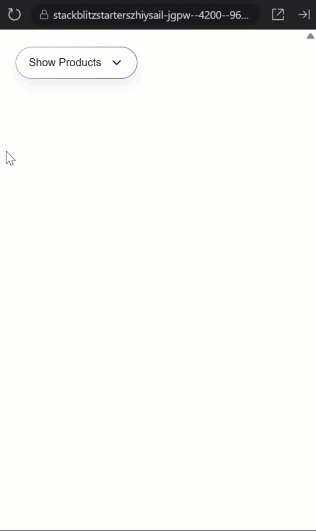
Okay, when we toggle the button, the items appear and disappear instantly.
Again, there are no animations here.
Let’s look at the HTML for this component to better understand how it works.
First, we’ve got the toggle button, which toggles the “show()” signal just like the previous example:
<button (click)="show.set(!show())">
    ...
</button>
Then below that, we have a list of products that are conditionally rendered based on the value of that “show()” signal:
<div class="products">
    @for (product of products; track product.id; let i = $index) {
        @if (show()) {
            <app-product [product]="product" />
        }
    }
</div>
Again, these product components are entering and leaving the DOM so we can animate them the same way:
<div class="products">
    @for (product of products; track product.id; let i = $index) {
        @if (show()) {
            <app-product
                [product]="product"
                animate.enter="stagger-in"
                animate.leave="stagger-out" />
        }
    }
</div>
Now we need to add the CSS for these animations.
First let’s add a keyframe animation named “fadeUp”:
@keyframes fadeUp {
    from {
        opacity: 0;
        translate: 0 30px;
    }
}
This will start with an opacity of 0 and a translation of 30px down.
Then it will finish with an opacity of 1 and a translation of 0.
Next, we can use the “stagger-in” and “stagger-out” classes to wire this new animation:
.stagger-in {
  animation: fadeUp 2000ms ease-out both;
}

.stagger-out {
  animation: fadeUp 2000ms ease-in both reverse;
}
This will run the “fadeUp” animation for 2000ms when it enters, and then run it in reverse for 2000ms when it leaves.
This time we’re using the “both” animation-fill-mode to apply the appropriate styles before and after the animation runs.
Okay, the items should now animate as they’re added and removed, so how does this look?
Nice, now each item smoothly enters and leaves the DOM, instead of snapping in and out.
Already a huge improvement, but it would be better if they were staggered as they enter and leave, right?
Add a Stagger with a Single Line
Let’s do it!
First, let’s switch back to the component template and use style binding to pass the list index as a CSS custom property:
<div class="products">
    @for (product of products; track product.id; let i = $index) {
        @if (show()) {
            <app-product
                [product]="product"
                [style.--i]="i"
                ... />
        }
    }
</div>
Now we can switch back to the CSS and use the calc() function to offset each item’s animation delay:
.stagger-in {
  ...
  animation-delay: calc(var(--i) * 150ms);
}

.stagger-out {
  ...
  animation-delay: calc(var(--i) * 150ms);
}
So now item 0 starts immediately, item 1 starts after 150ms, item 2 after 300ms, and so on.
Okay, how does this look now?
Nice, with the items staggered as they enter and leave, the list feels dynamic and polished.
All with just a single line of CSS.
Recap & Key Takeaways
So, animations should communicate change, not just decorate it.
With the new enter and leave primitives, Angular handles when, while CSS defines how.
Today we learned how to add a simple enter/leave animation, chained multiple steps with delays, and staggered a list using one dynamic CSS variable.
If this was helpful, don’t forget to subscribe for more hidden Angular gems.
Additional Resources
- The demo app BEFORE any changes
- The demo app AFTER making changes
- Migrating away from Angular’s Animations package
- Simplifying Animations with Angular’s New Native API
- Enter/Leave Animations in 2025: They’ve changed!
- My course “Angular: Styling Applications”
- My course “Angular in Practice: Zoneless Change Detection”
Want to See It in Action?
Want to experiment with the final version? Check out the full demo below.