Angular ::ng-deep Alternatives: Modern Styling Approaches
The deprecated ::ng-deep selector was Angular's way to break style encapsulation, but it causes maintenance issues, breaks encapsulation principles, and is no longer supported. Modern Angular provides better alternatives using CSS Custom Properties and View Encapsulation settings that maintain component boundaries while allowing necessary style overrides. This tutorial shows you how to replace ::ng-deep with maintainable, future-proof styling approaches that work with Angular's component architecture.
In this tutorial, I’ll show you two approaches:
- Using CSS Custom Properties
- And disabling View Encapsulation for those special cases where custom properties won’t cut it.
Goodbye ::ng-deep, Hello CSS Custom Properties!
Ok, here’s the basic application we’ll be using for this example:
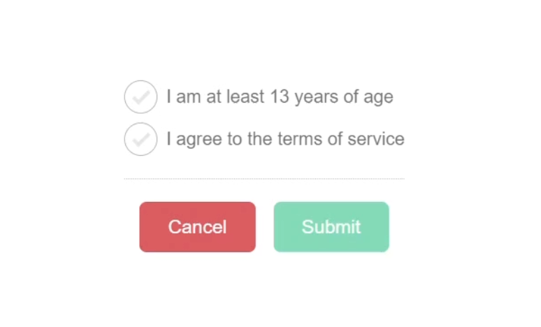
Now, in this demo, I only have a couple of components, but let’s imagine that this is an app that will eventually be quite large with hundreds of different components.
This particular toolbar component will be used over and over in many different situations.
Operating with that in mind, what this could mean is that we’d need default colors for these buttons.
These default colors would be used in most common scenarios, but we’d likely need to override them in certain situations.
In the example for this tutorial, this is one of those situations.
We are overriding the default colors.
If we open up the stylesheet for this toolbar component, we can see the default colors for the cancel and submit buttons:
button {
  &.cancel {
    background-color: #777;
  }

  &.submit {
    background-color: #000;
  }
}
The submit button is black and the cancel button is gray.
But in our example they are different colors because they are overridden in the app.component.scss where this toolbar component is used:
app-toolbar ::ng-deep button {
  &.cancel {
    background-color: #ff495d;
  }

  &.submit {
    background-color: #00deb7;
  }
}
We can see that we’re using ::ng-deep to break the style encapsulation for this component so that we can style these buttons from the parent app component.
If we remove these styles, and then save, we can see the default colors for the buttons:
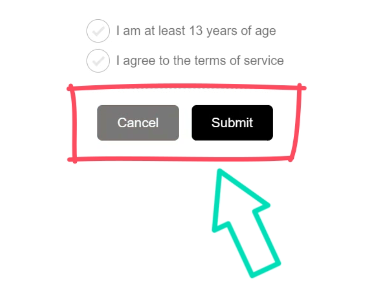
This is a perfect situation for CSS Custom Properties, so let’s switch it over.
First, we need to set up the buttons to use custom properties.
To do this we need to start by adding the var() function.
Then we can add the name for the for the custom property, prefixed with two dashes.
Let’s go with “–cancelBackground”:
button {
  &.cancel {
    background-color: var(--cancelBackground, #777);
  }
}
So now, if we define this custom property on a parent, that value will be used.
If not, it will fall back to the gray value.
Ok, now let’s add a custom property for our submit button:
button {
  &.submit {
    background-color: var(--submitBackground, #000);
  }
}
Now, what happens if we remove the overrides in the app.component.scss and save?
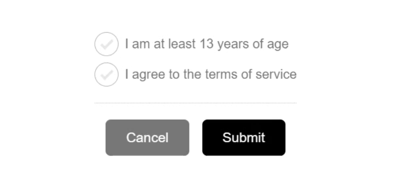
Perfect, the default colors are applied.
Now we just need to provide our custom property overrides for these colors in the app.component.scss file.
We can add them in our ruleset for the styles on the :host element:
:host {
    ...

    --cancelBackground: #ff495d;
    --submitBackground: #00deb7;
}
That’s it, now after we save, we should see the colors updated:

So, not only does this eliminate the need for ::ng-deep, but it actually results in fewer styles, at least in this case.
Custom properties are usually the first thing I go for in scenarios like this because they are simple and easy to implement.
But sometimes you may find that they don’t work so well, and you need another solution.
Let’s look at an example.
Scoped or Not? Disabling View Encapsulation for Flexibility
The other component we have here is a checkbox component.
Now, I’ve only added this component for stylistic purposes.
In this app, most of the time when we use a checkbox, we want it to look like it does here:
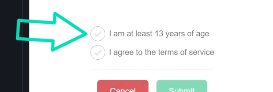
To pull this off, we need several styles.
There’s not really a great way to do this with custom properties.
And we may not want to add these as global styles because we may want a more standard checkbox style in certain scenarios.
So, what I’ve done is create this checkbox component, basically as a “wrapper” that we can add whenever we want to opt-in to this style.
Here, in the app.component.html, we can see this component wrapping both of the checkboxes and their associated labels:
<app-checkbox>
  <label>
    <input type="checkbox" />
    I am at least 13 years of age
  </label>
</app-checkbox>
<app-checkbox>
  <label>
    <input type="checkbox" />
    I agree to the terms of service
  </label>
</app-checkbox>
Now, we could’ve totally added the checkbox and label into our checkbox component, but what I’ve found is that you often need direct access to the input element for programmatic reasons.
So that’s why I prefer a “wrapper” style component for this type of thing.
But this means we need to use ::ng-deep right?
Actually, no.
We have another option.
Styles by default in Angular are scoped or encapsulated for each component, right?
But we can disable this for certain components when needed.
We can add the “encapsulation” property in our component metadata.
Then we can add the ViewEncapsulation enum from the @angular/core module.
This encapsulation mode can be one of three things:
- It can be set to “Emulated”, which is the default, where special scoping attributes are applied to emulate the effects of the native Shadow DOM.
- It can be set to “ShadowDom”, where it actually uses the native Shadow DOM to encapsulate styles.
- Or, it can be set to “None”, where there will be no style encapsulation.
And this is what we’re going to use here:
import { ..., ViewEncapsulation } from "@angular/core";

@Component({
    selector: 'app-checkbox',
    ...
    encapsulation: ViewEncapsulation.None
})
This means that the styles in this component will now be added un-scoped.
Essentially, they are applied just like the global styles.
So, we have to take extra care when doing this.
Also, it means we need to make a few changes to our styles.
First, we won’t need ::ng-deep anymore because all of the styles in this stylesheet are now inserted without scoping.
Also, now that we have turned off our encapsulation, the :host selector will no longer apply because it’s not being emulated and because we have no native Shadow DOM for this component.
So, what I like to do here is wrap these styles in the component selector instead:
app-checkbox {
    ...
}
So, even thought they are now applied gloablly, they will only apply to the elements placed within the component host.
Ok, that should be it.
Now we should be able to save and see the styles applied:

Nice, these styles look exactly the same, but now they no longer need ::ng-deep.
In Conclusion
So those are a couple of ways to effectively replace ::ng-deep in your projects.
CSS Custom Properties are a flexible and efficient way to manage styles for reusable components.
And for more complex cases, disabling View Encapsulation can be a great alternative.
Alright, hope that was helpful.
Don’t forget to check out my other Angular tutorials for more tips and tricks.
Additional Resources
- The demo BEFORE making changes
- The demo AFTER making changes
- Style Scoping in Angular
- CSS Custom Properties
- CSS Var Function
- Shadow DOM
Want to See It in Action?
Check out the demo code and examples of these techniques in the Stackblitz example below. If you have any questions or thoughts, don’t hesitate to leave a comment.


