Every Way to Style an Angular Component (but funny)😂
March 10, 2025Angular gives you so many ways to add styles to a component because, apparently, developers love too many choices and unnecessary suffering.
Angular gives you so many ways to add styles to a component because, apparently, developers love too many choices and unnecessary suffering.

Angular offers multiple ways to add styles to components, each with different use cases and trade-offs. From inline styles in the decorator to external stylesheets, from programmatic styling with Renderer2 to CSS custom properties, choosing the right approach impacts maintainability and performance. This comprehensive guide walks through every styling method available in Angular, helping you make informed decisions for your components.

You ever try to theme an Angular component? Yeah… it sounds easy. Just tweak some colors, maybe adjust a layout, how hard could it be? Well, let me tell you, by the time you're done battling :host, :host-context(), and CSS variables, you'll start questioning everything.

Component theming in Angular requires understanding how styles cascade and how to adapt components to different contexts. This tutorial demonstrates multiple theming strategies using CSS :host and :host-context selectors, along with CSS custom properties. You'll learn how to create flexible components that adapt their appearance based on where they're used, whether in a sidebar, main content area, or different color schemes. Each approach has trade-offs that we'll explore in detail.

Ever tried styling a component in Angular? It’s not just CSS—it’s an event! From class binding to ::ng-deep, from ViewEncapsulation to the mystical powers of !important, this is the wild world of Angular styling!
Angular folks, this one’s for you! Ever feel like your components are just tiny digital apartments trying to live their best life? Well, let’s talk about it—Seinfeld style!
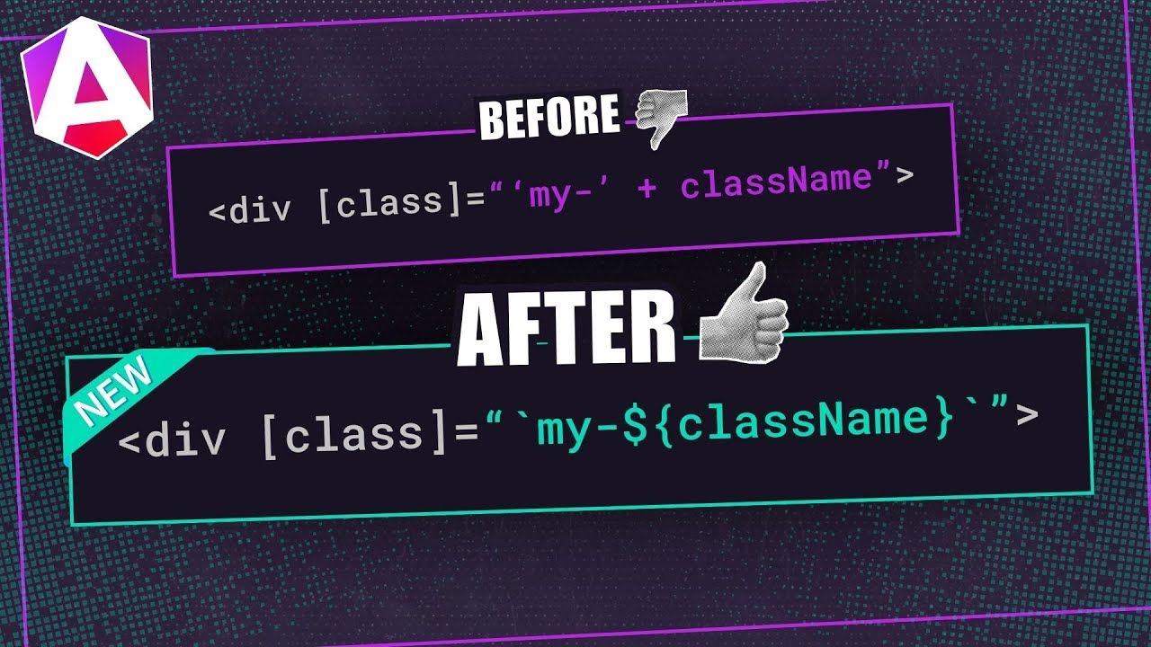
Dynamic class and style bindings in Angular templates often become complex, mixing string concatenation, ternary operators, and multiple bindings that are hard to read and maintain. Angular's template literal syntax provides a cleaner way to handle dynamic expressions, allowing you to use JavaScript template literals directly in templates for classes, styles, and complex interpolations. This tutorial demonstrates how to use template literals to simplify dynamic bindings and improve template readability.

Styling Angular components can be tricky, especially with encapsulated styles. But :host and :host-context let you target a component’s root element and adapt styles based on its context—without global CSS hacks. In this guide, you'll learn how to apply, modify, and control styles using these selectors, making your components smarter and more flexible. Let’s dive in!

Replacing ::ng-deep requires understanding CSS Custom Properties, View Encapsulation modes, and component architecture patterns. This follow-up tutorial addresses common misconceptions about avoiding ::ng-deep and provides specific, production-ready examples using CSS Custom Properties and View Encapsulation settings. You'll learn why ::ng-deep is discouraged by the Angular team and practical alternatives that maintain component boundaries while allowing necessary style customization.
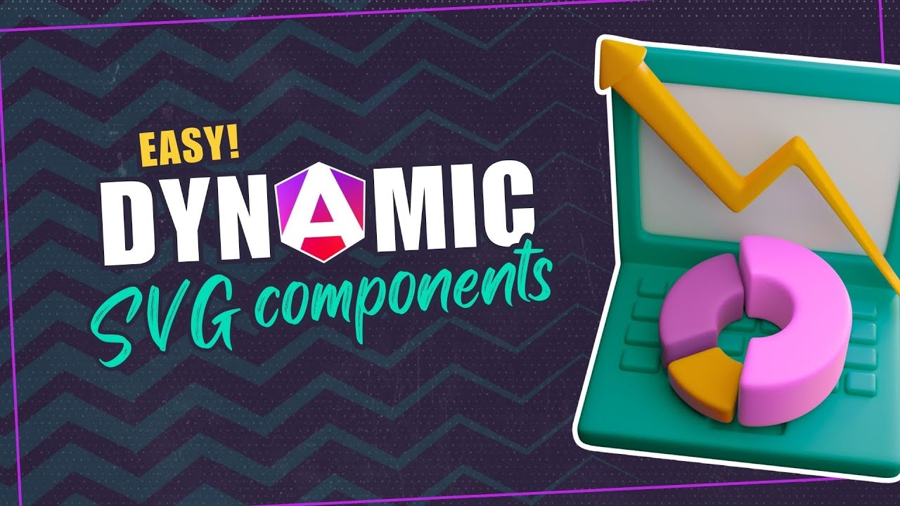
SVG components in Angular unlock powerful possibilities for data visualization and interactive graphics. Unlike static images, SVG components can respond to data changes, user interactions, and state updates in real time. This tutorial shows you how to transform basic lists into dynamic, interactive SVG charts using Angular's component system, signal-based reactivity, and template binding. You'll learn how to create scalable, data-driven visualizations that update automatically.

Loading content users never see wastes bandwidth and slows initial page loads, hurting performance metrics and user experience. Angular's deferred loading feature lets you load components only when they're needed, reducing initial bundle size and improving Core Web Vitals. This tutorial demonstrates how to combine deferred loading with animations, creating smooth transitions as components enter the viewport. Note: This uses Angular's deprecated animations module—modern alternatives are available.

The deprecated ::ng-deep selector was Angular's way to break style encapsulation, but it causes maintenance issues, breaks encapsulation principles, and is no longer supported. Modern Angular provides better alternatives using CSS Custom Properties and View Encapsulation settings that maintain component boundaries while allowing necessary style overrides. This tutorial shows you how to replace ::ng-deep with maintainable, future-proof styling approaches that work with Angular's component architecture.

Expand and collapse animations make Angular UIs feel polished and professional. This tutorial demonstrates how to animate height changes using Angular's deprecated animations module. While this approach still works, modern Angular (v19+) offers better alternatives using CSS animations and DOM events. You'll learn the legacy approach here, but for new projects, consider using pure CSS transitions or Angular's new enter/leave animation API.

Building toggle buttons in Angular doesn't have to be complicated. Whether you need to show/hide content with CSS classes or conditionally render elements, this tutorial covers multiple approaches. You'll learn how to create reusable toggle buttons that control content visibility, handle state management with signals, and implement smooth transitions. By the end, you'll have several patterns you can use in any Angular project.

Crossfade animations create smooth transitions between content changes, image carousels, and tab switches, eliminating jarring instant replacements. While CSS transitions can handle simple fades, coordinating simultaneous fade-out and fade-in effects requires careful timing and state management. This tutorial demonstrates how to create crossfade animations using Angular's animation framework, ensuring smooth transitions between content states. Note: This uses Angular's deprecated animations module—modern alternatives are available.

Flip animations create engaging card interactions, reveal effects, and 3D transformations that feel natural and intuitive. Implementing flip animations requires careful coordination of transforms, perspective, and timing to create convincing 3D effects. This tutorial demonstrates how to create flip animations using Angular's animation framework, including proper perspective setup and smooth transitions. Note: This uses Angular's deprecated animations module—modern alternatives are available.

CSS Shapes require a reference box to establish a coordinate system for drawing and positioning shapes. The reference box determines how shapes are calculated relative to the element's box model (margin, border, padding, or content box). This tutorial explains how reference boxes work, which box model values to use, and how they affect shape positioning and content flow.

CSS Shapes solve a fundamental web layout limitation: content wrapping around custom shapes. Before CSS Shapes, floated elements always created rectangular float areas, preventing content from flowing around circles, polygons, or transparent images. This tutorial explains what CSS Shapes are, how they control content flow without rendering visual shapes, and the core concepts needed to use them effectively.

CSS Shapes control how content flows around floated elements, but they don't actually render visual shapes—they define float areas. Understanding this distinction is crucial: CSS Shapes determine where content wraps, not what shapes appear on the page. This tutorial explains what CSS Shapes are, how they differ from visual CSS shapes created with borders or clip-path, and why floated elements still create rectangular float areas without the CSS Shapes module.

Web layouts have been trapped in rectangular boxes for decades, limiting designers to grid-based structures that can't match the creative freedom of print design. CSS Shapes changes everything by allowing content to flow around custom shapes, creating magazine-style layouts with text wrapping around circles, polygons, and custom paths. This comprehensive guide teaches you how to break free from rectangular constraints and build sophisticated, editorial-style layouts that were previously impossible on the web.