Angular Enter/Leave Animations in 2025: Old vs New
Angular's deprecated animations module is being replaced by a new enter/leave animation API that's lighter, hardware-accelerated, and simpler than the old DSL-based system. This tutorial demonstrates how to migrate from the legacy :enter and :leave animations to Angular's new animation primitives, showing how to create smooth enter/leave transitions using modern CSS animations and Angular's new animation helpers. You'll learn how to build professional animations without the deprecated module.
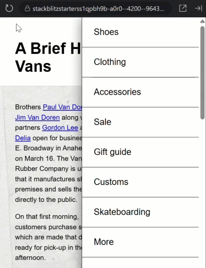
The Current App: What We’re Working With
We’ll be using the same sliding menu demo from my previous tutorial, and right now it’s working perfectly with traditional Angular animations:

The menu slides in from the right when we click the hamburger icon, and slides back out when we click outside to close it.
This is all working great, so let’s open the root component and take a look at the code.
First, we have an @if condition that controls whether to show the menu or not:
@if (menuOpen()) {
    <app-page-menu
        @openClose
        (close)="menuOpen.set(false)">
    </app-page-menu>
}
This means the component is being completely added and removed from the DOM, not just hidden and shown.
The @openClose animation trigger is attached to the menu component, handling enter and leave animations using Angular’s traditional animations framework.
The existing animation has an “enter” transition when the item is added and a “leave” transition when it’s removed:
animations: [
    trigger('openClose',[
        transition(':enter', [
            style(hidden),
            animate(timing, style(visible))
        ]),
        transition(':leave', [
            style(visible),
            animate(timing, style(hidden))
        ])
    ])
]
And we’re using variables to make the states easier to maintain:
const hidden = { transform: 'translateX(120%)' };
const visible = { transform: 'translateX(0)' };
const timing = '1s ease-in';
When hidden, it’s translated out of the viewport and we transition this translate value when opening and closing the menu.
Pretty straightforward, right?
But here’s why we’re about to completely change this approach…
Why the Old Animation System Falls Short
The Angular team no longer recommends using the animations module for most use cases, and there are several compelling reasons:
- First, the animations package adds about 60kb to your bundle size. Every kb counts, especially for mobile users.
- Second, these animations run without hardware acceleration. Meaning they run on the CPU, not the GPU, making them less smooth, especially on older or mobile devices.
- Third, the Angular animations API is Angular-specific. These skills don’t transfer easily to other frameworks or vanilla JavaScript projects.
The Angular team now recommends that we handle as much as possible through CSS, which is faster, more widely supported, and gives us buttery-smooth GPU acceleration out of the box.
But some things are still difficult with CSS alone, especially when items are removed from the DOM.
There’s a @starting-style for when items are added, but nothing for when they’re removed.
That’s why the Angular team is working on a new animations API to bridge this gap, and that’s what we’re exploring today.
How the New Animation API Works
With the new API, instead of animation triggers and transition arrays, we get some simple new features.
We can now add animate.enter and pass it a CSS class to apply when the item enters the DOM instead of the old animation trigger:
@if (menuOpen()) {
    <app-page-menu
        animate.enter="slide-in"
        (close)="menuOpen.set(false)">
    </app-page-menu>
}
The beauty of this approach is that we now get to define our animations using plain ol’ CSS.
Building Hardware Accelerated CSS Animations
Let’s switch to the SCSS for this component.
Here we’ll create our “slide-in” keyframe animation:
@keyframes slide-in {
    from {
        transform: translateX(120%);
    }
    to {
        transform: translateX(0);
    }
}
It’ll start translated out of the view and end in the default position, just like the old animation.
Then, we can use the “slide-in” class to trigger this animation:
.slide-in {
    animation: slide-in 1s ease-in;
}
And that’s it. Now it’s pure CSS!
Creating the Exit Animation
Now we need to handle the leave animation.
Let’s switch back to the code and add this to our component:
@if (menuOpen()) {
    <app-page-menu
        animate.enter="slide-in"
        animate.leave="slide-out"
        (close)="menuOpen.set(false)">
    </app-page-menu>
}
We’ll use a “slide-out” class for this.
Now let’s switch back over and add the styles.
The leave keyframe animation looks like this:
@keyframes slide-out {
    from {
        transform: translateX(0);
    }
    to {
        transform: translateX(120%);
    }
}
It’s just the inverse of the “slide-in” animation.
Then we use the “slide-out” class to trigger this animation:
.slide-out {
    animation: slide-out 1s ease-out;
}
So, it starts from the normal position and slides out 120%, ending up off-screen.
We’ve now recreated the same animation behavior, but with modern CSS.
Cleaning Up the Old Code
At this point, we can clean up the old animation system.
We can remove the entire animations array:
animations: [
    trigger('openClose',[
        transition(':enter', [
            style(hidden),
            animate(timing, style(visible))
        ]),
        transition(':leave', [
            style(visible),
            animate(timing, style(hidden))
        ])
    ])
]
We can also remove the animation imports and constants:
import { animate, style, transition, trigger } from '@angular/animations';

const hidden = { transform: 'translateX(120%)' };
const visible = { transform: 'translateX(0)' };
const timing = '1s ease-in';
And we can remove provideAnimationsAsync() from our bootstrap providers and its import too:
import { provideAnimationsAsync } from '@angular/platform-browser/animations/async';

providers: [
    provideAnimationsAsync()
]
The code is easier to understand, it’s now pretty much just standard CSS.
Testing Reveals an Unexpected Issue
Let’s save everything and test it out.
Let’s try opening the menu:

Perfect! The “slide-in” animation works beautifully.
But now let’s try closing it:
Hmm, it opens perfectly, but when it closes, the animation doesn’t work properly.
The menu just disappears instead of sliding out.
It took me a while to figure out what was happening here, because in theory, this should work perfectly.
But I think this might be a bug in the current implementation.
What I determined is that the component’s styles are being removed immediately as soon as the “menuOpen()” signal changes to false.
The new animation API keeps the DOM element around during the animation, which is exactly what we want, but without the component’s styles, the element isn’t rendered properly.
Hopefully this will be fixed in a future Angular release.
In the meantime however, I found a workaround.
A Workaround for the Bug
The solution: move the conditional logic into the page-menu component itself, so the component and its styles stay in the DOM always.
Just the guts of the component are added and removed conditionally.
To do this we need to add a conditional wrapper inside the component template, with a signal controlling open state.
So let’s switch to the menu component, add a “menuOpen” signal initialized to false:
import { ..., signal } from '@angular/core';

export class PageMenuComponent {
    ...
    protected menuOpen = signal(false);
}
Restructuring the Component Template
Now let’s go back to the template and wire up this new signal.
First, we’ll wrap everything in an @if block using the new signal:
@if (menuOpen()) {
    <ul (click)="close.emit()">
        @for (item of items; track item) {
            <li>
                <a>{{ item }}</a>
            </li>
        }
    </ul>
    <button (click)="close.emit()">
        <span class="visually-hidden">Close Menu</span>
    </button>
}
Inside this block, we’ll add a <div> that wraps all the content, then apply the animation directives to that <div>:
@if (menuOpen()) {
    <div
        animate.enter="slide-in"
        animate.leave="slide-out">
        ...
    </div>
}
Next, we need to update the button click event.
Instead of emitting the close event, we’ll directly set the signal to false:
Before:
<button (click)="close.emit()">
    ...
</button>
After:
<button (click)="menuOpen.set(false)">
    ...
</button>
And we’ll do the same for the click event on the list:
Before:
<ul (click)="close.emit()">
    ...
</ul>
After:
<ul (click)="menuOpen.set(false)">
    ...
</ul>
Moving Styles to the Right Place
Next, we need to move our animation styles and update the component.
Let’s copy the styles we added in the root component into the menu component:
.slide-in {
    animation: slide-in 1s ease-in;
}

@keyframes slide-in {
    from {
        transform: translateX(120%);
    }
    to {
        transform: translateX(0);
    }
}

.slide-out {
    animation: slide-out 1s ease-out;
}

@keyframes slide-out {
    from {
        transform: translateX(0);
    }
    to {
        transform: translateX(120%);
    }
}
Next, we need to update the component styles since we added the wrapper <div> for the animations.
Currently, all the positioning and styling is applied to :host, but now we need to apply it to the <div> inside instead:
Before:
:host {
    ...
}
After:
:host > div {
    ...
}
Wiring Up the Final Connections
At this point, we can remove the animations that we added in the root component.
@if (menuOpen()) {
    <app-page-menu
        animate.enter="slide-in"
        animate.leave="slide-out"
        (close)="menuOpen.set(false)">
    </app-page-menu>
}
Now, looking at how this menu currently toggles, it opens when the “menuClick” output event fires from the page-content component:
<app-page-content (menuClick)="menuOpen.set(true)"></app-page-content>
And closes with the “close” output from the menu component:
<app-page-menu
    ...
    (close)="menuOpen.set(false)">
</app-page-menu>
The state was previously managed here, but it’s now handled within the menu component.
Now we need to add a mechanism to open the menu externally.
Let’s switch back to the menu component and add this.
We’ll add a public “open()” method that other components can call to open this menu and all it needs to do is set the signal to true:
open() {
    this.menuOpen.set(true);
}
We can also remove the output since we don’t need it anymore:
close = output<void>();
Now, let’s switch back to the root component and add a template reference variable for the menu component.
Also, we need to remove the old “click” event and the condition around the component:
Before:
@if (menuOpen()) {
    <app-page-menu (close)="menuOpen.set(false)"></app-page-menu>
}
After:
<app-page-menu #menu></app-page-menu>
Next we need to update the “menuClick” event to call the “open()” method on the menu component using the reference variable:
Before:
<app-page-content (menuClick)="menuOpen.set(true)"></app-page-content>
After:
<app-page-content (menuClick)="menu.open()"></app-page-content>
Okay let’s save and try it out.
Testing the Complete Solution
Let’s try opening and closing the menu now:

Perfect! It slides in and out correctly now.
The best part? This is now using the new animations API with CSS animations, letting us leverage hardware acceleration for better performance.
What This Means for Your Projects
That’s it! We’ve successfully migrated to Angular’s new animation API.
We replaced complex animation triggers with simple directives, moved to hardware accelerated CSS animations, and reduced our bundle size.
Keep in mind though, this API is brand new and subject to change!
If you found this helpful, don’t forget to subscribe and check out my other Angular tutorials for more tips and tricks!
Additional Resources
- The original Angular Animations Tutorial
- Angular 20.2.0-next.2 Release Notes
- Angular Animation Documentation
- CSS @starting-style Documentation
- More on Angular Animations
- My course “Angular: Styling Applications”
Want to See It in Action?
Want to experiment? Explore the full StackBlitz demo below. If you have any questions or thoughts, don’t hesitate to leave a comment.