Switch Between Grid & List Views in Angular: Easy & Flexible
Grid/list view toggles improve UX by letting users choose their preferred content layout, but building flexible toggle components requires managing state, coordinating CSS classes or component trees, and handling both internal and external state management. This tutorial demonstrates how to build a reusable view mode toggle component in Angular that can switch between CSS classes or completely different component structures, supporting both self-contained and parent-controlled state patterns.
Getting Started: Building a Grid/List Toggle Component in Angular
For this tutorial, we’ve got a simple Angular app with a product listing and these view toggle buttons:
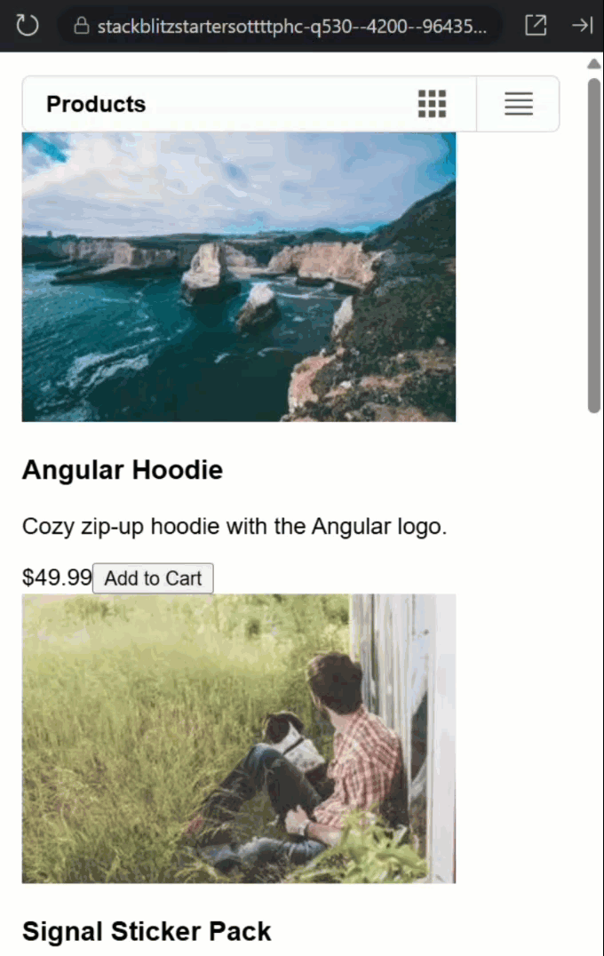
When I click them… absolutely nothing happens.
The buttons are there, they look nice, but they’re basically just decoration at this point.
Let’s look at the code behind all of this.
In the root app component, we have a view-mode-toggle component:
<view-mode-toggle>
    Products
</view-mode-toggle>
This component contains the button bar with the list view toggle.
It’s followed by a list of products rendered with a product-item component:
@for (product of products; track product.id) {
    <product-item [product]="product"/>
}
This is the list of products that we see below the button bar.
Now, let’s look at the view-mode-toggle component template.
Here we have two buttons, one for grid view and one for list view:
<button title="Grid View">
    ...
</button>
<button title="List View">
    ...
</button>
But what’s missing?
Well, there’s no click handlers, no state management, nothing to make them actually work.
And what about the TypeScript?
import { ChangeDetectionStrategy, Component } from "@angular/core";

@Component({
    selector: 'view-mode-toggle',
    templateUrl: './view-mode-toggle.html',
    styleUrl: './view-mode-toggle.scss',
    changeDetection: ChangeDetectionStrategy.OnPush
})
export class ViewModeToggleComponent {
}
It’s basically empty!
No properties, no methods, no logic whatsoever.
Using Angular Model Inputs for Clean Two-Way Data Binding
Alright, time to bring this component to life!
First, we need to track which view mode we’re in.
Instead of a standard input/output combo, we’ll use Angular’s model() input for two-way binding.
This avoids the need for separate input() and output() properties.
The parent can both read and update the value, and we can use the “banana-in-a-box” [(…)] syntax for seamless binding.
We’ll type the model input with a union type of “grid” or “list”, and let’s set its initial value to “list”:
import { ..., model } from "@angular/core";

export type ListMode = 'grid' | 'list';

@Component({
  selector: 'view-mode-toggle',
  ...
})

export class ViewModeToggleComponent {
    readonly mode = model<ListMode>('list');
}
Now let’s add a method to update it.
We’ll call it “set” and give it a “mode” parameter.
Then within it, we’ll simply set the “mode” to the value of the parameter:
protected set(mode: ListMode) {
    this.mode.set(mode);
}
Making the Grid/List Toggle Buttons Clickable and Dynamic
Now, back over in the component template, we need to wire up the buttons.
First, the “grid” button will get a click handler that sets the mode to “grid”:
<button
    (click)="set('grid')"
    title="Grid View">
    ...
</button>
So now, when someone clicks this button, it should properly update the mode.
And while we’re here, let’s also add visual feedback so users know which view is active.
Let’s use class binding to bind an “active” class when the mode value is set to “grid”:
<button
    (click)="set('grid')"
    [class.active]="mode() === 'grid'"
    title="Grid View">
    ...
</button>
Now let’s do the same thing for our list button:
<button
    (click)="set('list')"
    [class.active]="mode() === 'list'"
    title="List View">
    ...
</button>
Perfect! Our buttons now have brains.
They can think, they can act, they can even remember which one is active.
Connecting Angular Parent and Child Components with Banana-in-a-Box Syntax
Back in the parent (root) component, we need to track the “view mode” in this component.
So let’s add a signal typed using our “ListMode” type from the view-mode-toggle component, and we’ll set the initial value to “list” here too:
import { ..., ListMode } from './view-mode-toggle/view-mode-toggle';

protected viewMode = signal<ListMode>('list');
Now here’s where the magic happens.
We can use the “banana-in-a-box” syntax to connect the toggle component’s internal state to our parent’s state:
<view-mode-toggle [(mode)]="viewMode">
    Products
</view-mode-toggle>
Now, when the toggle changes, the parent’s “viewMode” updates automatically.
Now let’s actually use this mode to change how our products display.
For this, we can use the “viewMode” to conditionally apply “grid” or “list” classes to our product-item component:
@for (product of products; track product.id) {
    <product-item
        [product]="product"
        [class.grid]="viewMode() === 'grid'"
        [class.list]="viewMode() === 'list'"/>
}
So when we’re in grid mode, the product items get a “grid” class.
When we’re in list mode, they get a “list” class.
The product-item component’s CSS provides styles for these classes to completely change its layout.
Okay, that should be everything that we need so let’s save this and check it out:

Boom! Click the grid button, the layout changes. Click the list button, it switches back.
Why CSS Classes Aren’t Enough for a Flexible Grid/List Toggle
Now this first approach allows for the ultimate flexibility.
We have a reusable toggle component that simply provides a mode that you can do whatever you need with.
This is cool and really flexible but it means that we will probably end up with duplicate logic throughout our application whenever we want to use this toggle.
So, we want to keep this flexibility as is because we may need to use it in some edge cases, but now we’re going to add the ability to simply provide the markup for the views to the component and let it manage the state internally.
Using Angular ng-content and Conditional Slots for Dynamic Views
Let’s start inside the toggle component’s template.
After our <nav> element, let’s add some conditional content regions.
First, let’s add a condition for grid mode.
Inside of this condition we’ll use an ng-content directive to select an element with a “grid” attribute:
@if (mode() === 'grid') {
    <ng-content select="[grid]" />
}
So what’s happening here?
Well, this creates a “slot” that will only accept content marked with a “grid” attribute.
This is one of Angular’s most powerful content projection features, allowing us to create flexible, reusable components without tightly coupling them to specific templates.
And with the condition, it will only render when in grid mode.
Now let’s add the same thing for list mode:
@if (mode() === 'list') {
    <ng-content select="[list]" />
}
With this, projected content for each mode is handled internally, making the component a smart container.
It chooses which projected content to show.
Swapping Entire Angular Components Based on Grid/List Mode
Back over in the root component, first we need to import some specialized components for the list views so that we can use them:
import { GridViewCardComponent } from './grid-view-card/grid-view-card';
import { ListViewRowComponent } from './list-view-row/list-view-row';

@Component({
  selector: 'app-root',
  ...,
  imports: [
    ...,
    GridViewCardComponent,
    ListViewRowComponent
  ]
})
In the real world these would be purpose-built components.
The grid card would show a big image with minimal info, while the list row would be optimized for scanning lots of information quickly.
In this case though, they look exactly like the grid and list view of the current product-item component.
Now we can remove the product-item component from the template entirely and we can remove its imports too.
We can even remove the “viewMode” signal and the “mode” model binding.
We don’t need it anymore because the toggle component will handle its own state internally now.
Okay now, inside our view-mode-toggle element, we are going to add our grid view content.
First, we’ll add a <div> with a “grid” attribute to mark it as grid content.
Inside this <div> we’ll add the products loop again to create the list.
Then we’ll add the grid-view-card component:
<view-mode-toggle>
    <div grid>
        @for (product of products; track product.id) {
            <grid-view-card [product]="product" />
        }
    </div>
</view-mode-toggle>
Now let’s add the list view content.
Same idea, but with the “list” attribute this time, and our list-specific component:
<view-mode-toggle>
    <div grid>
        @for (product of products; track product.id) {
            <grid-view-card [product]="product" />
        }
    </div>
    <div list>
        @for (product of products; track product.id) {
            <list-view-row [product]="product" />
        }
    </div>
</view-mode-toggle>
Now, in the real-world, this could be anything.
These components could take in completely different data, they could include the loop themselves, whatever.
But for the purposes of this demo they both need the product loop and they both take in the same data.
Okay, let’s save and see how this works now:
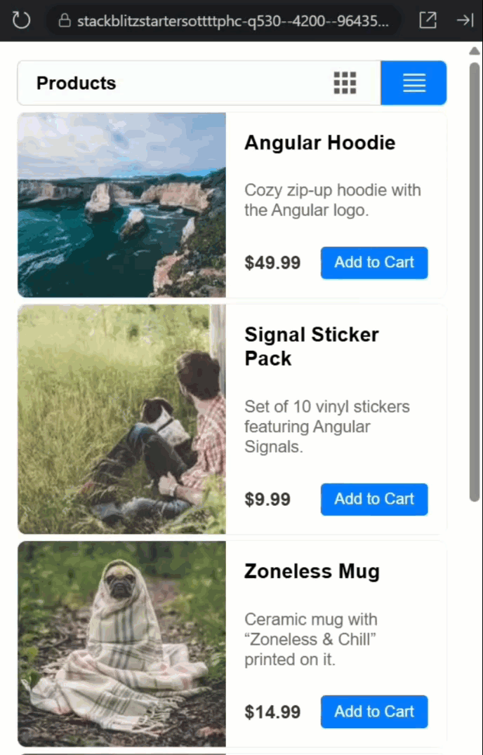
Look at that! We’re no longer handling any state externally, the toggle component does it all internally.
And the best part? Our toggle component doesn’t need to know anything about products, or cards, or rows.
It just manages view modes and content projection.
So now this component is super flexible.
It can be used in multiple ways.
The state can be managed externally and we can do anything we need, or we can simply add a “grid” slot and a “list” slot and let the component manage the state itself.
Wrapping Up: A Reusable and Flexible Grid/List Toggle Component
So we just transformed dead buttons into a smart, reusable component that works two ways.
One component, endless flexibility, zero headaches.
The real power? You’re not locked into one approach.
This pattern scales beautifully to tabs, theme switchers, or any component that toggles between views.
Until next time, keep building smarter, not harder, and thanks for reading!
Additional Resources
- Angular Model Inputs Documentation
- Angular Content Projection Guide
- Two-Way Binding in Angular
- Angular Signals Guide
- My course “Angular: Styling Applications”
Want to See It in Action?
Want to experiment with the final version? Explore the full StackBlitz demo below. If you have any questions or thoughts, don’t hesitate to leave a comment.