Angular 22: Better Tab Animations in Material
Angular Material tabs already make it easy to organize content into separate views, but the animation controls have always had one slightly annoying limitation: the tab indicator and the tab body shared the same animation duration. In Angular 22, that changes. Now, mat-tab-group can use separate values for the tab header and tab body animation durations, giving us more fine-grained control over the animation.
The Problem With Shared Tab Animation Durations
Let’s say we have a simple client workspace dashboard:
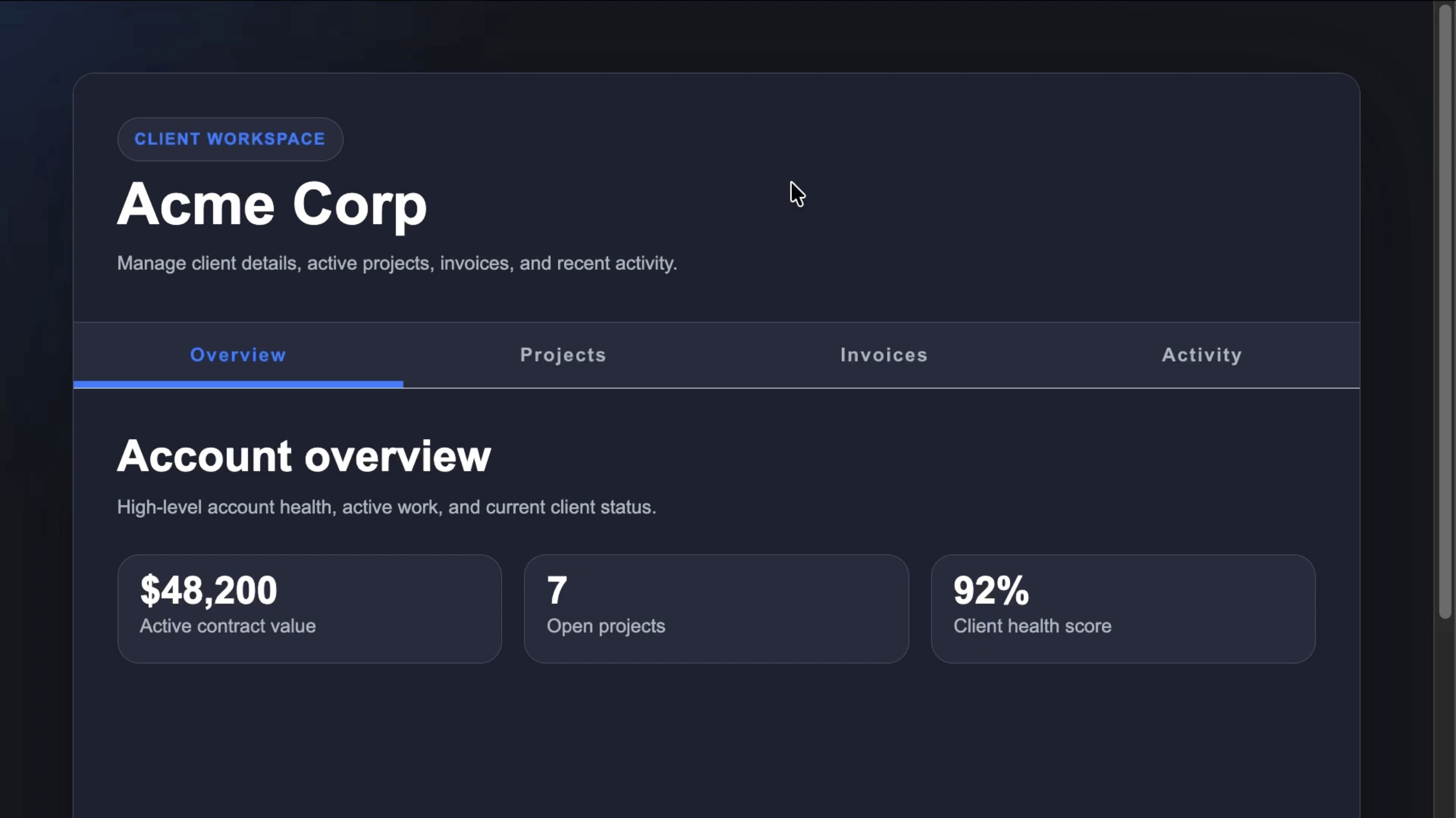
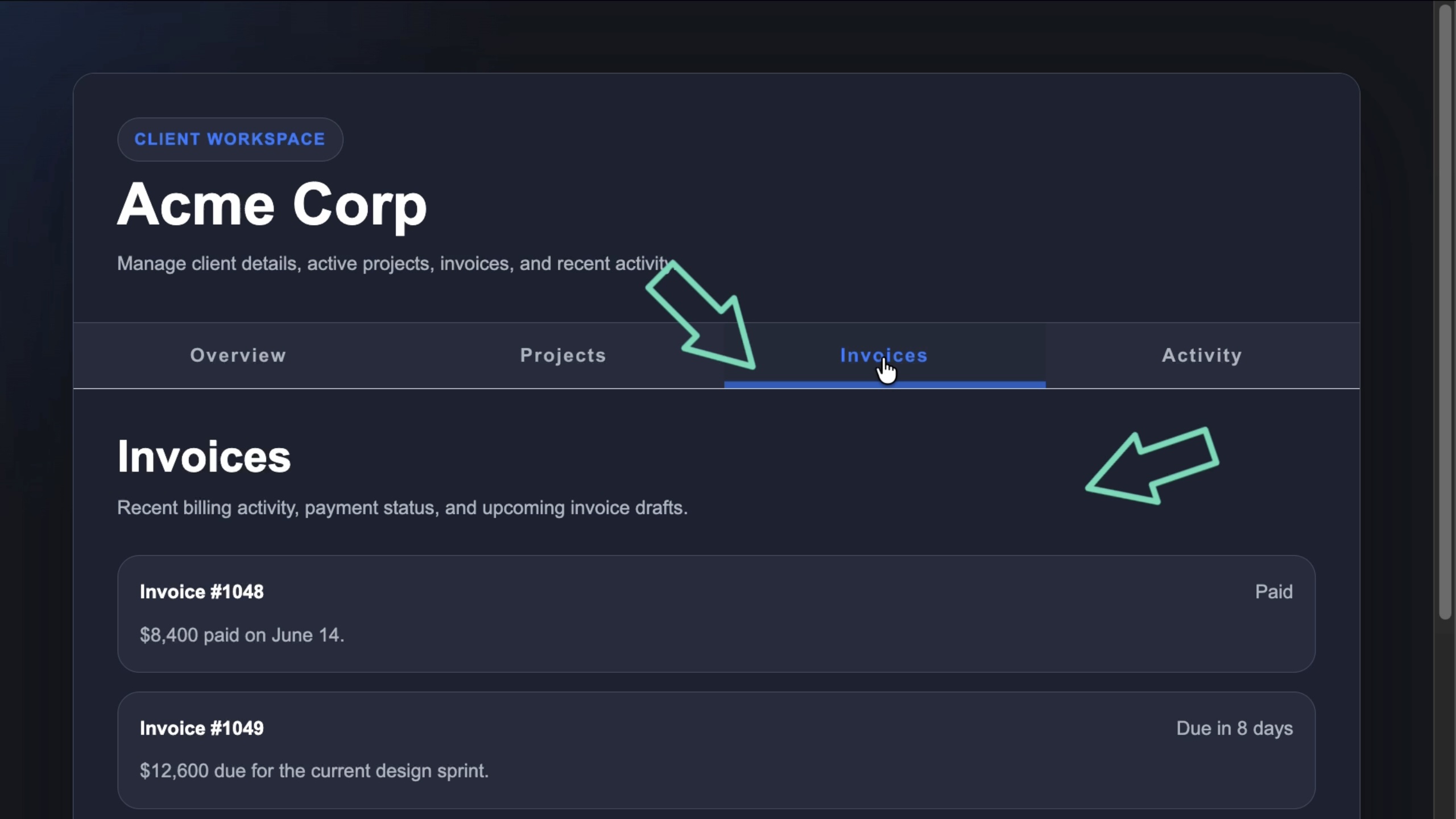
This app uses Angular Material tabs to separate the client overview, projects, invoices, and recent activity:
<mat-tab-group>
  <mat-tab label="Overview">
    ...
  </mat-tab>

  <mat-tab label="Projects">
    ...
  </mat-tab>

  <mat-tab label="Invoices">
    ...
  </mat-tab>

  <mat-tab label="Activity">
    ...
  </mat-tab>
</mat-tab-group>
Nothing fancy here.
It’s just a normal mat-tab-group with several mat-tab items inside it.
Each tab has a label that shows up in the tab header, and each tab also has content that gets displayed in the tab body.
But when we switch between these tabs, there are actually two different animations happening:
- The active tab indicator moves in the tab header
- The tab content slides in the tab body
Those two animations are related, but they don’t always need the same timing.
The tab indicator should usually feel quick and responsive because it confirms the user’s click.
The tab body can often move a little slower, especially when the content is heavier or more visual.
That’s where the old API created a tradeoff.
The Old Way: One Duration for Everything
Angular Material has supported the animationDuration input on mat-tab-group for a long time.
So, if we wanted to slow down the tab transition, we could do this:
<mat-tab-group animationDuration="1500ms">
  ...
</mat-tab-group>
This works.
The tab body would transition much slower, which can make larger content panels feel more intentional.
But there’s a catch.
That same duration also affects the header indicator animation.
So the content would feel smooth, but the selected tab indicator would feel like it’s dragging behind the click.
That makes the UI feel less responsive.
Making the Indicator Faster Creates the Opposite Problem
We can try to fix the sluggish tab indicator by lowering the duration:
<mat-tab-group animationDuration="150ms">
  ...
</mat-tab-group>
Now the selected tab indicator would feel much better.
It would move quickly, so the user would get immediate feedback.
But now the tab body animation would be too fast.
The content would snap into place, and we would lose the smoother transition we wanted in the first place.
So we would be stuck with a compromise:
- make the body animation feel smooth, but the header feel slow
- make the header feel fast, but the body feel abrupt
The issue is that the header and body are different parts of the UI.
They have different jobs.
So they should be able to have different animation durations.
And now in Angular 22, they can.
Angular 22: Separate Header and Body Durations
Angular Material tabs now allows the animationDuration input to accept either the original shared duration value or an object with separate header and body values.
So instead of this:
<mat-tab-group animationDuration="150ms">
  ...
</mat-tab-group>
We can bind to an object:
<mat-tab-group [animationDuration]="{
  header: '150ms',
  body: '1500ms'
}">
  ...
</mat-tab-group>
This gives us much better control.
The header value controls the tab header animation, which includes the active indicator.
The body value controls the tab content animation.
So now the indicator can stay fast, while the body content can transition more slowly.
When This Is Actually Useful
This is a small API improvement, but it solves a real UI polish problem.
For simple tabs with lightweight content, the default behavior is probably fine.
But separate durations can help when:
- the tab body contains heavier dashboard content
- you want a more polished transition between larger panels
- the active tab indicator feels delayed
- you want to disable or reduce one animation without affecting the other
- you’re trying to make tabs feel more responsive without making the content snap
The key idea is that feedback and transition are not always the same thing.
The header animation is feedback.
The body animation is transition.
Now Angular Material lets us tune them separately.
It’s not a huge feature, but it removes a real UI compromise.
Get Ahead of Angular’s Next Shift
Angular’s newest APIs are changing the way we build.
If you’re ready to go deeper with one of the biggest shifts in modern Angular, my Signal Forms course will help you get comfortable with the new forms model.
You can access it either directly or through YouTube membership, whichever works best for you:
👉 Buy the course
👉 Get it with YouTube membership