Angular Form Validation: Complete Guide to Validators and Error Handling
Form validation is crucial for creating great user experiences in Angular applications. Without proper validation, users struggle with unclear errors, incomplete submissions, and frustrating experiences. This tutorial shows you how to implement comprehensive form validation using Angular Reactive Forms, including required fields, email validation, and real-time error messages. You'll learn how to display helpful feedback and prevent invalid submissions.
Angular Forms Tutorial Series:
- Create a Basic Form Control - Learn form control basics
- Form Accessibility - Make forms accessible
- Migrate to Signal Forms - Modern Signal Forms migration
Adding a Simple Required Field Validator
Ok, the form that we’ll be using in this tutorial looks like this:
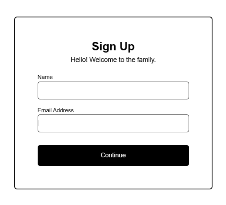
Right now, neither the “name” or “email” fields are required, but we want to make them both required before the user can successfully submit the form.
Also, we want to add validation messages to provide visual feedback when these fields are invalid so that users know what they need to do in order to complete the form.
So, how we do we do this?
Let’s start by taking a look at our form.component.ts, where the code for this form exists.
Here, we have a form that’s created using a FormGroup from the Angular forms module:
import { ..., FormGroup } from '@angular/forms';

protected form = new FormGroup<SignUpForm>({
    ...
});
Inside of this FormGroup we have our two controls, one for the “name” field, and another for the “email” address:
name: new FormControl<string>('', {
    nonNullable: true
}),
email: new FormControl<string>('', {
    nonNullable: true
})
These controls are created using FormControls, also from the forms module.
This FormGroup and these FormControls allow us to programmatically interact with and monitor the state of our form and its controls.
Now, let’s look at the template so we can understand how this all is used.
To wire up our FormGroup, we use the formGroup directive, and we pass it our “form” variable:
<div [formGroup]="form">
    ...
</div>
Then, nested within this group we provide our inputs where we use the formControlName directive:
<div [formGroup]="form">
    <label>
        <strong>Name</strong>
        <input type="text" formControlName="name" />
    </label>
    <label>
        <strong>Email Address</strong>
        <input type="email" formControlName="email" />
    </label>
    ...
</div>
That’s all it takes to make this an Angular form.
Ok, now let’s add some validation.
First let’s make our “name” field required.
For this, we add a “validators” property in the options for this FormControl.
Then, we can use the Validators class, also from the forms module.
From this class, we can use the “required” property:
import { ..., Validators } from '@angular/forms';

name: new FormControl<string>('', {
    nonNullable: true
})
Ok that’s it, this field is now required far as Angular is concerned.
Now, we can use this “required” status to provide some validation in the template.
Let’s start by adding a div with an “error” class.
<div class="error">
    Your name is required!
</div>
This class provides basic styles for our error messages.
Ok, now comes the cool part.
By default, this “error” class starts out hidden, but we can provide a “visible” class when we want to show it.
We’ll bind this class when the “name” field is invalid.
We can access the invalid state using our form group, then accessing its “controls” object, and then our “name” control where we can access the “invalid” status of this control:
<div
    class="error"
    [class.visible]="form.controls.name.invalid">
    ...
</div>
Ok, let’s save and check this out now:
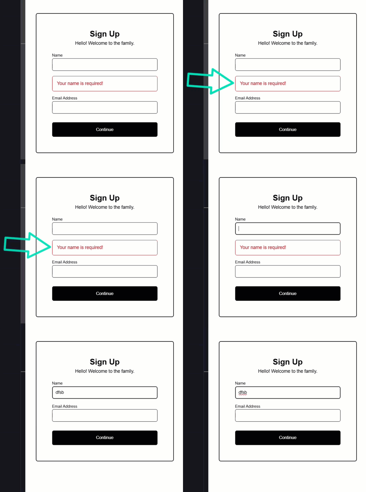
Ok, well it looks like it’s working.
Since this field is required, when no value has been added, it’s invalid so we see the message right out of the gate.
Then, as soon as we add content, it’s no longer invalid so the message is hidden.
Now, that’s cool, but we probably don’t want to show it when the user hasn’t even interacted with it yet, right?
Well, we can fix this pretty easily.
Providing a Validation Message Only After the Control Has Been Interacted With
With Angular forms, we have access to a “touched” state.
The control will be in this state once a user has interacted with the control and then blurred it.
So, we want to add this check to our condition:
<div
    class="error"
    [class.visible]="form.controls.name.invalid && form.controls.name.touched">
    Your name is required!
</div>
Also, while we’re doing this, I don’t like that we have to repeat “form.controls.name” for each of these conditions.
So, I’m going to add a template variable with a @let block for this which will allow us to shorten these to just “name” instead:
@let name = form.controls.name;
<div
    class="error"
    [class.visible]="name.invalid && name.touched">
    ...
</div>
Ok, let’s save and try this again:

Ok, that’s better, now we’re not seeing it initially.
Then, if we interact with it and blur, the message displays.
Then, if we enter content, the message hides again.
Adding a Multiple Validators to a Single Control
Now, the email field is a little different.
Not only does it need to be required, but it also needs to validate that the value is a properly formatted email address.
Well, this is pretty easy too.
Let’s start by adding the “validators” property to this control, but this time, we’re going to make it an array.
The first validator we need will be the required validator.
Then, the Validators class also provides an email validator, which is cool because this means we don’t need to create it from scratch right?
import { ..., Validators } from '@angular/forms';

email: new FormControl<string>('', {
    nonNullable: true,
    validators: [
        Validators.required,
        Validators.email
    ]
})
Ok, so that’s how you add multiple validation checks on a single Angular FormControl.
Now, let’s add some messages in the template.
First, let’s add a template variable for this field like we did for the “name” field:
@let email = form.controls.email;
Now, let’s add an “error” div again.
This message is a little more complicated than the “name” field since we need to show the “required” message when the user has only interacted and blurred the field, and then we need to show a the “email” message when they’ve added some content, but it’s not in the correct email format.
So, let’s add an @if condition using our “email” variable to call a “hasError()” function that we’ll pass the error we want to check against, in this case we’ll check if it’s “required”.
When it is required, we’ll display: “Your email is required!, when it’s not, we’ll display: “Please enter a valid email address!”:
<div class="error">
    @if (email.hasError('required')) {
        Your email is required!
    } @else {
        Please enter a valid email address!
    }
</div>
So those are the messages that we want to show, now let’s control when we show them.
Let’s bind the “visible” class again, checking for the “invalid” and “touched” statuses of the control:
<div
    class="error"
    [class.visible]="email.invalid && email.touched">
    ...
</div>
Ok, let’s save and try this now:
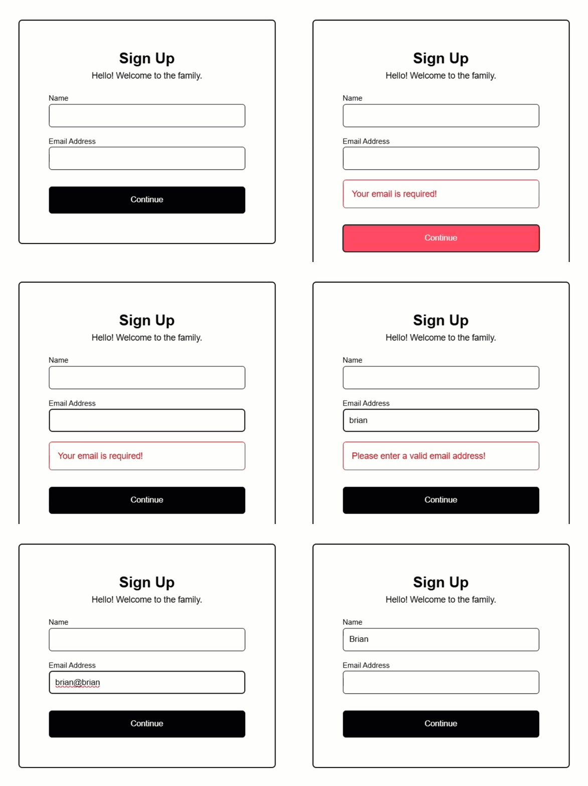
Ok, it’s properly hidden to start.
Then we can trigger the required message.
Then, when we have an invalid email, it displays the invalid email message.
And then, if we make it a valid format, the message is hidden.
Pretty cool stuff right?
And there’s still more!
A lot more actually, but I’m going to point out one more cool thing here.
Adding Validation Based on the Overall Form Group Status
Let’s say we want to make it a little more apparent when the form is invalid.
Let’s change this border around the form to red when the overall FormGroup is invalid:
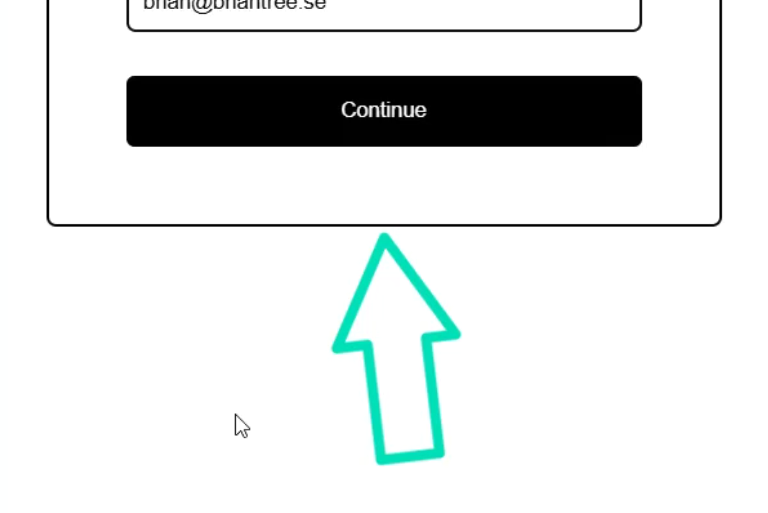
Well, just like with the individual form controls themselves, we can monitor the overall form validity and touched status.
We have an “invalid” class that we can bind to this container.
This class will make the border red.
Then, we can access the “invalid” state directly on the FormGroup itself.
Likewise, we can do the same with the “touched” state:
<article [class.invalid]="form.invalid && form.touched">
    ...
</article>
That’s it, let’s save and see it in action:
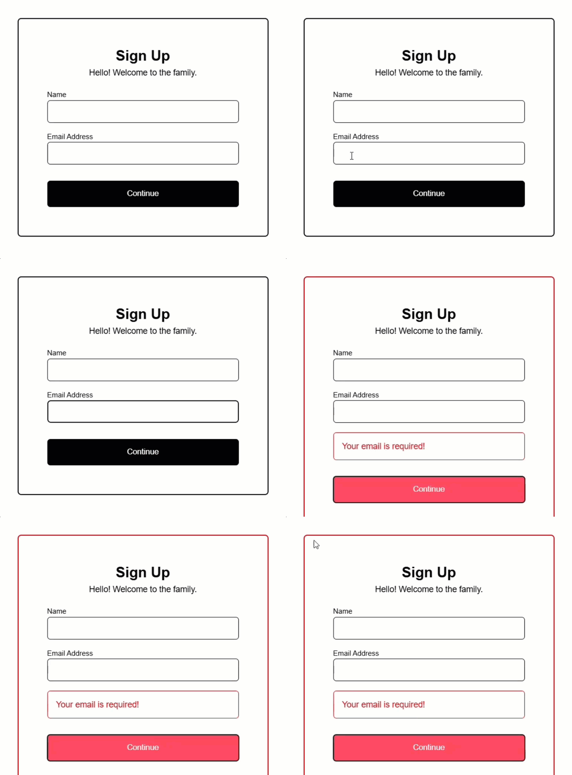
Ok, everything looks normal to start right?
But now once we trigger an error, this border turns red.
Pretty cool stuff right?
In Conclusion
Ok now you’ve learned how to add required validation, dynamic error messages, and even group-level visual feedback to your forms.
With these techniques, you can build forms that are not only functional but also user-friendly and intuitive.
Keep experimenting and applying these concepts to make your Angular forms stand out.
Don’t forget to check out my other Angular tutorials for more tips and tricks.
Additional Resources
- The demo BEFORE making changes
- The demo AFTER making changes
- Angular forms documentation
- Angular form validation documentation
Want to See It in Action?
Check out the demo code and examples of these techniques in the Stackblitz example below. If you have any questions or thoughts, don’t hesitate to leave a comment.


