Angular Directive Composition API: Enhance Components with Host Directives (v19+)
Applying multiple directives to components creates verbose templates and makes it easy to forget required directives. Angular's Directive Composition API lets you embed directives directly into components, creating reusable component behaviors that can't be accidentally omitted. This tutorial demonstrates how to use host directives to add functionality like auto-focus, click-outside detection, and accessibility features directly into components, reducing template complexity and improving maintainability.
The Starting Point: A Simple Signup Form
Here’s the base app we’re starting with — it’s just a simple sign-up form with “name” and “email address” inputs, and a plain old “save” button:
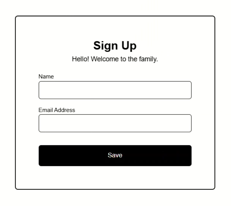
Nothing fancy yet, but that’s about to change.
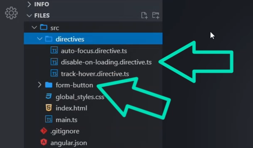
I’ve already created some example directives for this tutorial and what we want to do is apply all of these to this button to enhance the functionality:
Controlling Focus with the Auto-Focus Directive for Better UX
The first directive we’ll be adding is the auto focus directive:
import { Directive, ElementRef, afterNextRender, inject } from "@angular/core";

@Directive({
  selector: "[appAutoFocus]",
})
export class AutoFocusDirective {
  private elementRef = inject(ElementRef<HTMLElement>);

  constructor() {
    afterNextRender(() => {
      this.elementRef.nativeElement.focus();
    });
  }
}
It uses the afterNextRender function to focus the host element as soon as it’s rendered.
This is handy for forms where you want the user to land right on the first interactive element.
To add this directive, let’s open up the root app component.
Here, we’ve got the form markup in the template:
<form>
  <header>
    <h2>Sign Up</h2>
    <em>Hello! Welcome to the family.</em>
  </header>
  <div>
    <label>
      <strong>Name</strong>
      <input type="text" autocomplete="off" />
    </label>
  </div>
  <div>
    <label>
      <strong>Email Address</strong>
      <input type="email" autocomplete="off" />
    </label>
  </div>
  <button appFormButton>Save</button>
</form>
There’s a “name” input, an “email address” input, and our “save” button at the bottom.
This save button is actually using our form button component which we can see with the “appFormButton” attribute selector on the button itself:
<button appFormButton>Save</button>
Let’s enhance the functionality of this button.
To add the directive, let’s add the “appAutoFocus” attribute right on the button:
<button appFormButton appAutoFocus>Save</button>
Then, in order for this to be added to the button properly, we need to add the directive to the imports array of the component:
import { AutoFocusDirective } from './directives/auto-focus.directive';

@Component({
  selector: 'app-root',
  ...,
  imports: [..., AutoFocusDirective],
})
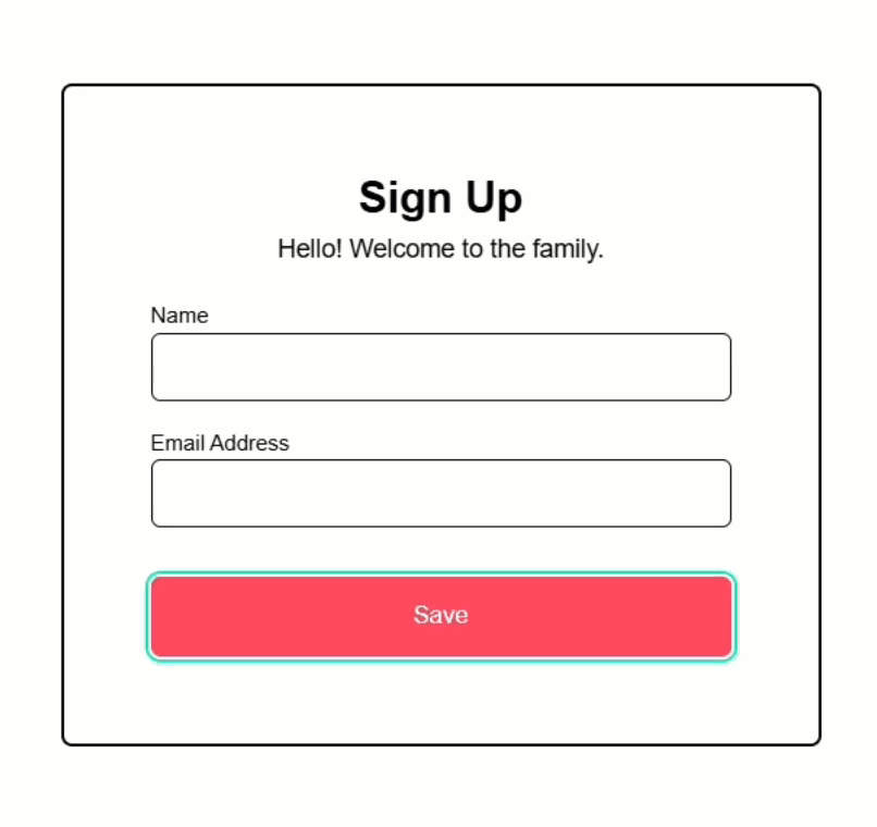
Ok, now let’s save and see if this works:
Nice, now the button is focused automatically!
The pink-ish color and the blue-green outline are styles that are applied to the button when it’s focused.
Monitoring Hover with the Hover Tracker Directive
Next, we have the track hover directive.
This one listens for pointerenter and pointerleave events using the host metadata, and injects a little “Hovering!” message when you hover over the element:
import {
  Directive,
  ElementRef,
  inject,
  Renderer2,
  signal,
} from "@angular/core";

@Directive({
  selector: "[appTrackHover]",
  host: {
    "(pointerenter)": "this.showHoverMessage()",
    "(pointerleave)": "this.removeHoverMessage()",
  },
})
export class TrackHoverDirective {
  private elementRef = inject(ElementRef<HTMLElement>);
  private renderer = inject(Renderer2);
  private tooltip?: HTMLElement;

  private showHoverMessage() {
    this.tooltip = this.renderer.createElement("span");
    this.renderer.addClass(this.tooltip, "hovering");
    this.tooltip!.textContent = "👋 Hovering!";
    this.renderer.appendChild(this.elementRef.nativeElement, this.tooltip);
  }

  private removeHoverMessage() {
    if (this.tooltip) {
      this.renderer.removeChild(this.elementRef.nativeElement, this.tooltip);
      this.tooltip = undefined;
    }
  }
}
It uses Renderer2 to create and clean up the tooltip element.
Now, a directive like this would probably be used for something like stats or analytics in the real world, but for this demo, it just shows a simple message.
Like the last example, this is really easy to add to our button, we just add the selector right on the button element:
<button appFormButton appAutoFocus appTrackHover>Save</button>
Then we need to import it in the component imports array:
import { TrackHoverDirective } from './directives/track-hover.directive';

@Component({
  selector: 'app-root',
  ...,
  imports: [..., TrackHoverDirective],
})
Ok, now we can save:
And when we hover over the button, boom — there’s our “Hovering” message.
It’s injected directly into the DOM by the directive and disappears when we move the mouse away.
Disabling the Button While Loading with the Disable on Loading Directive
The last directive we’re going to add is the disable on loading directive:
import { Directive, input } from "@angular/core";

@Directive({
  selector: "[appDisableOnLoading]",
  host: {
    "[disabled]": "this.loading()",
  },
})
export class DisableOnLoadingDirective {
  loading = input<boolean>(false);
}
This one uses an input() signal to determine whether the host element should be disabled.
The actual disabling is done declaratively from the parent and then the disabled attribute is bound on the host element in the host metadata based on the value of the input.
Let’s wire it up on our button.
First, like the others, we need to add the directive selector to the button:
<button appFormButton appAutoFocus appTrackHover appDisableOnLoading>
  Save
</button>
And we need to import it too:
import { DisableOnLoadingDirective } from './directives/disable-on-loading.directive';

@Component({
  selector: 'app-root',
  ...,
  imports: [..., DisableOnLoadingDirective],
})
But this one is a little more complicated.
We need to pass the loading state to the input for the directive, but we don’t have anything for this just yet.
Let’s start by adding an “isSaving” signal with an initial value of false.
protected isSaving = signal(false);
This will track whether we’re currently saving the form or not.
We’ll also create another signal called “saveStatus”, which will hold a success message once the save is complete.
protected saveStatus = signal("");
Now, we need to add a function to set these signals that will be called when the button is clicked.
Let’s call it handleClick().
When the button is clicked, we’ll set “isSaving” to true, then simulate a delay using setTimeout.
After 4 seconds, we’ll mark “isSaving” as false and update the status message:
protected handleClick() {
  this.isSaving.set(true);
  setTimeout(() => {
    this.isSaving.set(false);
    this.saveStatus.set('Data saved successfully!');
  }, 4000);
}
Now let’s actually bind the isSaving() signal to the “loading” input for our appDisableOnLoading directive:
<button ... appDisableOnLoading [loading]="isSaving()">Save</button>
Then, we’ll use click event binding to call our handleClick() function when the button is clicked:
<button ... appDisableOnLoading [loading]="isSaving()" (click)="handleClick()">
  Save
</button>
Lastly, we want to show our success message when the “saveStatus” exists after the simulated save completes:
@if (saveStatus()) {
<p>✅ {{ saveStatus() }}</p>
}
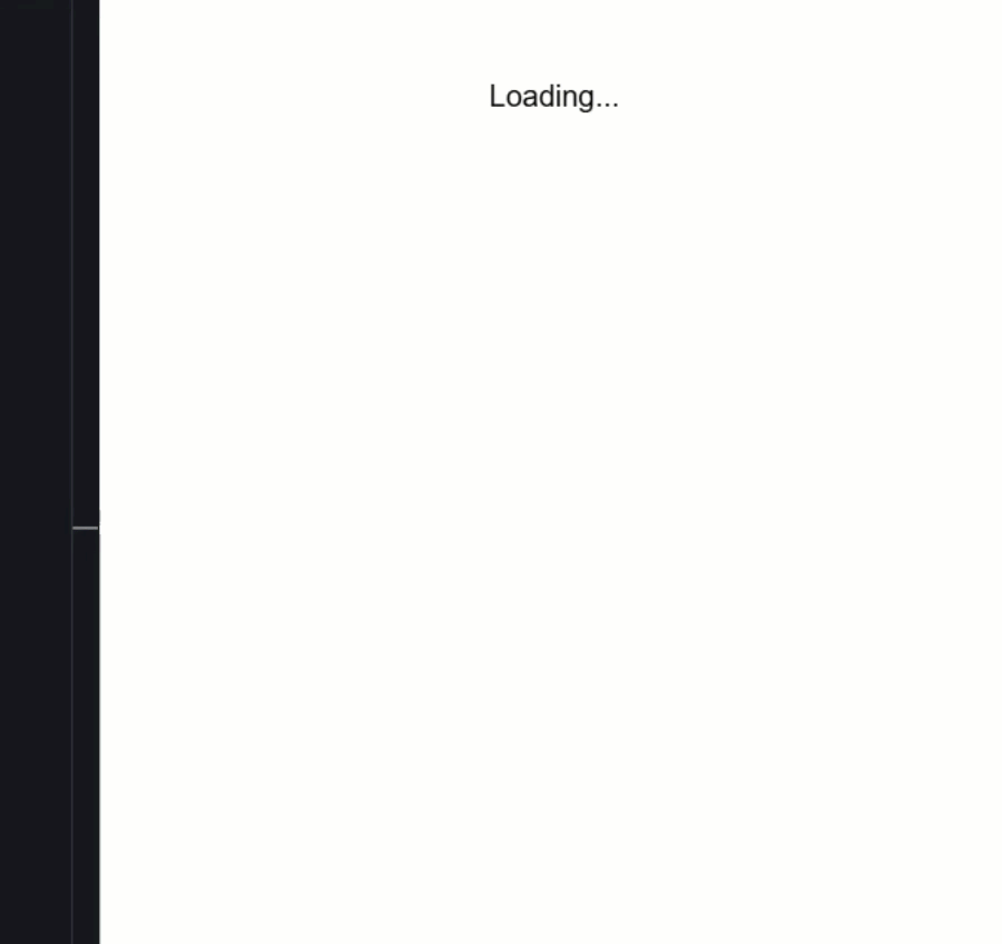
Ok, that should be everything we need, let’s save and try it out:
Now, when you click the button, it becomes disabled, that’s our directive in action, and after 4 seconds, the message appears confirming the data was saved.
So, this is all cool, right?
We’ve added a lot of functionality to this button now with these directives.
But what if we want this functionality to be included with this button component every time we add it?
Well, we could add the code from each of the directives to the code for the component, but that’s not a great idea because we may want to use these directives outside of this component too.
So, what else can we do?
Composing Directives with hostDirectives and the Directive Composition API
Well, we can actually add these directives to the form button component with the hostDirectives property.
In this array, we can add whatever directives we want to the host of this component, so let’s add the auto focus directive first.
import { AutoFocusDirective } from '../directives/auto-focus.directive';

@Component({
  selector: '[appFormButton]',
  ...,
  hostDirectives: [
    { directive: AutoFocusDirective }
  ],
})
Now, we can remove it from the root component too.
And that’s it, let’s save and make sure it still works:
Nice, the button still gets focused when it’s initialized, but now our root component is simpler, no need to apply the directive manually.
So, let’s go ahead and add the track hover directive now:
import { TrackHoverDirective } from '../directives/track-hover.directive';

@Component({
  selector: '[appFormButton]',
  ...,
  hostDirectives: [
    ...,
    { directive: TrackHoverDirective }
  ],
})
Then, we need to remove it from the root app component too.
Ok, now let’s save again and make sure it still works properly:
Nice, it looks like we still get the “Hovering” message when we hover over the button.
All without repeating logic in the main app component.
Passing Inputs with the Directive Composition API
Finally, let’s add the disable on loading directive to the component too.
But this one is a little different because it has an input, right?
Well, to do this, we can add the inputs array where we can simply pass our “loading” input to the directive:
import { DisableOnLoadingDirective } from '../directives/disable-on-loading.directive';

@Component({
  selector: '[appFormButton]',
  ...,
  hostDirectives: [
    ...,
    {
      directive: DisableOnLoadingDirective,
      inputs: ["loading"]
    }
  ],
})
Then, we can remove this directive from the root app component too, but we will need to keep the “loading” input and the handleClick() function too:
<button appFormButton [loading]="isSaving()" (click)="handleClick()">
  Save
</button>
Now, when we save, everything should work the same:
And it looks like it does, nice!
The button disables during saving, shows the hover message, and gets autofocus.
But now all of that is encapsulated in one clean, reusable component.
We don’t need to add all of these directives to the button each time we use it.
Conclusion: Clean, Reusable, and Powerful
And that’s it!
We took three Angular directives and composed them into a form button using hostDirectives and the Directive Composition API.
This keeps our app clean and makes the button logic reusable across the entire app.
If you found this helpful, don’t forget to subscribe and check out my other Angular tutorials for more tips and tricks!
Additional Resources
- The demo app BEFORE any changes
- The demo app AFTER making changes
- Directive Composition API Documentation
- Custom Directives Documentation
- Angular Signals Documentation
- Videos About Angular Signals
- My course: “Styling Angular Applications”
Want to See It in Action?
Check out the demo code showcasing these techniques in the StackBlitz project below. If you have any questions or thoughts, don’t hesitate to leave a comment.