Angular Form Accessibility: Make Forms Accessible for Everyone
Inaccessible forms exclude millions of users and violate accessibility standards, yet many Angular developers overlook basic accessibility practices. Screen reader users, keyboard-only users, and people with motor impairments need properly labeled fields, clear error messages, and keyboard navigation support. This tutorial demonstrates how to make Angular forms accessible by adding proper labels, ARIA attributes, keyboard support, and visual indicators. You'll learn techniques that improve usability for everyone while ensuring compliance with WCAG guidelines.
Angular Forms Tutorial Series:
- Create a Basic Form Control - Learn form control basics
- Form Validation Basics - Learn form validation fundamentals
- Migrate to Signal Forms - Modern Signal Forms migration
The Existing, Partially Accessible Form
For this example, we’ll be working with the form that we created in a previous tutorial about Reactive form controls in Angular. If you haven’t seen that tutorial, you’ll probably want to read it first because this tutorial might not make as much sense if you don’t.
If you’d rather watch a video, check it out below:
When it comes to Angular forms, there are several common accessibility challenges that we need to be aware of.
Including Proper Form Labels
One of the most critical issues is missing or incorrect label tags, which can make it impossible for screen readers to properly announce the form fields to users who rely on them.
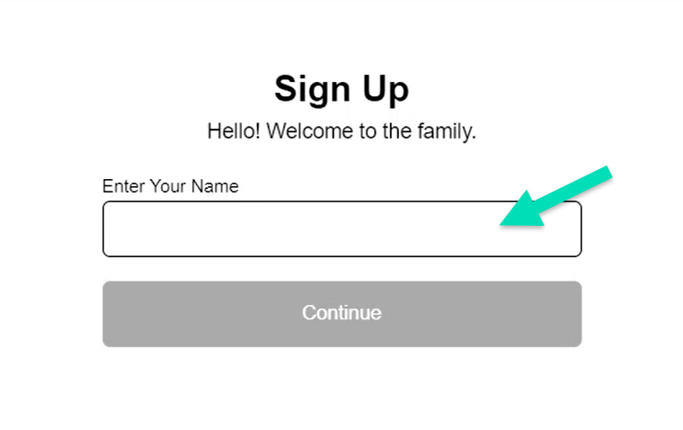
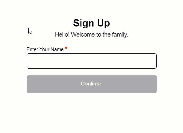
Here, in our form component, we do actually already have this handled correctly. Mostly anyway…
form.component.html
<label>
    <strong>Enter Your Name</strong>
    <input type="text" [formControl]="name" />
</label>
Our input is placed within the label element which will properly associate the “Enter Your Name” text description with the input.
Keyboard Navigation and Focus Management
Another challenge is the lack of keyboard navigation which can prevent users, who can’t use a mouse, from interacting with our form.
Now, this type of thing normally happens when we create custom controls where we’re not using native web form controls like inputs and buttons.
This can be common practice in Angular apps, but this example is a simple form and we are using a standard text input field and a button. So this shouldn’t be an issue for us. Both of them will automatically receive focus when tabbing through the form.
So, this form is not horrible accessibility-wise, but there are several things we can do to make it more accessible. Let’s explore some practical tips and techniques for improving this form.
Enhancing Accessibility for the Angular Form
First and foremost, we need to ensure that our form fields have proper label tags, which should be programmatically associated with their respective fields.
Now, as we already learned, we’re already good here with the use of the label element. But we are actually missing some information.
The name field is required, yet a person using assistive technology to navigate our form would have no idea that they must enter this information before moving on.
We need to make them aware.
Adding the Appropriate Required Information
There are few things that we should do for this. First, we should add the HTML required attribute to the form field:
form.component.html
<input type="text" [formControl]="name" required />
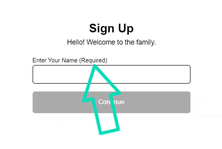
Next, we should add some additional information to the label to help describe the fact that it’s required.
Let’s add a span, and let’s add the word “required” within it:
form.component.html
<label>
    <strong>
        Enter Your Name
        <span>(Required)</span>
    </strong>
</label>
So now, a screen reader will announce the label, and it will include the word “required” which helps convey its required status to the user.
Using CSS to Visually Hide Text Accessibly
Often times, the design for our forms may require us to hide this additional “required” label and mark this in some sort of visual manner instead.
To hide this text in an accessible way, we need to be careful in how we do it. Using CSS like display: none or opacity: 0 can actually prevent this text from being read by screen readers. Luckily, we do have a recommended set of styles to use for this “visibility hidden” concept.
Using the CSS clip property, along with position: absolute, and several other styles, we have a widely accepted pattern to hide things without harming their accessibility.
form.component.scss
.visually-hidden {
    border: 0;
    clip: rect(0 0 0 0);
    height: 1px;
    margin: -1px;
    overflow: hidden;
    padding: 0;
    position: absolute;
    width: 1px;
    white-space: nowrap;
    outline: 0;
    left: 0;
}
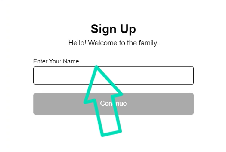
So, we can add this “visually-hidden” class to our span:
form.component.html
<label>
    <strong>
        Enter Your Name
        <span class="visually-hidden">(Required)</span>
    </strong>
</label>
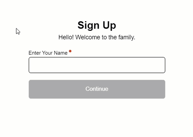
Now, we should see the required text hidden, but it will still be processed correctly by assistive technologies:
Adding Visual Representation of Required Status with CSS
We still want to mark this field as required visually so that it’s clear for sighted users as well.
In the CSS, for our strong element, we’ll add styles to an ::after pseudo element to create a little red dot after the label text.
form.component.scss
strong::after {
    content: '';
    height: 0.5em;
    width: 0.5em;
    background-color: red;
    border-radius: 50%;
    display: inline-block;
    vertical-align: text-top;
}
There, now after we save, we should have a visual representation of the required status of this field:
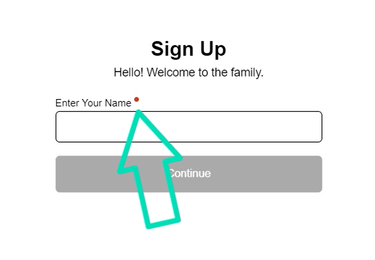
This just makes it more accessible for everyone, even sighted users.
Enhancing the Visual Feedback for Focus States
Speaking of the visibility of things, when we tab to our textbox and then to our button, we do get an outline on these controls:
It’s not horrible, but it can easily be made a little more clear and made to work more consistently across different browsers.
So, let’s add some styles for our input and button focus states. Let’s add a consistent outline, let’s use “skyblue” for the color:
form.component.scss
input,
button {

    &:focus {
        outline: solid 0.25em skyblue;
    }

}
This will be similar to what we just saw before the change, just a different color. But this way it will be more consistent in Safari, Firefox, you name it.
Now to make it stand out a little more, let’s offset it from the control a little bit:
form.component.scss
input,
button {

    &:focus {
        outline: solid 0.25em skyblue;
        outline-offset: 0.25em;
    }

}
Ok, now when we tab between the field and the button, the outline should stand out a little more:
Not a huge difference but should be pretty apparent now.
This just helps those with vision impairments understand where they are focused easier. And realistically it helps the rest of us too.
Setting the Submit Button as the Default Button for the Form
Now, to make this form easier to use, we should make the submit button the default button for the form.
What I mean by this is, when we’re focused within the form, if we hit the enter key, the submit action should automatically fire.
The easiest way to do this is to wrap the form contents in an HTML form element:
form.component.html
<form>
    <label>
        ...
        <input type="text" [formControl]="name" required />
    </label>
    <button>
        Continue
    </button>
</form>
And that’s it. We shouldn’t need to do anything else which may seem odd because we’re using the “click” event on our button to submit our form:
form.component.html
<button (click)="submitted = name.valid;" ...>
    Continue
</button>
The “click” event actually fires on activation. So, with this being our default button now, when we click, or use the enter key, or even the spacebar, the button will be activated.
Ok, now we should be able to focus the field, add a value, then hit enter, and it should submit the form without needing to click the button:

Enhancing the Accessibility of the Inline Validation for the Form Control
Ok, at this point, we’ve added some great enhancements, and this form is sure to be easier to use. But one area that we haven’t yet focused on is the validation aspect.
How do we let the user know that they’ve made a mistake, or missed something?
Well, you may have seen the “Your name is required!” error message display as we’ve been working with this form.
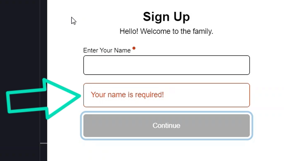
This is great for users who can see it, but for those that can’t, they won’t know it exists. But we can actually associate this message with the form field programmatically.
For this we’ll add an aria-describedBy attribute to our input element. This attribute requires a list of ids for the elements that describe it.
We can think of our error message as something that helps describe this field. So, we need to add an id to this element, let’s call it “nameError”:
form.component.html
<div id="nameError" ...>
    Your name is required!
</div>
Now we can pass this id to the aria-describedBy attribute:
form.component.html
<input aria-describedby="nameError" ... />
There, now this message will be announced by screen readers.
Enhancing the Overall Angular Form Validation
Next, we need to handle how we react when the submit button is activated while the form is invalid.
Here in this example we’re lucky because it’s a very simple form. If it were a larger form with multiple fields requiring validation, we’d have to handle the possibility for multiple invalid fields.
Here though, we’re only concerned with the single name form control. If it’s valid, we simply submit the form. Easy right? If not, we simply need to focus the field.
Now, it’s important to mention here, I’m using a class and CSS to make the button appear disabled while the form is invalid.
form.component.html
<button [class.disabled]="name.invalid" ...>
    Continue
</button>
This is important because I often get the question, “why not use the HTML disabled attribute?”. The reason I don’t use it is because making it disabled will take the button out of the tab order.
So, a user navigating via the keyboard, or some other assistive technology would tab right on by not knowing that’s the end of the form.
This is a problem because these users may want to navigate to the end of the form to discover what’s being requested of them before filling it all out. So, the disabled attribute should be avoided for this type of thing.
Ok, to handle the focusing when invalid, let’s add a new function to submit the form, let’s call it submitForm():
form.component.ts
protected submitForm() {
}
We’ll call this function when the button is activated so within it, we’ll set our “submitted” property just like we were in the template, based on the valid state of the form control:
form.component.ts
protected submitForm() {
    this.submitted = this.name.valid;
}
Now, we can add a condition to set focus. So, if “submitted” is false, we’ll want to programmatically focus the input:
form.component.ts
protected submitForm() {
    ...
    if (!this.submitted) {
    }
}
Now, to focus this field, we need to get a handle to the input element, so let’s add a “field” parameter to our function. It will be typed to an HTMLInputElement since we’ll be passing it our name input element:
form.component.ts
protected submitForm(field: HTMLInputElement) {
    ...
}
Ok, now we can programmatically focus this element when “submitted” is false:
form.component.ts
protected submitForm(field: HTMLInputElement) {
    ...
    if (!this.submitted) {
        field.focus();
    }
}
Now, the last thing we need to do is prevent the form from natively submitting in the browser since we handle the form submission ourselves. We will need to prevent the default action of the button.
To do this, we can pass the click event to the submitForm() function as a parameter. It’ll be typed to a MouseEvent:
form.component.ts
protected submitForm(field: HTMLInputElement,
                     event: MouseEvent
) {
    ...
}
Now, within our function, we want to prevent the default action of this event since we handle everything ourselves:
form.component.ts
protected submitForm(field: HTMLInputElement,
                     event: MouseEvent
) {
    event.preventDefault();
    ...
}
Ok, now we just need to wire this up in the template. Let’s add a template reference variable on the input element, we’ll call it “nameField”.
form.component.html
<input #nameField ... />
Ok, now in the click event on the button, let’s replace this with the submitForm() function, and we’ll pass it our input element reference. We’ll also need to pass along the click event too:
form.component.html
<button (click)="submitForm(nameField, $event)" ...>
    Continue
</button>
Ok, that should be all that we need. Let’s save it and try it out:
Now, when we tab to the name field, and then to the button, when we hit enter, now we see that it no longer reloads and instead focuses the name field like we want.
And then, if we add a valid name, we can properly submit the form.
So now it’ll be much less confusing to the user.
In Conclusion
So, by following these tips, we can greatly enhance the accessibility of our Angular form, making it usable by a much wider range of users.
In this particular case, we had an application that, if used by people with disabilities, would be fairly inaccessible to them. By implementing the strategies we just covered, we were able to make the form much more accessible.
The importance of making Angular forms accessible cannot be overstated. By following these strategies, we can ensure that our application is usable by everyone, regardless of their abilities.
That’s why I want to leave you with a sense of responsibility to prioritize accessibility in your own projects.
Now, if you’ve made it this far, I’d love to hear from you in the comments below! Have you had any experiences with making forms accessible in Angular? Do you have any tips or tricks to share?
Be sure to check out my YouTube channel for more Angular tips and tutorials, and let’s keep the conversation going!
Additional Resources
- The demo BEFORE making any changes
- The demo AFTER adding accessibility changes
- W3C WAI Accessible Forms Tutorial
Want to See It in Action?
Check out the demo code and examples of these techniques in the Stackblitz example below. If you have any questions or thoughts, don’t hesitate to leave a comment.


