Angular Component Selectors: Complete Guide to Element, Attribute, and Class Selectors
Choosing the wrong component selector in Angular creates maintenance issues, breaks encapsulation, and limits component flexibility. Angular supports three selector types—element, attribute, and class—each with different use cases and trade-offs. This tutorial demonstrates all component selector options in Angular, helping you choose the right selector for your component based on reusability, styling needs, and integration requirements.
Custom Elements as Component Selectors: The Default
By default, when you generate a new Angular component, the selector will be a custom element.
In our app here, we can see this exact thing in our icon-button.component.ts:
@Component({
    selector: 'app-icon-button',
    ...
})
When it was generated, it was generated with this custom element selector.
Then, whenever we want to use this component, we need to add this custom element:
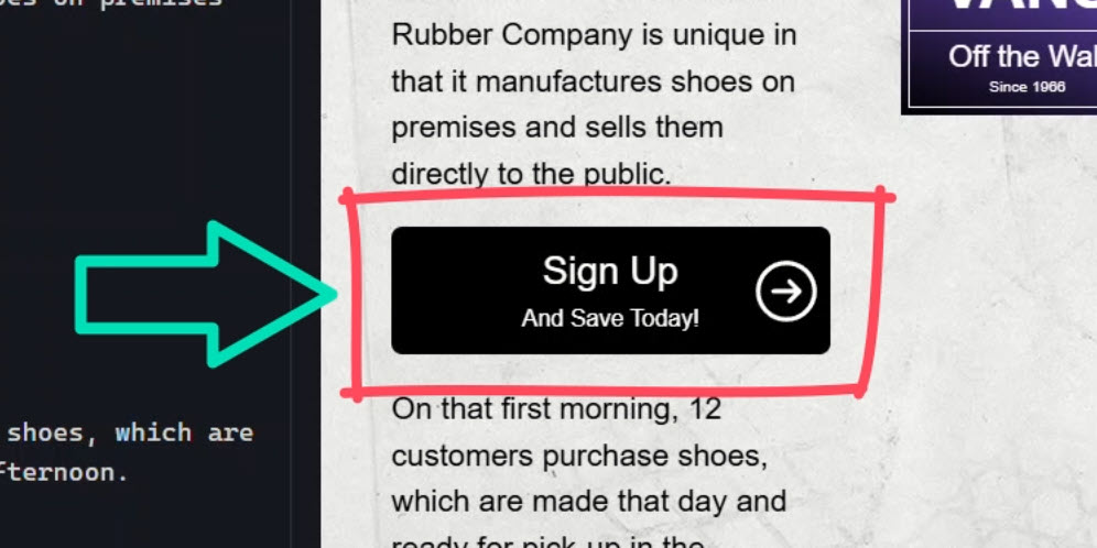
<app-icon-button (clicked)="signUp()" label="Sign Up" message="And Save Today!">
</app-icon-button>
So, this works well in many cases, but in this particular case it’s not great.
With a standard HTML button we’d have direct access to the click event, but since this component uses a custom element for the selector, the button is added within the template:
<button (click)="clicked.emit()">
  ...
  <button></button>
</button>
This requires us to add an output to emit the click event from the button so that we can properly react to it in the parent component.
So, we can use a custom element, and in many cases this will work great, but sometimes we may want/need to use something else as the selector.
Luckily, Angular provides several different options for component selectors.
Using Native HTML Elements as Component Selectors
In this case, the ideal scenario would be for us to target the HTML button element generically as our component host right?
Well, this is actually supported.
We can simply use an existing HTML element as a selector:
@Component({
    selector: 'button',
    ...
})
Ok, now that we’re using the button element as the selector, we are able to remove the old click output since we’ll now have direct access to the button’s click event in the parent component.
We can also remove the button from the template.
Then, we just need to change our old app-icon-button custom element to a standard HTML button, and we can switch the old output to a standard click event:
<button (click)="signUp()" label="Sign Up" message="And Save Today!"></button>
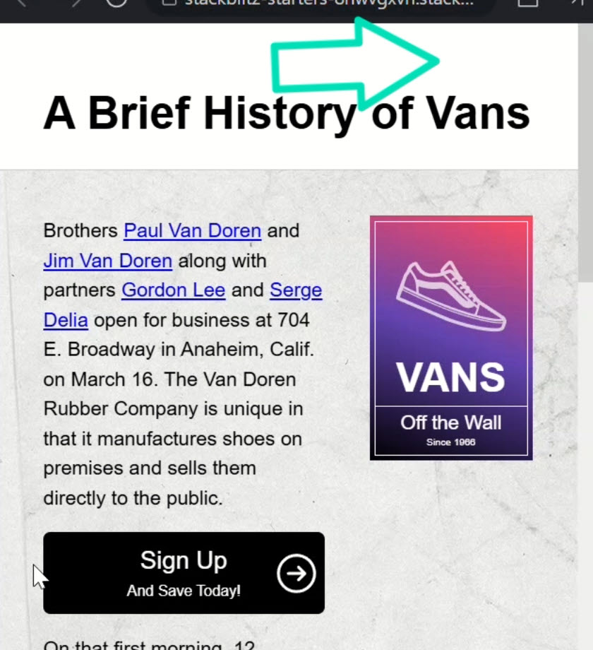
Ok, let’s save and make sure this all works correctly still:
Yep, everything looks good right?
So, we can use an existing HTML element as the selector, but this may not be a great idea in this case either because it means that every button in this app will now become an icon-button component.
Most likely, we don’t want this.
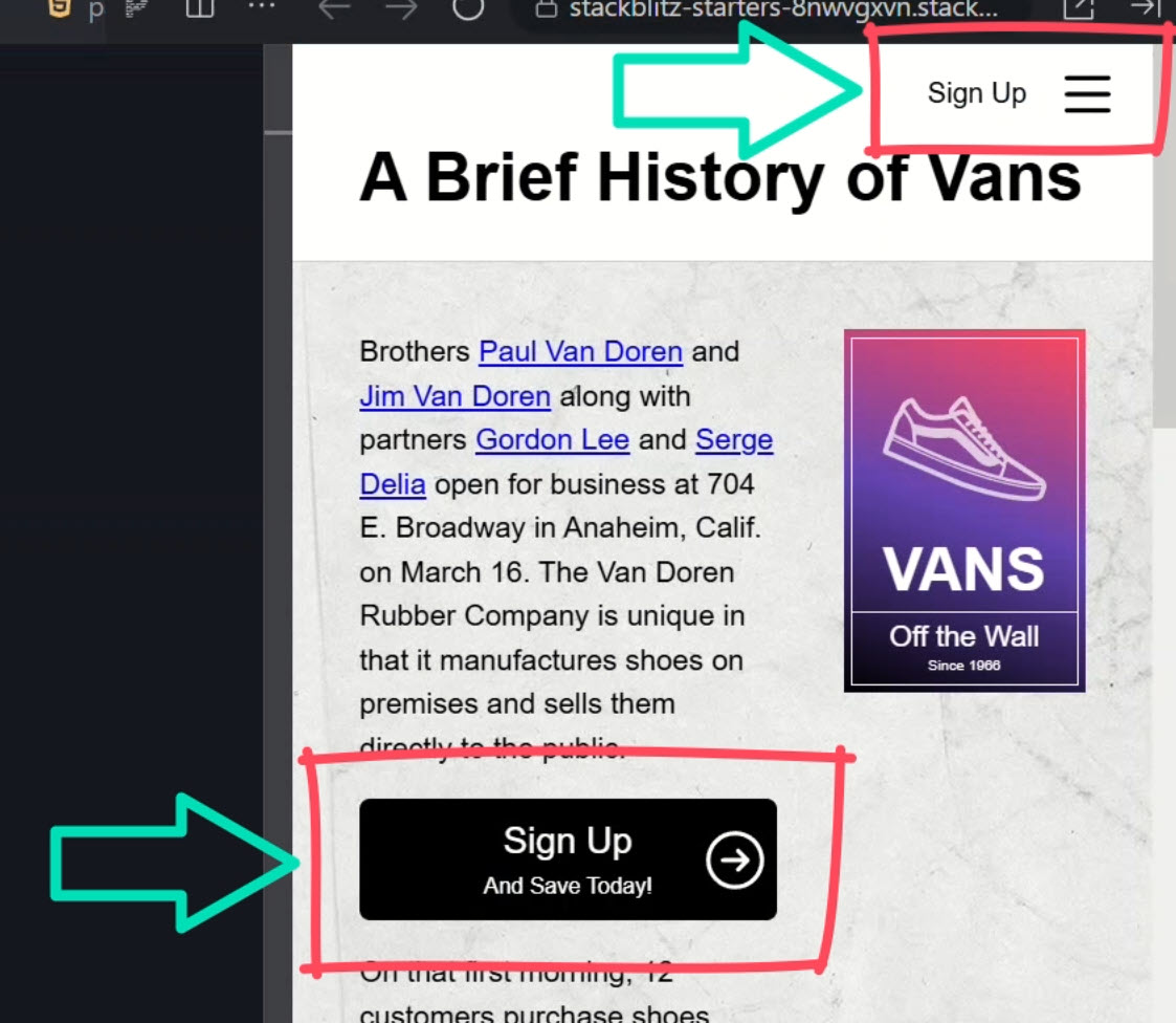
As a matter of fact, we have two buttons right in the page.component.html that have been negatively impacted by this change:
<button class="signUp">...</button> <button class="menu">...</button>
Normally these buttons are displayed in the upper right corner of the page, but since they are now icon-button components, they’re no longer displayed correctly:
Filtering Elements with :not() – A Smart Exclusion Trick
Well in this case, we have another option.
The CSS :not() pseudo class is supported in the component selector too.
So here, we could omit the button with the “signUp” class as well as the button with the “menu” class:
@Component({
    selector: 'button:not(.signUp):not(.menu)',
    ...
})
This will now ignore these two buttons leaving them as they were.
Let’s save and see if we get these buttons back now:
Nice, those buttons are back, and our icon-button component is still working correctly too.
So, the :not() pseudo class provides us with another option, but again in this case it’s probably not exactly what we’d want because as the app grows, this list of buttons to ignore will continue to grow too.
Attribute-Based Selectors: A Flexible Approach
Well, we have yet another option.
Angular also supports attributes as a selector.
These attributes could be known HTML attributes like href, src, title, or they could be custom attributes that we define ourselves.
Let’s change the selector to a custom attribute instead, it will need to be wrapped in square brackets just as if we were using it as a CSS selector in a stylesheet:
@Component({
    selector: '[appIconButton]',
    ...
})
Now we just need to add this attribute to our button:
<button
  appIconButton
  (click)="signUp()"
  label="Sign Up"
  message="And Save Today!"
></button>
Ok, now let’s save and see if this still works correctly:
Yep, looks good right?
So, this is a great option for this scenario.
Most likely, this is what I would choose for this sort of thing.
But we do still have a few more options.
CSS Class-Based Component Selectors
Angular supports using a CSS class as a selector.
So, we can switch this to a standard CSS class selector instead:
@Component({
    selector: '.appIconButton',
    ...
})
Then, we need to add this class to our button element and we can remove the custom attribute that we were just using:
<button
  class="appIconButton"
  (click)="signUp()"
  label="Sign Up"
  message="And Save Today!"
></button>
Ok, let’s save and make sure this works:
Nice, so we can use a CSS class as a selector too.
So we’ve seen several different options for component selectors, and there’s still one more!
Combining Selectors for Precision Targeting
Angular supports combinations of selectors too.
Let’s say we want to target an HTML button element but only when it has the .appIconButton CSS class on it.
Well, we can add this combination as a selector too:
@Component({
    selector: 'button.appIconButton',
    ...
})
We don’t need to change anything else since it was already a button with this class in our template, so let’s save and make sure this still works correctly:
Yep, there it is.
So, we can even use more complex combinations of selectors if needed.
Defining Multiple Selectors for Maximum Flexibility
Ok, if all of this wasn’t enough, we have more options when it comes to component selectors.
We can provide multiple selectors if needed.
In this case we already match on buttons with the .appIconClass selector, but what if we needed to use other selectors too?
Well, we can simply provide a comma-separated list and add more selectors as needed.
Like if we want to support the custom attribute and the custom element, we can simply add them to the list:
@Component({
    selector: 'button.appIconButton, [appIconButton], app-icon-button',
    ...
})
So now, to add this component, we can add a button with the .appIconButton class, we can add the custom appIconButton attribute to any element, or we can add the app-icon-button custom element.
Any of these options will work now.
So, we have a lot of different options when it comes to component selectors, but looking at this example, I would say that the right fit here is the attribute selector.
Custom Selector Prefixes in Angular
It’s also important to note that the Angular team recommends using a standard short prefix for custom element and attribute selectors for components.
By default, the Angular CLI uses a prefix of “app”, so that’s what we’re using here.
You can customize this prefix in the config for your own app or Angular library.
It’s a good idea to follow this format to keep your code more organized and to be able to tell what’s going on at a glance.
Which Angular Selector Will You Use?
So there you have it! Angular gives us a ton of flexibility when it comes to component selectors, from custom elements to HTML tags, attributes, and even class-based selectors.
Plus, we can fine-tune things with :not() and even combine selectors for more precision.
Choosing the right selector can make a big difference in how your components behave and interact in your app.
In this case, the attribute selector was the best fit, but depending on your use case, another option might be better!
If you found this helpful, don’t forget to check out my other Angular tutorials for more tips and tricks!
Additional Resources
- The demo BEFORE making changes
- The demo AFTER making changes
- Angular component selectors documentation
- My course: “Styling Angular Applications”
Want to See It in Action?
Check out the demo code and examples of these techniques in the Stackblitz example below. If you have any questions or thoughts, don’t hesitate to leave a comment.