Angular Content Projection: Complete Guide to ng-content and Slots
Content projection is one of Angular's most powerful features for building flexible, reusable components. Instead of hardcoding content inside components, you can create "slots" where parent components inject their own content. This tutorial covers everything from basic single-slot projection to advanced multi-slot patterns and fallback content. You'll learn how to build components that adapt to different use cases without duplicating code.
From Web Components to Angular: The Power of Content Projection
The idea of content projection actually comes from Web Components.
At its core, it’s about punching “holes” in a component where you can insert unique content, whether that’s plain text, custom markup, or even other components.
These “holes” are called slots.

Think of them as placeholders for content that comes from outside the component.
This is super useful because it lets you inject custom content into specific regions of a component without mixing up the DOM trees.
It keeps everything clean and organized.
And the best part?
Angular fully supports this concept.
In Web Components, we use the HTML <slot> element for content projection.
But in Angular, we use a special element called <ng-content>.
Let’s dive into an example to see how it works!
Basic Content Projection with <ng-content>
Alright, let’s imagine we’ve got a growing Angular application, and we’re starting to sprinkle a bunch of message sections throughout the app:
Now, since we’re repeating the same markup with just different content each time, it makes sense to turn this into a presentational component.
Great idea, right?
So, we’ve already started creating a message component to handle this.
But here’s the challenge, we’re dealing with dynamic content.
We can’t rely on these regions just having simple strings of text.
The content could be anything, headings, paragraphs, lists, or even more complex markup.
So, how do we handle this?
We need to use Content Projection of course!
We want to project any unknown content into the <article> element within the message component template:
<svg>...</svg>
<article>
    <!-- Any content will be inserted here -->
</article>
To do this, we just add an <ng-content> element inside the <article>:
<svg>...</svg>
<article>
    <ng-content></ng-content>
</article>
Now, when the component is rendered, any content we place between the opening and closing tags of this component will get injected right here inside the article.
Now, let’s switch to the main app component and import our new message component:
import { MessageComponent } from './message/message.component';

@Component({
  selector: 'app-root',
  ...,
  imports: [ MessageComponent ]
})
Once that’s done, we can simply replace all of the <div> elements with our new message component:
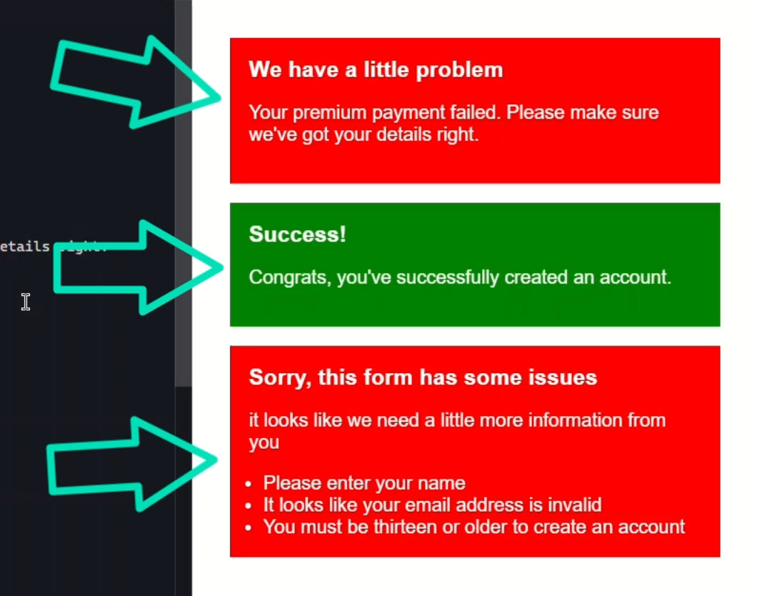
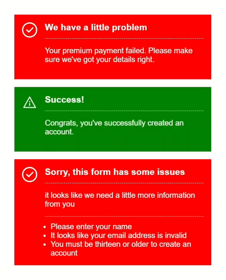
Before:
<div class="error">
    <h3>We have a little problem</h3>
    <p>Your premium payment failed. Please make sure we've got your details right.</p>
</div>
<div class="success">
    <h3>Success!</h3>
    <p>Congrats, you've successfully created an account.</p>
</div>
<div class="error">
    <h3>Sorry, this form has some issues</h3>
    <p>It looks like we need a little more information from you</p>
    <ul>
        <li>Please enter your name</li>
        <li>It looks like your email address is invalid</li>
        <li>You must be thirteen or older to create an account</li>
    </ul>
</div>
After:
<app-message class="error">
    <h3>We have a little problem</h3>
    <p>Your premium payment failed. Please make sure we've got your details right.</p>
</app-message>
<app-message class="success">
    <h3>Success!</h3>
    <p>Congrats, you've successfully created an account.</p>
</app-message>
<app-message class="error">
    <h3>Sorry, this form has some issues</h3>
    <p>It looks like we need a little more information from you</p>
    <ul>
        <li>Please enter your name</li>
        <li>It looks like your email address is invalid</li>
        <li>You must be thirteen or older to create an account</li>
    </ul>
</app-message>
Okay, after we save it looks a little different now with the icons and whatnot:
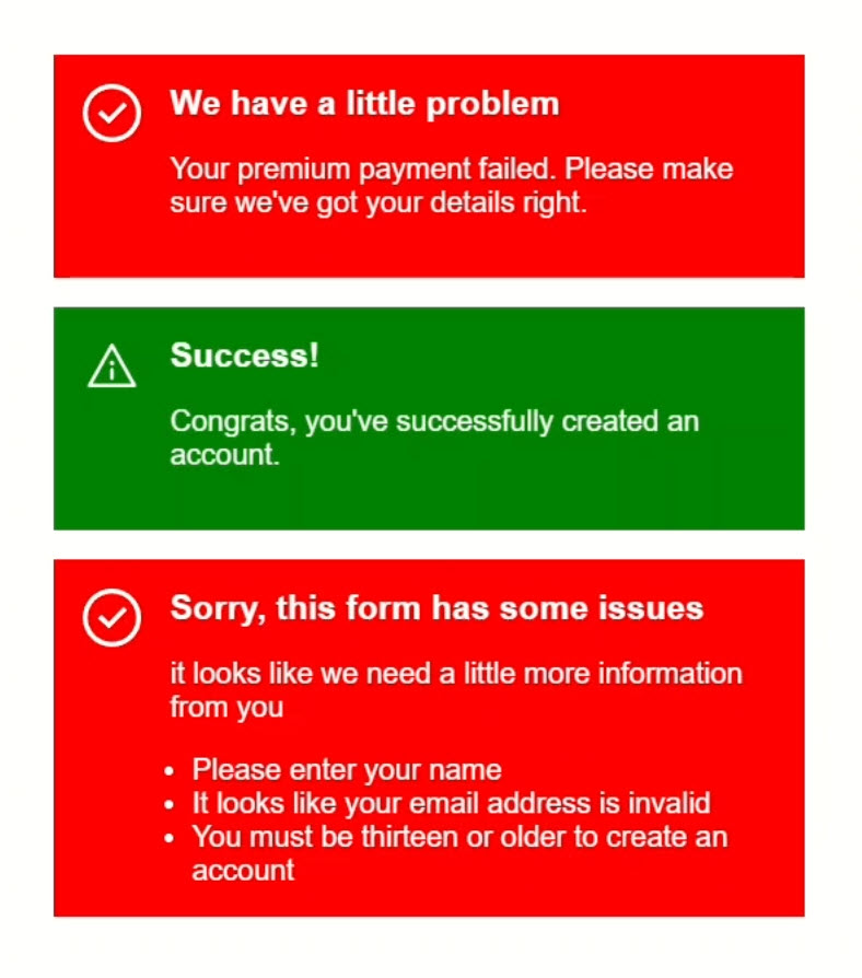
This is because we have these icons and some basic styles already included in our message component.
But this is awesome, we’ve just created a reusable message component that encapsulates all the markup and styling, and we can drop any content we need into it.
Super clean, super flexible.
Why You Won’t See <ng-content> in the DOM
Now, here’s something important to keep in mind: the <ng-content> element isn’t a real DOM element.
It’s not an Angular component, and it’s not a directive either.
It’s just a placeholder that Angular uses to inject content during rendering.
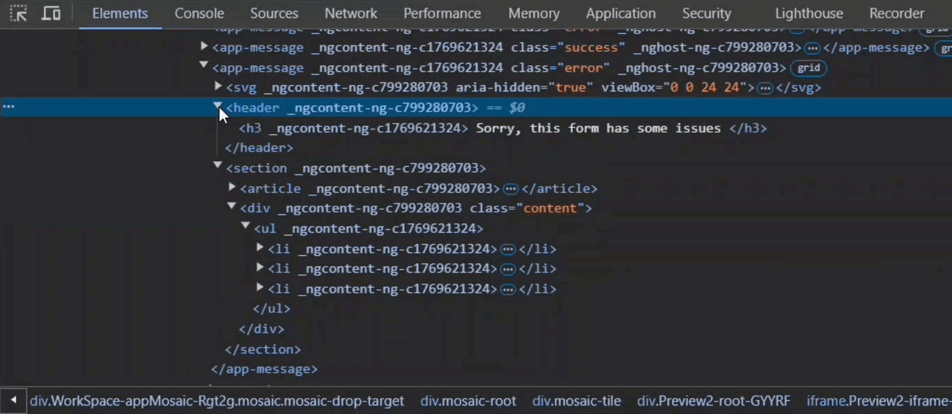
So, you might expect to see this <ng-content> tag if we inspect the final output, right?
Let’s check:
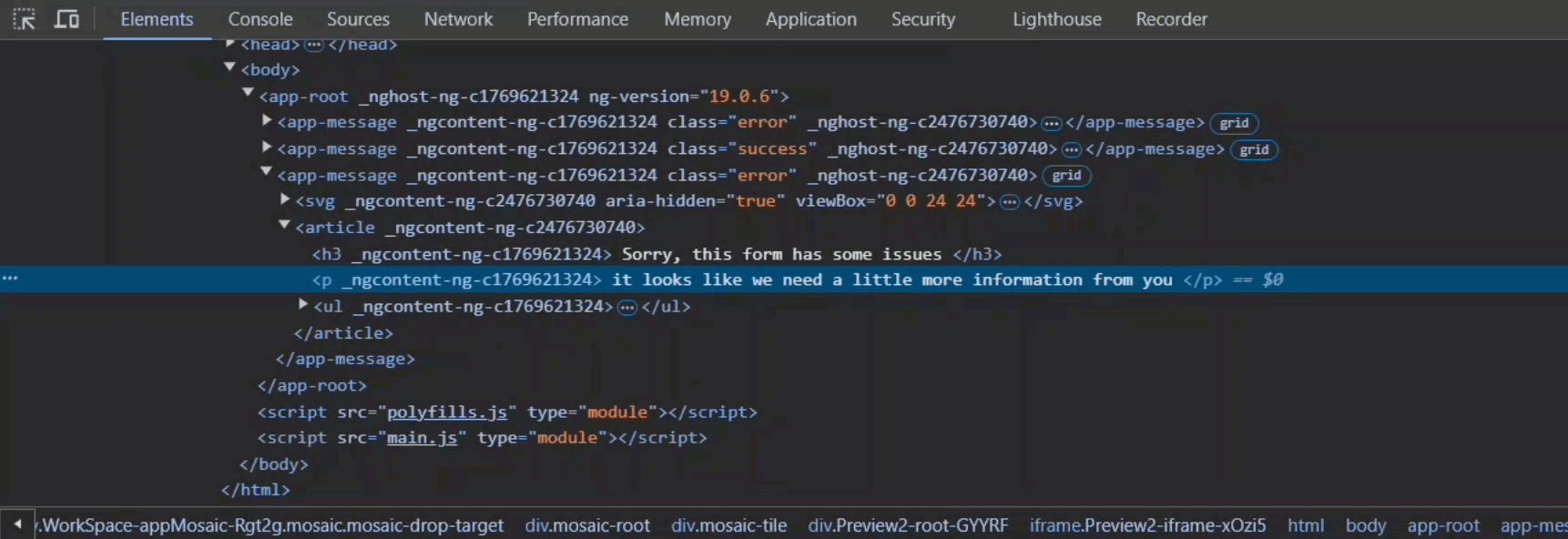
Well, we see our message component.
Inside it we can see the SVG icon from the component template, and the <article> element.
But notice inside the <article>, there’s no <ng-content> tag.
That’s because Angular replaces it entirely with the projected content.
And this is crucial to remember because it means you can’t add directives, apply styles, or bind properties directly to it.
It’s purely a placeholder at compile time.
Alright, so that’s how we add a basic, generic content slot.
But what if we want more structure in our component?
What if we need multiple content regions?
Well, good news, we can set this up easily and I’ll show you how!
Target Specific Content with Named Slots
Let’s start by adding a <header> element for our title and we’ll drop in another <ng-content> element:
<svg>...</svg>
<header>
    <ng-content></ng-content>
</header>
<article>
    <ng-content></ng-content>
</article>
Now, here’s something interesting, at this point we have two generic content regions.
But the way Angular processes this is that the last one wins.
That means the first slot in the header gets completely ignored during content projection.
But don’t worry, we can fix that by creating multiple named slots using a special “select” attribute.
This “select” attribute takes a CSS selector to target specific content.
In this case, let’s use <h3>:
<header>
    <ng-content select="h3"></ng-content>
</header>
Now, Angular will look for any <h3> tags between our component’s opening and closing tags and project them right into this header.
And just to be clear, it doesn’t have to be an element selector.
You can use a class or even an attribute selector if you prefer.
Next, let’s add another select attribute on the original region, but this time targeting the <p> tag.
<article>
    <ng-content select="p"></ng-content>
</article>
Alright, let’s wrap the article in a <section> and we’ll add a <div> with a class of “content”.
Inside this <div>, we’ll place a generic <ng-content> region.
This will catch any content that isn’t an <h3> or <p>, so everything else will get projected here.
Here’s the complete template with multiple slots:
<svg>...</svg>
<header>
    <ng-content select="h3"></ng-content>
</header>
<section>
    <article>
        <ng-content select="p"></ng-content>
    </article>
    <div class="content">
        <ng-content></ng-content>
    </div>
</section>
Since we’re already using <h3> and <p> tags in our main component, there’s no need to change anything else:
Now, after we save, we’ve got some additional borders separating each of these regions.
This is because we have some styles for these regions in our existing stylesheet for this message component and now that content is projected into them, these styles are applied correctly.
And if we inspect the DOM, you’ll see the <h3> ends up inside the header, the <p> tag inside the article, and all the remaining content lands in the “content” div:
By using multiple slots like this, we can create specialized regions with custom styling while keeping the component flexible and reusable.
And, we can still accept random content with the generic slot whenever we need it.
Alias Your Slots for Maximum Flexibility
Now, if all of this still doesn’t give you enough flexibility, don’t worry Angular has another trick up its sleeve.
It supports aliasing for projected content placeholders, giving you even more control.
Let’s say I want to move the <h3> and <p> tags directly into the template:
<header>
    <h3>
        <ng-content select="h3"></ng-content>
    </h3>
</header>
<section>
    <article>
        <p>
            <ng-content select="p"></ng-content>
        </p>
    </article>
    ...
</section>
But here’s the thing, it wouldn’t make sense to select these regions using <h3> and <p> tags because we’d end up with the same tags nested inside themselves.
That’d get messy, right?
So instead, I’m going to swap these out for custom element selectors.
<header>
    <h3>
        <ng-content select="message-title"></ng-content>
    </h3>
</header>
<section>
    <article>
        <p>
            <ng-content select="message-subtitle"></ng-content>
        </p>
    </article>
    ...
</section>
Now, if we had components or directives matching these custom elements, they’d get projected into the right spots.
But wait, that means we’d have to actually create those components or directives, or register them in our custom elements schema, and that feels like overkill for this.
Alternatively, you could use attribute selectors (like [message-title]) if you prefer to keep your HTML more semantic without custom tags.
But for this example, I’m going to stick with the custom element selectors to help illustrate the point.
And, there is another way.
We can switch these elements to something else entirely.
I’m going to use an <ng-container> because it doesn’t add any extra markup to the DOM.
Now here’s the cool part: we can use a special attribute called “ngProjectAs”.
With this, we can tell Angular to treat these containers as if they were custom selectors.
So for the title, I’ll add “message-title”, and for the subtitle, “message-subtitle”:
<app-message class="error">
    <ng-container ngProjectAs="message-title">
        We have a little problem
    </ng-container>
    <ng-container ngProjectAs="message-subtitle">
        Your premium payment failed. Please make sure we've got your details right.
    </ng-container>
</app-message>
<app-message class="success">
    <ng-container ngProjectAs="message-title">
        Success!
    </ng-container>
    <ng-container ngProjectAs="message-subtitle">
        Congrats, you've successfully created an account.
    </ng-container>
</app-message>
<app-message class="error">
    <ng-container ngProjectAs="message-title">
        Sorry, this form has some issues
    </ng-container>
    <ng-container ngProjectAs="message-subtitle">
        It looks like we need a little more information from you
    </ng-container>
    <ul>
        <li>Please enter your name</li>
        <li>It looks like your email address is invalid</li>
        <li>You must be thirteen or older to create an account</li>
    </ul>
</app-message>
And that’s it!
When we save it looks the same, right?
That’s how you know it’s working.
Now, I probably wouldn’t do this exact setup in this scenario for a real-world project, but you might find this handy in more complex scenarios where flexibility is key.
So, “ngProjectAs” lets us alias content to match specific selectors in our component template, giving us more flexibility without creating extra components or directives.
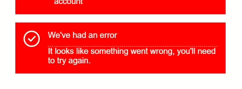
No Content? No Problem! How to Use Fallback Content in Angular
Alright, with everything we’ve covered so far, you might run into situations where you need to display some default content when nothing gets projected into a specific region.
This is considered “fallback content”.
Implementing fallback content is super simple, just add the default content between your opening and closing <ng-content> tags.
<header>
    <ng-content select="h3">
        We've had an error
    </ng-content>
</header>
<section>
    <article>
        <ng-content select="p">
            It looks like something went wrong, you'll need to try again.
        </ng-content>
    </article>
    ...
</section>
That way, if no content is passed into these slots, the fallback text will automatically show up instead.
Now, let’s go ahead and add an empty message component in our main app component with the rest of the messages:
<app-message class="error"></app-message>
And after we save, our fallback content is showing up just like we want:
Wrapping Up: Build Flexible, Reusable Angular Components
Okay, I think that’s probably everything you need to know about content projection in Angular!
Now you can build flexible, reusable components with dynamic content, multiple slots, and fallback options.
If you found this helpful, don’t forget to subscribe, and check out my other Angular tutorials for more tips and tricks!
Additional Resources
- The demo app BEFORE any changes
- The demo app AFTER making changes
- The official Angular Content Projection documentation
- The Web Component Slot element
Get Ahead of Angular’s Next Shift
Most Angular apps today still rely on reactive forms, but that’s starting to shift.
Signal Forms are new, and not widely adopted yet, which makes this a good time to get ahead of the curve.
I created a course that walks through everything in a real-world context if you want to get up to speed early: 👉 Angular Signal Forms Course
Want to See It in Action?
Check out the demo code and examples of these techniques in the Stackblitz example below. If you have any questions or thoughts, don’t hesitate to leave a comment.


