Angular Slide Animation: Slide-in/Slide-out Effects (Deprecated Module)
Slide-in and slide-out animations are essential for modals, sidebars, and dynamic content, creating smooth transitions that guide user attention. While CSS transitions work for simple show/hide scenarios, Angular's animation framework provides better control over timing, easing, and coordination with component lifecycle. This tutorial demonstrates how to create professional slide animations using Angular's animation framework. Note: This uses Angular's deprecated animations module—modern alternatives are available.
Enabling Animations in Your Application
Before we can create and add our slide animation, we need to include the animations module in our application. In order to do this, we need to add the “providers” array to our bootstrapApplication function. Then, we need to include the provideAnimations() function within this array.
main.ts
import { provideAnimations } from '@angular/platform-browser/animations';

bootstrapApplication(App, {
  providers: [
    provideAnimations()
  ]
});
Ok, now we can add animations.
Create and Add a State-based Slide-in-out Animation
So, I’ve already created a basic component for this example. Right now, it’s super simple. If we look at the code for this component, we’ll see just how simple it is.
animation.component.ts
import { Component, signal } from "@angular/core";

@Component({
  selector: 'app-animation',
  standalone: true,
  templateUrl: './animation.component.html',
  styleUrl: './animation.component.scss'
})
export class AnimationComponent {
  protected visible = signal(false);
}
All we have is a single “visible” Boolean signal that’s initialized to false.
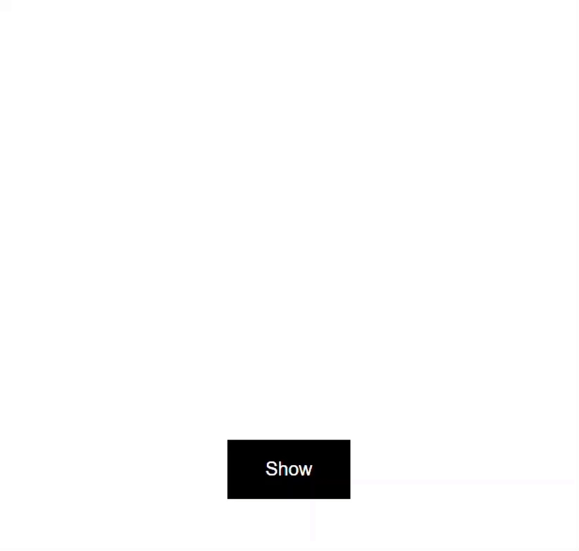
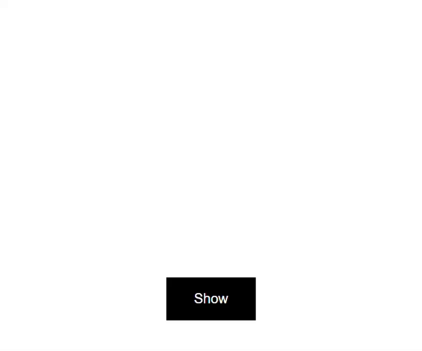
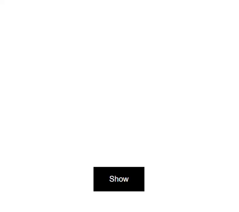
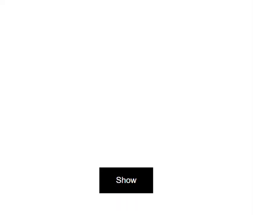
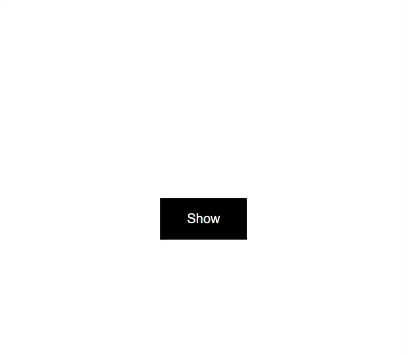
If we switch to the template, we have a div which is the box that we can see in the middle of the screen in the demo application, and then we have the button that toggles the value of the “visible” signal when clicked.
animation.component.html
<div></div>
<button (click)="visible.set(!visible())">{{ visible() ? 'Hide' : 'Show' }}</button>
So, what we’re going to do is use this value to toggle the slide animation we’re going to create. The box will start outside of the left-side of the viewport, and then slide in when the value switches to true.
Creating the Basic Slide Animation
Ok, to add animations, we need to use the animations array in the component metadata.
animation.component.ts
@Component({
  selector: 'app-animation',
  ...
  animations: [
  ]
})
Within this array, we need to add a trigger() function from the animations module. Then we need to give this trigger a name, let’s call it “slide”.
animation.component.ts
import { trigger } from '@angular/animations';

animations: [
    trigger('slide', [
    ])
]
Now, we’re going to animate using our “visible” value, so it will have two states. One will be false for when it’s hidden, and the other will be true for when it’s visible. To create these states, we’ll use the state() function from the animations module. Then we need to provide the state as a string for the value that will trigger this state. Let’s start with the false or hidden state.
animation.component.ts
import { ..., state } from '@angular/animations';

animations: [
    trigger('slide', [
        state('false')
    ])
]
We’re using a value of “false” because we will be binding this animation using the “visible” signal. So when it’s false, it will trigger this state.
Ok, next, we need to add the style that we want the box to have when in this hidden state. We do this with the style() function from the animations module. This function requires a style object.
Now if we think about what we want here, we want the box to start outside of the viewport to the left, and then animate to its current location. To do this, we will want to use a negative X translation value. Let’s go with a value of negative two hundred percent.
animation.component.ts
import { ..., style } from '@angular/animations';

animations: [
    trigger('slide', [
        state('false', style({ translate: '-200%' }))
    ])
]
Ok, now let’s add our visible state. For this we’ll use a value of true, then we’ll translate to a zero X value.
animation.component.ts
animations: [
    trigger('slide', [
        state('false', style({ translate: '-200%' })),
        state('true', style({ translate: 0 }))
    ])
]
Ok, so that’s our hidden and visible states. The last part of the animation is to transition between the two states. We do this with the transition() function from the animations module.
The first value that this function needs is an expression representing the states that we want to transition between as a string. So, we can add “false”, and then to denote animating between two states, we’ll and an arrow pointing in two directions, and then we add “true”.
animation.component.ts
import { ..., transition } from '@angular/animations';

animations: [
    trigger('slide', [
        ...
        transition('false <=> true')
    ])
]
This expression states that we want to transition from a state of “false” to “true” and from a state of “true” to “false”. So basically, whenever the value changes, we want the transition to run.
Ok, now we can animate this transition with the animate() function from the animations module.
For this function, we provide a duration and, optionally an easing function as a string. Let’s go with a duration of point one five seconds, so pretty fast, and let’s add an easing function of ease-in-out.
animation.component.ts
animations: [
    trigger('slide', [
        ...
        transition('false <=> true', animate('0.15s ease-in-out'))
    ])
]
Binding the Animation in the Component Template
Ok, at this point, we’ve created the animation. All we need to do now is add this animation to our box element in the template. So, let’s switch to the template and bind the animation trigger.
To use our animation we use the @ symbol followed by the trigger name. Then we’ll bind this to the value of our “visible” signal.
animation.component.html
<div [@slide]="visible()"></div>
Ok, that should be everything we need for the animation to run, so let’s save and see how it works.
Now to start out, we don’t see the box, so the hidden state is being applied correctly. Then, when we click the button the box slides in from the left. When we click the button again, it animates back to the hidden state.
Switching the Slide Animation Direction
Now, what if we wanted to animate in a different direction, like if we want the box to animate in from the right side instead? Well, this is pretty easy, we just need to switch the translate value on our hidden, false state from a negative to a positive value.
Before:
state('false', style({ translate: '-200%' }))
After:
state('false', style({ translate: '200%' }))
There, now let’s save and see how it looks.
Nice, now when we click the button it animates in from the right. And when we click it again, in animates back to the right.
What about if we want to animate down from the top? Well, we just need to update the translate value on our hidden state again. Let’s go with zero for the X value this time, and then a value of negative three hundred percent for the Y value.
Before:
state('false', style({ translate: '200%' }))
After:
state('false', style({ translate: '0 -300%' }))
Ok, let’s save and take another look.
There, now when we click the button, it slides in from the top. That was pretty easy right?
So, now you know how to create a basic sliding animation from any direction. But, you don’t actually have to create this if you don’t want to.
Installing and Using the Bootjack Bounce Animation Library
I’ve found that there are quite a few animation concepts that I use pretty often when building Angular applications and I don’t want to recreate them over and over again. So, to cut down on this work, I’m creating an installable Angular library called ngx-bootjack-bounce where I’ll be creating and sharing several of these animations. So instead, you can install and use it if you want.
Now at the moment, I only have a slide animation in it, but hopefully by the time you’re reading this, there’s more available.
To use this library, you can install it in your angular app using this command:
npm i ngx-bootjack-bounce
Now, let’s look at how to use it.
Adding The State-Based Animation from the Library
Now, I’ve already installed the library in this project so I’m ready to use the animations within it. To create the same animation we just built in the first half of this video, I can add the “btjSlideState” animation.
animation.component.ts
import { btjSlideState } from 'ngx-bootjack-bounce';

@Component({
  selector: 'app-animation',
  ...
  animations: [
    btjSlideState
  ]
})
Then I just need to go into the template and bind this animation to the “visible” property again.
animation.component.html
<div [@btjSlideState]="visible()"></div>
There, now let’s save and try this out.
So it’s starting off hidden again and when I click the button, it slides in. And when I click again, it slides out.
So that’s even easier right?
But with the animation we built earlier, we could easily change the direction, how would we do the same thing here?
Custom Configuration Using Animation Params
Well, if we want to customize this animation, we can provide some custom configuration using animation params. The params available are:
- startX
- startY
- startOpacity
- startScale
- duration
So, let’s add some custom configuration.
To pass params to our animation, we need to convert to an object in our animation binding. Then we’ll pass a value to this object based on our “visible” signal. This will trigger the appropriate state for the animation when the value changes.
Next, we can add the params object. Let’s animate in from the right with a “startX” value of two hundred percent. Then let’s add a “startOpacity” of zero, and a “startScale” of point seven. Also, let’s slow it down with a duration of three seconds.
animation.component.html
<div [@btjSlideState]="{
    value: visible(),
    params: {
        startOpacity: 0,
        startScale: 0.7,
        duration: '3s'
    }
}">
</div>
Ok, now let’s save and see how it looks.
There, now when we click the button, it slides in really slow from the right.
Adding an Enter/Leave Animation from the Library
We can even switch from a state-based animation to an enter/leave animation if the element you need to animate is added and removed from the DOM conditionally.
To illustrate this, I’ve switched the logic in the component around so that the box is now conditionally added when the “visible” signal is true.
animation.component.html
@if (visible()) {
    <div></div>
}
Now, let’s switch to the typescript and add the animation for this. This time we’ll add the “btjSlideEnterLeave” animation.
animation.component.ts
import { btjSlideEnterLeave } from 'ngx-bootjack-bounce';

@Component({
  selector: 'app-animation',
  ...
  animations: [
    btjSlideEnterLeave
  ]
})
Now we can switch back to the template. This time, we won’t need to bind the animation, we can just add the trigger to the div.
animation.component.html
@if (visible()) {
    <div @btjSlideEnterLeave></div>
}
That’s it. Let’s save again.
And there we go, even though this item is entering and leaving the DOM physically, it’s still transitioning. And on top of that, with this library you didn’t really need to add much yourself in order to do this.
Also, all of the same params: startX, startY, startOpacity, startScale, and duration are available with this enter/leave animation too, so you can change it to suit your needs.
In Conclusion
So now you know how to create a basic slide animation, and you know how to make it slide in and out to and from all different directions. And if you don’t want to create one yourself, you can use my library.
I hope you found this tutorial helpful, and if you did, check out my YouTube channel for more tutorials about various topics and features within Angular.
Additional Resources
- The demo BEFORE animations
- The demo AFTER animations
- The demo using the Bootjack Bounce library
- My Angular Animations YouTube Playlist
- Introduction to Angular animations
- Bootjack Bounce Animation Library
Want to See It in Action?
Check out the demo code and examples of these techniques in the Stackblitz example below. If you have any questions or thoughts, don’t hesitate to leave a comment.