Angular Content Toggle: Show/Hide Content with Buttons
Building toggle buttons in Angular doesn't have to be complicated. Whether you need to show/hide content with CSS classes or conditionally render elements, this tutorial covers multiple approaches. You'll learn how to create reusable toggle buttons that control content visibility, handle state management with signals, and implement smooth transitions. By the end, you'll have several patterns you can use in any Angular project.
The Demo Application
Ok, to begin, we have already created a basic demo application to start from. In this application, we have an example component that contains the content that is rendered.
If we take look at the component typescript, we can see that there’s nothing here yet, just the basic code needed for an angular component.
example.component.ts
import { Component } from "@angular/core";

@Component({
    selector: 'app-example',
    standalone: true,
    templateUrl: './example.component.html',
    styleUrl: './example.component.scss',
})
export class ExampleComponent {
}
If we switch to the template, we can see that there’s a little more going on. First, there’s a button element. Then, there’s a div element for the purple box below the button.
example.component.html
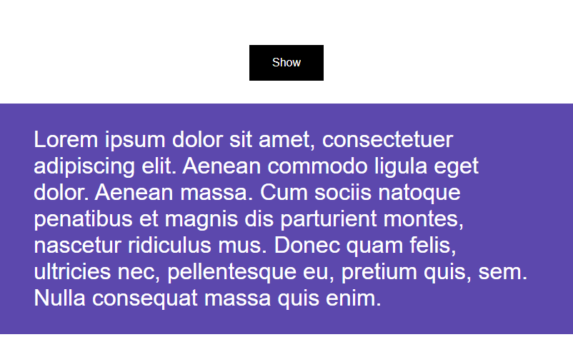
<button>Show</button>
<div class="box">Content</div>
The plan is to use the button to toggle the display of the content we see in the purple box. We’ll set this box up to start out hidden. Then when we click the button, a class will be added and that class will have some associated CSS which will display the button.
Creating a Class-Based, CSS Toggle Button
Ok, back over in the code for this component, let’s create a protected field called “visible”. This will be a boolean property and we’ll set its initial value to false.
example.component.ts
export class ExampleComponent {
    protected visible = false;
}
Ok, that’s all we’ll need to add here. Now, let’s switch to the template.
The first thing we need to do here is set it up to toggle the “visible” property value when the button is clicked. We can use simple event binding on the button to bind to the click event. When this event fires, we’ll set the “visible” property equal to the opposite of its current value.
example.component.html
<button (click)="visible = !visible">
    Show
</button>
Ok, now we can use class binding to bind a class on our box when this property is true.
example.component.html
<div [class.visible]="visible" class="box">
    Content
</div>
We’ll add some CSS for these “visible” and “hidden” states in a minute but first, we can swap out the label for this button with a simple ternary operator.
So, when visible is true, we’ll make the label display the word “Hide”. Then, when it’s false, the button will display “Show”.
example.component.html
<button (click)="visible = !visible">
    {{ visible ? 'Hide' : 'Show' }}
</button>
Ok, that’s all the changes we’ll need to make in the template, now let’s switch to the CSS.
So, we want our box to be hidden by default. Now, there are lots of ways to do this, but we’ll simply set its opacity to zero for this example.
Then, when it has the “visible” class, we’ll set the opacity to one so that it shows.
example.component.scss
.box {
    opacity: 0;

    &.visible {
        opacity: 1;
    }

}
Ok, that should do it, check out the example below:
Now, the box is not showing by default and when we click the button, the content shows. Then when we click it again, it hides.
So now you know how to hide and show content by conditionally binding a class and adding some basic CSS.
And, there are definitely many variations to this concept too.
Using the Class-Based, CSS Toggle Button to Show/Hide Text Truncated to a Single Line
For example, if you had content like a paragraph of text like this:
You can pretty easily change the CSS around a little to truncate the first line of text hiding the rest, and then when the button is clicked, display the full text.
To do this, we can start by removing the CSS we just added in the previous example. Then, when the box does not have the “visible” class, let’s add some new styles.
For this example, we needed to add an inner div specifically for these styles to be applied correctly, so we’ll need to be sure to include it as part of our selector.
Then, we’ll add overflow, hidden to hide the content we don’t want to see.
After that, we’ll add the text-overflow property and set it to ellipsis. This allows us to truncate the text with an ellipsis when it won’t fit in its container.
Next, let’s add the white-space property and give it a value of nowrap to prevent the text from wrapping onto multiple lines.
Then, we just need to set the width to one 100% to keep the content from growing horizontally.
example.component.scss
.box:not(.visible) div {
    overflow: hidden;
    text-overflow: ellipsis;
    white-space: nowrap;
    width: 100%;
}
That’s it, everything else remains the same.
Check out the example below to see it in action:
There, now the text starts out truncated to a single line. Then, when we click the button, the full message is displayed.
Pretty cool right?
Using the Class-Based, CSS Toggle Button to Show/Hide Text Truncated to Multiple Lines
We can even change this to instead show the first two lines with the content fading out at the bottom before toggling to show the full paragraph.
To do this, we can first remove everything except the overflow: hidden style from our previous example. Then, we can add a height to constrain our content, let’s go with 2em.
Then, we can fade the content out at the bottom. We’ll use the mask-image property for this along with a linear-gradient.
example.component.scss
.box:not(.visible) div {
    overflow: hidden;
    height: 2em;
    mask-image: linear-gradient(to bottom, black, black calc(100% - 1em), transparent);
}
Ok, that’s everything we need for this example.
You can see it working in the example below:
Now the content shows almost two lines and then fades out at the bottom. Then when we click the button, we see all of the content. And when we click it again, it goes back down to two lines.
So, those are just some common scenarios that I’ve encountered and I’m sure there are many others out there.
Creating a Toggle Button for Conditional Content
Now, rather than using a conditional class, you may want to instead physically add and remove some content from the DOM when the button is clicked.
Well, this is pretty easy to do as well.
Let’s start with or first example again. We’ll simply wrap the “box” div in a condition based on whether the “visible” property is true or not.
example.component.html
@if (visible) {
    <div class="box">Content</div>
}
Now it will be inserted into the DOM when true and be removed when false.
We can also remove the “visible” class binding, along with the opacity styles that we used to control the visibility because we’re no longer doing this with CSS.
Ok, that’s it.
You can check out the full working example below:
So the box is not there to start, but when we click the button, it shows. And when we click again, it’s removed.
So, this works exactly the same as that first example, it’s just conditionally adding and removing the content instead of using a class and CSS to show and hide it.
In Conclusion
Ok, so now you should have some handy concepts for creating buttons that can be used to toggle the visibility of associated content.
You can use classes and CSS, or you can use conditional logic, it really depends on your situation.
Ok, I guess that’s all for now.
I hope you found this tutorial helpful, and if you did, check out my YouTube channel for more tutorials about various topics and features within Angular.