Nobody Wants to See a Blank Screen… Build Smarter Loaders!
Blank screens and generic spinners create poor user experiences, making apps feel slow even when they're loading quickly. Skeleton loaders improve perceived performance by showing UI structure immediately, providing visual feedback, and creating smooth transitions to real content. This tutorial demonstrates how to build skeleton loaders using Angular's deferred loading, signals for state management, and animations for smooth transitions. Note: This uses Angular's deprecated animations module—modern alternatives are available.
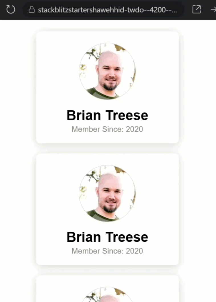
Baseline Setup: A Simple Profile Card with Simulated Delay
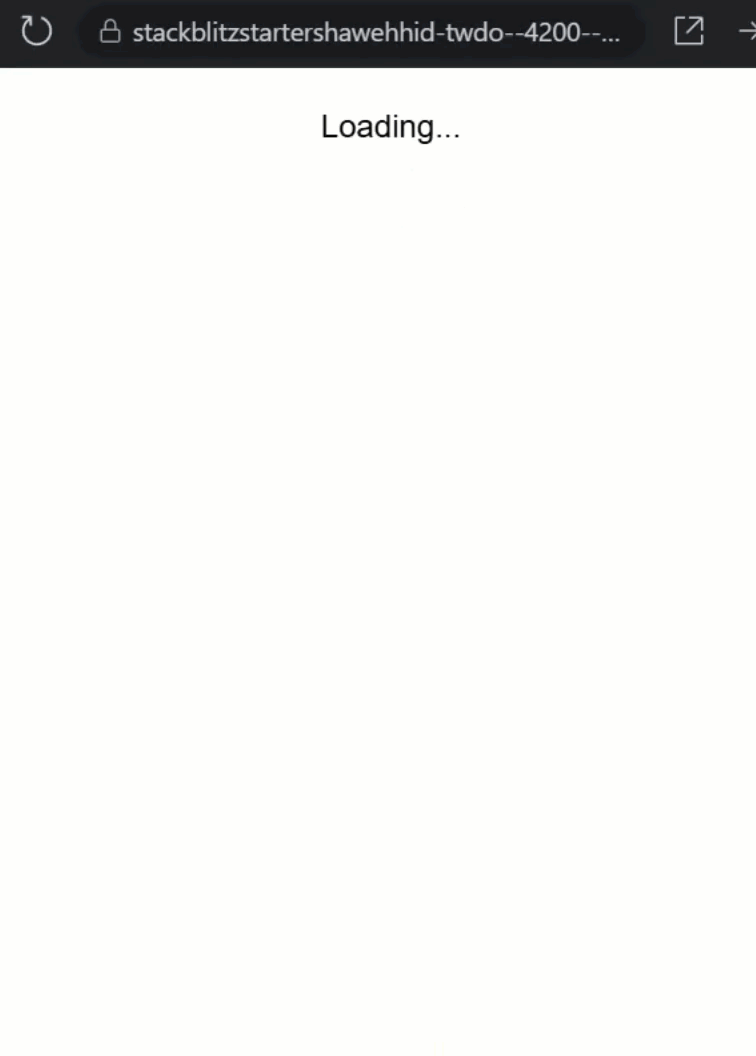
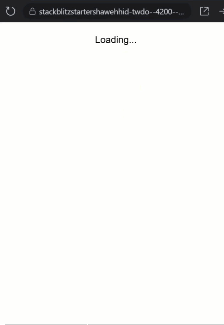
This is our basic app. I’ll refresh it a couple of times, and you’ll notice there’s a delay before anything shows up:
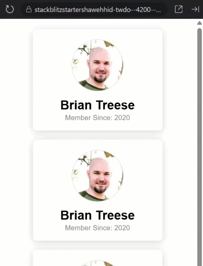
That delay is mocking the type of thing that may occur with a real API request.
If we look at the code in the profile service where this data comes from, we can see why: we’re using setTimeout() to simulate a network call:
loadProfile() {
  setTimeout(() => {
    this._profile.set({
      name: 'Brian Treese',
      avatar: 'https://avatars.githubusercontent.com/u/9142917',
      memberSince: 2020
    });
  }, 3000);
}
It’s fake, but realistic. You could imagine this data coming from your backend or Firebase or whatever you use.
Let’s look at the profile-card.component.ts to see how this service is implemented.
Here, the component injects the profile service, and in the constructor, we load the profile if it isn’t already set:
export class ProfileCardComponent {
  private profileService = inject(ProfileService);
  protected profile = this.profileService.profile;

  constructor() {
    effect(() => {
      if (!this.profile()) {
        this.profileService.loadProfile();
      }
    });
  }
}
This is all pretty simple and reactive, using Angular signals.
Over in the template, we’ve got a basic @if block to conditionally render the content once it’s available.
Using @defer to Replace Conditional Rendering
In the existing setup, we simply check if the profile data was loaded, then we load the card content.
This works fine, the content only shows once the data is available. But Angular now gives us something better: deferred loading with the @defer block.
Think of @defer as a smarter conditional rendering tool.
It lets you wait for a specific condition to become true, show placeholder content while you’re waiting, and optimize for lazy loading, improving perceived performance.
It’s perfect for API-driven content, dashboard widgets, or anything with async data.
We can simply replace the @if with @defer instead.
Then, we have several triggers to choose from to control when Angular loads and displays the content.
In this case, we’ll use the when trigger which will simply trigger the content to load once the profile signal becomes truthy:
@defer (when profile()) {
  <div>
    <img [src]="profile()!.avatar" class="avatar" />
    <h2>{{ profile()!.name }}</h2>
    <em>Member Since: {{ profile()!.memberSince }}</em>
  </div>
}
This behaves the same way as @if, but now we can expand it, and that’s where the power comes in.
Building the Skeleton Loader UI
Here’s what makes @defer so useful: it lets us show something else while we wait, like a skeleton loader.
We just add a @placeholder block.
Within this block we can add markup that we want to render while we wait for the profile to load.
I’ll add several divs with some classes so that I can easily style placeholder markers for each of the corresponding pieces of content from the actual card:
@defer (when profile()) {
  ...
} @placeholder {
  <div class="skeleton">
    <div class="avatar"></div>
    <div class="text title"></div>
    <div class="text subtitle"></div>
  </div>
}
Now Angular will render the placeholder immediately, and then swap it out only once the profile signal emits a non-null value.
It’s like telling Angular…
“don’t render this part of the page until I have the data, but while you wait, show something helpful.”
Ok, now we just need to add some styles to make this look right so let’s switch to the SCSS.
Here, for our skeleton, let’s add some styles for the mock avatar and text label regions:
.skeleton {
  .avatar {
    background: #ccc;
  }

  .text {
    background: #ccc;
    margin-inline: auto;
  }

  .title {
    border-radius: 8px;
    width: 70%;
    height: 28px;
    margin-block: 9px 3px;
  }

  .subtitle {
    height: 15px;
    border-radius: 6px;
    width: 50%;
  }
}
Okay, this should be enough to style our skeleton markup and give us something to show while the profile loads.
Let’s save and see how it works:
There we go! The skeleton appears instantly, and once the data is ready, the real content pops in. Huge win for the user experience already.
This is quite a bit better than before right?
But, I think we can make it even better.
Animating the Skeleton with CSS Shimmer Effects
Let’s level it up with animation. A static skeleton like this might make it feel as if nothing is actually happening.
First, I’ll remove the background color from the mock avatar and text elements and I’ll replace this background with a linear-gradient.
We also need to add a background-size that’s larger than these shapes so that we can animate the background position:
.skeleton {
  .avatar,
  .text {
    background: linear-gradient(
      90deg,
      #eee 25%,
      #fff 50%,
      #eee 75%
    );
    background-size: 400% 100%;
  }
}
Okay, now that we have the gradient, we need to create a keyframe animation to animate it.
We’ll start with the gradient offset to the left, and then we’ll end offset to the right:
@keyframes shimmer {
  0% {
    background-position: -200% 0;
  }
  100% {
    background-position: 200% 0;
  }
}
So, it will slide left-to-right.
Okay, we have the gradient, and now we have the keyframe animation, let’s add this animation to the mock avatar and text labels with the animation property.
We’ll animate this left-to-right transition over two seconds and we’ll make it loop with the infinite property:
.skeleton {
  .avatar,
  .text {
    ...
    animation: shimmer 2s infinite linear;
  }
}
Alright, that’s all we need, so let’s save and try it now:
Look at that shimmer!
Now, it gives the illusion that the app is “working” on loading the content. Pretty slick.
Adding Angular Animations for a Smooth Transition
This is looking pretty good, right? But I think we can still make it even better.
The change between the skeleton loader and the actual content is pretty abrupt.
I think it would be better to animate this transition too.
But this is a little more difficult to animate.
Since we have an item that’s leaving the DOM and an item that’s entering, we’ll need to use Angular animations to handle this.
In order to do this, we first need to enable animations in this application.
Let’s open up the main.ts file.
Here, we need to provide the animations module to the bootstrap application function.
Let’s add the providers array, and then we need to add the provideAnimationsAsync method:
import { provideAnimationsAsync } from '@angular/platform-browser/animations/async';

bootstrapApplication(AppComponent, {
  providers: [provideAnimationsAsync()],
});
This enables Angular’s animation system, so now, we can use it.
Let’s switch back to the profile-card.component.ts file.
To add Angular animations, we need to add the animations array:
@Component({
  selector: 'app-profile-card',
  ...,
  animations: [
  ]
})
Then, we can use the trigger function to create an animation, let’s call it “fadeOut”:
animations: [
  trigger('fadeOut', [
  ])
]
Then, we need to add a transition with the transition function.
Here, we’ll select the “leaving” element which will be our skeleton div:
animations: [
  trigger('fadeOut', [
    transition(':leave', [
    ])
  ])
]
Now we can use the animate function to animate this div.
First, we add the duration and easing function to use.
We’ll go with five hundred milliseconds and “ease-out”:
animations: [
  trigger('fadeOut', [
    transition(':leave', [
      animate('500ms ease-out')
    ])
  ])
]
Now we can add the style that we want to animate to with the style function.
All we’re going to do is animate to an opacity of zero:
animations: [
  trigger('fadeOut', [
    transition(':leave', [
      animate('500ms ease-out', style({ opacity: 0 }))
    ])
  ])
]
Okay that’s all we need for our skeleton “leave” animation, so now we can add another trigger called “fadeIn”:
animations: [
  trigger('fadeOut', [...]),
  trigger('fadeIn', [
  ])
]
Then we’ll add another transition, this time for the element that’s “entering”:
animations: [
  trigger('fadeOut', [...]),
  trigger('fadeIn', [
    transition(':enter', [
    ])
  ])
]
Now this animation is a little different because we need to provide the animation starting state, so we’ll add a style function, and we’ll start with an opacity of zero:
animations: [
  trigger('fadeOut', [...]),
  trigger('fadeIn', [
    transition(':enter', [
      style({ opacity: 0 }),
    ])
  ])
]
Now, we can add the animation for this element with another animation function.
Let’s use a duration of six hundred milliseconds this time and an easing function of, “ease-in”:
animations: [
  trigger('fadeOut', [...]),
  trigger('fadeIn', [
    transition(':enter', [
      style({ opacity: 0 }),
      animate('600ms ease-in')
    ])
  ])
]
Then we’ll animate to a final style with the style function and an opacity of one:
animations: [
  trigger('fadeOut', [...]),
  trigger('fadeIn', [
    transition(':enter', [
      style({ opacity: 0 }),
      animate('600ms ease-in', style({ opacity: 1 }))
    ])
  ])
]
So, “fadeOut” animates when the placeholder leaves. “fadeIn” kicks in when the real content shows up.
These are lifecycle-aware transitions built into Angular’s animation system.
Okay, now we just need to switch over to the template and add the animation triggers on the items that need to animate:
@defer (when profile()) {
  <div @fadeIn>
    ...
  </div>
} @placeholder {
  <div class="skeleton" @fadeOut>
    ...
  </div>
}
This is the final touch, so now let’s save and see how it looks:
Nice, now our skeleton fades out, and the real content fades in. No jump cuts, no hard swaps, just smooth motion.
Now it feels fast. Feels thoughtful, and really just improves the user’s experience overall.
Conclusion: Smarter Loading UX with Modern Angular
Alright, you now know how to build a smart skeleton loader in Angular using deferred loading, signals, and animations.
We kept it clean, modern, and pretty much, boilerplate-free.
If you found this helpful, don’t forget to subscribe and check out my other Angular tutorials for more tips and tricks!
Additional Resources
- The demo app BEFORE any changes
- The demo app AFTER making changes
- Angular Deferred Loading
- Angular Signals Guide
- Angular Animations Overview
- My course: “Styling Angular Applications”
Want to See It in Action?
Check out the demo code showcasing these techniques in the StackBlitz project below. If you have any questions or thoughts, don’t hesitate to leave a comment.