Angular Expand/Collapse Animation: Animate Height Changes (Deprecated Module)
Expand and collapse animations make Angular UIs feel polished and professional. This tutorial demonstrates how to animate height changes using Angular's deprecated animations module. While this approach still works, modern Angular (v19+) offers better alternatives using CSS animations and DOM events. You'll learn the legacy approach here, but for new projects, consider using pure CSS transitions or Angular's new enter/leave animation API.
Setting the Scene: Our Current Application
Here’s the application that we’ll be using in this demo:
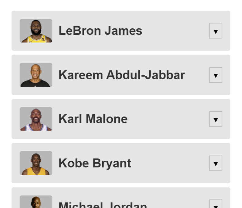
We have a basic list of great NBA players.
As you can see, each player in the list has a button that we can use to show and hide a panel of additional content about the given player:
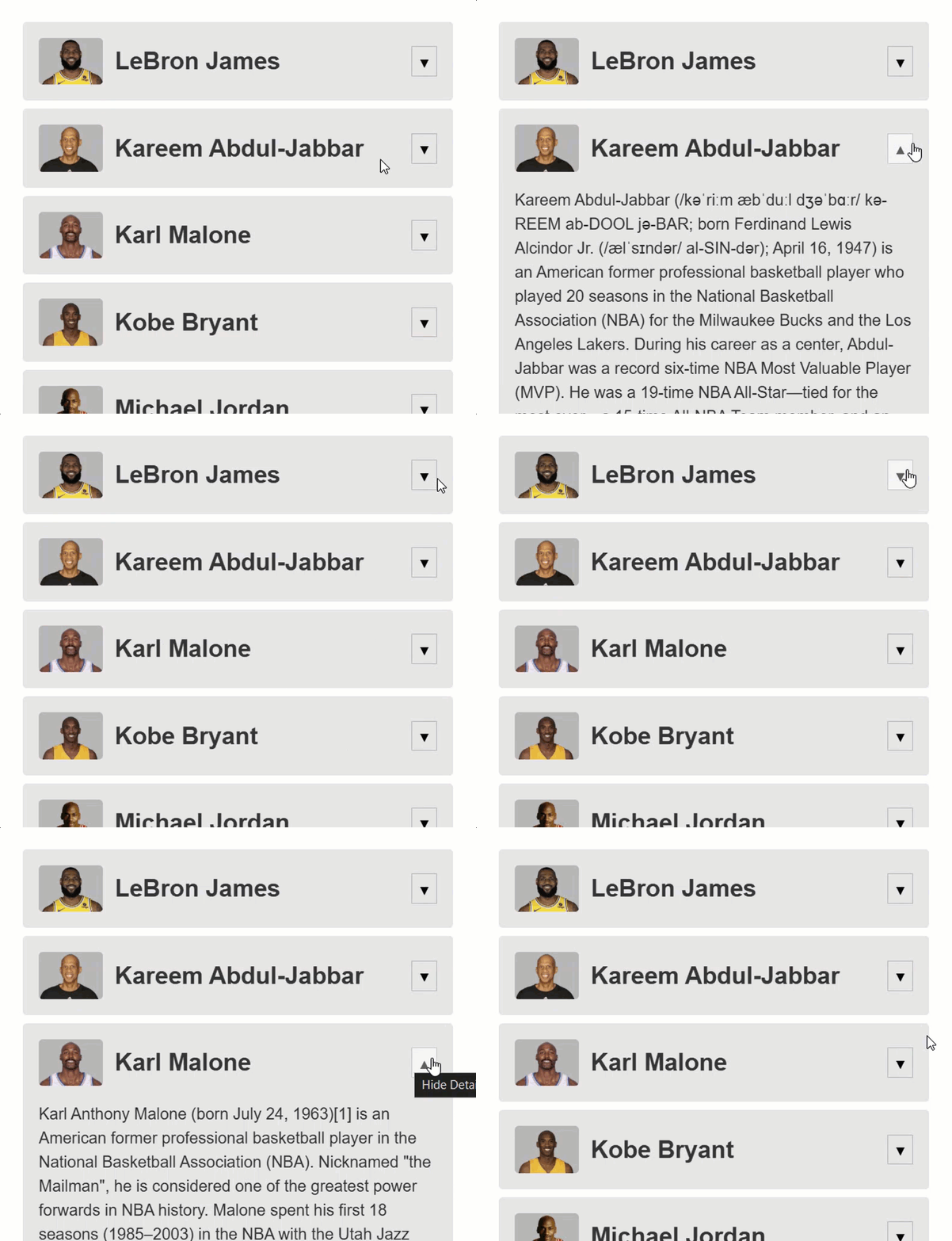
So that’s neat but it feels pretty abrupt when we toggle this content doesn’t it?
I think so, so we’re going to add an animation for this to make it feel better.
Preparing for Action: Enabling Angular Animations
But, before we can create and add our animation, we need to include the animations package.
To do this, we need to add the “providers” array to our bootstrapApplication() function in our main.ts file. Then, we need to include the provideAnimationsAsync() function within this array:
import { provideAnimationsAsync } from '@angular/platform-browser/animations/async';

bootstrapApplication(App, {
  providers: [
    provideAnimationsAsync()
  ]
});
Ok, now we can add animations.
Building the Core: Adding the Expanding Animation
Each of the players in this list are displayed with a player component.
So, this is where we’ll need to add our animation.
First, let’s look at the template for this component.
This section here is where the extra details are rendered:
@if (showDetails()) {
    <section>
        <div class="details">
            @if (player().description) {
                <p>{{ player().description }}</p>
            }
            <dl>
                ...
            </dl>
        </div>
    </section>
}
As we can see, this region is conditional.
It’s added and removed from the DOM when the “showDetails()” property changes.
This property changes when we click this button above the conditionl region:
<button
(click)="showDetails.set(!showDetails())"
[title]="showDetails() ? 'Hide Details' : 'Show Details'">
@if (showDetails()) {
▲
<span class="cdk-visually-hidden">Hide Details</span>
} @else {
▼
<span class="cdk-visually-hidden">Show Details</span>
}
</button>
Ok, let’s add the animation now.
To begin, we need to add the “animations” property to our component metadata:
@Component({
  selector: 'app-player',
  animations: [
  ]
})
To create an animation, we need to add the trigger() function.
This function will need to be imported from the Angular animations module.
Then we need to add a name for this trigger, let’s go with “toggle”:
import { trigger } from '@angular/animations';

trigger('toggle', [
])
Within this function, we’ll add some transitions with the transition() function.
This function needs to be imported from the animations module as well.
Then, since this container will be entering and leaving the DOM, we can use a special alias to target the opening state.
We can add a colon followed by the word “enter”:
import { ..., transition } from '@angular/animations';

trigger('toggle', [
    transition(':enter', [
    ])
])
So, this will be the animation that runs when we make the content visible.
Next, we can add the style that we’ll want to start our animation from.
For this we’ll use the style() function, also from the animations module.
Within this function we add the styles we want as an object.
We’ll add a height of zero, and we’ll add an opacity of zero too so that it starts off hidden:
import { ..., style } from '@angular/animations';

trigger('toggle', [
    transition(':enter', [
        style({ height: 0, opacity: 0 })
    ])
])
Now, we can add the animation to animate to our open style.
We’ll use the animate() function from the animation module for this.
The first parameter that we need to provide is the duration and easing function.
Let’s go with a duration of one second and we’ll use the ease-in easing function:
import { ..., animate } from '@angular/animations';

trigger('toggle', [
    transition(':enter', [
        ...
        animate('1s ease-in')
    ])
])
Now, one second is probably a little long for an animation like this.
Normally I’d want to keep it under two hundred and fifty milliseconds, but I want to make sure we can really see the animation for the purposes of this tutorial.
In a real-world scenario, you’ll often want to keep your animation durations short so that the user doesn’t really notice them.
Ok, next we need to add the style that we want to animate to, so we’ll add another style() function.
We need to animate the height, but the heights of these are all different so how do we animate to an unknown height?
Well, Angular has a special token for this, we use an asterisk.
This will animate to the dynamic end height of the content no matter what that height is.
Then we just need to add an opacity of one:
trigger('toggle', [
    transition(':enter', [
        style({ height: 0, opacity: 0 }),
        animate('1s ease-in',
            style({ height: '*', opacity: 1 })
        )
    ])
])
Ok this is all we need for our opening animation when the content is added to the DOM, next we need to add the closing animation, when the content is removed from the DOM.
For this, we need to add another transition() function.
This time we’ll use the “leave” alias:
trigger('toggle', [
    ...
    transition(':leave', [
    ])
])
After that, we just need to add the inverse of the “enter” animation.
So, a starting style of the unknown height and an opacity of one.
trigger('toggle', [
    ...
    transition(':leave', [
        style({ height: '*', opacity: 1 })
    ])
])
Then we’ll animate, with the same duration and easing, to an ending style with a height of zero and an opacity of zero too:
trigger('toggle', [
    ...
    transition(':leave', [
        style({ height: '*', opacity: 1 }),
        animate('1s ease-in',
            style({ height: 0, opacity: 0 })
        )
    ])
])
Ok, that’s it for the animation, now we just need to configure our section element to use it in the template.
We do this by first adding an “@” symbol, followed by the trigger name:
<section @toggle>
    ...
</section>
Ok, that’s it.
Let’s save and see how it works now:
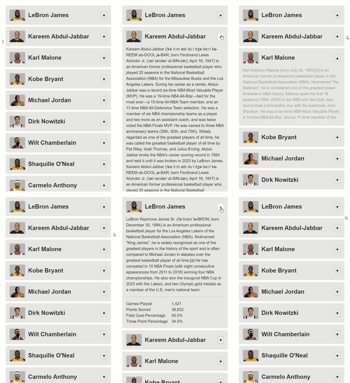
Ok, now we have a nice little animation when we toggle this content.
It’s much better than it was before right?
But, I think we can make it even a little better.
Let’s look at how we can use some more advanced animation concepts to add a transition to slide the inner content in and out as the “:enter” and “: leave” animations run.
Refining the Experience: Using Advanced Animation Concepts
Ok, in this scenario we are going need to keep the height transition as is, but we need to add a transition on the inner element with the “details” class:
<section @toggle>
    <div class="details">
        ...
    </div>
</section>
This means that we’ll need to query for this container using the query() function from the animations module.
This function allows us to find child elements inside the element with the trigger and animate them.
To query for an element, we use a CSS selector, in this case it’s the “.details” class:
import { ..., query } from '@angular/animations';

trigger('toggle', [
    transition(':enter', [
        ...
        query('.details', [
        ])
    ])
])
Then, within this query, let’s add our starting style for this particular element.
In order to slide it in we’ll set a translate value that pushes it up, out of the container to start:
trigger('toggle', [
    transition(':enter', [
        ...
        query('.details', [
            style({ translate: '0 -100%' })
        ])
    ])
])
Now, we just need to add the animation for this item, right?
So, let’s add another query().
Then, let’s add the animate() function with the same duration and easing.
Then we just need to add our end style which will be to translate to a normal position:
trigger('toggle', [
    transition(':enter', [
        ...
        query('.details', [
            style({ translate: '0 -100%' })
        ]),
        ...
        query('.details', [
            animate('1s ease-in',
                style({ translate: '0 0' })
            )
        ])
    ])
])
Ok, now an important concept when adding animations is that they run in sequence.
This means, that first, these styles will apply:
style({ height: 0, opacity: 0 }),
query('.details', [
    style({ translate: '0 -100%' })
])
Then the height animation will run:
animate('1s ease-in',
    style({ height: '*', opacity: 1 })
)
And then, after it completes, this transition will run:
query('.details', [
    animate('1s ease-in',
        style({ translate: '0 0' })
    )
])
But what we want here is for both of these animations to run simultaneously.
It would be weird if one ran before the other.
So for this, we can use another animation concept, the group() function.
We’ll wrap these two animations in an array within this function:
import { ..., group } from '@angular/animations';

trigger('toggle', [
    transition(':enter', [
        style({ height: 0, opacity: 0 }),
        query('.details', [
            style({ translate: '0 -100%' })
        ]),
        group([
            animate('1s ease-in',
                style({ height: '*', opacity: 1 })
            ),
            query('.details', [
                animate('1s ease-in',
                    style({ translate: '0 0' })
                )
            ])
        ])
    ])
])
And this will set these to animate in parallel.
Ok, now we just need to add the inverse for the “:leave” animation.
First, we add the starting style, so starting from the default translate position.
Then, we’ll add a group() function.
Then we can add another query() function, and another animate() function with the same duration and easing, and finally, the style() function to translate up out of the container:
trigger('toggle', [
    ...
    transition(':leave', [
        ...
        style({ height: '*', opacity: 1 }),
        query('.details', [
            style({ translate: '0 0' })
        ]),
        group([
            animate('1s ease-in',
                style({ height: 0, opacity: 0 })
            ),
            query('.details', [
                style({ translate: '0 -100%' })
            ]),
        ])
    ])
])
Ok, that should be everything.
Let’s save and see if it looks any better now:
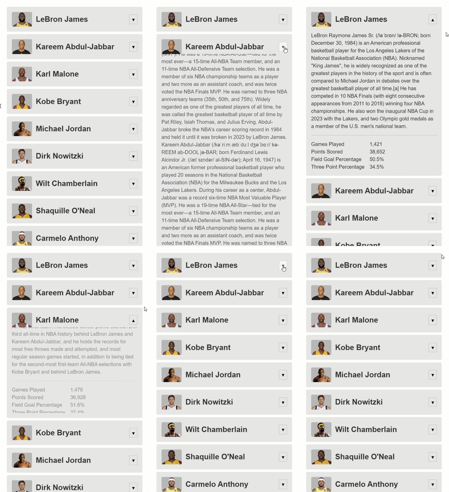
Eh, maybe a little bit.
We could probably make it even better, but I think this is a good start.
In Conclusion
It’s probably negligible but hopefully you have some more tools to go and add your own expanding and collapsing animations now.
I hope you found this tutorial helpful, and if you did, check out my channel for more videos on Angular Animations, and on various other topics and features within Angular.
I hope you found this tutorial helpful, and if you did, check out my YouTube channel for more on Angular Animations, and on various other topics and features within Angular.
Additional Resources
- The demo BEFORE animations
- The demo AFTER animations
- My Angular Animations YouTube Playlist
- Introduction to Angular animations
Get Ahead of Angular’s Next Shift
Most Angular apps today still rely on reactive forms, but that’s starting to shift.
Signal Forms are new, and not widely adopted yet, which makes this a good time to get ahead of the curve.
I created a course that walks through everything in a real-world context if you want to get up to speed early: 👉 Angular Signal Forms Course
Want to See It in Action?
Check out the demo code and examples of these techniques in the Stackblitz example below. If you have any questions or thoughts, don’t hesitate to leave a comment.


