Angular Reactive Forms: Create and Enhance Form Controls
Building forms in Angular requires understanding Reactive Forms, but many developers struggle with creating form controls, tracking validation states, and providing user feedback. This tutorial shows you how to create form controls using Angular's Reactive Forms Module, track validity and interaction states, and enhance forms with visual feedback based on user input. You'll learn the fundamentals needed to build production-ready forms that guide users through the submission process.
Angular Forms Tutorial Series:
- Form Validation Basics - Learn form validation fundamentals
- Form Accessibility - Make forms accessible
- Migrate to Signal Forms - Modern Signal Forms migration
The Demo Application
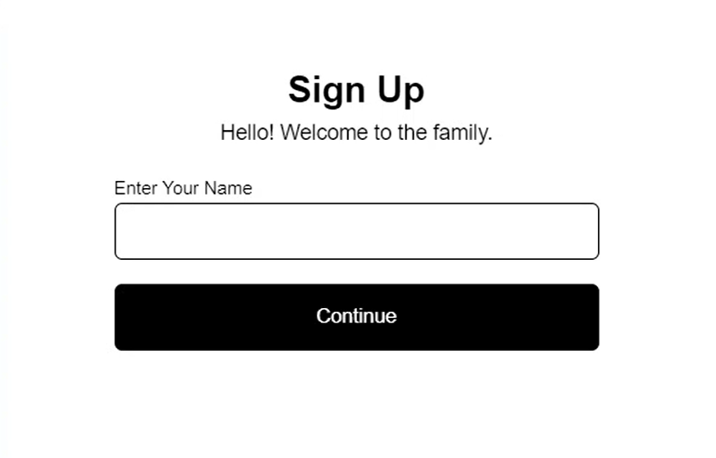
Ok, for this example, I have already created a basic sign-up form component where we’ll need to collect a person’s name before they can create an account.
Let’s take a look at the code for this component.
form.component.ts
import { Component } from "@angular/core";

@Component({
    selector: 'app-form',
    templateUrl: './form.component.html',
    styleUrl: './form.component.scss',
    standalone: true,
})
export class FormComponent {
}
Starting off, we don’t really have much here, just the basic make-up for an Angular component.
Let’s switch and take a look at the template. This is where we have the mark-up for our form.
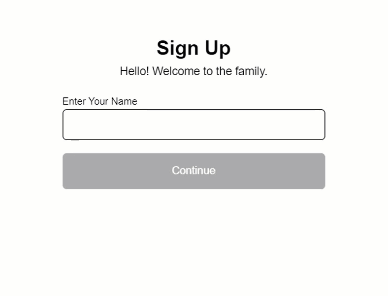
Up at the top, we have the title region that appears above the form.
<header>
    <h2>Sign Up</h2>
    <em>Hello! Welcome to the family.</em>
</header>
Below this, we have a success message that we’ll want to display once our form has been submitted.
<!-- <div class="success">
    <h2>Success!</h2>
    <em>The form was submitted with: </em>
</div> -->
We’ll use some logic to conditionally display this message, but we don’t want it to show right now, so we’ll leave it commented out.
Then we have the label and form field for the name that we are requesting from the user.
<label>
    <strong>Enter Your Name</strong>
    <input type="text" />
</label>
This input will become our Angular Form Control.
Below this field, we have an error message that we’ll conditionally display when our form control is invalid after the user has interacted with it.
<div class="error">
    Your name is required!
</div>
Then, here at the bottom, we have the button that will be used to submit the form.
<button>Continue</button>
Ok, so that’s what we’re starting with, now let’s begin by adding the form control.
Adding an Angular Form Control and How it Works
We’ll start by adding a protected field to be used by our form control, let’s call it, “name”. We’ll set this field to a new instance of a FormControl from the Angular forms module. This control will be typed as a string since we’re expecting the name value entered to be a string.
The first parameter we need to pass is the initial value of our control. In this case, we’ll start it out as an empty string.
form.component.ts
import { FormControl } from '@angular/forms';

@Component({
    selector: 'app-form',
    ...
})
export class FormComponent {
    protected name = new FormControl<string>('');
}
Ok, this is all we need to provide for a basic control, but we do have more options that we can set here too.
In this case, we’ll want this field to be required before the form can be submitted since it wouldn’t make sense to submit an empty name value. So, to make it required we can use the Validators class from the Angular forms module.
This class contains a set of common validators that can be used with form controls. In our case we’ll use the “required” method from this class.
form.component.ts
import { ..., Validators } from '@angular/forms';

@Component({
    selector: 'app-form',
    ...
})
export class FormComponent {
    protected name = new FormControl<string>('', Validators.required);
}
Ok, that’s it.
Now, to wire this control up on our input in the template we’ll use the formControl directive from the Reactive Forms Module. In order to use this directive, we need to import this module into our component imports array.
form.component.ts
import { ..., ReactiveFormsModule } from '@angular/forms';

@Component({
    selector: 'app-form',
    ...,
    imports: [
        ReactiveFormsModule
    ]
})
Ok, now we can switch back to the template where we can simply bind the formControl directive to our “name” field.
form.component.html
<input type="text" [formControl]="name" />
That’s it. This is now a form control.
Now to better illustrate what this means, let’s out the value of this field below the form with string interpolation.
form.component.html
<div>{{ name.value }}</div>
This will make it so that when we type in the form field, as the value changes, we should see this value update here too.
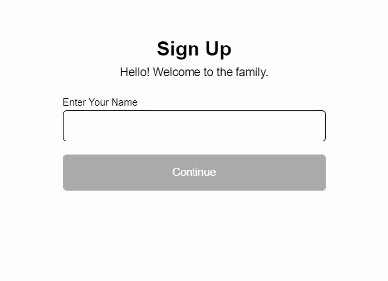
Ok, let’s save and take a look.
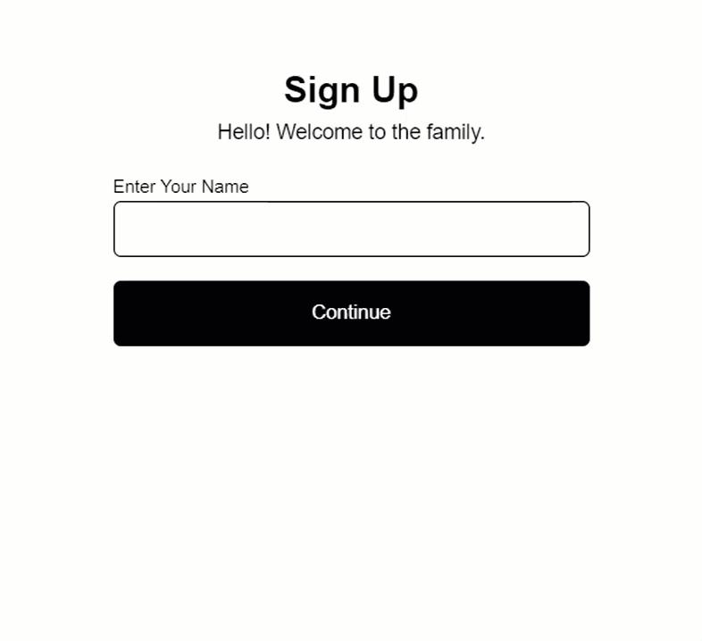
Once the app reloads, it looks like nothing has changed. But, when we type a name we can see the value updating below the form.
So that’s how you create a basic form control. This input now has some superpowers. As you can see, it’s easy to access the dynamic value of the control and there’s a whole lot more that we can do here too.
Monitoring the Invalid State of the Angular Form Control
With a form control, there are many properties that we can access on the control itself, besides just the value. One of these is the invalid state of the control.
form.component.html
<div>{{ name.invalid }}</div>
Now let’s save and check it out.
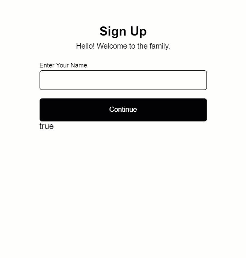
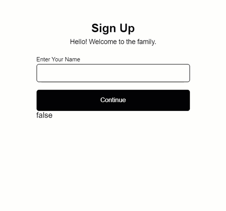
Ok, right out of the gate we can see that the form is invalid with it displaying a value of true. This is, of course, because the field is required, but we haven’t yet entered a value.
Then, as soon as we enter a single character the form becomes valid and displays a value of false for the invalid state.
Monitoring the Interaction State of the Angular Form Control
Something else we can do is monitor whether a person has interacted with the control and then moved on.
For this, we can use the “touched” property.
form.component.html
<div>{{ name.touched }}</div>
Now let’s save and see how this works.
Ok, as we’d expect, the touched state of the control is false before we interact with it. Then, when we focus the control, the touched value remains unchanged. But, once we focus outside of the control, the touched value is updated to true.
Now there’s a lot more that we can do too, but this is all we’ll focus on for this tutorial.
Now that we know how to react to the invalid and touched states of our form control, we can easily add some enhancements to this form.
Adding Conditional Classes Based on Angular Form Control Validity
For one, let’s bind a “disabled” class on the button while the form control is invalid.
To do this, we’ll use simple class-binding and we’ll bind this “disabled” class when the name control is in an invalid state.
form.component.html
<button [class.disabled]="name.invalid">
    Continue
</button>
Ok, now let’s save and see how this works.
Ok, now we can see that our disabled styles are applied before entering a value because the form control is invalid at that point. Then, as soon as we type, the form becomes valid so the “disabled” class and its styles are removed.
That’s pretty handy right?
Toggling an Error Message Based on Angular Form Control Validity and Touched Status
Now, let’s add some logic to display the error message.
We want to show this message when the field is invalid, but we don’t want to show it until the control has been touched.
So, let’s use class-binding again to bind a “visible” class on the div containing the message. This class will be added when the name field is invalid, and when it’s touched.
form.component.html
<div
    [class.visible]="name.invalid && name.touched"
    class="error">
    Your name is required!
</div>
Ok let’s save and try this now.
So, the message is not rendered to start which is what we want. Then when we focus, and then blur the field, it’s properly displayed.
So now the user has some pretty good feedback about what they need to do in this form.
When the control is invalid, the button looks disabled. Then when we interact with it, if we mess up, it presents us with feedback letting us know what’s wrong.
Submitting the Form and Displaying a Success Message
Now, let’s wire up the form to submit and swap the form with the success message afterward.
For this, let’s switch back to the typescript and add another protected field. Let’s call it “submitted”, and let’s set its initial value to false.
form.component.ts
protected submitted = false;
Ok, now let’s switch back to the template.
Now to set this property, we’ll use event-binding. We’ll bind to the click event on our button.
When it’s clicked, we’ll set the “submitted” property, based on the invalid state of the control. So, if you click it and it’s invalid, the submitted value will remain false, but when you click it and it’s valid, it will be set to true.
form.component.html
<button
    [class.disabled]="name.invalid"
    (click)="submitted = name.valid">
    Continue
</button>
Ok, now we can use this property to add the logic to switch between showing the form, and the success message.
We’ll wrap the success message in an @if condition based on the “submitted” value. Then, we can wrap the form in the @else condition.
form.component.html
@if (submitted) {
    <div class="success">
        <h2>Success!</h2>
        <em>The form was submitted with: </em>
    </div>
} @else {
    <label>
        <strong>Enter Your Name</strong>
        <input type="text" [formControl]="name" />
    </label>
    <div
        [class.visible]="name.invalid && name.touched"
        class="error">
        Your name is required!
    </div>
    <button
        (click)="submitted = name.valid"
        [class.disabled]="name.invalid">
        Continue
    </button>
}
So, when the “submitted” property is false, we’ll show the form. When it’s true, we’ll hide the form and show the success message.
Now, let’s also add the value that the control was submitted with, to the message.
form.component.html
<em>The form was submitted with: {{ name.value }}</em>
Ok, now let’s save and try this all out.
Ok, everything looks good to start, and when we touch the textbox, we still get the error message. So that all still works correctly.
Then when we add a name, the button is enabled. And now, when we submit the form, we see the success message that includes the name value added from the form control.
Pretty cool right?
In Conclusion
So now you know how to create a basic required form control in Angular using the Reactive Forms Module. Also, you know how to use various properties from that control to enhance your form in several different ways. And overall, it’s not all that difficult to do either, right?
Ok, I guess that’s all for now.
I hope you found this tutorial helpful, and if you did, check out my YouTube channel for more tutorials about various topics and features within Angular.
Additional Resources
- The demo BEFORE making any changes
- The demo AFTER adding the form control and all other features
- The Official Angular Reactive Forms Documentation
Get Ahead of Angular’s Next Shift
Most Angular apps today still rely on reactive forms, but that’s starting to shift.
Signal Forms are new, and not widely adopted yet, which makes this a good time to get ahead of the curve.
I created a course that walks through everything in a real-world context if you want to get up to speed early: 👉 Angular Signal Forms Course
Want to See It in Action?
Check out the demo code and examples of these techniques in the Stackblitz example below. If you have any questions or thoughts, don’t hesitate to leave a comment.


