One Slot? Two Slots? Conditional Slots? Solved.
Multi-slot content projection in Angular enables flexible component APIs, but managing multiple slots, conditional projection, and fallback content requires understanding Angular's content projection system. This tutorial demonstrates how to create components with multiple named slots, handle conditional content projection, provide fallback content when slots are empty, and conditionally render the same slot in different locations based on component state.
That’s what this tutorial is all about.
By the end, you’ll know how to build layout components that adapt to what’s passed into them — and only render what they need.
Let’s make our components a little smarter.
Understanding the Starting Card Layout
Here’s what we’re starting with, a pretty basic card component:
It renders some projected content, but nothing fancy.
It’s just a basic presentation component that can be used in a lot of different ways.
In this tutorial, we’re going to add some additional content regions to this component to provide even more flexibility.
But, before we do, let’s look at the code to get a better understanding of what’s going on.
Right now, in the template for this component, we’ve got a generic ng-content directive:
<div class="card">
    <div class="card-body">
        <ng-content></ng-content>
    </div>
</div>
This acts like a placeholder, it’s where any content passed between the opening and closing card component tags will show up.
Okay, now let’s switch to the main app component to see how this component is used:
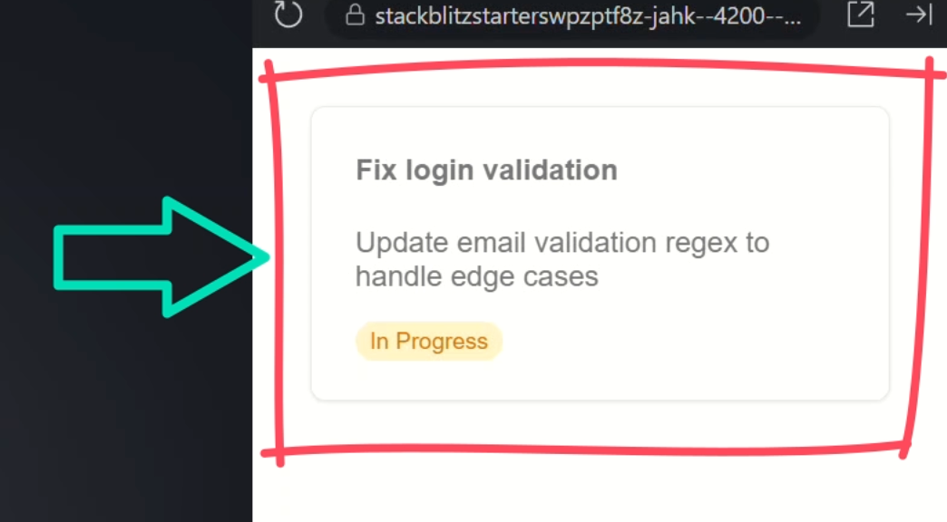
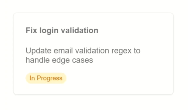
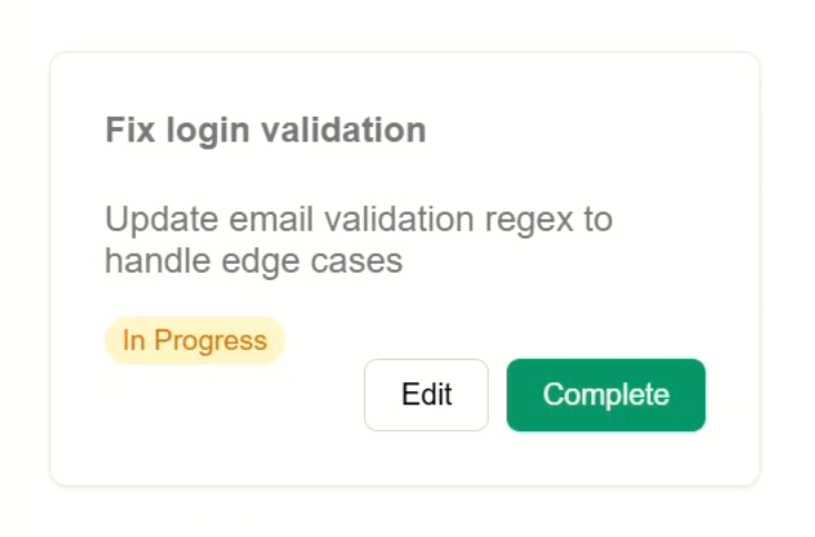
<app-card>
    <h4>Fix login validation</h4>
    <p>Update email validation regex to handle edge cases</p>
    <mark>In Progress</mark>
</app-card>
Here you can see we’re projecting some generic HTML: a heading, paragraph, and a mark tag into the content region for our card component.
And that’s what shows here:
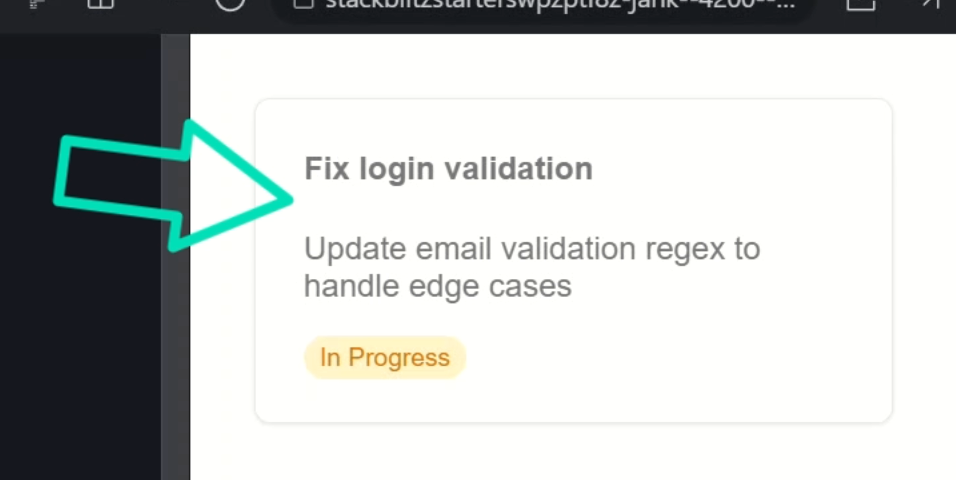
This is basic content projection.
Whatever you place between the component tags gets rendered where ng-content is.
How to Add Multiple Content Slots
Okay, now that we understand everything here, we want to add a title region to this component, also using content projection, but how can we do this since we already have a generic slot in our component?
Well let’s open back up the template and I’ll show you.
Projecting a Custom Header with ng-content
First, let’s start by adding another ng-content directive.
But this time, we’re going to set it up to select something more specific with the select attribute:
<ng-content select="h3"></ng-content>
This allows us to project a specific piece of content into this slot using a CSS selector, in this case an h3.
This tells Angular: Only project the h3 element here, skip everything else.
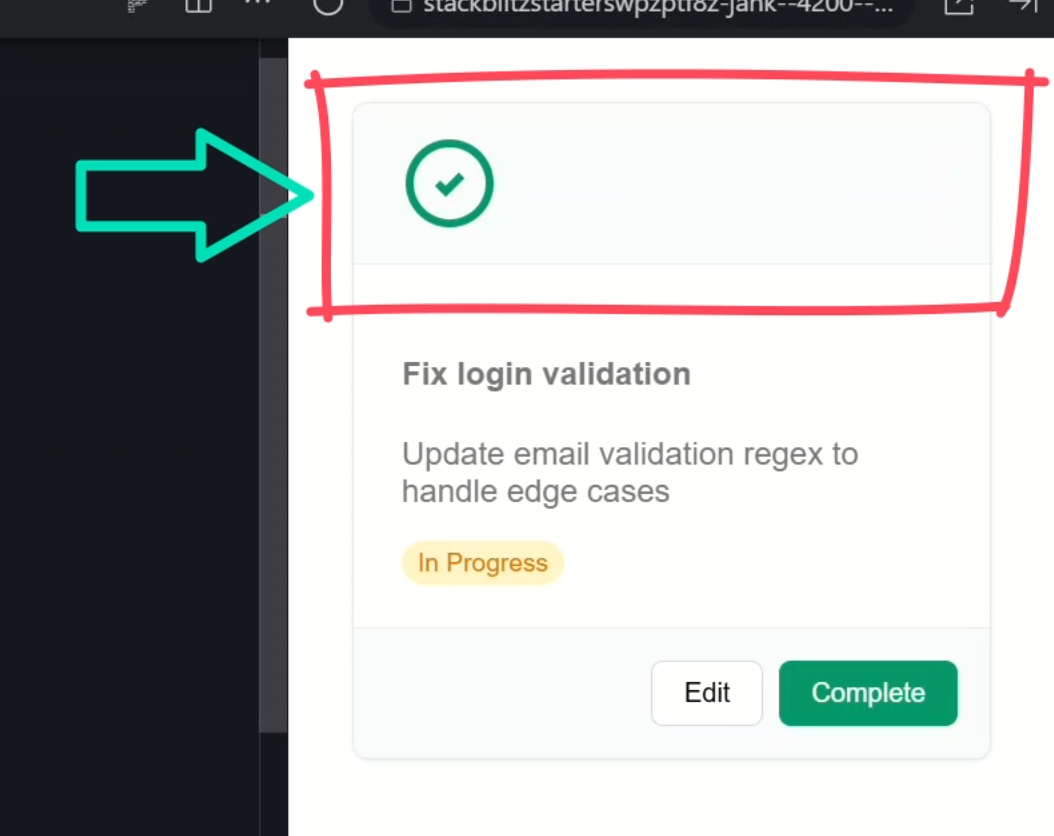
Now, in order to make this look a little better, we’ll wrap it in a div with the card-header class and add a check mark icon to give it a little more visual pop:
<div class="card-header">
    <ng-content select="h3"></ng-content>
    <img src="/assets/icon.svg" alt="" />
</div>
Okay now let’s go back into the app component and add an h3 with the title above our other content:
<app-card>
    <h3>Task Details</h3>
    ...
</app-card>
Now let’s save and take a look:
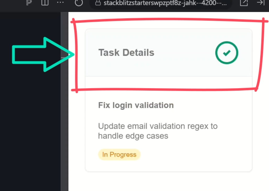
Boom! Our title is now neatly wrapped in that styled header section. We’re on our way!
Adding Footer Actions with a Named Slot
Now I want to add yet another slot.
This one will be for an “actions” region in the bottom of this card.
This one will be for buttons like “edit”, “learn more”, “Save”, etc.
Here, we have a navigation component already created and this is what we want to project into this new region.
So, let’s open back up the card component template.
Below the body, let’s add another div, this time with the card-actions class.
Then within this div, we’ll add another ng-content directive.
This time we’ll select on the app-navigation element:
<div class="card-actions">
    <ng-content select="app-navigation"></ng-content>
</div>
Okay, now that we have a slot, let’s head back into the app component.
Now, before we can use the navigation component, we need to import it in our component’s imports array:
import { NavigationComponent } from './navigation/navigation';

@Component({
    selector: 'app-root',
    ...,
    imports: [
        ...,
        NavigationComponent
    ]
})
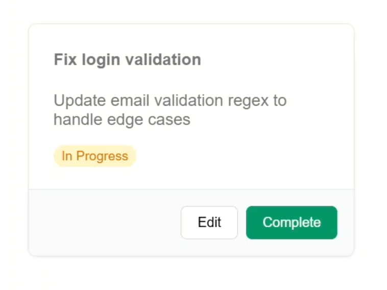
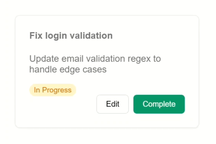
Okay now we can add this component within our card.
And within it, let’s add an “edit” button, and let’s add a “complete” button, and make it a type “submit”:
<app-card>
    ...
    <app-navigation>
        <button>Edit</button>
        <button type="submit">
            Complete
        </button>
    </app-navigation>
</app-card>
That should be all we need here, so let’s save and see how it looks:
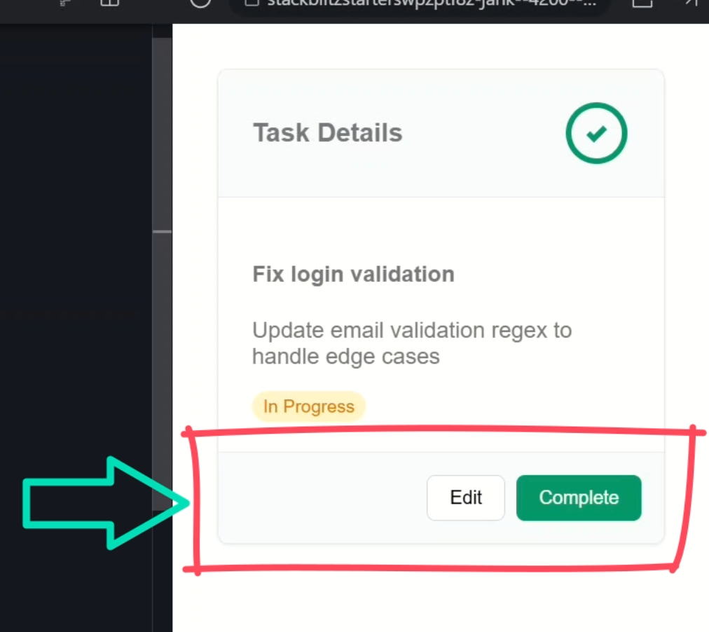
There it is.
Our new footer region with action buttons. Looks good, right?
So, this is pretty cool.
Making Layout Markup Conditional
We can easily add multiple different slot regions in our components when needed.
But a lot of the time, when we have layout components like this, the slots may be optional.
We may have a header in one case but not in another.
But now we have markup surrounding these slots.
So, what happens if the slot is not used?
Hiding the Header When It’s Not Projected
Well let’s comment out the h3 and find out:
Okay so right now, even if I remove the content, the container still shows up. That’s not ideal.
But good news, this can be fixed.
Let’s switch over to the TypeScript for the card component and add a property to check if the header slot exists or not that we can then use in our template.
Let’s call it “header,” and since the elements projected into this component are considered its “content”, we can use a contentChild() signal query.
In this case it will be an element, and we’ll look for an element with an alias of “header” which we’ll see more on in a minute:
import { ..., contentChild } from '@angular/core';

@Component({
    selector: 'app-card',
    ...
})
export class CardComponent {
    protected header = contentChild<Element>('header');
}
So, this sets up a reactive signal called “header”.
It’ll return the element if something with the template reference of “header” is projected into the component.
Otherwise, it’ll be null.
This means that we can now switch over to the template and then wrap the header markup in an @if block based on this signal:
@if (header()) {
    <div class="card-header">
        <ng-content select="h3"></ng-content>
        <img src="/assets/icon.svg" alt="" />
    </div>
}
So now this section should only render if the “header” signal is truthy.
Let’s save and see:
Nice, since we don’t have a header at the moment, we no longer see the header markup either.
Now, let’s switch back over and uncomment the header, then in order to be recognized by the content child function, we need to add a “header” template reference variable here:
<h3 #header>Task Details</h3>
Ok, now let’s save and see how it looks:
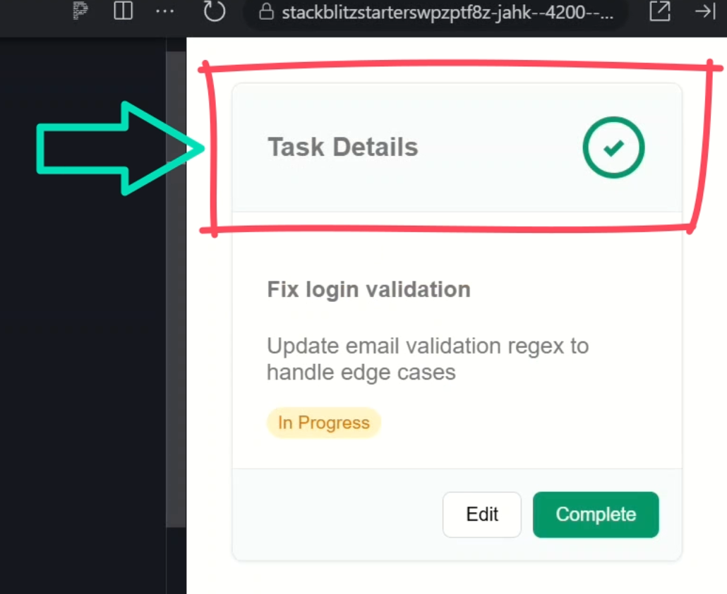
And there it is. The wrapping markup is back!
So, this is cool, but needing to remember the reference variable might be a little annoying.
You can do it this way but it’s probably a little awkward.
Let’s comment back out this h3.
<app-card>
    <!-- <h3 #header>Task Details</h3> -->
    ...
</app-card>
Conditionally Rendering Footer Actions
Next, let’s do the same for the navigation section.
But in this case, it’ll be a little different, maybe even a little better actually.
First, let’s comment out the navigation component and save:
<app-card>
    ...
    <!--<app-navigation>
        <button>Edit</button>
        <button type="submit">
            Complete
        </button>
    </app-navigation> -->
</app-card>
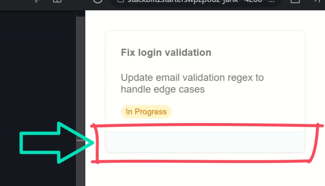
Yep, the footer container still shows up, empty and sad.
Let’s switch back over to the TypeScript for the card component and add another contentChild() signal, this time for the navigation component, so we can use the class as the selector:
import { NavigationComponent } from '../navigation/navigation';

@Component({
    selector: 'app-card',
    ...
})
export class CardComponent {
    protected nav = contentChild(NavigationComponent);
}
Then we can switch over to the template and update the footer container to only render if this signal is truthy:
@if (nav()) {
    <div class="card-actions">
        <ng-container *ngTemplateOutlet="navActions" />
    </div>
}
Okay that’s it, let’s save and see:
Nice, now the navigation wrapper disappears too.
Using the Same Slot in Multiple Places
Now, what if we need a slot in multiple different locations conditionally in the template.
Like, what if I want this navigation section to show up where it does only when the header is included, but when the navigation is included without the header, it is included in the body region?
Well let’s switch over to the template and try this out.
The Problem with Duplicate Slots
Let’s duplicate the navigation slot inside the card body, but wrap it in an @if block to only show if there’s no header:
<div class="card-body">
    <ng-content></ng-content>
    @if (nav() && !header()) {
        <ng-content select="app-navigation"></ng-content>
    }
</div>
Then let’s update the original section to only show when there is a header:
@if (nav() && header()) {
    <div class="card-actions">
        <ng-content select="app-navigation"></ng-content>
    </div>
}
So now it’s mutually exclusive, only one should show depending on the header’s presence.
Okay, let’s save and try this out:
Nice. In this case, we have no header so the buttons are included right with the body content.
But, what happens when we add the header back in?
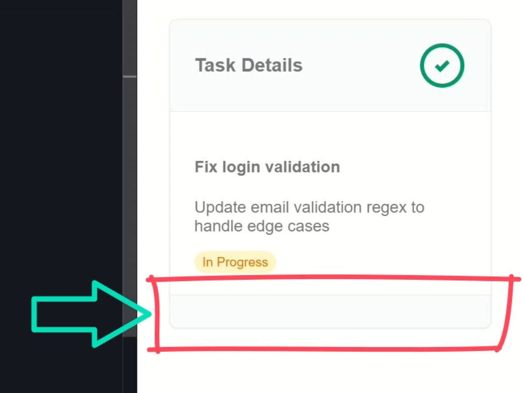
Bummer, now we’re not actually getting any buttons.
This is the problem with how we have this slot included twice.
What happens in this case is that the first slot encountered is the one that gets rendered.
But in this case, that slot isn’t actually rendered because the condition is false.
This is why we don’t actually see any buttons.
But there is a fix!
The Fix: Reusing Slots with ngTemplateOutlet
Let’s switch back to the card template and move this slot into an ng-template with a reference variable of navActions:
<ng-template #navActions>
    <ng-content select="app-navigation"></ng-content>
</ng-template>
Okay now we can switch these over to use an ng-container with an ngTemplateOutlet where we reference the variable for our template:
First Slot
<div class="card-body">
    <ng-content></ng-content>
    @if (nav() && !header()) {
        <ng-container *ngTemplateOutlet="navActions" />
    }
</div>
Second Slot
@if (nav() && header()) {
    <div class="card-actions">
        <ng-container *ngTemplateOutlet="navActions" />
    </div>
}
Then we just need to switch over to the TypeScript and add the ngTemplateOutlet directive to our component imports:
import { NgTemplateOutlet } from '@angular/common';

@Component({
  selector: 'app-card',
  ...,
  imports: [ NgTemplateOutlet ]
})
Okay now let’s save and try it again:
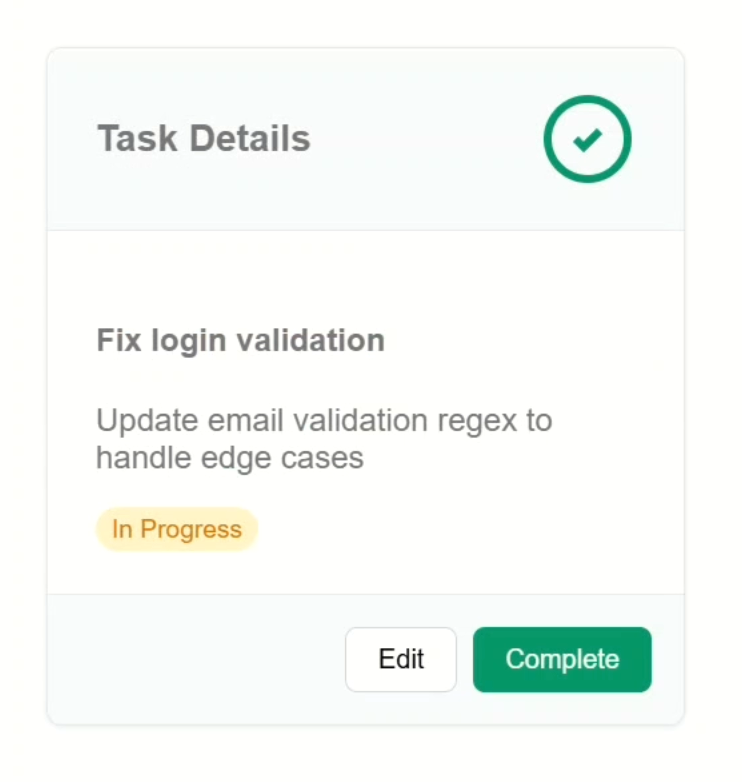
Nice, now everything works exactly as expected.
If we have a header, we have the navigation in a footer container.
If we don’t, the buttons move in with the body:
Now, this component is a lot more flexible right?
Wrap-Up: Smarter, Cleaner Layout Components
And that’s it.
We’ve gone from a basic card component to something way more flexible, adaptive, and just smarter.
We covered how to create multiple named slots with ng-content, control their rendering with contentChild(), and reuse them across your layout with ngTemplateOutlet.
These small patterns go a long way in making your components more flexible, cleaner, and easier to use.
If this helped, give it a like and subscribe for more Angular tips and tricks.
If you found this helpful, don’t forget to subscribe and check out my other Angular tutorials for more tips and tricks!
Additional Resources
- Content projection with ng-content
- Angular Signals Overview
- contentChild Signal Query Docs
- The ngTemplateOutlet Directive
- Angular flow control basics
- My course: “Angular: Styling Applications”
Want to See It in Action?
Want to experiment with the final version? Explore the full StackBlitz demo below. If you have any questions or thoughts, don’t hesitate to leave a comment.


