Toast Notifications in Angular? Easier Than You Think!
Toast notifications provide user feedback for actions, errors, and system messages, but building them from scratch requires overlay management, positioning, and animation coordination. Angular Material's Snackbar service handles all of this complexity, providing a simple API for displaying toast notifications with actions, custom durations, and styling. This tutorial demonstrates how to implement toast notifications using Angular Material, including advanced patterns like triggering overlays from snackbar actions.
Install Angular Material and Set Up the Project
Now, I already have Angular Material installed in this demo project, but if you’re starting from scratch, you’ll want to run this command first to install it in your project:
npm install --save @angular/material
This gives you access to all of Angular Material’s components — including the snackbar service and overlay tools we’ll be using in this video.
Okay, now that we have that installed, let’s look at the app we’ll be using in this tutorial.
Review the Basic Contact Form (Before Snackbars)
It’s just a basic contact form with name, email, and message fields, and when we click the “Send” button, nothing happens:
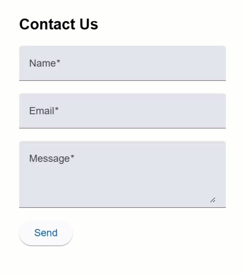
No success message.
No error.
Let’s fix that.
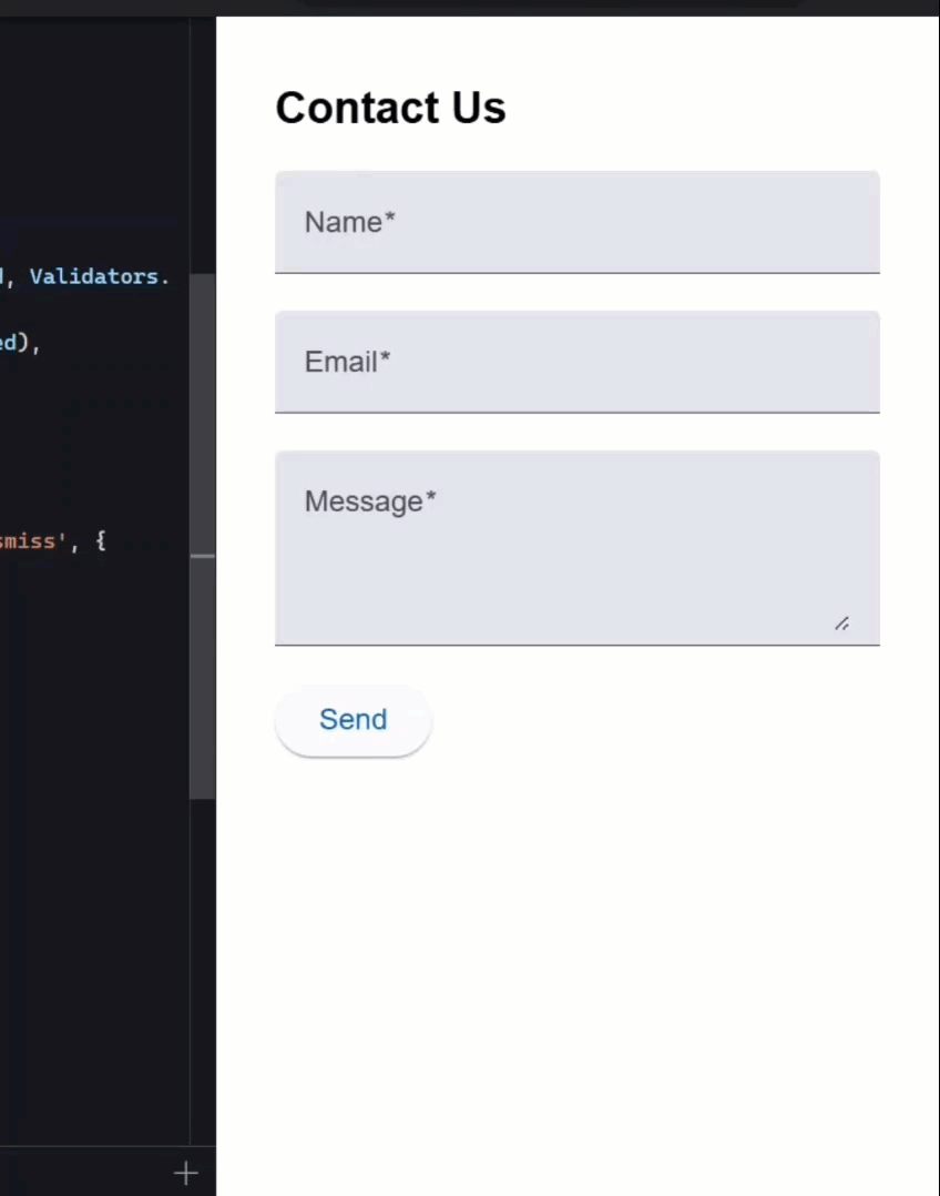
Let’s look at the component behind that form.
You can follow along with the code here.
All we’ve got is a form group defined with some simple controls and basic validators:
export class ContactFormComponent {
  protected contactForm = new FormGroup({
    name: new FormControl<string>('', Validators.required),
    email: new FormControl<string>('', [Validators.required, Validators.email]),
    message: new FormControl<string>('', Validators.required),
  });
}
But if you look down near the bottom, the function responsible for handling form submission is completely empty:
export class ContactFormComponent {
  ...

  protected submitForm() {
  }
}
Now let’s look at the template.
In the HTML, we’ve got three Angular Material form fields and a button to submit the form:
<h2>Contact Us</h2>
<form [formGroup]="contactForm" (ngSubmit)="submitForm()">
  <mat-form-field>
    <mat-label>Name</mat-label>
    <input matInput formControlName="name" required />
  </mat-form-field>
  <mat-form-field>
    <mat-label>Email</mat-label>
    <input
      matInput
      formControlName="email"
      required
      type="email"
      autocomplete="none"
    />
  </mat-form-field>
  <mat-form-field>
    <mat-label>Message</mat-label>
    <textarea matInput formControlName="message" rows="4"></textarea>
  </mat-form-field>
  <button mat-raised-button type="submit">Send</button>
</form>
This is all connected to that same empty submit function we just saw:
<form ... (ngSubmit)="submitForm()">
  ...
</form>
Okay, so that’s what we’re starting with.
Let’s enhance this form with some simple toast-style notifications.
Show Success Messages with Angular Material Snackbars
To add these types of notifications, all we need is Angular Material’s MatSnackBar service.
So, let’s create a new field named “snackBar”, and we’ll use the inject() function to inject the snackbar service:
import { MatSnackBar } from '@angular/material/snack-bar';

export class ContactFormComponent {
  ...

  protected snackBar = inject(MatSnackBar);
}
This gives us access to a method that will trigger snackbars anywhere in the component.
Now, in our submitForm() method, let’s add a condition to check if the form group is valid.
If it is, we’ll open a snackbar using the service’s open() method.
The first thing we pass in is the message we want to display.
The next parameter is a label for the optional action button in the snackbar.
By default, this action will close the snackbar. So we’ll add a label of “Dismiss”.
import { MatSnackBar } from '@angular/material/snack-bar';

export class ContactFormComponent {
  ...

  protected submitForm() {
    if (this.contactForm.valid) {
      this.snackBar.open('Message sent successfully!', 'Dismiss');
    }
  }
Now, for the third parameter, we can specify custom configuration options.
By default, snackbars stay visible until they’re dismissed, but we want this success message to disappear after a short period of time.
We can do that by adding a “duration” option.
I’ll set it to nine seconds:
this.snackBar.open('Message sent successfully!', 'Dismiss', {
  duration: 9000,
});
So, it should automatically close after nine seconds now.
Alright, the last thing we need to do is reset the form after submission, just to clear everything out:
this.contactForm.reset();
Okay, that should be all we need to show a message when a valid form is submitted, so let’s save and try it out:
Okay, nothing looks different to start, but now, when I fill out the form and click send, the success message slides in at the bottom.
After nine seconds, it’ll close on its own.
Or we can fill out the form again, submit, and click the “Dismiss” button to close it manually.
It’s a clean and efficient solution, and remarkably simple to implement.
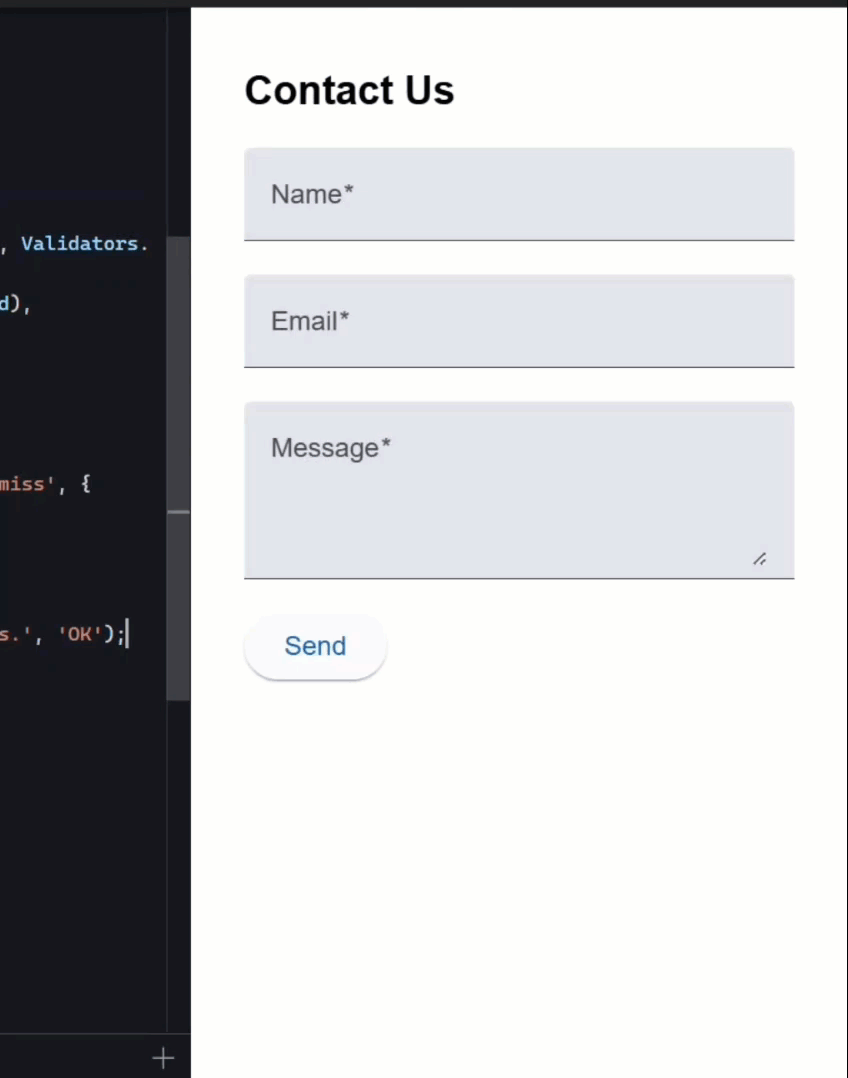
Add Error Notifications for Invalid Form Submissions
Now, let’s add a message when the form is invalid as well.
I’ll add an “else” condition with a different snackbar message.
This time, I’ll use an action label of “OK”:
export class ContactFormComponent {
  ...

  protected submitForm() {
    if (this.contactForm.valid) {
      ...
    } else {
      this.snackBar.open('Please fill in all required fields.', 'OK');
    }
  }
And for this message, we’ll leave it visible until it’s manually dismissed, so I’ll skip the duration config.
Alright, let’s save and see how this one works:
Now when we submit an incomplete form, we get an error message with an “OK” button.
And when we click that button, the message disappears.
Pretty straightforward, right?
Style Snackbars with Custom Classes and Global Styles for Success and Error States
But I think this would be even better if these messages were visually different, maybe green for success and red for error.
To do that, we can add custom classes to each snackbar.
We’ll use the “panelClass” option, which takes an array of class names.
Let’s add “snackbar-success” for the success message, and “snackbar-error” for the error message:
export class ContactFormComponent {
  ...

  protected submitForm() {
    if (this.contactForm.valid) {
      this.snackBar.open('Message sent successfully!', 'Dismiss', {
        ...,
        panelClass: ['snackbar-success'],
      });
      ...
    } else {
      this.snackBar.open('Please fill in all required fields.', 'OK', {
        panelClass: ['snackbar-error'],
      });
    }
  }
These classes will let us target the snackbar container with custom styles.
Next, we’ll create a stylesheet for these styles.
We’ll add them as global styles, since the snackbar markup is injected outside of our contact form component.
Let’s call the file _mat-snackbar.scss.
Now I’ll add some custom style overrides using Angular Material’s specific classes and CSS variables where possible:
.snackbar-success,
.snackbar-error {
  --mat-snack-bar-button-color: white;

  .mat-mdc-snack-bar-action {
    background-color: rgba(white, 0.2);
  }
}

.snackbar-success {
  --mdc-snackbar-container-color: #4caf50;
}

.snackbar-error {
  --mdc-snackbar-container-color: #f44336;
}
In these styles I’ll set the success background to green, and the error background to red.
Okay, now I just need to include that SCSS partial along with the rest of the global styles.
I’ll open the global stylesheet and add the import line:
@use 'scss/mat-snackbar';
Alright, that should be all we need to style the snackbars, so let’s save and try it out:
Now if I submit the form with errors, it’s red, nice.
And if I submit valid data, it’s green.
Much clearer for the user, right?
Trigger a Custom Help Panel from the Snackbar Action
Now, what if we want to do something more interesting when the action button is clicked?
Like… instead of just dismissing the error, what if we showed a help panel?
Well, we can customize that behavior too.
I’ve already created a help panel component for this.
What we want to do is conditionally display this panel when the user clicks the action button in the error snackbar.
To do this, first, I’ll add a “showHelpPanel” signal to control visibility, and I’ll initialize it to false:
export class ContactFormComponent {
  ...

  protected showHelpPanel = signal(false);
}
Next, I’ll change the snackbar action label from “OK” to “Help”:
this.snackBar.open('Please fill in all required fields.', 'Help', {
  ...
});
The open() method returns a reference to the snackbar (MatSnackBarRef), so let’s store that in a variable:
const snackBarRef = this.snackBar.open(...);
Now, we’ll use that reference to call the onAction() method, which gives us an observable that emits when the action is clicked.
We’ll subscribe to it, and inside the callback, we’ll set the showHelpPanel signal to true:
snackBarRef.onAction().subscribe(() => {
  this.showHelpPanel.set(true);
});
Okay, that takes care of opening the help panel.
Now let’s add a function to close it.
We’ll call it closeHelpPanel(), and just set the signal back to false:
protected closeHelpPanel() {
  this.showHelpPanel.set(false);
}
Now we need to add the help panel to the template, but first, we need to import it in the component’s imports array:
import { HelpPanelComponent } from "./help-panel/help-panel.component";

@Component({
  selector: 'app-contact-form',
  ...,
  imports: [
    ...
    HelpPanelComponent,
  ],
})
export class ContactFormComponent {
  ...
}
Okay, switching over to the HTML…
First, I’ll add an @if block that checks the showHelpPanel signal.
Inside that block, I’ll render the
This allows it to appear or disappear based on our internal signal.
Finally, we’ll wire up a (close) event on the component that calls our closeHelpPanel() method:
@if (showHelpPanel()) {
  <app-help-panel (close)="closeHelpPanel()"></app-help-panel>
}
Alright, let’s save everything and try it out:

Now, when we submit the form without filling it out, we get the error snackbar, but now the action says “Help.”
Clicking it opens the help panel, and clicking “Close” inside the panel hides it again.
Pretty clean, right?
Final Recap: Toast Notifications and Help Panels Done Right
So that’s it! We added Angular Material snackbars for both success and error feedback, styled them using global styles, and made the app more interactive by linking the snackbar action to a custom help panel.
This is a really simple way to make your app feel more responsive and helpful for users.
If you found this helpful, don’t forget to subscribe and check out my other Angular tutorials for more tips and tricks!
Additional Resources
- The demo app BEFORE any changes
- The demo app AFTER making changes
- Angular Material Snackbar Official Docs
- Angular Material Installation Guide
- Angular Signals (Official Guide)
- Angular Reactive Forms (Official Guide)
- Angular CDK Overview
- My course: “Styling Angular Applications”
Want to See It in Action?
Check out the demo code showcasing these techniques in the StackBlitz project below. If you have any questions or thoughts, don’t hesitate to leave a comment.


