The Easiest Way to Add a Modal in Angular
Building modals in Angular often requires third-party libraries or complex overlay code, but the Angular CDK Dialog provides a native, lightweight solution that handles positioning, focus management, and backdrop behavior automatically. This tutorial demonstrates how to create modals using the CDK Dialog service, open any component as a modal, customize styling, and add custom behavior without external dependencies. You'll learn the simplest way to add professional modals to your Angular applications.
Install the Angular CDK: The First Step to Easy Modals
Since we’ll be using the Angular CDK for this example, you’ll want to make sure it’s installed before doing anything else.
I’ve already installed it in the demo project for this tutorial, but if you’re starting from scratch, just run this command:
npm install @angular/cdk
Once that’s done, we’re ready to use the Dialog service to create a modal.
Build Your First Angular Modal with the CDK Dialog
In this example, we’ve got a simple button on the page:
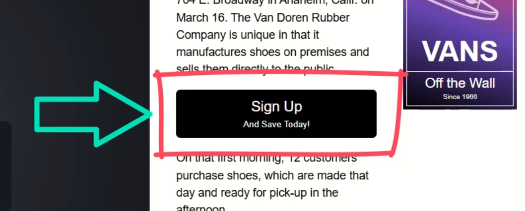
When a user clicks this button, we want to open the sign-up form component inside a modal that sits on top of everything else on the page.
Now, because this is an Angular app, and everything’s broken up into components, this might seem tricky at first.
But thanks to the Angular team, it’s actually really straightforward.
To start, the first step is to inject the Dialog service in the home component where the button lives, so let’s add a new property called “dialog”.
Then we’ll use the inject() function to inject the CDK Dialog service:
import { ..., inject } from "@angular/core";
import { Dialog } from "@angular/cdk/dialog";

export class HomeComponent {
  private dialog = inject(Dialog);
}
Okay, now that it’s injected, let’s create a function to open our modal, we’ll call it “openModal()”.
Within this function, we simply need to call the open() method from the Dialog service, then we need to pass the component that we want to “modalize”, so let’s add our sign-up form component:
import { SignUpFormComponent } from '../sign-up-form/sign-up-form.component';

export class HomeComponent {
  ...
  openModal() {
    this.dialog.open(SignUpFormComponent);
  }
}
And that’s it! That’s all it takes to open a component in a modal.
Now we just need to wire it up to the button click.
So, let’s switch over to the component template and add a click event on the button where we’ll call our new “openModal()” function:
<button (click)="openModal()">...</button>
Pretty simple, right?
Let’s save and try it out:
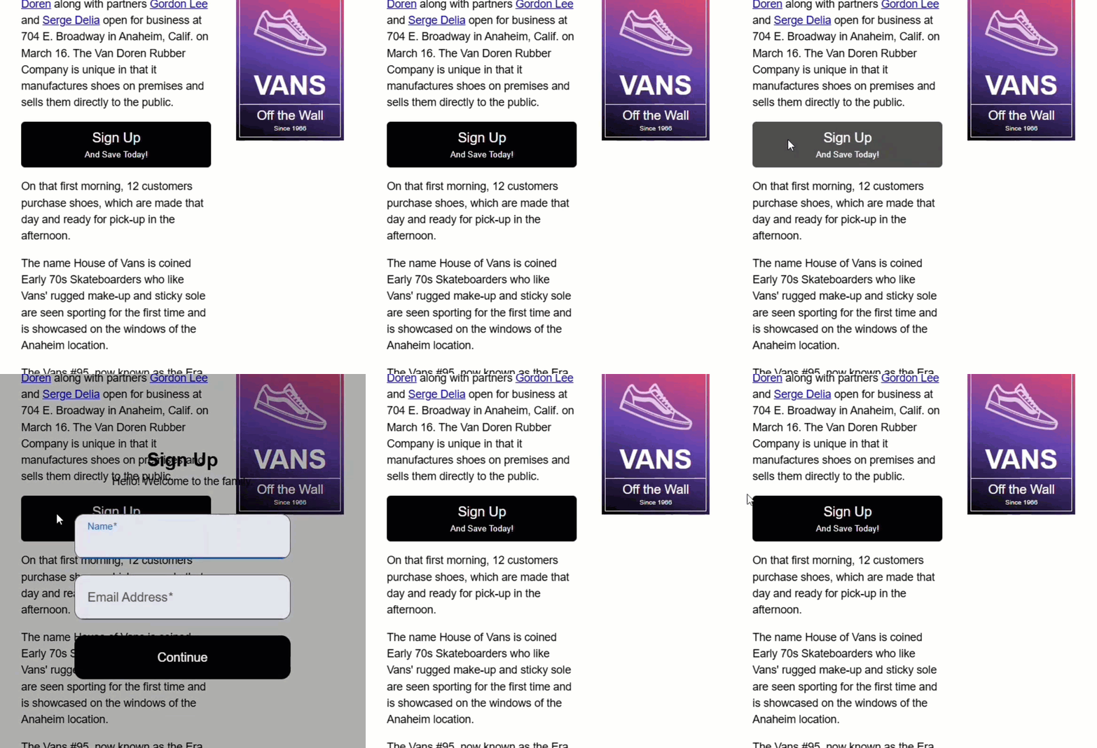
Okay, so the modal opens!
But… it doesn’t look much like a modal.
There are some very basic overlay styles included with the CDK Dialog, but our sign up form is just floating here and it’s pretty difficult to see.
We’ll need to add more CSS to make it look more like a traditional modal.
Style Your Modal: From Bare Bones to Beautiful
If we inspect the DOM, you can see that the CDK has injected some overlay containers near the end of the body, and within all this markup, our sign-up form component is injected right in the middle of it:
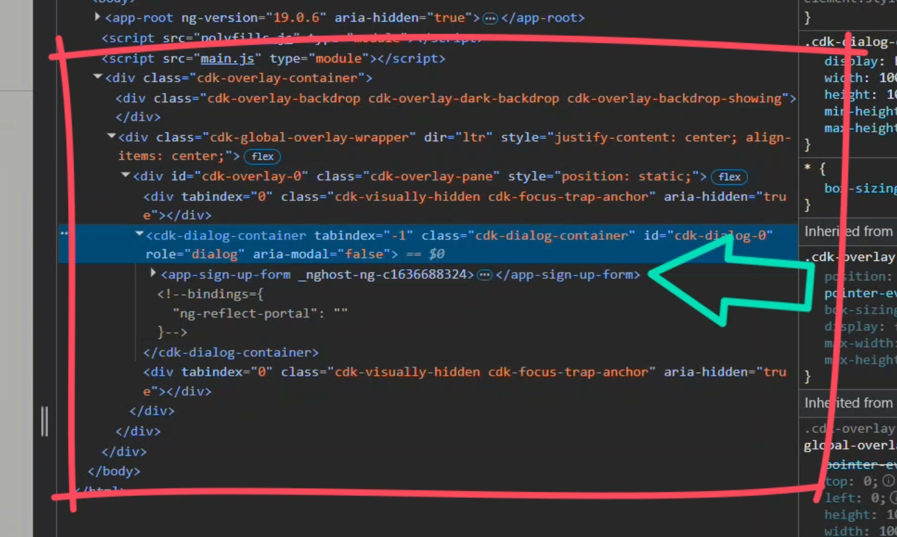
This is pretty cool because the button that opened this is up above in the root component and then within the markup for the home component:
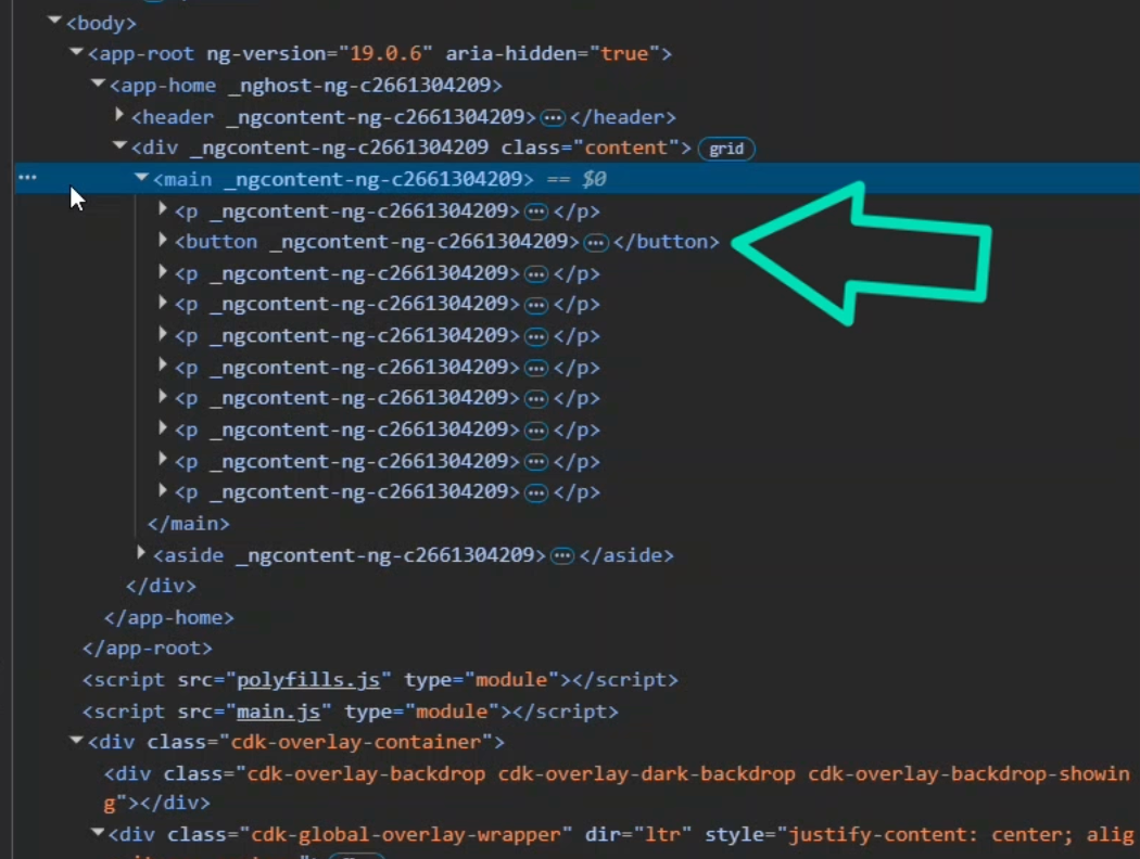
So now that the code works, we just need to add some styles.
We’ll apply some container styles directly to the host element of the sign-up form component.
But here’s the trick, we’ll only apply these styles when the component is inside a cdk-dialog-container since this form could be used outside of the dialog where we wouldn’t want these styles to apply, so we’ll use host-context instead of host for this:
:host-context(cdk-dialog-container) {
  display: block;
  border-radius: 0.375em;
  background-color: white;
  filter: drop-shadow(0 0 2em rgba(black, 0.5));
  padding: 0 2em 2em;
}
Okay, let’s try this again:
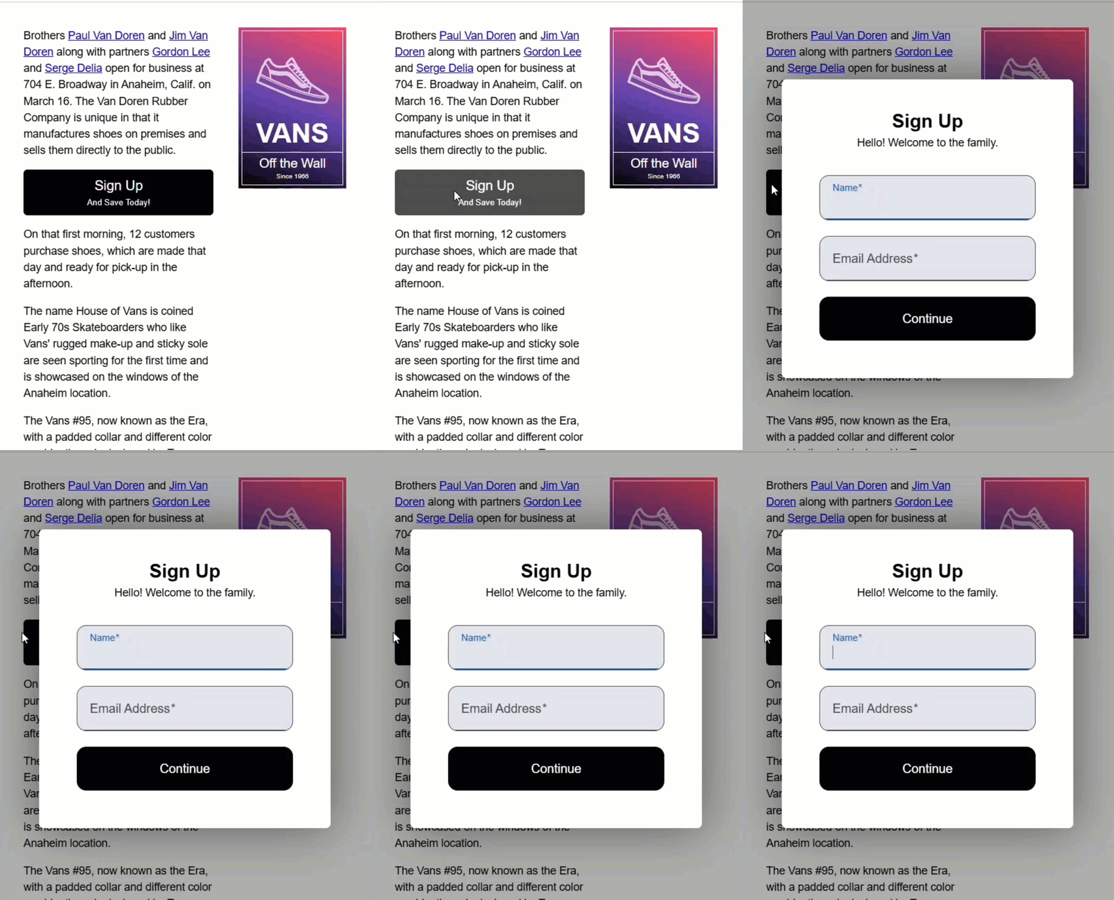
Perfect — that gives us a proper modal look and feel.
Close the Modal the Right Way (No Accidental Clicks)
Alright, we’ve got a working modal… but how do we close it?
Well, by default, if you click anywhere on this backdrop here, the modal will close:
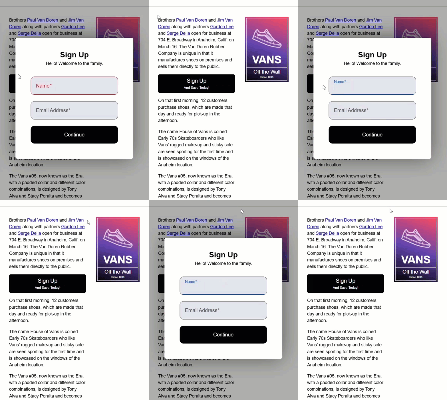
That’s handy — but it can also be frustrating, especially if the user accidentally clicks outside the modal unintentionally.
Well, we can disable this functionality pretty easily.
When you open a modal with the Dialog service, you can pass in a configuration object to customize its behavior.
So, inside the open() method, we’ll pass a second argument and set disableClose to true:
this.dialog.open(SignUpFormComponent, { disableClose: true });
Okay, now let’s test it out:
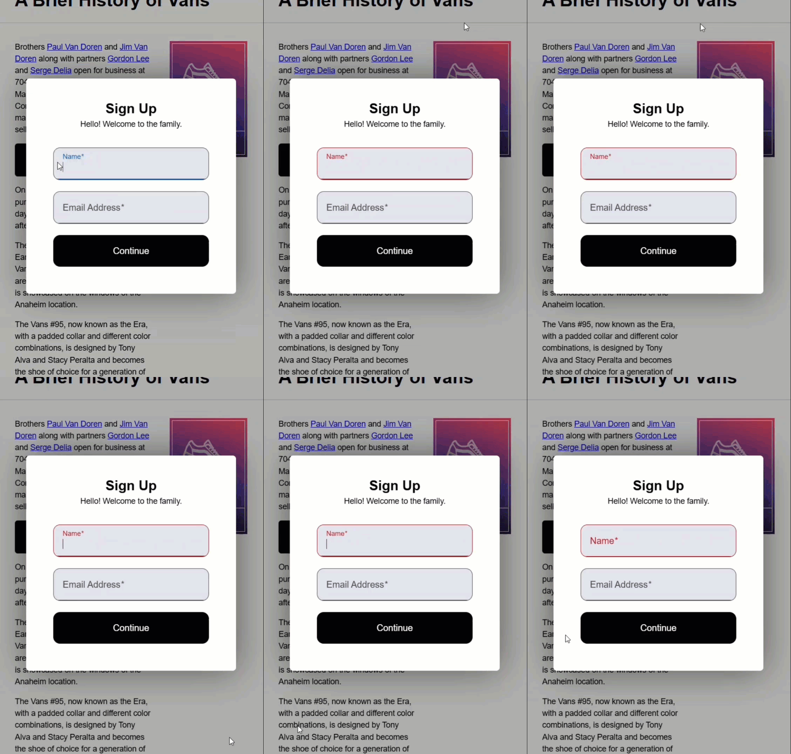
There, now, the backdrop is still visible, but clicking it doesn’t close the modal.
That’s great — except now, we don’t have any way to close it.
Let’s fix that by adding a custom close button to our sign-up form component.
First, we’ll inject the DialogRef so we can get a reference to the currently opened dialog.
We’ll call the property “dialogRef”, and again use the inject() function.
Since this component might also be used outside of a modal, we’ll mark this injection as optional:
import { ..., inject } from "@angular/core";
import { DialogRef } from '@angular/cdk/dialog';

export class SignUpFormComponent {
  ...
  protected dialogRef = inject(DialogRef, { optional: true });
}
Okay, now let’s create a “closeModal()” method.
Inside this method, we’ll call the DialogRef close() method to safely close the modal if the reference exists:
export class SignUpFormComponent {
  ...
  protected closeModal() {
    this.dialogRef?.close();
  }
}
Okay, that should be everything we need here.
Now let’s wire this up in the template.
First, we need to add a button, and we’ll add a “close” label.
Then, we need to add a click event where we can call our new “closeModal()” function:
<button (click)="closeModal()">Close</button>
Okay, let’s save and open the modal again:
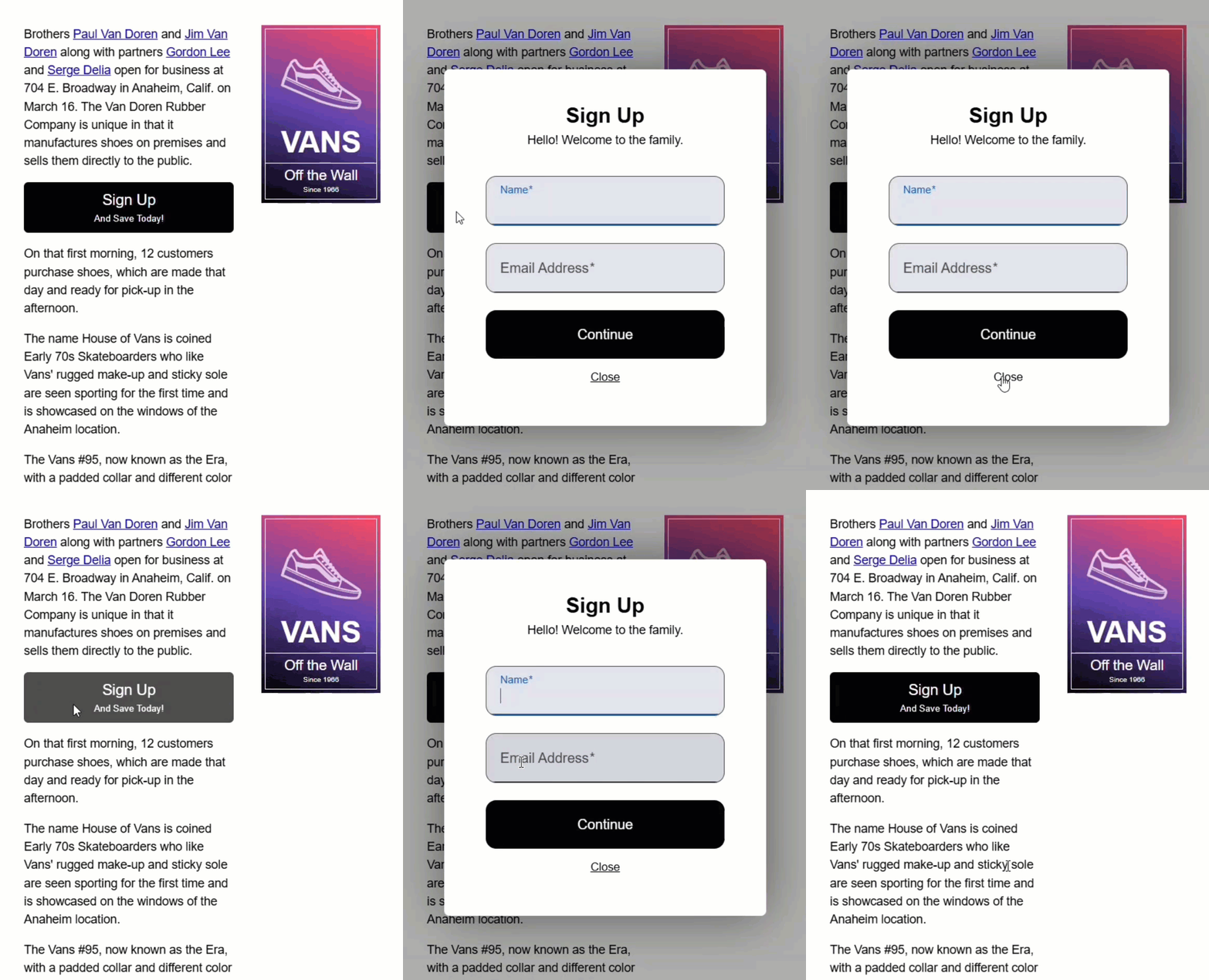
Now, we can close it properly with a custom button!
Wrap-Up: Angular CDK Dialog Modal Complete
So that’s it!
You just built a fully functional, customizable modal using the Angular CDK Dialog — no other external libraries, no extra dependencies.
It’s clean, it’s flexible, and it feels like it truly belongs in your Angular app.
If you found this helpful, don’t forget to subscribe and check out my other Angular tutorials for more tips and tricks!
Additional Resources
- The demo app BEFORE any changes
- The demo app AFTER making changes
- Angular CDK Dialog – Official Docs
- Angular Inject Function - Official Docs
- Accessibility in Modals (WAI-ARIA patterns)
- My course: “Styling Angular Applications”
Get Ahead of Angular’s Next Shift
Most Angular apps today still rely on reactive forms, but that’s starting to shift.
Signal Forms are new, and not widely adopted yet, which makes this a good time to get ahead of the curve.
I created a course that walks through everything in a real-world context if you want to get up to speed early: 👉 Angular Signal Forms Course
Want to See It in Action?
Check out the demo code showcasing these techniques in the StackBlitz project below. If you have any questions or thoughts, don’t hesitate to leave a comment.


