Angular Component Styling: Every Way to Add Styles (Complete Guide)
Angular offers multiple ways to add styles to components, each with different use cases and trade-offs. From inline styles in the decorator to external stylesheets, from programmatic styling with Renderer2 to CSS custom properties, choosing the right approach impacts maintainability and performance. This comprehensive guide walks through every styling method available in Angular, helping you make informed decisions for your components.
Using the styles Metadata Property for Quick Inline Styles
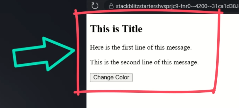
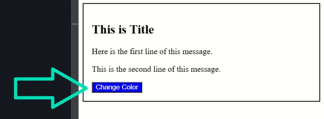
For this tutorial, we’ll be using a simple Angular component with a title, a couple of lines of text, and a button:
The easiest way to quickly add styles to a component is to add them directly in the component decorator, so let’s open the TypeScript for this example component.
Now, to add styles here, we can add a “styles” property.
This property accepts a template literal also known as a template string.
Within this string, we can simply add CSS, so let’s add some styles to our component host element:
@Component({
  selector: 'app-example',
  ...
  styles: `
    :host {
      display: block;
      padding: 1rem;
      border: solid 2px;
    }
  `
})
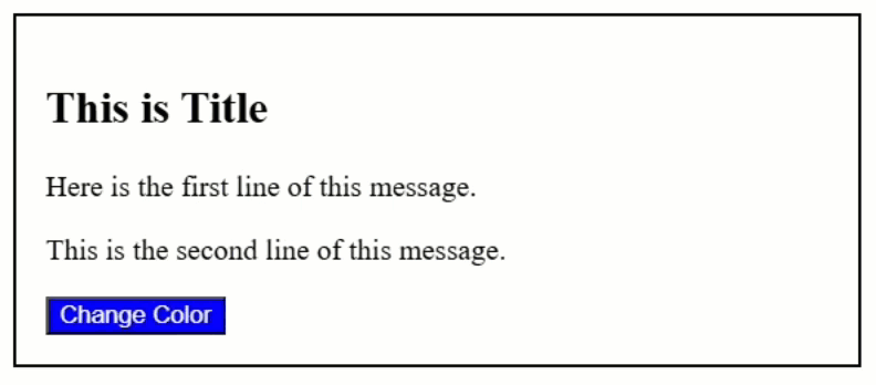
Now let’s save and see how it looks:
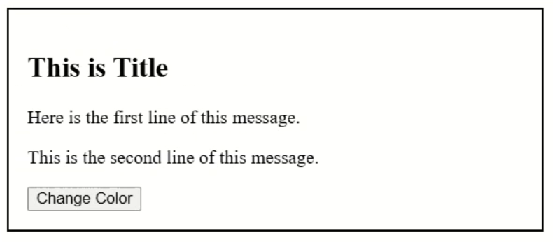
There, we’ve added some basic styles to the host element.
That was pretty easy, right?
Now, I rarely do this.
It works well for quick component-specific styles, but it isn’t ideal for large applications.
Instead, I prefer to move these styles to an external file.
Moving Styles to External Stylesheets with styleUrl or styleUrls
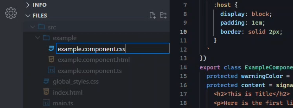
To add styles in an external stylesheet, we can link to any existing stylesheet so let’s go ahead and create one for this component.
We’ll call it example.component.css and we’ll create it right within the directory for this component:
Now, I’ve created a standard CSS stylesheet with the CSS extension, but if you prefer to use a preprocessor like SCSS or Less, you can simply add a file with the proper extension and it should just work.
Okay, now I’m going to copy the styles that we just added into this stylesheet instead:
:host {
  display: block;
  padding: 1rem;
  border: solid 2px;
}
Now we can replace the styles property with the styleUrl property instead:
@Component({
  selector: 'app-example',
  ...
  styleUrl: './example.component.css'
})
This property accepts a single string with the path, relative to our component, to the stylesheet.
Now, if you happen to have more than one stylesheet that you want to include, you can change this styleUrl property to styleUrls instead:
@Component({
  selector: 'app-example',
  ...
  styleUrls: [
    './example.component.css',
    'new-stylesheet.css'
  ]
})
This property accepts an array of path strings.
So that’s an option, but I rarely need to do that, so I’ll stick with the styleUrl property and the single stylesheet.
Now, let’s save and make sure it works:
Nice, it looks the same, so we know that it’s working correctly.
So this is how I add styles for components most often, and I normally prefer to use SCSS just because it makes things easier to build and maintain although this is becoming less and less the case as CSS continues to advance over time.
Adding the styles in external stylesheets keeps styles modular and makes them easier to maintain.
Personally, I prefer not to edit CSS directly in the TypeScript file.
Now these options work great for more static styles, but sometimes we may need to add styles programmatically.
Dynamically Applying Styles with Style Binding
If we find ourselves needing to do this, we can use style binding in the component template.
Let’s look at how we do this.
Before we switch to the template, I want to point out that I’ve already added a “warningColor” signal here set to the value “blue”:
export class ExampleComponent {
  warningColor = signal('blue');
  ...
}
Normally, if you need to programmatically add styles you’ll be doing it based off some sort of data or something, but I’ve just hard coded it for the purposes of this demo.
Okay, let’s switch to the template.
To bind a style we add square brackets, then we add the style attribute, followed by a dot and the property that we want to add, in our case this will be the background property.
Then we’ll simply bind this style to our “warningColor” signal:
<button [style.background]="warningColor()">Change Color</button>
Ok, that’s it so let’s save:
Cool, now the button is blue.
So, this works for binding a single style property, but what if we need to bind multiple styles?
Well, we can do this too.
Binding Multiple Styles with Style Object Syntax
We can start by removing the .background from the style binding.
Then we’ll replace the signal with an object.
Now within this object, we can add multiple styles.
So, let’s add the background, and let’s add a color too:
<button
  [style]="{
    'background': warningColor(),
    'color': 'white'
  }"
>
  Change Color
</button>
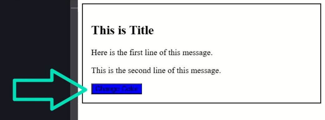
Okay, now let’s save and see how this works:
Nice, now we have changed both the background color and the text color.
So, that’s how we can bind styles in the template, but what about the component’s host element?
Well, we can do this too.
Binding Styles Directly to the Component Host Element
Let’s switch back to the component TypeScript.
Here, we already have a function created to generate a random color:
export class ExampleComponent {
  ...
  protected setRandomColor() {
    const color = `#${Math.floor(Math.random() * 16777215).toString(16)}`;
  }
}
So, I’m going to add a new property called “color”.
It’ll be a signal, and we’ll give it an initial hex value for yellow.
export class ExampleComponent {
  ...
  private color = signal('#ffff00');
}
Okay, now in the random color function, let’s set this signal to the random color:
export class ExampleComponent {
  ...
  protected setRandomColor() {
    const color = `#${Math.floor(Math.random() * 16777215).toString(16)}`;
    this.color.set(color);
  }
}
Okay, now for the last part, we need to call this function when our button is clicked.
So we’ll add a click event on the button, and then when clicked, we’ll call the setRandomColor() function:
<button (click)="setRandomColor()">Change Color</button>
Ok now we’re toggling the color value when this button is clicked so we need to bind this color style to our component host.
Let’s switch back to the TypeScript.
To bind to the host element, we need to add the host property.
In this object, we can bind attributes on the host just like we do on elements within the template.
We use square brackets, the style attribute, followed by a dot and the property that we want to add.
Then we can bind this to our color signal:
@Component({
  selector: 'app-example',
  ...
  host: {
    '[style.background]': 'color()'
  }
})
So now it should start out with a yellow background and then when we click the button, it should change to a random color.
Let’s save and try it out:
Nice, now it’s yellow to start, then when we click the button it changes to a random color.
Pretty cool, right?
This isn’t something you’ll need to do a lot but it’s good to know about for when you do need it.
Programmatic Styling with Renderer2 setStyle()
Next up, now that we know how we can programmatically add styles to elements that we have access to, sometimes we may find ourselves with the need to do the same with dynamic markup.
This is the type of code that may be injected from a third party library, from an API call, or something along those lines.
Here in our component template I’m simulating this concept with this “content” signal by binding it with innerHTML.
It contains some hardcoded markup:
export class ExampleComponent {
  ...
  protected content = signal(`
    <h2>This is Title</h2>
    <p>Here is the first line of this message.</p>
    <p>This is the second line of this message.</p>`);
}
Then, in the template here, we are injecting this content by binding it with innerHTML:
<div [innerHTML]="content()"></div>
This means that we have no way to bind to the markup elements in this innerHTML.
But we can actually do it with the Renderer2 class.
So, let’s switch back to the TypeScript.
The first thing we need to do is add a property for the Renderer2 and inject it with the inject() function:
import { ..., inject, Renderer2 } from '@angular/core';

export class ExampleComponent {
  ...
  private renderer = inject(Renderer2);
}
We also need to add an elementRef property and inject the ElementRef class:
import { ..., ElementRef } from '@angular/core';

export class ExampleComponent {
  ...
  private elementRef = inject(ElementRef);
}
Next, we need to add a constructor and within it, we’ll add the afterNextRender() method:
import { ..., afterNextRender } from '@angular/core';

export class ExampleComponent {
  ...
  constructor() {
    afterNextRender(() => {
    });
  }
}
This method will allow us to access the markup after the component has been rendered.
Within the callback for this method, I’m going to add a variable for the host element, and we’ll access it with the nativeElement on the ElementRef.
Then I’m going to create another variable called “title” where I’ll use the host element to query for an H2 element within:
export class ExampleComponent {
  ...
  constructor() {
    afterNextRender(() => {
      const host = this.elementRef.nativeElement;
      const title = host.querySelector('h2');
    });
  }
}
Then we’ll have programmatic access to this H2 element which means that we can add styles with the Renderer2 class and its setStyle() method.
This method needs three arguments:
- The first is the element that we want to set style on, this will be our “title” element
- Then we need to give it the property that we want to add as a string, we’ll add the color property
- Then we need to provide the value that we want to add for this property, we’ll give it “red”
export class ExampleComponent {
  ...
  private renderer = inject(Renderer2);
  private elementRef = inject(ElementRef);

  constructor() {
    afterNextRender(() => {
      const host = this.elementRef.nativeElement;
      const title = host.querySelector('h2');
      this.renderer.setStyle(title, 'color', 'red');
    });
  }
}
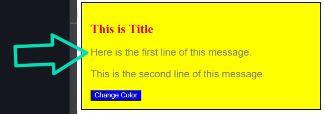
Okay, that should be it, let’s save and see:
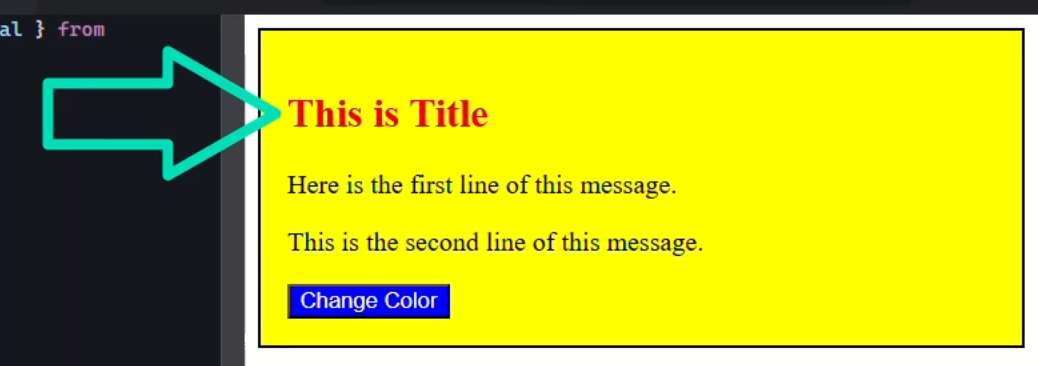
Nice, now the title is red.
Again, this is something that you shouldn’t need often but it’s useful when styling dynamic content that Angular doesn’t directly control.
Using Global Styles for App-Wide Style Control
Okay, if all this wasn’t enough, we also have the ability to add styles outside of components that are applied globally across the application.
By default, when you create a new Angular application, it will be configured to include a stylesheet at the app level that will simply be included in the head of the application.
This is similar to what you may already be used to with standard stylesheets on the web.
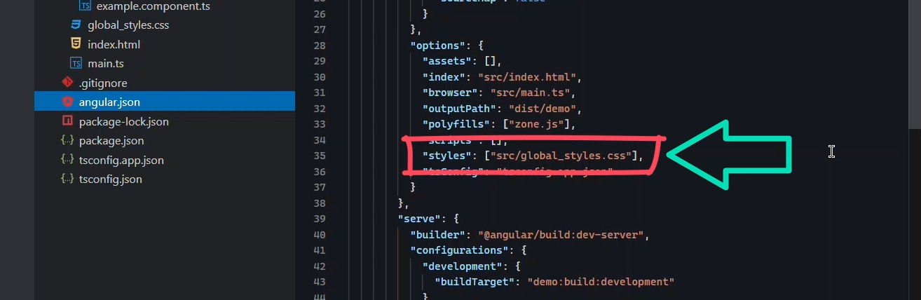
You can find this stylesheet by looking in your angular.json configuration file
Here, you can see we have a global_styles.css stylesheet in the src directory:
So, let’s open this stylesheet and add some styles for paragraph tags:
p {
  font-family: Arial, Helvetica, sans-serif;
  font-size: 120%;
  color: gray;
}
These styles will be applied to all p tags in the entire application.
Let’s save and see how it looks:
Nice, now the paragraphs have some basic styles applied.
I mean this component is pretty ugly but hopefully you get the idea.
When using this concept for styles, you need to be careful because they are applied globally, meaning you can easily break things unexpectedly and make things difficult to maintain.
Personally, I prefer to use these sparingly for things like general CSS resets, basic overall font styles, and similar global styles.
Best Practices: Choosing the Right Styling Approach in Angular
Alright, we’ve seen a lot here, so let’s recap.
Using the Styles Metadata Property
We want to use the styles metadata property for quick, small styles.
Using the styleUrl(s) Metadata Properties
We should use the styleUrl or styleUrls to create more structured, organized styles with external stylesheets.
Using Style Binding
We can use style binding both within the template and on the component host when programmatic styles are needed.
Using the Renderer2 setStyle() Method
We can use the Renderer2 setStyle method when we need to add programmatic styles to markup that Angular doesn’t control or as another method for programmatic styles when style binding doesn’t work.
Using Global Styles
And finally, we can add global, app-wide styles for things like theming and other defaults.
Each approach has its place, so choose based on your use case!
Wrapping Up
And that’s it! You now have a complete toolkit for adding styles in Angular components.
Which method do you use most often?
If you found this helpful, don’t forget to subscribe and check out my other Angular tutorials for more tips and tricks!
Additional Resources
- The demo app BEFORE any changes
- The demo app AFTER making changes
- Angular Component Styling Guide
- Angular Renderer2 API Docs
- Angular Host Metadata Docs
- My course: “Styling Angular Applications”
Want to See It in Action?
Check out the demo code showcasing these techniques in the StackBlitz project below. If you have any questions or thoughts, don’t hesitate to leave a comment.