Angular Component Theming: CSS Custom Properties and :host-context
Component theming in Angular requires understanding how styles cascade and how to adapt components to different contexts. This tutorial demonstrates multiple theming strategies using CSS :host and :host-context selectors, along with CSS custom properties. You'll learn how to create flexible components that adapt their appearance based on where they're used, whether in a sidebar, main content area, or different color schemes. Each approach has trade-offs that we'll explore in detail.
Context-Aware Themes with :host-context
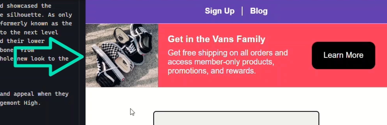
For this tutorial, we’ll be woking with a card component that creates this banner region at the top of the page:
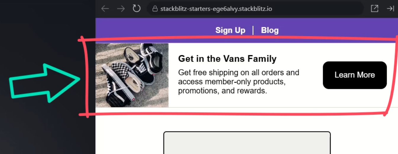
It looks pretty good at the top of this sign-up page so, if we’re only using it here, we wouldn’t need to make any changes, right?
But we’ve decided that we need to add it to the sidebar on the blog page and it doesn’t look so good:
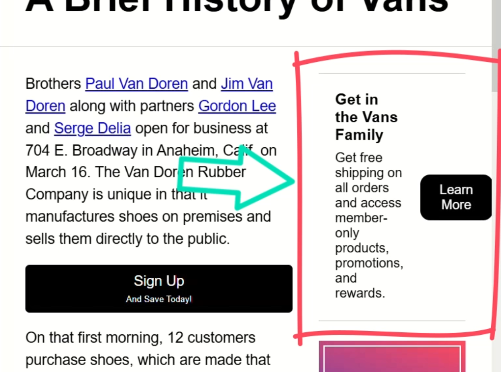
We need to do something to fix the way it looks here.
In this case, we want to alter the styles whenever the component is placed within an aside element.
To do this, we can use the :host-context pseudo class.
This pseudo class allows us to style components contextually based on the surrounding markup.
When using it, in the parentheses we add the CSS selector that we want to style based on, so we’ll add the aside element selector:
:host-context(aside) {
}
Now, any styles within this block will only apply when the component is nested within the aside element.
Now, I’ll go ahead and add several styles to fix the layout in this situation:
:host-context(aside) {
  border: 1px solid #ccc;
  display: block;
  padding-inline-end: 0;

  div {
    height: 8em;
    width: 100%;
  }

  p {
    margin-bottom: 0;
  }

  footer {
    padding: 0 1em 1em;
  }

  button {
    width: 100%;
  }
}
These styles will apply more of a vertical layout for the card:
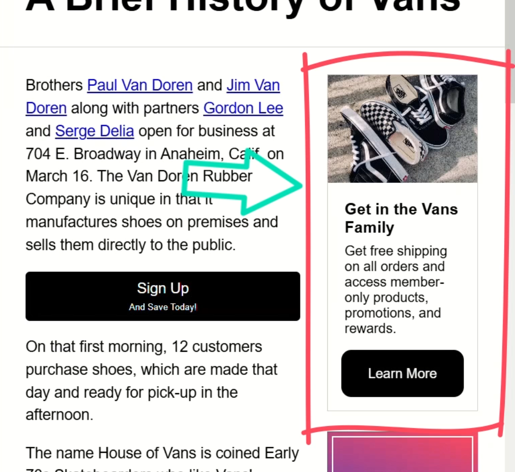
Nice! this looks better here now right?
And if we go back to the sign-up page, it remains unchanged there:
Pros
So, what are the pros to theming components with :host-context?
Well, for one, it’s context aware so the component’s layout automatically adapts based on the scenario it finds itself in.
And two, it remains reusable, we just may need to handle more specific use cases if it needs to adapt in another scenario too.
However, this could also be a downside.
Cons
If we needed this same layout elsewhere, we’d need to add another :host-context selector to these styles.
And we may need to continue to add to these over time, which is not ideal. For example:
:host-context(aside),
:host-context(section),
:host-context(.sidebar) {
  ...
}
Another downside is that these styles could break if the parent element changes.
In that case, these styles would no longer apply correctly.
So those are some things to consider with this method of styling components.
To avoid these issues, we have some other options.
Precise Theming with :host and Classes
I’ve found that sometimes it’s better to create multiple layouts for components and style them using classes.
For this, we can leverage the :host pseudo class instead.
This selector targets the host element of the component and, unlike :host-context, stops there without considering the surrounding markup.
Creating Layout Variations with :host
What I like to do in this type of scenario is completely separate the styles unique to each layout.
For this component, I’ll create a “horizontal” section for our horizontal layout styles like we see on the sign-up page, and move all of the styles unique to this horizontal layout into this new section:
:host(.horizontal) {
  border-block: 1px solid #ccc;
  display: flex;
  padding-inline-end: 1.5em;

  div {
    position: relative;
    width: 25%;
  }

  section {
    flex: 1;
  }

  footer {
    align-self: center;
  }
}
And then I’ll create a “vertical” section for the vertical style layout where I’ll isolate the styles for this layout:
:host(.vertical) {
  display: block;
  border: 1px solid #ccc;

  div {
    height: 8em;
  }

  footer {
    padding: 0 1em 1em;
  }

  button {
    width: 100%;
  }
}
There, so now we have the styles for the two layouts separated.
Keeping them completely separate like this avoids the need for layout styles to override each other, making them easier to understand and maintain.
Okay, now that we’ve got the styles separated, we just need to go to each of these component instances and add the appropriate class.
Home Page:
<app-card class="horizontal"></app-card>
Blog Page:
<aside>
  <app-card class="vertical"></app-card>
</aside>
There, now with the classes added, after we save, we see that the horizontal layout is applied on the home page:
And the vertical layout is applied on the blog page:
So, what are the pros to theming components with the :host pseudo class and layout classes?
Pros
Well number one and most important, the styles remain encapsulated in the component.
Number two, the layout styles are isolated from each other, so they don’t conflict and cause maintenance challenges.
And number three, simplicity. It’s easy to toggle layouts by simply changing classes.
How about some cons?
Cons
Well, one may be that you may have the need to switch layout classes at different responsive breakpoints.
This means that you’d probably need to monitor viewport changes with JavaScript and programmatically apply the appropriate class.
Or, you might need to add more complex styles that consider media queries.
So, this concept works well for different component layouts in many cases but there may be some challenges with responsiveness.
So far, we’ve really only covered the concept of layouts in component themes.
But the way that I’ve experienced it is that there are at least two major aspects of component themes, one is layout, and the other is color.
Creating Color Variations with :host
Similar to our layout example, I like to use color classes with the :host pseudo-class to apply different color states to components.
So, let’s add a “red” class, and then add a red-ish background color along with a white text color:
:host(.red) {
  background-color: #ff495d;
  color: white;
}
Let’s also add a “purple” class, with a purple background, and white text:
:host(.purple) {
  background-color: #6244b0;
  color: white;
}
And then, just like the layout classes, let’s add these classes to the individual component instances.
Home Page:
<app-card class="horizontal red"></app-card>
Blog Page:
<aside>
  <app-card class="vertical purple"></app-card>
</aside>
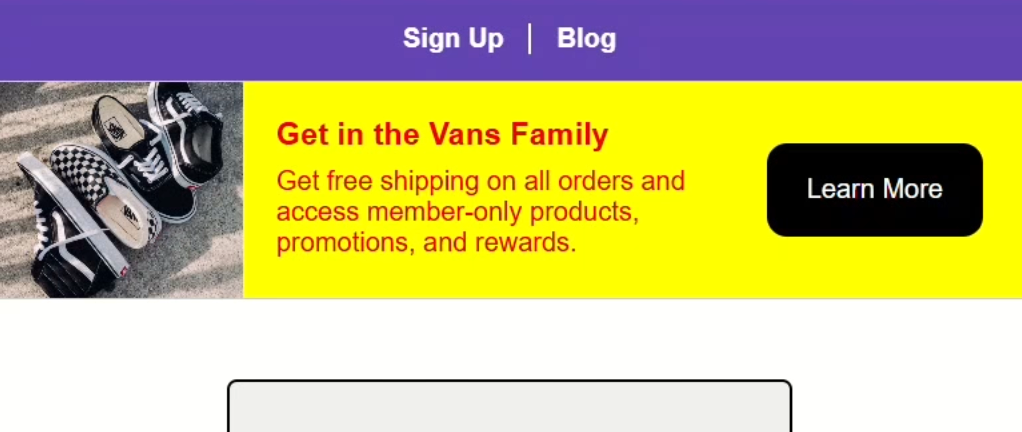
Now, once we save, this component should be purple now:
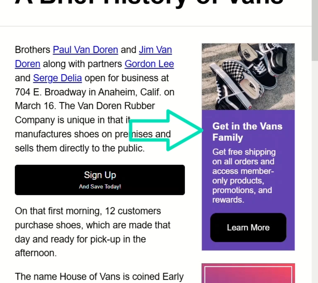
And, the banner on the home page should be red:
So that’s how I like to manage layouts and colors.
But, while these concepts work great, they’re still not without their own issues.
Sometimes they don’t work well because you need more customization for a given scenario but maybe it’s more of a one-off use case where you don’t want to create a new class for it.
Well, we have options for this type of customization too.
Dynamic Theming with CSS Custom Properties
In these cases, I like to use CSS custom properties to expose configuration that can be overridden when needed.
To do this, let’s add another :host selector in our stylesheet.
This time, we won’t add a class we’ll apply these styles to the host by default.
Let’s add a background-color style and we’ll add a custom property for it.
Then, we’ll add a color style with a custom property too:
:host {
  background-color: var(--card-background);
  color: var(--card-foreground);
}
Now, let’s go into the stylesheet for the home page component and provide custom values for these properties.
We’ll set the background to yellow and the text color to red:
:host {
  --card-background: yellow;
  --card-foreground: red;
}
Then, we just need to remove the color class for the component on the home page:
Ok, now let’s save and see how this looks:
Nice.
Well not really nice, this color combo is kinda ugly, but the styles are properly overridden, so that’s good.
This gives us even more flexibility when it comes to component theming.
Wrapping Up
To wrap things up, we’ve seen how CSS empowers you to create flexible, context-aware components.
By using :host-context and :host, along with layout and color classes—and even dynamic theming with custom properties—you can fine-tune your designs for any scenario.
Each approach has its trade-offs, so experiment to find the best balance for your projects.
If you found this helpful, don’t forget to subscribe, and check out my other Angular tutorials for more tips and tricks!
Additional Resources
- The demo app BEFORE any changes
- The demo app AFTER making changes
- Angular Component Styling Guide
- MDN Web Docs – :host
- MDN Web Docs – :host-context
- MDN Web Docs – CSS Custom Properties
- Angular styling secrets: How to use :host and :host-context like a pro
- My course: “Styling Angular Applications”
Want to See It in Action?
Check out the demo code showcasing these techniques in the StackBlitz project below. If you have any questions or thoughts, don’t hesitate to leave a comment.


