3 Modern CSS Techniques for Centering Items
Centering elements in CSS used to require complex hacks, but modern CSS provides multiple reliable methods. Each approach—positioning, flexbox, and grid—has different use cases and trade-offs. This tutorial demonstrates three modern centering techniques, helping you choose the right method for your layout needs and understand when each approach works best.
It’s really such an odd thing that it was so difficult for so long to simply place items in the center of a container on the Web. Well, horizontal centering was easy, but vertical centering was nearly impossible up until more recent years.
Using CSS Positioning to Center Items
This first method, using CSS positioning, has probably been around the longest, but it has evolved a little as newer properties have emerged. Let’s look at an example.
Here we have this box that we want to center in this other container with the red border.
It’s a strong element and it’s placed directly within a div element which is this red box that we’re seeing here.
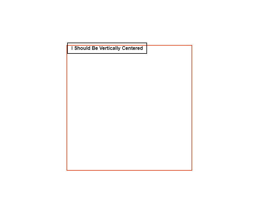
We’re going to use absolute positioning for this method so let’s add it to our strong element.
strong {
    position: absolute;
}
Now, in order for this to function correctly, our div will need to create a positioning context for our item to be positioned on. There are many different ways to do this but the best option for this example is to use relative positioning.
div {
    position: relative;
}
Now we can position our element down fifty percent of the height of our div and over fifty percent of the width. To position down from the top we can use the new logical property, inset-block-start with a value of fifty percent. And, to position over from the left we can use inset-inline-start with the same value of fifty percent.
strong {
    ...
    inset-block-start: 50%;
    inset-inline-start: 50%;
}
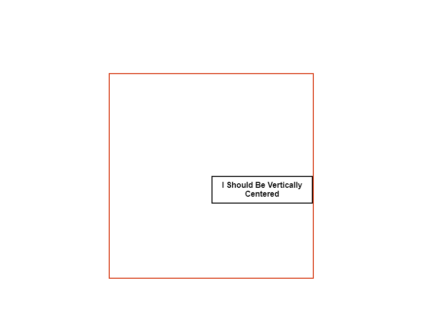
Ok, so it’s not exactly centered, is it?
Well, this is because we’ve positioned the item in the center of our div, but its position is based on its top left corner. What we need to do now is shift the item back up fifty percent of its own height and back over fifty percent of its own width. This will get it properly placed in the center.
But, how can we do this?
It’s actually really easy. We can use the new CSS translate property. The first value will translate along the x-axis. We need to go back fifty percent, so we’ll add a value of negative fifty percent. And, the second value translates along the y-axis, we’ll give it the same value of negative fifty percent.
strong {
    ...
    translate: -50% -50%;
}
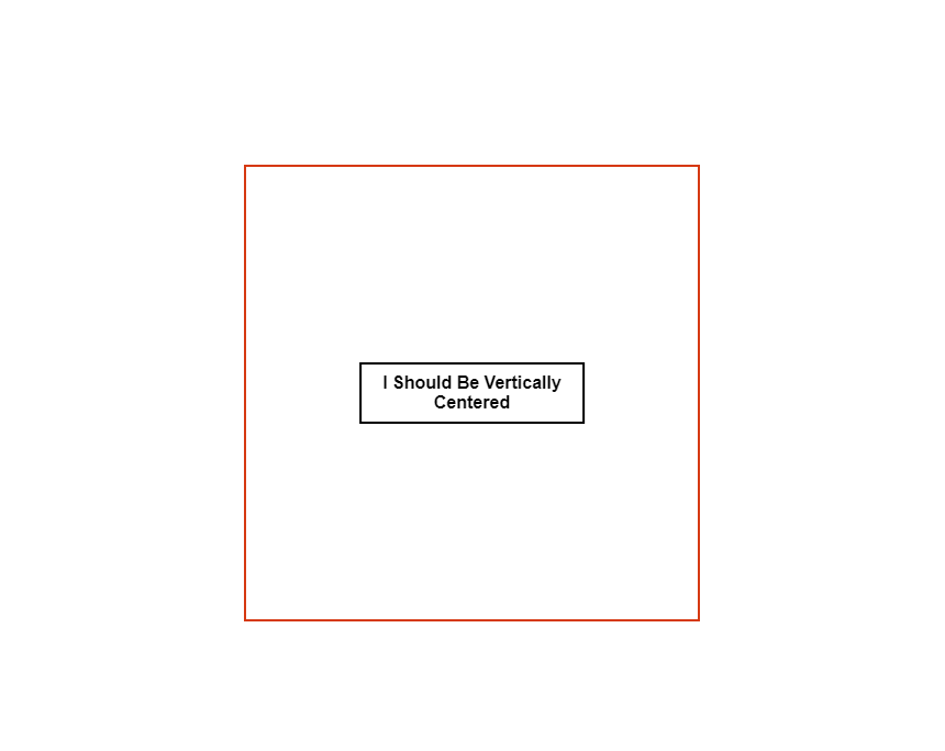
And there we go. Perfectly centered.
Here’s the final working example using positioning and translation:
See the Pen CSS Positioning for centering by Brian (@brianmtreese) on CodePen.
So, this is one way we can do it, but it’s not my favorite.
Using Flexbox to Center Items
If I can, I prefer to use flexbox over positioning because it’s even easier, requires fewer lines of code, no positioning context, and honestly, it just feels like a better, more modern solution. Let’s look at an example.
Ok, so we’re starting from the same point, we have our outer div with the red border and then our inner strong element.

We start by making our div a flex container with display, flex. Then we can align our item to the center along the x-axis with the justify-content property and a value of center. And last but not least, we can align along the y-axis with the align-items property and the same value of center.
div {
    display: flex;
    justify-content: center;
    align-items: center;
}
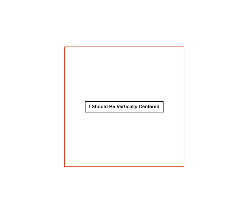
And there you have it, the item is properly centered and it only took three lines of code to get there this time.
Here’s the final working example using Flexbox:
See the Pen CSS Flexbox for centering by Brian (@brianmtreese) on CodePen.
So that’s cool and I sometimes have the need to do this, but my favorite way to position items in the center is to use CSS grid. And again, my reasons for this are because it’s even easier than flex and requires even less code.
Using Grid to Center Items
Ok, same starting point with the red box and inner item.

This time we’ll make our div a grid container with a display value of grid. Now what’s cool here is that we can use the same two properties that we used for our flexbox example if we want. We can add justify-content: center and align-items: center. It works the same exact way.
div {
    display: grid;
    justify-content: center;
    align-items: center;
}
Kind of funny but it’s just the way grid works, it can use the same box-alignment properties that flexbox does. But, if we left it this way there’d really be no advantage to use grid right?
Well, what we can do instead is, remove these alignment properties, and replace them with the place-items property. And, we can give this property a value of center.
div {
    display: grid;
    place-items: center;
}

There we go, now we’ve whittled it all the way down to just two lines of CSS.
Here’s the final working example using CSS Grid:
See the Pen CSS Grid for centering by Brian (@brianmtreese) on CodePen.
So like I said earlier, it’s a lot easier than it used to be that’s for sure. But all of these techniques are still very relevant and may be needed due to any number of circumstances so it’s good to know all of them just in case. I would definitely prefer the least amount of code CSS grid, and if that doesn’t work the next best thing flexbox, and if neither of those work, try positioning.


