Angular ::ng-deep Alternatives Part 2: CSS Custom Properties and View Encapsulation
Replacing ::ng-deep requires understanding CSS Custom Properties, View Encapsulation modes, and component architecture patterns. This follow-up tutorial addresses common misconceptions about avoiding ::ng-deep and provides specific, production-ready examples using CSS Custom Properties and View Encapsulation settings. You'll learn why ::ng-deep is discouraged by the Angular team and practical alternatives that maintain component boundaries while allowing necessary style customization.
Let’s begin with a little background on how ::ng-deep came to be.
The Origins of ::ng-deep
Angular’s style encapsulation mimics the native Shadow DOM, preventing styles from leaking between components.
Initially, web components used shadow-piercing combinators like /deep/ and >>> to override encapsulated styles when needed.
Angular emulated this behavior too.
But it was quickly realized that piercing the Shadow DOM’s boundaries undermined the purpose of encapsulation, keeping components self-contained.
As a result, these combinators were deprecated and removed from the Web Components specification.
This prompted the Angular team to introduce ::ng-deep as a temporary solution for backward compatibility, but they advise against new uses.

So that’s how we got here.
At this point I want to say, if you’re comfortable using ::ng-deep and don’t like what I present here in this tutorial, keep using it.
Just know that there could come a time when it’s removed from the framework and you’ll need to do the work to migrate to some other solution.
Personally, I’m trying to avoid that.
I’m trying to share my knowledge/experience and trying to do so within the confines of the framework and what’s recommended by the Angular team.
Ok, with all of that out of the way, I want to look at some specific approaches to styling a component from a third-party library since that was the main reason that many of you were using ::ng-deep.
For this tutorial, we’re going to use the mat-form-field component from Angular Material as an example.
Now Material makes use of many custom properties for overriding the look of their components.
For this example, I’ll be overriding some of these custom properties but also some things that don’t have custom properties available.
Global Style Overrides for Third-Party Libraries in Angular
Ok, in this tutorial we’ll be using a simple sign-up form:
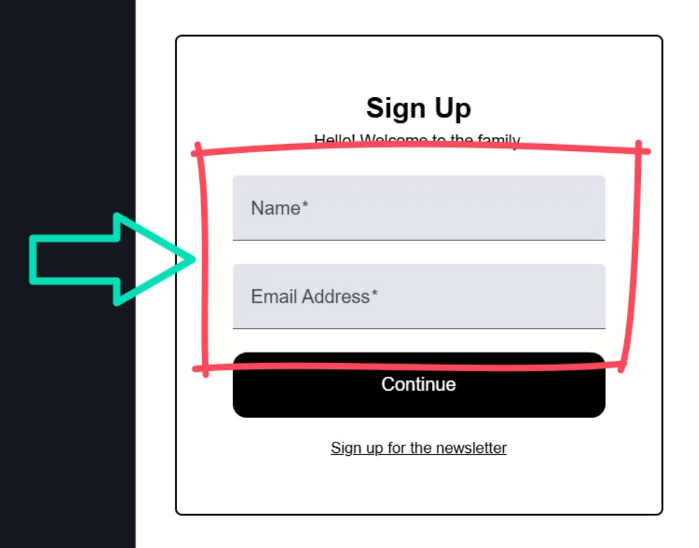
We’re using the mat-form-field component from Angular Material for these two text boxes for the name and email.
It doesn’t look bad, but we need to change a couple of things to align with the design aspects of our existing app.
For one, we need to add a border around the fields and increase the border-radius on the corners.
Also, we need to round the bottom corners as well.
Now, when it comes to overrides for a third-party library, there’s really two concepts:
- Do we want these changes to be applied globally to every instance of the component?
- Do we want these changes to be applied to a specific instance of the component?
Well, in this first case, let’s say we want them to look like this globally, for every instance.
We’ll look at a specific case later in this tutorial.
So, for these overrides, we can simply add global styles.
Applying Global Styles to All Instances of a Component
If we look at the global stylesheet, we can see that we have a couple stylesheets already included:
@use "scss/base";
@use "scss/visually-hidden";
To keep things organized, we’ll add another style sheet for these overrides named _mat-form-field.scss.
Within this stylesheet, we’ll add a body selector to nest our overrides within, in order to increase specificity over the Material styles already included:
body {
}
The styles that we’ll need to add will be a combination of the exposed custom properties from the Material styles and overrides for things that don’t have custom properties.
Now, if we only needed to override the custom properties, some of the concepts in this tutorial wouldn’t be needed since these properties could be defined at any level and overridden as needed.
So just keep that in mind.
Ok, to start overriding the styles we need to add the mdc-text-field--filled class.
Then, we can add the border using the --mat-sys-on-surface-variant custom property from Material.
And we can override the border-radius to increase it and apply it to all four corners:
body {
  .mdc-text-field--filled {
    border: solid 1px var(--mat-sys-on-surface-variant);
    border-radius: 0.75em;
  }
}
One last thing we need to do is use the mdc-text-field--invalid class to set the border color to the --mat-sys-error property.
This will match the color of the bottom border when the field is invalid:
body {
  .mdc-text-field--filled {
    border: solid 1px var(--mat-sys-on-surface-variant);
    border-radius: 0.75em;

    &.mdc-text-field--invalid {
      border-color: var(--mat-sys-error);
    }
  }
}
Ok, so now any time we use the mat-text-field component, these styles will be applied no matter what component they are in.
Let’s save and see how it looks:
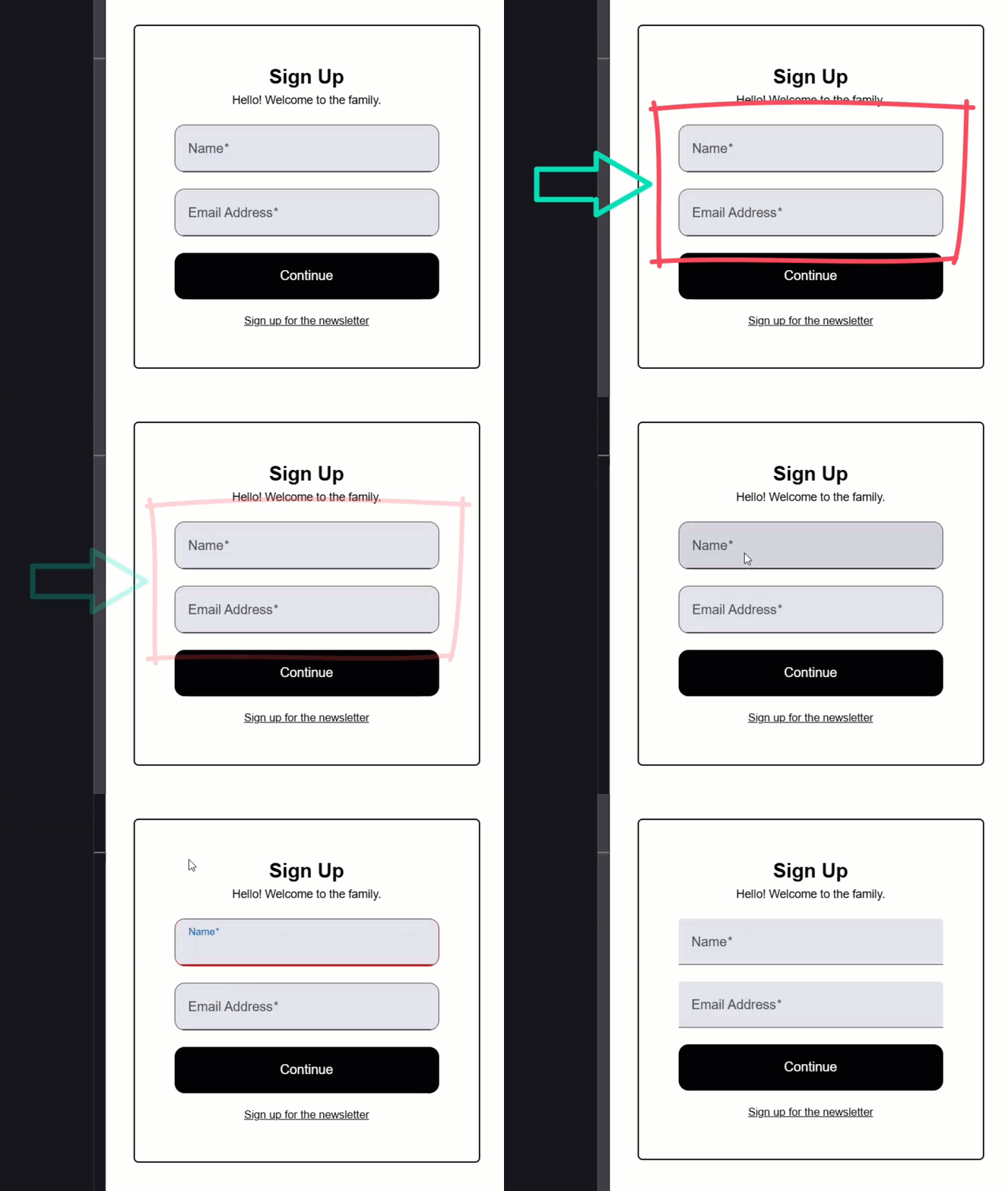
Ok, now there’s a border and the corners are rounded to match the “Continue” button.
And when we make one invalid, the border is switched to red.
No need for ::ng-deep right?
But what if we want to override a textbox in a specific component to make it look different?
Like what if we want to remove the background and border from this textbox in our newsletter-modal.component.html?
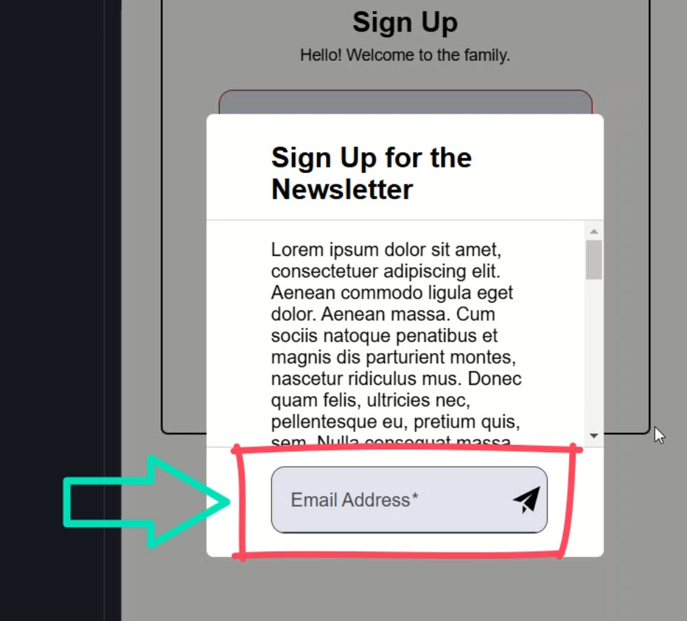
Using Global Styles for a Unique Component Instance Within a Specific Context
Well, one way we could do this is add these styles in our global stylesheet too.
First, we need to add the component selector to scope them to this component:
app-newsletter-modal {
}
Then, we can clear the background-color by setting the --mdc-filled-text-field-container-colorcustom property to transparent.
We also need to remove the background-color on hover by setting the --mat-form-field-hover-state-layer-opacity property to zero:
app-newsletter-modal {
  --mdc-filled-text-field-container-color: transparent;
  --mat-form-field-hover-state-layer-opacity: 0;
}
Next, we need to remove the padding, the border, and the border-radius:
app-newsletter-modal {
  --mdc-filled-text-field-container-color: transparent;
  --mat-form-field-hover-state-layer-opacity: 0;

  .mdc-text-field {
    padding: 0;
  }

  .mdc-text-field--filled {
    border: none;
    border-radius: 0;
  }
}
Ok, I think that’s it.
Let’s save and see how it looks:
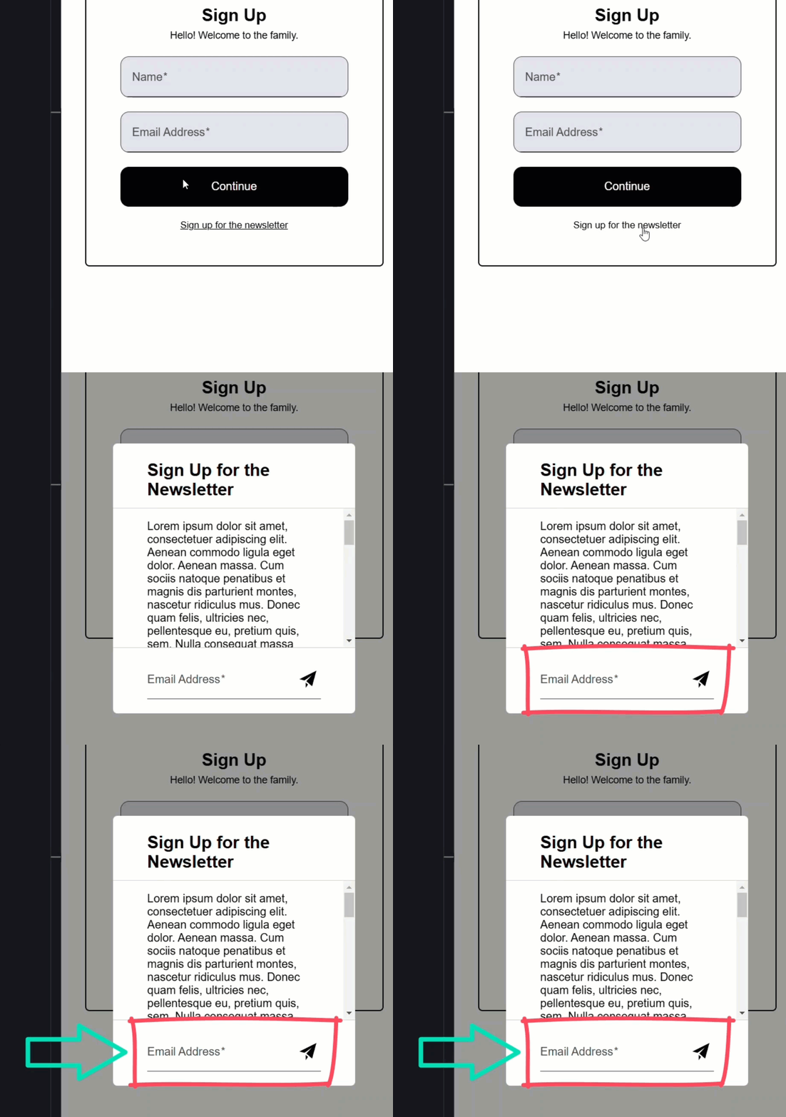
Ok, looks like we want right?
So, we added styles for this specific use case, but they are global.
I don’t like this because if we remove this component at some point, like if it was no longer needed or something, we could easily leave these styles behind.
It can also add confusion and make this all more difficult to modify and maintain.
But, we can pretty easily change this by adding our own custom properties at the global level.
Customizing Third-Party Libraries: Global Defaults with Unique Overrides
Let’s switch the styles for the textbox a little.
For the border, let’s add our own custom property.
Let’s call it --mat-text-field-border, and the fallback will be the 1-pixel solid border.
And let’s do the same for the border-radius.
let’s also add a custom property for the padding using the mdc-text-field class and let’s set the fallback value to 16 pixels:
body {
  .mdc-text-field--filled {
    border: var(
      --mat-text-field-border,
      solid 1px var(--mat-sys-on-surface-variant)
    );
    border-radius: var(--mat-text-field-radius, 0.75em);

    &.mdc-text-field--invalid {
      border-color: var(--mat-sys-error);
    }
  }

  .mdc-text-field {
    padding: var(--mat-text-field-padding, 0 16px);
  }
}
So now, the fallback values will be applied if values for these custom properties aren’t provided elsewhere.
This allows us to simply override them where needed.
In this case we want to override them in the newsletter-modal.component.scss.
We can simply add these custom properties with the values we want within our :host selector:
:host {
    ...

    --mdc-filled-text-field-container-color: transparent;
    --mat-form-field-hover-state-layer-opacity: 0;
    --mat-text-field-border: none;
    --mat-text-field-radius: 0;
    --mat-text-field-padding: 0;
}
Ok, now these should override the global styles, so let’s save and see:

Yep, looks like we want right?
So, this is another, much better option.
Rather than using ::ng-deep in this component, we can provide more generic, global custom properties ourselves and then override them in the components where needed.
This is better than the previous example because we keep the global styles generic.
If this component were removed, its custom overrides will be removed along with it, and there’s nothing specific to this component left behind in the global space.
Now, we still have another, more controversial option.
Many of you didn’t like this when I suggested it in my last tutorial, but I think it may have been because the concept wasn’t all that clear.
So, let’s try it again.
Isolating Third-Party Overrides with ViewEncapsulation.None
Let’s assume that we don’t want to add these custom properties because this is the only time we’ll ever need to override these styles.
Let’s create a new component to serve as the container for these custom styles within our newsletter-modal component directory.
Let’s call it mat-field-container.
Now, within this component, let’s turn off View Encapsulation 😱:
import { ..., ViewEncapsulation } from '@angular/core';

@Component({
    selector: 'app-mat-field-container',
    ...,
    encapsulation: ViewEncapsulation.None,
})
export class MatFieldContainerComponent {}
Now, I want to be really clear on this, I’m not suggesting that you turn View Encapsulation off on all components.
I’m also not suggesting that you turn it off on any component that can have other components nested within it.
I’m simply suggesting that you leverage this feature of the framework, sparingly, and in very specific and controlled situations like this one.
A lot of global, unscoped styles in a large Angular application would be a nightmare to maintain.
But, in this specific case, used with extra caution, it’s a good solution.
Ok, now we can paste our styles into this file, wrapped within the component selector:
app-mat-field-container {
  --mdc-filled-text-field-container-color: transparent;
  --mat-form-field-hover-state-layer-opacity: 0;

  .mdc-text-field {
    padding: 0;
  }

  .mdc-text-field--filled {
    border-radius: 0;
    border: none;
  }
}
This means that, while these styles will be added un-scoped, they will only apply within this container component and never to any mat-text-field outside.
For the last part, we need to add a content slot in the template:
<ng-content></ng-content>
Now, we can just wrap this component around the mat-text-field component in the template for our newsletter-modal.component.html:
<app-mat-field-container>
  <mat-form-field> ... </mat-form-field>
  ...
</app-mat-field-container>
Then we just need to import it in the newsletter-modal.component.ts:
import { MatFieldContainerComponent } from "./mat-field-container/mat-field-container.component";

@Component({
    selector: 'app-newsletter-modal',
    ...,
    imports: [
        ...,
        MatFieldContainerComponent
    ],
})
export class NewsLetterModalComponent {
    ...
}
Ok, that’s it.
Let’s save and see how it looks:
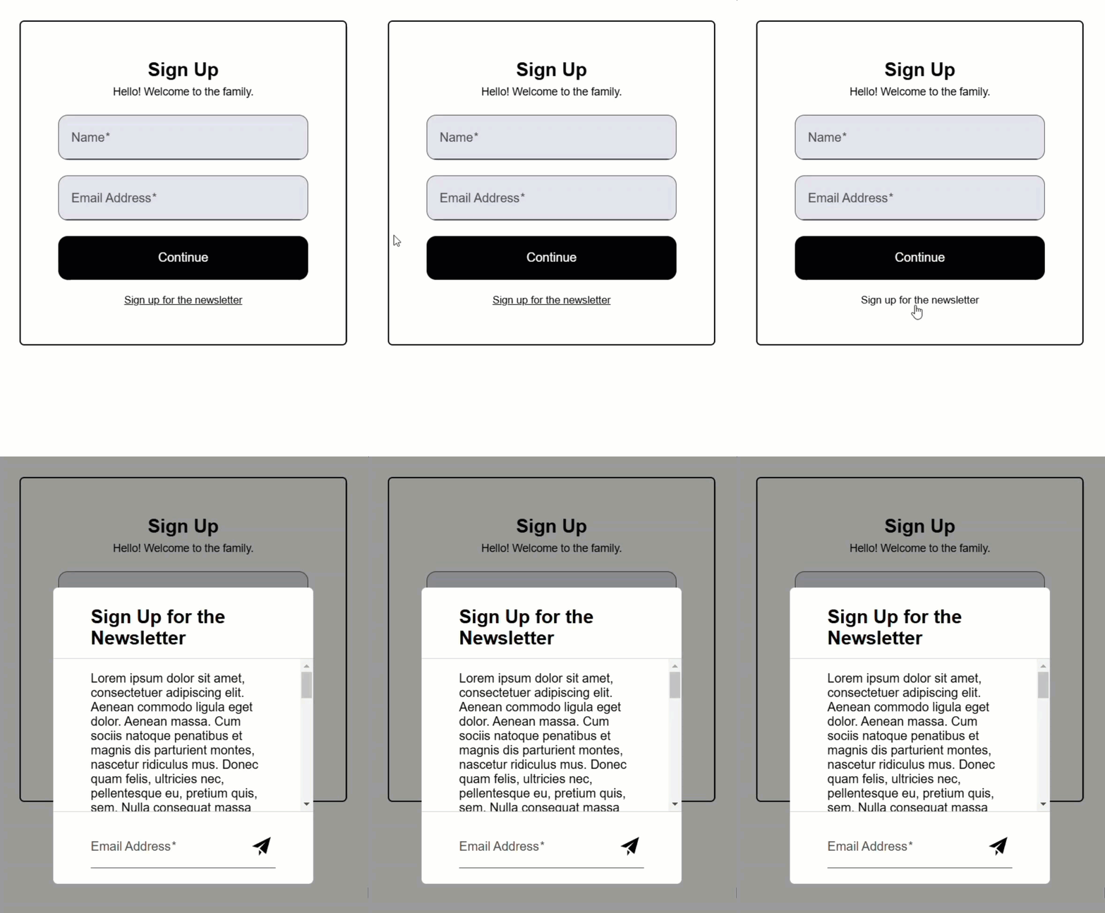
Ok, so our global textbox styles still look good.
And our newsletter form looks good too.
So, this is just a solution that you can use sparingly, when needed.
It works and acts very similar to ::ng-deep, but it’s using a feature that is not discouraged by the Angular team.
It has the benefit of keeping the overrides where they are used.
It also isolates them so that they can easily be removed if we were to ever remove the mat-text-field from this component.
And, if we no longer need this newsletter modal component altogether and decide to remove it, these overrides will be removed too.
Again, this is just something to use in very specific and controlled scenarios, but it can be leveraged, even with third-party libraries.
In Conclusion
By avoiding ::ng-deep and leveraging these alternative techniques, you can create clean, maintainable styles for your Angular applications while staying aligned with best practices.
Whether it’s global styles, your own custom properties, or un-scoped components, you now have several tools to handle third-party styling challenges effectively.
Alright, hope that was helpful.
Don’t forget to check out my other Angular tutorials for more tips and tricks.
Additional Resources
- The demo BEFORE making changes
- The demo AFTER making changes
- What the Angular Team says about ::ng-deep
- Stop using ::ng-deep… what to do instead
- Style Scoping in Angular
- CSS Custom Properties
- CSS Var Function
- Shadow DOM
Want to See It in Action?
Check out the demo code and examples of these techniques in the Stackblitz example below. If you have any questions or thoughts, don’t hesitate to leave a comment.


