Build the Perfect “Show More” Component in Angular
Expandable content components are essential for long-form content, but implementing smooth height transitions requires handling dynamic content heights, coordinating CSS animations, and managing state. This tutorial demonstrates how to build a professional "show more" component in Angular with smooth height transitions, fade effects, and proper state management. You'll learn how to measure content height dynamically, create elegant expand/collapse animations, and handle edge cases like nested content and responsive layouts.
The Broken Component
We’re starting with a super basic Angular application with some content that needs to toggle:
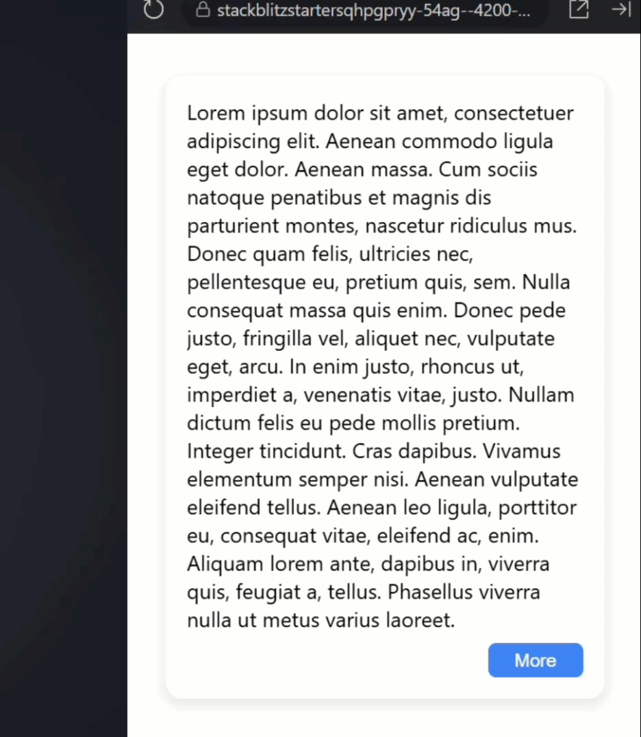
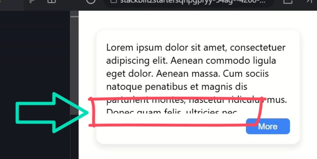
Currently, when we click the button, all that happens is the text changes between “more” and “less”.
That’s literally all it does right now.
So, let’s fix this and make it actually do something meaningful.
Why Not Use HTML Details?
Before we dive in, you might be wondering:
“Hey, doesn’t HTML have a details element for this?”
Good question!
While details/summary is great for simple show/hide functionality, we want something more flexible.
We want to toggle arbitrary content, starting at any height, with smooth animations, and a subtle fade effect.
Think of this as the details element’s cooler, more customizable cousin.
Understanding the Foundation
Okay, let’s start by understanding what we’re working with.
Let’s take a look at the toggle height component template.
Here we have an article element that contains a generic content slot:
<article>
    <ng-content></ng-content>
</article>
This will put whatever content the parent component gives us right here.
Below that, we have our footer with the button that calls the “toggle()” method when clicked:
<footer>
    <button (click)="toggle()">
        ...
    </button>
</footer>
Then we have either a “Less” or “More” label based on whether the component is expanded which is tracked with an “isExpanded()” signal:
@if (isExpanded()) {
    Less
} @else {
    More
}
The Signal-Powered Logic
Now let’s switch to the component TypeScript file to see what’s happening under the hood.
Here’s our “isExpanded()” signal:
export class ToggleHeightComponent {
    protected isExpanded = signal(false);
    ...
}
It’s initialized to false, so we start collapsed.
And then, we’re binding a class on the component host when this “isExpanded()” signal is true:
@Component({
    selector: 'app-toggle-height',
    ...,
    host: {
        '[class.expanded]': 'isExpanded()'
    }
})
We’ll need to use this class in a minute as part of the toggle functionality.
Finally, we have the “toggle()” method that’s used to toggle the value of the “isExpanded()” signal:
export class ToggleHeightComponent {
    ...
    protected toggle() {
        this.isExpanded.update(v => !v);
    }
}
This is a great starting point, but here’s the problem: we’re not actually doing anything with this expanded state except changing the button text.
Time to fix that.
Adding Real Functionality
Let’s make this component actually expandable.
First, I’m going to add a new input called “collapsedHeight” and I’ll provide a default value of 50px:
import { ..., input } from "@angular/core";

export class ToggleHeightComponent {
    collapsedHeight = input('50px');
    ...
}
This makes our component configurable.
Different instances can have different collapsed heights depending on their needs.
And if we don’t provide a custom height, it will default to 50px.
Now we can use style binding to add a custom property on the host using this input value:
@Component({
    selector: 'app-toggle-height',
    ...,
    host: {
        ...,
        '[style.--collapsedHeight]': 'collapsedHeight()',
    }
})
CSS custom properties are like variables in CSS, but the cool part is we can even set them dynamically from JavaScript.
We’ll use this in our component styles in a minute as part of the overall expand/collapse strategy.
Okay, to make this work properly, we need to be able to measure the actual height of our content.
And to do that, we need a reference to the DOM element.
Let’s switch back to the HTML template and add a template reference variable to our article element
<article #container>
    ...
</article>
This gives us a way to access this specific DOM element from our TypeScript.
Now let’s switch back to the component TypeScript to wire this all up.
Let’s add a new property called “container” where we’ll use the viewChild function to access the element.
This item will be required, it will be typed as an ElementRef, and we can use our “container” reference label as the selector:
import { ..., viewChild } from "@angular/core";

export class ToggleHeightComponent {
    protected container = viewChild.required<ElementRef>('container');
    ...
}
In this case, viewChild is Angular’s way of saying:
“Give me direct access to that DOM element.”
Think of it like getting a backstage pass.
Instead of just seeing the element from the audience, we can go behind the scenes and actually measure it, manipulate it, whatever we need.
Next, we need a signal to track our expanded height.
It’ll either be a string or null and we’ll initialize it to null:
export class ToggleHeightComponent {
    protected expandedHeight = signal<string | null>(null);
    ...
}
Next, we can bind another custom property for this value on the host so that we can access it from the component styles as well:
@Component({
    selector: 'app-toggle-height',
    ...,
    host: {
        ...,
        '[style.--expandedHeight]': 'expandedHeight()',
    }
})
Now we need to update the toggle method to actually calculate the expanded height.
We’ll use the “set()” method to set this value, but we’re going to set it based on whether the component is expanded or not.
If we are expanded, we’ll set the value to the scrollHeight of the article, if not it’ll be null:
export class ToggleHeightComponent {
    ...
    protected toggle() {
        this.isExpanded.update(v => !v);
        this.expandedHeight.set(
            this.isExpanded() ?
                `${this.container().nativeElement.scrollHeight}px` : null);
    }
}
Using the scrollHeight gives us the total height of the content, including any content that’s currently hidden due to overflow.
It’s perfect for this use case because it tells us exactly how tall our element needs to be to show all its content.
Also, using null when the container is collapsed will remove the custom property from the host entirely.
CSS Magic: Making It Work
Now, let’s take a look at the component SCSS.
Currently, the article just has overflow: hidden which prevents content from spilling out.
But now we need to actually control the height.
Let’s set the height using our --collapsedHeight custom property:
article {
    overflow: hidden;
    height: var(--collapsedHeight);
}
Now we need to add styles for when we’re expanded.
For this, let’s use the :host selector with the “expanded” class to target the article element in the expanded state:
:host(.expanded) article {
}
Now, whatever styles we add here will apply to our article element, but only when the host has the “expanded” class.
So now, let’s set the height using the --expandedHeight custom property:
:host(.expanded) article {
    height: var(--expandedHeight);
}
Testing Our Basic Version
Okay, I think that should be all we need so let’s save and see how it works.
Moment of truth…
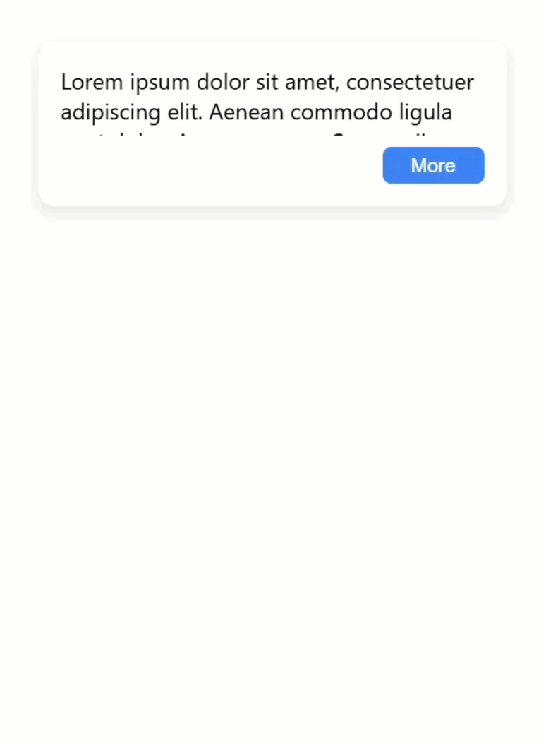
Boom! Look at that expanding and collapsing!
And then, if we want this to start out taller in this particular case, we can switch over to the root component where it’s included and add a custom value using our input.
Let’s go with 120px:
<app-toggle-height collapsedHeight="120px">
    ...
</app-toggle-height>
Okay let’s save this again and see how it looks:
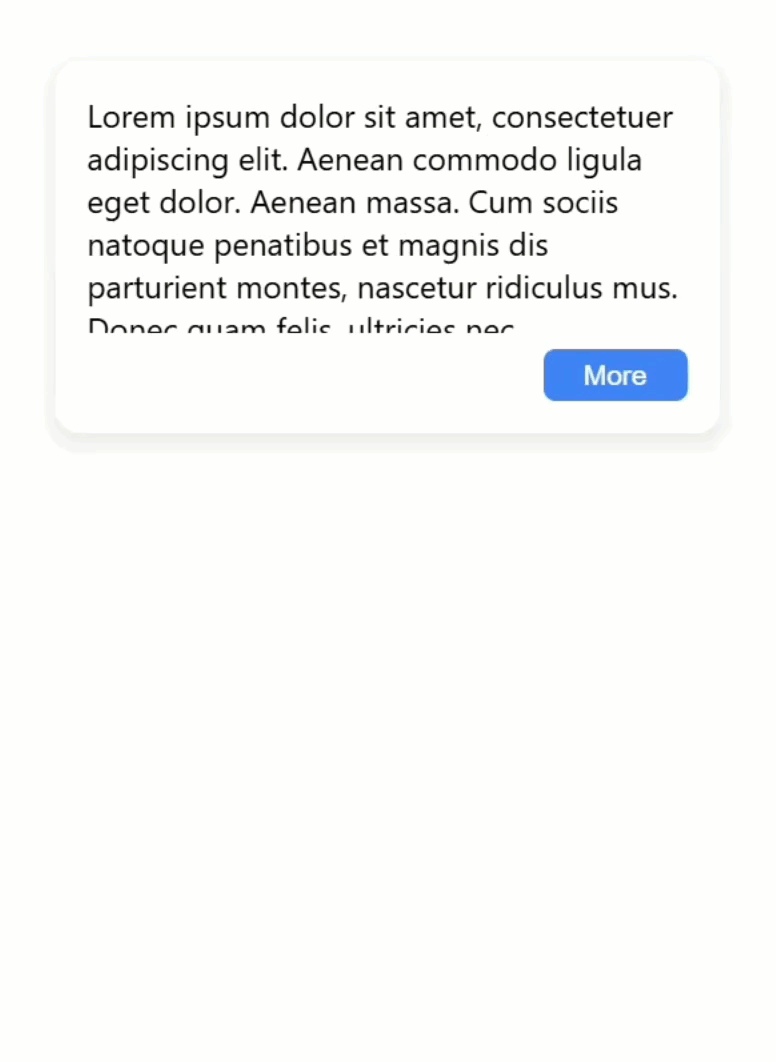
Perfect! Now we can see more content initially, and when we click ‘More’, it still expands to show the full text.
Alright, phase one complete.
We have basic expanding and collapsing.
Now for phase two: making it actually look good.
Here comes the fun part, we’re about to turn this basic toggle into something that would make even the most picky designer happy.
The Professional Polish
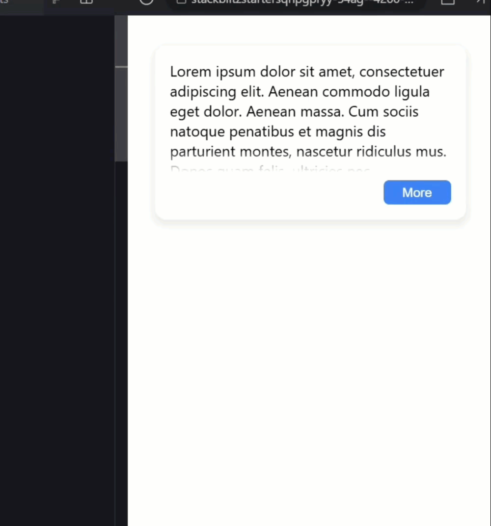
Right now, the content just gets cut off abruptly, which looks a bit harsh:
Let’s add a nice fade effect to make it more elegant.
I’m going to add a mask-image using a linear-gradient to create a fade-out effect at the bottom of the collapsed content:
article {
    ...,
    mask-image: linear-gradient(
        black,
        black calc(100% - 1.5em),
        rgba(black, 0) 100%);
}
We’re going from fully opaque black to transparent, which means the content will gradually fade out over the last 1.5em of height.
Then we need to add a mask-size for this to make sure it fits the content properly:
article {
    ...,
    mask-size: 100% calc(100% + 1.5em);
}
And finally, we need to use the mask-position property to position this mask at the bottom of the container:
article {
    ...,
    mask-position: bottom;
}
By the way, if you want to dive deeper into CSS masks, I have another tutorial that can really help.
Masks are incredibly powerful once you understand them!
Now if we were to leave this as is, when we expand the content, we’d be showing everything, but the fade effect will still be there.
That means the last bit of content will still fade out, even in the expanded state.
Let’s fix this by adding some extra padding in this case:
:host(.expanded) article {
    ...,
    padding-block-end: 1.5em;
}
And while we’re here, let’s make this transition smooth instead of jarring.
Let’s animate both the height change and the padding change over a quarter second with an ease timing function:
article {
    ...,
    transition:
        height 0.25s ease,
        padding-block-end 0.25s ease;
}
This should make it all feel much more polished.
Okay, let’s save and check out the final result:
Perfect! Look at this beautiful, smooth transition.
The content fades out elegantly when collapsed, and when I expand it, everything slides down smoothly with no jarring cuts.
And when I collapse it again, that fade effect makes it look like the content is gracefully disappearing rather than being brutally chopped off.
Make It Your Own
And there you have it! We transformed a useless toggle into a polished, reusable component using Angular’s modern features and a little CSS magic.
Try adding different fade effects or transitions… the possibilities are endless!
If you found this helpful, don’t forget to subscribe and check out my other Angular tutorials for more tips and tricks!
Additional Resources
- Angular Signals Documentation
- CSS Masks Deep Dive Video
- Angular viewChild Documentation
- CSS Custom Properties MDN
- Angular Component Interaction
- Modern Angular Best Practices
- My course “Angular: Styling Applications”
Want to See It in Action?
Want to experiment with the final version? Explore the full StackBlitz demo below. If you have any questions or thoughts, don’t hesitate to leave a comment.